29 May 2024

Graphical Representation: Graphics We Live By (Part VII: Reading a Conversion Rates Chart with ChatGPT and Copilot)

Graphical Representation Series

One of the areas where ChatGPT, Copilot and other similar AI-based chatbots can help is in summarizing a chart saved as image. Ideally, the chatbots should be able also to approximate the points from the chart as well (an image is made of pixels and thus areas should be easy to delimit). So, I was wondering how far the chatbots can be used for these purposes. I used first an image copied from the web, though I realized that not all visual elements could be read (e.g. Copilot had issues retrieving the values for some months) and I had no basis data for comparisons to identify how big the deviations are. 

So, I created a chart in Power BI based on the below chart (see original data):

Conversion Rates Dual Axes Chart

Here's the output based on Copilot over several attempts:
Original data First attempt Second attempt Third attempt Fourth attempt
Sorting Month Conv. Conv. Rate Conv. Conv. Rate Conv. Conv. Rate Conv. Conv. Rate Conv. Conv. Rate
1 Jul 8 4 10 1 10 1 8 4 8 4
2 Aug 280 16 275 15 275 15 275 18 275 18
3 Sep 100 13 225 12 225 10 225 12 225 12
4 Oct 280 14 275 12 275 11 275 11 275 11
5 Nov 90 4 75 5 75 6 75 6 75 6
6 Dec 85 3.5 100 5 100 5 100 5 100 5
7 Jan 70 4.5 50 3 50 3 50 4 50 4
8 Feb 30 1.5 50 3 25 2 50 2.5 50 2.5
9 Mar 70 4 25 1 50 2.5 25 1.5 25 1.5
10 Apr 185 11 200 10 200 10 200 10 200 10
11 May 25 3.5 50 4 50 4 50 3.5 50 3.5
12 Jun 195 4 225 10 225 10 225 11 195 4

Please note that same values were repeated to identify whether the chatbot is able to identify the resemblance correctly. 

Based on the data several tests were made with ChatGPT4o, where the following prompts were given:

  1. generate the data behind the chart as excel list (see 'First attempt' in the table)
  2. generate the data behind the chart as excel list where blue is represented on the left axis and orange on the right axis (see 'Second attempt');
  3. reevaluate the values from the previous output considering that the values for Jul are 8, respectively 4% (see 'Third attempt');
  4. reevaluate the values from the previous output considering that the values for Jun are 195, respectively 4% (see 'Fourth attempt');
  5. generate the data behind the dual axis chart as list from the last conversation;
  6. summarize the chart by revealing trends and other statistics.
From attempt to attempt, the values get closer to the original data, corrections being made, though there are points in the final output that diverge considerably. ChatGPT does generate a table which can be easily copied to MS Excel, and even gives some instructions on how to generate a dual axis chart. 

It's great that one can use data between sessions and improve maybe the output. ChatGPT's summary is better than expected and it leverages the latest corrections. However, the estimations need to improve so that the inferences can be correct. 

Here's the output based on the same prompts in Copilot:
Original data First attempt Second attempt Third attempt Fourth attempt
Sorting Month Conv. Conv. Rate Conv. Conv. Rate Conv. Conv. Rate Conv. Conv. Rate Conv. Conv. Rate
1 Jul 8 4 300 18 300 18 8 4 8 4
2 Aug 280 16 250 16 250 16 250 16 250 16
3 Sep 100 13 200 14 200 14 200 14 200 14
4 Oct 280 14 150 12 150 12 150 12 150 12
5 Nov 90 4 100 10 100 10 100 10 100 10
6 Dec 85 3.5 50 8 50 8 50 8 50 8
7 Jan 70 4.5 300 18 300 18 300 18 300 18
8 Feb 30 1.5 250 16 250 16 250 16 250 16
9 Mar 70 4 200 14 200 14 200 14 200 14
10 Apr 185 11 150 12 150 12 150 12 150 12
11 May 25 3.5 100 10 100 10 100 10 100 10
12 Jun 195 4 50 8 50 8 50 8 195 4

Copilot's estimations are higher than the ones made by ChatGPT and deviate more from the original data. No reevaluations are done between prompts for the other values. The summary provides information that can be used to complement ChatGPT's output. 

Overall, ChatGPT seems to perform better than Copilot, at least for this example (though we might talk here about different "generations"). Unfortunately, given that the estimations provided by both chatbots deviate considerably from the expectation, the output needs to be revised and corrected, which decreases the usability of such chatbots. In fact, one can use them to generate an initial set of data and correct then the deviations.

The outputs of other chatbots like Google's Gemini or Claude-3-Haiku (via Poe) can't be compared with the ones from ChatGPT or Copilot yet. Claude-3-Haiku does provide estimated values (even with comma), though they deviate considerably from the original data. 

It would be interesting to test how other charts and plots are processed by chatbots, respectively whether the various visual elements (e.g. gridlines, ticks, markers) make a difference.

Previous Post <<||>> Next Post

27 May 2024

Graphical Representation: Graphics We Live By (Part VI: Conversion Rates in Power BI)

Graphical Representation Series

Introduction

Conversion rates record the percentage of users, customers and other entities who completed a desired action within a set of steps, typically as part of a process. Conversion rates are a way to evaluate the performance of digital marketing processes in respect to marketing campaigns, website traffic and other similar actions. 

In data visualizations the conversion rates can be displayed occasionally alone over a time unit (e.g. months, weeks, quarters), though they make sense only in the context of some numbers that reveal the magnitude, either the conversions or the total number of users (as one value can be calculated then based on the other). Thus, it is needed to display two data series with different scales if one considers the conversion rates, respectively display the conversions and the total number of users on the same scale. 

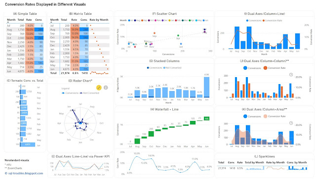
For the first approach, one can use (1) a table or heatmap, if the number of values is small (see A, B) or the data can be easily aggregated (see L); (2) a visual with dual axis where the values are displayed as columns, lines or even areas (see E, I, J, K); (3) two different visuals where the X axis represents the time unit (see H); (4) a visual that can handle by default data series with different axis - a scatter chart (see F). For the second approach, one has a wider set of display methods (see C, D, G), though there are other challenges involved.

Conversion Rates in Power BI

Tables/Heatmaps

When the number of values is small, as in the current case, a table with the unaltered values can occasionally be the best approach in terms of clarity, understandability, explicitness, or economy of space. The table can display additional statistics including ranking or moving averages. Moreover, the values contained can be represented as colors or color saturation, with different smooth color gradients for each important column, which allows to easily identify high/low values, respectively values from the same row with different orders of magnitude (see the values for September).

In Power BI, a simple table (see A) allows to display the values as they are, though it doesn't allow to display totals. Conversely, a matrix table (see B) allows to display the totals, though one needs to use measures to calculate the values, and to use sparklines, even if in this case the values displayed are meaningless except the totals. Probably, a better approach would be to display the totals with sparklines in an additional table (see L), which is based on a matrix table. Sparklines better use the space and can be represented inline in tables, though each sparkline follows its own scale of values (which can be advantageous or disadvantageous upon case).

Column/Bar Charts 

Column or bar charts are usually the easiest way to encode values as they represent magnitude by their length and are thus easy to decode. To use a single axis one is forced to use the conversions against the totals, and this may work in many cases. Unfortunately, in this case the number of conversions is small compared with the number of "actions", which makes it challenging to make inferences on conversion rates' approximate values. Independently of this, it's probably a good idea to show a visual with the conversion rates anyway (or use dual axes).

In Power BI, besides the standard column/bar chart visuals (see G), one can use also the Tornado visual from Microsoft (see C), which needs to be added manually and is less customizable than the former. It allows to display two data series in mirror and is thus more appropriate for bipartite data (e.g. males vs females), though it allows to display the data labels clearly for both series, and thus more convenient in certain cases. 

Dual Axes 

A dual-axis chart is usually used to represent the relationship between two variables with different amplitude or scale, encoding more information in a smaller place than two separate visuals would do. The primary disadvantage of such representations is that they take more time and effort to decode, not all users being accustomed with them. However, once the audience is used to interpreting such charts, they can prove to be very useful.

One can use columns/bars, lines and even areas to encode the values, though the standard visuals might not support all the combinations. Power BI provides dual axis support for the line chart, the area chart, the line and staked/clustered column charts (see I), respectively the Power KPI chart (see E). Alternatively, custom visuals from ZoomCharts and other similar vendors could offer more flexibility.  For example, ZoomCharts's Drill Down Combo PRO allows to mix  columns/bars, lines, and areas with or without smooth lines (see J, K).

Currently, Power BI standard visuals don't allow column/bar charts on both axes concomitantly. In general, using the same encoding on both sides of the axes might not be a good idea because audience's tendency is to compare the values on the same axis as the encoding looks the same. For example, if the values on both sides are encoded as column lengths (see J), the audience may start comparing the length without considering that the scales are different. One needs to translate first the scale equivalence (e.g. 1:3) and might be a good idea to reflect this (e.g. in subtitle or annotation). Therefore, the combination column and line (see I) or column and area (see K) might work better. In the end, the choice depends on the audience or one's feeling what may work. 

Radar Chart

Radar charts are seldom an ideal solution for visualizing data, though they can be used occasionally for displaying categorical-like data, in this case monthly based data series. The main advantage of radar charts is that they allow to compare areas overlapping of two or more series when their overlap is not too cluttered. Encoding values as areas is in general not recommended, as areas are more difficult to decode, though in this case the area is a secondary outcome which allows upon case some comparisons.

Scatter Chart

Scatter charts (and bubble charts) allow by design to represent the relationship between two variables with different amplitude or scale, while allowing to infer further information - the type of relationship, respectively how strong the relationship between the variables is. However, each month needs to be considered here as a category, which makes color decoding more challenging, though labels can facilitate the process, even if they might overlap. 

Using Distinct Visuals

As soon as one uses distinct visuals to represent each data series, the power of comparison decreases based on the appropriateness of the visuals used. Conversely, one can use the most appropriate visual for each data series. For example, a waterfall chart can be used for conversions, and a line chart for conversion rates (see H). When the time axis scales similarly across both charts, one can remove it.

The Data

The data comes from a chart with dual axes similar to the visual considered in (J). Here's is the Power Query script used to create the table used for the above charts:

let
    Source = #table({"Sorting", "Month" ,"Conversions", "Conversion Rate"}
, {
{1,"Jul",8,0.04},
{2,"Aug",280,0.16},
{3,"Sep",100,0.13},
{4,"Oct",280,0.14},
{5,"Nov",90,0.04},
{6,"Dec",85,0.035},
{7,"Jan",70,0.045},
{8,"Feb",30,0.015},
{9,"Mar",70,0.04},
{10,"Apr",185,0.11},
{11,"May",25,0.035},
{12,"Jun",195,0.04}
}
),
    #"Changed Types" = Table.TransformColumnTypes(Source,{{"Sorting", Int64.Type}, {"Conversions", Int64.Type}, {"Conversion Rate", Number.Type}})
in
    #"Changed Types"

Conclusion

Upon case, depending also on the bigger picture, each of the above visuals can be used. I would go with (H) or an alternative of it (e.g. column chart instead of waterfall chart) because it shows the values for both data series. If the values aren't important and the audience is comfortable with dual axes, then probably I would go with (K) or (I), with a plus for (I) because the line encodes the conversion rates better than an area. 

Happy (de)coding!

Previous Post <<||>> Next Post

23 May 2024

Microsoft Fabric: Domains (Notes)

Disclaimer: This is work in progress intended to consolidate information from various sources and may deviate from them. Please consult the sources for the exact content!
Last updated: 29-May-2024

Domains & Entities

Domains

  • {definition} a way of logically grouping together data in an organization that is relevant to a particular area or field [1]
    • associated with workspaces 
      • {benefit} allows to group data into business domains [1]
      • all the items in the workspace are then associated with the domain, and they receive a domain attribute as part of their metadata [1]
      • {benefit} enables a better consumption experience [1]
        • simplify discovery and consumption 
  • provide a management boundary between tenant and workspace enabling domain admins to have more granular control over multiple workspaces [6]
    • some tenant-level settings for managing and governing data can be delegated to the domain level [2]
  • [security] domain roles
    • Fabric admins (or higher)
      • can create and edit domains
      • can specify domain admins and contributors
      • can associate workspaces with domains [4]
      • can see, edit, and delete all domains in the admin portal [4]
      • domain admins
    • business owners or experts of a domain
      • can update the domain description
      • can define contributors
      • can associate workspaces with the domain [4]
      • can define and update the domain image
      • can override tenant settings for any specific settings the tenant admin has delegated to the domain level [4]
      • can't delete the domain, change the domain name, or add/delete other domain admins
      • can only see and edit the domains they're admins of.
    • domain contributors
      • ⇐ must be a workspace admin
      • can associate their workspaces with a domain or change the current domain association
      • don’t have access to the Domains page in the admin portal
    • domain users
      • can share lakehouse with other domain users without giving access to workspace and other artifacts [4]
  • {concept} default domain
    • a domain that has been specified as the default domain for specific users and/or security groups [3]
      • ⇒ when these users/security groups create/update a new/unassigned workspace, that workspace will automatically be assigned to that domain [3]
      • ⇒ generally automatically become domain contributors of the workspaces that are assigned in this manner [3]
  • {feature} subdomains
    • a way for fine tuning the logical grouping data under a domain [1]
      • subdivisions of a domain
      • only one level is supported in the hierarchy
    • visible as part of the domains filter and as part of the item location path
    • no setup available
      • [planned] some domain settings will be added to subdomains as well

Acronyms:
MF - Microsoft Fabric

Resources:
[1] Microsoft Learn (2023) Administer Microsoft Fabric (link)
[2] Microsoft Learn - Fabric (2024) Governance overview and guidance (link)
[3] Microsoft Learn: Fabric (2023) Fabric domains (link)
[4] Establishing Data Mesh architectural pattern with Domains and OneLake on Microsoft Fabric, by Maheswaran Arunachalam (link
[5] Microsoft Fabric Updates Blog (2024) Easily implement data mesh architecture with domains in Fabric, by Naama Tsafrir 
(link)
[6] Microsoft (2024) Microsoft Fabric Domains – Data Mesh [with Naama Tsafrir & Assaf Shemesh]


18 May 2024

Graphical Representation: Graphics We Live By (Part IV: Area Charts in MS Excel)

Graphical Representation

An area chart or area graph (see A) is a graphical representation of quantitative data based on a line chart for which the areas between axis and the lines of the series are commonly emphasized with colors, textures, or hatchings (Wikipedia). It resembles a combination between line and bar charts. Each data series results in the formation of a region (aka area), allowing thus to identify the overlapping and do comparisons between the lines within the same visual display. This approach works usually well for two or three data series if the lines don't overlap, though if more data series are added to the chart, the higher are the chances for lines to overlap or for one area to be covered by another (see B). This can easily become more than the chart can handle, even if the data series can be filtered dynamically.

Area Charts
Area Charts

Stacked area charts are a variation of area charts in which the areas are stacked, much like stacked bar charts (see C). Research papers abound with such charts, probably because they allow to stack together multiple data series within a small area, reflecting thus the many variables involved. Such charts allow to track individual as well as intermediary and total aggregated trends.

Stacked Area Charts
Stacked Area Charts

Unfortunately, besides the fact that some areas are barely distinguishable or that distant areas can't be compared (especially when one area in between has strong fluctuations), the lack of ticks and/or gridlines (see D) makes it difficult to interpret such charts. Moreover, when the lines are smoothed, it becomes even more difficult to identify the actual points. To address this it makes sense to use markers for data points to show that one works with discrete and not continuous points (see further paragraphs).

In general, it's recommended to reduce the number of data series to 3-5. For example, one can split the data series into 2-3 groups or categories based on series' characteristics (e.g. concentrate on the high values in one chart, respectively the low values in another, or group the low values under an "others" category) which would allow to make better comparisons.

Being able to sort the time series on their average value or other criteria (e.g. showing the areas with minimal variations first) can improve the readability of such charts.

Moreover, areas under curves can easily hide missing data (see F) and occasionally negative values (which is the case of the 8th example), or distort the rate of change when the charts are wider than needed (compare F with C). 

Line Chart, respectively Area Chart based on a subset
Area Charts Variations

Area charts seem to encode a dimension as area, though that's not necessarily the case. It seems natural to display time series of different granularities (day, month, quarter, year), though one needs to be careful about one important aspect! On a time scale, the more one moves away from the day to weeks and months as time units, the bigger the distance between points is. In the end, all the points in a series are discrete points (not continuous), though the bigger the distance, the more category-like these series become (compare F with C, the charts have the same width).

Using the area under the curve as dimension makes sense when there's continuity or the discrete points are close enough to each other to resemble continuity. Thus, area charts are useful when the number of points is high (and the distance between them becomes neglectable), e.g. showing daily values within a year or the months over several years. 

According to [2], [3] and several other sources, using the area to encode quantitative information is a poor graphical method and this applies to pie charts and area charts altogether. By contrast, for a bar chart (see G) one has either height or width to use for comparisons while the points are always as bars delimited. Scatter plots (see H), even if they might miss the time dimension, they better reflect the dispersion of the points along the lines delimited by encoding the color (compare H with E). 

Column Chart and Scatter Plot
Alternatives for Area Charts

The more category-like and the fewer data points the data series have, the higher the chances for other graphical representation tools to be able to better represent the data. For example, year or even quarter-based data can be better visualized with Sankey charts (unfortunately, not available as standard Excel visual yet).

Conversely, there are situations in which the area chart isn't supposed to convey specific values but to get a feeling of areas' shape, or its simplicity is more appropriate, situations in which area charts do a good job. In the end, a graphical representation's utility is linked to a chart's purpose (and audience, of course). 

References:
[1] Wikipedia (2023) Area charts (link)
[2] William S Cleveland (1993) Visualizing Data
[3] Robert L Harris (1996) Information Graphics: A Comprehensive Illustrated Reference

14 May 2024

Graphical Representation: Sparklines (Notes)

Example Sparklines within Groups

Sparkline

  • {definition} "small, intense, simple, word-sized graphic with typographic resolution" [1]
  • {timeline}
    • [1993] initially considered as 'intense continuous time-series' by Tufte [2]
    • [2006] the term is introduced by Tufte [1]
    • [2009] introduced in Microsoft Excel 2010
    • ⇐ see also [3] for a broader timeline
  • {characteristic} small
    • considered as tiny charts 
  • {characteristic} word-sized graphic (aka word-like)
    • comparable to words and letters
    • their distributions on a page are like sentences and paragraphs [1]
  • {characteristic} inline
    • can be everywhere a word or number can be
    • e.g. embedded in a sentence, table, headline, map, spreadsheet, graphic [1]
  • {characteristic} minimalistic
    • no grid lines 
    • other visual elements are used occasionally, though kept to a minimum 
  • {characteristic} approximate
    • it isn't meant to give precise values, though is precise enough for its scope
  • {characteristic} compact
    • vastly increase the amount of data within readers' eye-span
    • aggregates pattern along with plenty of local detail [1]
    • allows for speed and convenience [1]
  • {characteristic} provides context
    • enables us to put numbers in context 
  • {characteristic} typographic resolution
    • "work at intense resolutions, at the level of good typography and cartography" [1]
  • forms
    • line graph
    • bar chart 
    • win/loss
  • scope
    • show trends in a series of values
    • highlight maximum and minimum values
    • show recent change in relation to past changes
    • make comparisons across the lines and/or within groups
  • supports
    • time series
      • e.g.  seasonal increases or decreases, economic cycles
    • binary data
      • e.g. presence/absence, occurrence/non-occurrence, win/loss [1]
    • multivariate data
      • can simultaneously accommodate several variables
  • {recommendation} position a sparkline near its data for greatest impact

References:
[1] Edward R Tufte (2006) "Beautiful Evidence"
[2] Edward R Tufte (1983) "The Visual Display of Quantitative Information"
[3] Wikipedia (2023) Sparklines (link)

07 May 2024

Microsoft Fabric: The Metrics Layer (Notes) [new feature]

Disclaimer: This is work in progress intended to consolidate information from various sources.
Last updated: 07-May-2024

The Metrics Layer in Microsoft Fabric (adapted diagram)

[new feature] Metrics Layer (Metrics Store)

  • {definition}an abstraction layer available between the data store(s) and end users which allows organizations to create standardized business metrics, that are rooted in measures and are discoverable and intended for reuse
    • ⇐ {important} feature still in private preview 
  • {goal} extend existing infrastructure 
    • {benefit} leverages and extends existing features
  • {goal} provide consistent definitions and descriptions [1]
    • consistent definitions that include besides business logic additional dimensions and filters [1]
    • ⇒ {benefit} allows to standardize the metrics across the organization
    • ⇒ {benefit} enforce to enforce a SSoT
  • {goal} easy management 
    • via management views 
    • [feature] lineage 
    • [feature] source control
    • [feature] duplicate identification
    • [feature] push updates to downstream uses of the metrics 
  • {goal}searchable and discoverable metrics 
    • {feature} integration
      • based on Sempy fabric package
        • ⇐ a dataframe for storage and propagation of Power BI metadata which is part of the python-based semantic Link in Fabric
  • {goal}trust
    • [feature] trust indicators
    • {benefit} facilitates report's adoption
  • {feature} metric set 
    • {definition} a Fabric item that groups together a set of metrics into a mini-model
    • {benefit} allows to reduce the overall complexity of semantic models, while being easy to evolve and consume
    • associated with a single domain
      • ⇒ supports the data mesh architecture
    • shareable 
      • can be shared with other users
    • {action} create metric set
      • creates the actual artifact, to which metrics can be added 
  • {feature} metric
    •  {definition} a way to elevate the measures from the various semantic models existing in the organization
    • tied to the original semantic model
      • ⇒ {benefit} allows to see how a metric is used across the solutions 
    • reusable
      • can be reused in other fabric artifacts
        • new reports on the Power BI service
        • notebooks 
          • by copying the code
      • can be reused in Power BI
        • via OneLake data hub menu element
      • can be chained 
        • changes are propagated downstream 
    • materializable 
      • its output can be persisted to OneLake by saving it a delta table into a lakehouse
      • {misuse} data is persisted unnecessarily
    • {action} elevate metric
      • copies measure's definition and description
      • ⇒  implies restructuring, refactoring, moving, and testing a lot of code in the process
      • {misuse} data professionals build everything as metrics
    • {action} update metric
    • {action} add filters to metric 
    • {action} add dimensions to metric
    • {action} materialize metric 

Acronyms:
SSoT - single source of truth ()

References:
[1] Power BI Tips (2024) Explicit Measures Ep. 236: Metrics Hub, Hot New Feature with Carly Newsome (link)
[2] Power BI Tips (2024) Introducing Fabric Metrics Layer / Power Metrics Hub [with Carly Newsome] (link)

06 May 2024

Microsoft Fabric: The Metrics Layer [new feature]

Introduction

One of the announcements of this year's Microsoft Fabric Community first conference was the introduction of a metrics layer in Fabric which "allows organizations to create standardized business metrics, that are rooted in measures and are discoverable and intended for reuse" [1]. As it seems, the information content provided at the conference was kept to a minimum given that the feature is still in private preview, though several webcasts start to catch up on the topic (see [2], [4]). Moreover, as part of their show, the Explicit Measures (@PowerBITips) hosts had Carly Newsome as invitee, the manager of the project, who unveiled more details about the project and the feature, details which became the main source for the information below. 

The idea of a metric layer or metric store is not new, data professionals occasionally refer to their structure(s) of metrics as such. The terms gained weight in their modern conception relatively recently in 2021-2022 (see [5], [6], [7], [8], [10]). Within the modern data stack, a metrics layer or metric store is an abstraction layer available between the data store(s) and end users. It allows to centrally define, store, and manage business metrics. Thus, it allows us to standardize and enforce a single source of truth (SSoT), respectively solve several issues existing in the data stacks. As Benn Stancil earlier remarked, the metrics layer is one of the missing pieces from the modern data stack (see [10]).

Microsoft's Solution

Microsoft's business case for metrics layer's implementation is based on three main ideas (1) duplicate measures contribute to poor data quality, (2) complex data models hinder self-service, (3) reduce data silos in Power BI. In Microsoft's conception the metric layer provides several benefits: consistent definitions and descriptions, easy management via management views, searchable and discoverable metrics, respectively assure trust through indicators. 

For this feature's implementation Microsoft introduces a new Fabric Item called a metric set that allows to group several (business) metrics together as part of a mini-model that can be tailored to the needs of a subset of end-users and accessed by them via the standard tools already available. The metric set becomes thus a mini-model. Such mini-models allow to break down and reduce the overall complexity of semantic models, while being easy to evolve and consume. The challenge will become then on how to break down existing and future semantic models into nonoverlapping mini-models, creating in extremis a partition (see the Lego metaphor for data products). The idea of mini-models is not new, [12] advocating the idea of using a Master Model, a technique for creating derivative tabular models based on a single tabular solution.

A (business) metric is a way to elevate the measures from the various semantic models existing in the organization within the mini-model defined by the metric set. A metric can be reused in other fabric artifacts - currently in new reports on the Power BI service, respectively in notebooks by copying the code. Reusing metrics in other measures can mean that one can chain metrics and the changes made will be further propagated downstream. 

The Metrics Layer in Microsoft Fabric (adapted diagram)

Every metric is tied to the original semantic model which allows thus to track how a metric is used across the solutions and, looking forward to Purview, to identify data's lineage. A measure is related to a "table", the source from which the measure came from.

Users' Perspective

The Metrics Layer feature is available in Microsoft Fabric service for Power BI within the Metrics menu element next to Scorecards. One starts by creating a metric set in an existing workspace, an operation which creates the actual artifact, to which the individual metrics are added. To create a metric, a user with build permissions can navigate through the semantic models across different workspaces he/she has access to, pick a measure from one of them and elevate it to a metric, copying in the process its measure's definition and description. In this way the metric will always point back to the measure from the semantic model, while the metrics thus created are considered as a related collection and can be shared around accordingly. 

Once a metric is added to the metric set, one can add in edit mode dimensions to it (e.g. Date, Category, Product Id, etc.). One can then further explore a metric's output and add filters (e.g. concentrate on only one product or category) point from which one can slice-and-dice the data as needed.

There is a panel where one can see where the metric has been used (e.g. in reports, scorecards, and other integrations), when was last time refreshed, respectively how many times was used. Thus, one has the most important information in one place, which is great for developers as well as for the users. Probably, other metadata will be added, such as whether an increase in the metric would be favorable or unfavorable (like in Tableau Pulse, see [13]) or maybe levels of criticality, an unit of measure, or maybe its type - simple metric, performance indicator (PI), result indicator (RI), KPI, KRI etc.

Metrics can be persisted to the OneLake by saving their output to a delta table into the lakehouse. As demonstrated in the presentation(s), with just a copy-paste and a small piece of code one can materialize the data into a lakehouse delta table, from where the data can be reused as needed. Hopefully, the process will be further automated. 

One can consume metrics and metrics sets also in Power BI Desktop, where a new menu element called Metric sets was added under the OneLake data hub, which can be used to connect to a metric set from a Semantic model and select the metrics needed for the project. 

Tapping into the available Power BI solutions is done via an integration feature based on Sempy fabric package, a dataframe for storage and propagation of Power BI metadata which is part of the python-based semantic Link in Fabric [11].

Further Thoughts

When dealing with a new feature, a natural idea comes to mind: what challenges does the feature involve, respectively how can it be misused? Given that the metrics layer can be built within a workspace and that it can tap into the existing measures, this means that one can built on the existing infrastructure. However, this can imply restructuring, refactoring, moving, and testing a lot of code in the process, hopefully with minimal implications for the solutions already available. Whether the process is as simple as imagined is another story. As misusage, in extremis, data professionals might start building everything as metrics, though the danger might come when the data is persisted unnecessarily. 

From a data mesh's perspective, a metric set is associated with a domain, though there will be metrics and data common to multiple domains. Moreover, a mini-model has the potential of becoming a data product. Distributing the logic across multiple workspaces and domains can add further challenges, especially in what concerns the synchronization and implemented of requirements in a way that doesn't lead to bottlenecks. But this is a general challenge for the development team(s). 

The feature will probably suffer further changes until is released in public review (probably by September or the end of the year). I subscribe to other data professionals' opinion that the feature was for long needed and that can have an important impact on the solutions built. 

Previous Post <<||>> Next Post

Resources:
[1] Microsoft Fabric Blog (2024) Announcements from the Microsoft Fabric Community Conference (link)
[2] Power BI Tips (2024) Explicit Measures Ep. 236: Metrics Hub, Hot New Feature with Carly Newsome (link)
[3] Power BI Tips (2024) Introducing Fabric Metrics Layer / Power Metrics Hub [with Carly Newsome] (link)
[4] KratosBI (2024) Fabric Fridays: Metrics Layer Conspiracy Theories #40 (link)
[5] Chris Webb's BI Blog (2022) Is Power BI A Semantic Layer? (link)
[6] The Data Stack Show (2022) TDSS 95: How the Metrics Layer Bridges the Gap Between Data & Business with Nick Handel of Transform (link)
[7] Sundeep Teki (2022) The Metric Layer & how it fits into the Modern Data Stack (link)
[8] Nick Handel (2021) A brief history of the metrics store (link)
[9] Aurimas (2022) The Jungle of Metrics Layers and its Invisible Elephant (link)
[10] Benn Stancil (2021) The missing piece of the modern data stack (link)
[11] Microsoft Learn (2024) Sempy fabric Package (link)
[12] Michael Kovalsky (2019) Master Model: Creating Derivative Tabular Models (link)
[13] Christina Obry (2023) The Power of a Metrics Layer - and How Your Organization Can Benefit From It (link

29 April 2024

Power BI: Working with Visual Calculations (Part III: Matrix Tables with Square Numbers as Example)

Introduction

In the previous post I exemplified various operations that can be performed with visual calculations on simple tables based on square numbers. Changing the simple table to a matrix table doesn't bring any benefit. The real benefit comes when one restructures the table to store only a cell per row in a table. 

Data Modelling

For this the Magic5 table can be transformed via the following code, which creates a second table (e.g. M5):

M5 = UNION (
    SUMMARIZECOLUMNS(
     Magic5[Id]
     , Magic5[R]
     , Magic5[Index]
     , Magic5[C1]
     , "Col", "C1"
    )
    , SUMMARIZECOLUMNS(
     Magic5[Id]
     , Magic5[R]
     , Magic5[Index]
     , Magic5[C2]
     , "Col", "C2"
    )
    , SUMMARIZECOLUMNS(
     Magic5[Id]
     , Magic5[R]
     , Magic5[Index]
     , Magic5[C3]
     , "Col", "C3"
    )
    ,  SUMMARIZECOLUMNS(
     Magic5[Id]
     , Magic5[R]
     , Magic5[Index]
     , Magic5[C4]
     , "Col", "C4"
    )
    , SUMMARIZECOLUMNS(
      Magic5[Id]
     , Magic5[R]
     , Magic5[Index]
     , Magic5[C5]
     , "Col", "C5"
    )
)

Once this done, one can add the column [Col] as values for the matrix in a new visual. From now on, all the calculations can be done on copies of this visual. 

Simple Operations

The behavior of the RUNNINGSUM and other functions is different when applied on a matrix table because the formula is applied to every cell of the N*N table, a column with the result being added for each existing column of the matrix.

Moreover, there are four different ways of applying the formula based on the Axis used. ROW calculates the formula by the row within a column:

Run SumByRow(C) = RUNNINGSUM([C], ROWS)
Output:
R C Run Sum(C) C Run Sum(C) C Run Sum(C) C Run Sum(C) C Run Sum(C)
R1 18 18 25 25 2 2 9 9 11 11
R2 4 22 6 31 13 15 20 29 22 33
R3 15 37 17 48 24 39 1 30 8 41
R4 21 58 3 51 10 49 12 42 19 60
R5 7 65 14 65 16 65 23 65 5 65

By providing COLUMNS as parameter for the Axis makes the calculation run by the column within a row: 

Run SumByCol(C) = RUNNINGSUM([C], COLUMNS)
Output:
R C Run Sum(C) C Run Sum(C) C Run Sum(C) C Run Sum(C) C Run Sum(C)
R1 18 18 25 43 2 45 9 54 11 65
R2 4 4 6 10 13 23 20 43 22 65
R3 15 15 17 32 24 56 1 57 8 65
R4 21 21 3 24 10 34 12 46 19 65
R5 7 7 14 21 16 37 23 60 5 65

By providing ROW COLUMNS as parameter for the Axis makes the calculation run by the column and then continuing the next column (without resetting the value at the end of the column):
Run SumByRow-Col(C) = RUNNINGSUM([C],ROWS COLUMNS)
Output:
R C Run Sum(C) C Run Sum(C) C Run Sum(C) C Run Sum(C) C Run Sum(C)
R1 18 18 25 90 2 132 9 204 11 271
R2 4 22 6 96 13 145 20 224 22 293
R3 15 37 17 113 24 169 1 225 8 301
R4 21 58 3 116 10 179 12 237 19 320
R5 7 65 14 130 16 195 23 260 5 325

By providing COLUMNS ROWS as parameter for the Axis makes the calculation run by the row and then continuing the next row (without resetting the value at the end of the column):
Run SumByCol-Row = RUNNINGSUM([C],COLUMNS ROWS)
Output:
R C Run Sum(C) C Run Sum(C) C Run Sum(C) C Run Sum(C) C Run Sum(C)
R1 18 18 25 43 2 45 9 54 11 65
R2 4 69 6 75 13 88 20 108 22 130
R3 15 145 17 162 24 186 1 187 8 195
R4 21 216 3 219 10 229 12 241 19 260
R5 7 267 14 281 16 297 23 320 5 325

Ranking

RANK can be applied independent of the values, or considering the value with ASC or DESC sorting:
RankByRow = RANK(DENSE,ROWS) -- ranking by row independent of values
RankByRow ASC = RANK(DENSE,ROWS, ORDERBY([C],ASC)) -- ranking by row ascending
RankByRow DESC = RANK(DENSE,ROWS, ORDERBY([C], DESC)) -- ranking by row descending
RankByRow-Col ASC = RANK(DENSE,ROWS COLUMNS, ORDERBY([C],ASC)) -- ranking by row columns ascending
RankByRow-Col DESC = RANK(DENSE,ROWS COLUMNS, ORDERBY([C], DESC)) -- ranking by row columns ascending

[RankByRow-Col ASC] matches the actual numbers from the matrix and is thus useful when sorting any numbers accordingly. 

Differences

Differences can be calculated between any of the cells of the matrix:
DiffToPrevByRow = [C] - PREVIOUS([C])  -- difference to previous record
DiffToPrevByRow* = IF(NOT(IsBlank(PREVIOUS([C]))), [C] - PREVIOUS([C])) -- extended difference to previous record
DiffToPrevByRow-Col = [C] - PREVIOUS([C],, ROWS COLUMNS) -- difference to previous record by ROWS COLUMNS
DiffToFirstByRow = [C] - FIRST([C]) -- difference to first record
DiffToPrevByCol = [C] - FIRST([C], COLUMNS) -- difference to previous record COLUMNS

Ranking = RANK(DENSE, ROWS COLUMNS, ORDERBY([C], ASC)) -- ranking of values by ROWS COLUMNS
OffsetDiffToPrevByRow = [C] - calculate([C], OFFSET(1, ROWS, ORDERBY([Ranking],DESC))) -- difference to the previous record by ROW
OffsetDiffToPrevByRow-Col = [C] - calculate([C], OFFSET(1, ROWS COLUMNS, ORDERBY([Ranking],DESC))) -- difference to the previous record by ROW

Ranking has been introduced to facilitate the calculations based on OFFSET.

The other functions [1] can be applied similarly.

Happy coding!

Previous Post <<||>> Next Post

References:
[1] Microsoft Learn (2024) Power BI: Using visual calculations [preview] (link)

Power BI: Working with Visual Calculations (Part II: Simple Tables with Square Numbers as Example)

Introduction

The records behind a visual can be mentally represented as a matrix, the visual calculations allowing to tap into this structure intuitively and simplify many of the visualizations used. After a general test drive of the functionality, it makes sense to dive deeper into the topic to understand more about the limitations, functions behavior and what it takes to fill the gaps. This post focuses on simple tables, following in a next post to focus on matrices and a few other topics. 

For exemplification, it makes sense to use a simple set of small numbers that are easy to work with, and magic squares seem to match this profile. A magic square is a matrix of positive sequential numbers in which each row, each column, and both main diagonals are the same [1]. Thus, a square of order N has N*N numbers from 1 to N*N, the non-trivial case being order 3. However, from the case of non-trivial squares, the one of order 5 provides a low order and allows hopefully the minimum needed for exemplification:

18252911
46132022
15172418
213101219
71416235
17131925

Data Modeling

One magic square should be enough to exemplify the various operations, though for testing purposes it makes sense to have a few more squares readily available. Each square has an [Id], [C1] to [C5] corresponds to matrix's columns, while [R] stores a row identifier which allows to sort the values the way they are stored in the matrix:

let
    Source = #table({"Id","C1","C2","C3","C4","C5","R"}
, {
{1,18,25,2,9,11,"R1"},
{1,4,6,13,20,22,"R2"},
{1,15,17,24,1,8,"R3"},
{1,21,3,10,12,19,"R4"},
{1,7,14,16,23,5,"R5"},
{2,1,7,13,19,25,"R1"},
{2,14,20,21,2,5,"R2"},
{2,22,3,9,15,16,"R3"},
{2,10,11,17,23,4,"R4"},
{2,18,24,5,6,12,"R5"},
{3,1,2,22,25,15,"R1"},
{3,9,10,16,11,19,"R2"},
{3,17,23,13,5,7,"R3"},
{3,24,12,6,20,3,"R4"},
{3,14,18,8,4,21,"R5"},
{4,22,6,3,18,16,"R1"},
{4,4,14,11,15,21,"R2"},
{4,5,8,12,23,17,"R3"},
{4,25,13,19,7,1,"R4"},
{4,9,24,20,2,10,"R5"},
{5,5,9,20,25,6,"R1"},
{5,13,15,2,11,24,"R2"},
{5,21,1,23,3,17,"R3"},
{5,19,18,4,14,10,"R4"},
{5,7,22,16,12,8,"R5"}
}
),
    #"Changed Type to Number" = Table.TransformColumnTypes(Source,{{"C1", Int64.Type}, {"C2", Int64.Type}, {"C3", Int64.Type}, {"C4", Int64.Type}, {"C5", Int64.Type}}),
    #"Sorted Rows" = Table.Sort(#"Changed Type to Number",{{"Id", Order.Ascending}, {"R", Order.Ascending}}),
    #"Added Index" = Table.AddIndexColumn(#"Sorted Rows", "Index", 0, 1, Int64.Type)
in
    #"Added Index"

The column names and the row identifier could have been numeric values from 1 to 5, though it could have been confounded with the actual numeric values.

In addition, the columns [C1] to [C5] were formatted as integers and an index was added after sorting the values after [Id] and [R]. Copy the above code as a Blank Query in Power BI and change the name to Magic5. 

Prerequisites

For the further steps you'll need to enable visual calculations in Power BI Developer via:
File >> Options and settings >> Options >> Preview features >> Visual calculations >> (check)

Into a Table visual drag and drop [R], [C1] to [C5] as column and make sure that the records are sorted ascending by [R]. To select only a square, add a filter based on the [Id] and select the first square. Use further copies of this visual for further tests. 

Some basic notions of Algebra are recommended but not a must. If you worked with formulas in Excel, then you are set to go. 

In Mathematics a matrix starts from the top left side and one moves on the rows (e.g. 18, 25, 2, ...) and then on the columns. With a few exceptions in which the reference is based on the latest value from a series (see Exchange rates), this is the direction that will be followed. 

Basic Operations

Same as in Excel [C1] + [C2] creates a third column in the matrix that stores the sum of the two. The sum can be further applies to all the columns:

Sum(C) = [C1] + [C2] + [C3] + [C4] + [C5] -- sum of all columns (should amount to 65)

The column can be called "Sum", "Sum(C)" or any other allowed unique name, though the names should be meaningful, useful, and succinct, when possible.

Similarly, one can work with constants, linear or nonlinear transformations (each formula is a distinct calculation):

constant = 1 -- constant value
linear = 2*[C1] + 1 -- linear translation: 2*x+1
linear2 = 2*[C1] + [constant] -- linear translation: 2*x+1
quadratic = Power([C1],2) + 2*[C1] + 1 -- quadratic translation: x^2+2*x+1 quadratic2 = Power([C1],2) + [linear] -- quadratic translation: x^2+2*x+1
Output:
R C1 constant linear linear2 quadratic quadratic2
R1 18 1 37 37 361 361
R2 4 1 9 9 25 25
R3 15 1 31 31 256 256
R4 21 1 43 43 484 484
R5 7 1 15 15 64 64
Please note that the output was duplicated in Excel (instead of making screenshots).

Similarly, can be build any type of formulas based on one or more columns.

With a simple trick, one can use DAX functions like SUMX, PRODUCTX, MINX or MAXX as well:

Sum2(C) = SUMX({[C1], [C2], [C3], [C4], [C5]}, [Value]) -- sum of all columns
Prod(C) = PRODUCTX({[C1], [C2], [C3], [C4], [C5]}, [Value]) -- product of all columns
Avg(C) = AVERAGEX({[C1], [C2], [C3], [C4], [C5]}, [Value]) -- average of all columns
Min(C) = MINX({[C1], [C2], [C3], [C4], [C5]}, [Value]) -- minimum value of all columns
Max(C) = MAXX({[C1], [C2], [C3], [C4], [C5]}, [Value]) -- maximum value of all columns
Count(C) = COUNTX({[C1], [C2], [C3], [C4], [C5]},[Value]) -- counts the number of columns
Output:
C1 C2 C3 C4 C5 Sum(C) Avg(C) Prod(C) Min(C) Max(C) Count(C)
18 25 2 9 11 65 13 89100 2 25 5
4 6 13 20 22 65 13 137280 4 22 5
15 17 24 1 8 65 13 48960 1 24 5
21 3 10 12 19 65 13 143640 3 21 5
7 14 16 23 5 65 13 180320 5 23 5

Unfortunately, currently there seems to be no way available for applying such calculations without referencing the individual columns. 

Working across Rows

ROWNUMBER and RANK allow to rank a cell within a column independently, respectively dependently of its value:

Ranking = ROWNUMBER() -- returns the rank in the column (independently of the value)
RankA(C) = RANK(DENSE, ORDERBY([C1], ASC)) -- ranking of the value (ascending) 
RankD(C) = RANK(DENSE, ORDERBY([C1], DESC)) -- ranking of the value (descending) 
Output:
R C1 Ranking RankA(C) RankD(C)
R1 18 1 4 2
R2 4 2 1 5
R3 15 3 3 3
R4 21 4 5 1
R5 7 5 2 4

PREVIOUS, NEXT, LAST and FIRST allow to refer to the values of other cells within the same column:

Prev(C) = PREVIOUS([C1]) -- previous cell
Next(C) = NEXT([C1])  -- next cell
First(C) = FIRST([C1]) -- first cell
Last(C) = LAST([C1]) -- last cell
Output:
R C1 Prev(C) NextC) First(C) Last(C)
R1 18 4 18 7
R2 4 18 15 18 7
R3 15 4 21 18 7
R4 21 15 7 18 7
R5 7 21 18 7

OFFSET is a generalization of these functions

offset(2) = calculate([C1], offset(2)) -- 
offset(-2) = calculate([C1], offset(-2))
Ind = ROWNUMBER() -- index
inverse = calculate([C1], offset(6-2*[Ind])) -- inversing the values based on index
Output:
R C1 offset(2) offset(-2) ind inverse
R1 18 15 1 7
R2 4 21 2 21
R3 15 7 18 3 15
R4 21 4 4 4
R5 7 15 5 18

The same functions allow to calculate the differences for consecutive values:

DiffToPrev(C) = [C1] - PREVIOUS([C1]) -- difference to previous 
DiffToNext(C) = [C1] - PREVIOUS([C1]) -- difference to next 
DiffTtoFirst(C) = [C1] - FIRST([C1]) -- difference to first
DiffToLast(C) = [C1] - LAST([C1]) -- difference to last
Output:
R C1 DiffToPrev(C) DiffToNextC) DiffToFirst(C) DiffToLast(C)
R1 18 18 14 0 11
R2 4 -14 -11 -14 -3
R3 15 11 -6 -3 8
R4 21 6 14 3 14
R5 7 -14 7 -11 0

DAX makes available several functions for working across the rows of the same column. Two of the useful functions are RUNNINGSUM and MOVINGAVERAGE:

Run Sum(C) = RUNNINGSUM([C1]) -- running sum
Moving Avg3(C) = MOVINGAVERAGE([C1], 3) -- moving average for the past 3 values
Moving Avg2(C) = MOVINGAVERAGE([C1], 2) -- moving average for the past 2 values

Unfortunately, one can use only the default sorting of the table with the functions that don't support the ORDERBY parameter. Therefore, when the table needs to be sorted descending and the RUNNINGSUM calculated ascending, for the moment there's no solution to achieve this behavior. However, it appears that Microsoft is planning to implement a solution for this issue.

RUNNINGSUM together with ROWNUMBER can be used to calculate a running average:

Run Avg(C) = DIVIDE(RUNNINGSUM([C1]), ROWNUMBER()) -- running average
Output:
R C1 Run Sum(C) Moving Avg3(C) Moving Avg2(C) Run Avg(C)
R1 18 18 18 18 18
R2 4 22 11 11 11
R3 15 37 12.33 9.5 12.33
R4 21 58 13.33 18 14.5
R5 7 65 14.33 14 13

With a mathematical trick that allows to transform a product into a sum of elements by applying the Exp (exponential) and Log (logarithm) functions (see the solution in SQL), one can run the PRODUCT across rows, though the values must be small enough to allow their multiplication without running into issues:

Ln(C) = IFERROR(LN([C1]), Blank()) -- applying the natural logarithm
Sum(Ln(C)) = RUNNINGSUM([Ln(C)]) -- running sum
Run Prod(C) = IF(NOT(ISBLANK([Sum(Ln(C))])), Exp([Sum(Ln(C))])) -- product across rows
Output:
R C1 Ln(C) Sum(Ln(C)) Run Prod(C)
R1 18 2.89 2.89 18
R2 4 1.39 4.28 72
R3 15 2.71 6.98 1080
R4 21 3.04 10.03 22680
R5 7 1.95 11.98 158760

These three calculations could be brought into a single formula, though the result could be more difficult to troubleshoot. The test via IsBlank is necessary because otherwise the exponential for the total raises an error. 

Considering that when traversing a column it's enough to remember the previous value, one can build MIN and MAX functionality across a column: 

Run Min = IF(OR(Previous([C1]) > [C1], IsBlank(Previous([C1]))), [C1], Previous([C1])) -- minimum value across rows
Run Max = IF(OR(Previous([C1]) < [C1], IsBlank(Previous([C1]))), [C1], Previous([C1])) -- maximum across rows

Happy coding!

Previous Post <<||>> Next Post

References:
[1] Wikipedia (2024) Magic Squares (online)
[2] Microsoft Learn (2024) Power BI: Using visual calculations [preview] (link)

Related Posts Plugin for WordPress, Blogger...

About Me

My photo
IT Professional with more than 24 years experience in IT in the area of full life-cycle of Web/Desktop/Database Applications Development, Software Engineering, Consultancy, Data Management, Data Quality, Data Migrations, Reporting, ERP implementations & support, Team/Project/IT Management, etc.