Showing posts with label charts. Show all posts

04 August 2024

Graphical Representation: Graphics We Live By (Part X: Pie and Donut Charts in Power BI and Excel)

Graphical Representation Series

Pie charts are loved and hated by many altogether, and there are many entitled reasons to use them and avoid them, though the most important criteria to evaluate them is whether they do the intended job in an acceptable manner, especially when compared to other representational means. The most important aspect they depict is the part to whole ratio, which even if can be depicted by other graphical tools, few tools are efficient in representing it. 

The pie chart works well as a visualization tool when it has only 3-5 values that are easily recognizable in the visualization, however as soon the size or the number of pieces vary considerably, the more difficult it is to visualize and interpret them, in case their representation has more negative than positive effects. There are many topics that form something like a long tail - the portion of the distribution having many occurrences far from the head or beginning. Displaying the items from the long tail together with the other components together can totally obscure the distribution of the items from the long tail as they become unrecognizable in the diagram. 

One approach to handle this is to group all the items from the long tail together under a piece (e.g. Other) and use a second form of representation to display them separately. For example,  Microsoft Excel offers a way to zoom in the section of a pie chart with small percentages by displaying them in a second pie chart (pie of pie) or bar chart (bar of pie), something like a "zoom in" perspective (see image below). Unfortunately, the feature seems to limit itself only to small percentages, and thus can't be used currently to offer a broader perspective. Ideally, it would be useful to zoom in on any piece of the pie, especially when the items are categorized as a hierarchy with two or even more levels. 


Unfortunately, even modern visualization tools offer limited features in displaying this kind of perspective into a flexible unitary visualization, and thus users are forced to use their creativity in providing proper solutions. In the below example the "Renewables" piece of pie is further broken down into several components of a full pie, an ensemble supposed to function as a single form of representation. With a bit of effort, the reader probably will understand the meaning behind the two pie charts, however the encoding of colors and other elements used are suboptimal in the decoding process. 

Pie Charts - Original Solution

In the above example, the arrow may suggest that in between the two donut charts exists a relationship, reflected also in the description provided, however the readers may still have difficulties in correctly interpreting the diagrams, especially when there's some kind of overlapping or other type of implied or unimplied resemblance. If the colors overlap or have other similarities, are they intentional? If the circles have the same size, does this observed resemblance have a meaning? The reader shouldn't bother himself with this type of questions, but see the resemblance and the meaning of the various elements with a minimum of effort while decoding a chart's elements. Of course, when the meaning is not clear, some guidance should be ideally provided!

Unfortunately, Power BI doesn't seem to have a similar visual like the one from Excel yet, however with a bit of effort one can obtain similar results, even if there are other minor or important limitations. For example, the lines between the two pie charts can't be drawn, so one is forced to use other encodings to show that there's a connection between the Renewable slice and the small pie chart. Moreover, the ensemble thus created isn't treated unitary and handled accordingly. Frankly, the maturity of a graphical representation environment can and should be judged also from this perspective!

The below representation built in Power BI uses a few tricks to display two pie charts together. The smaller pie chart representing the breakdown and pieces' colors are variations of parent's color, attempting to show that there's a relationship between the slice from the first chart and the pie chart with the details. Unfortunately, it wasn't possible to use similar lines like in Excel to show the relation between the two sections. 

Pie of Pie in Power BI

Instead of a pie chart, one can use a donut, like in the original representation. Even if the donut uses a smaller area for representation, in theory the pie chart offers a better basis for comparisons, at least in theory. Stacked column charts can be used as well (see C), however one loses the certainty that the pieces must add up to 100%. Further limitations can appear when one wants to achieve more with the visualizations.

Custom charts can be used as well. The pie chart coming from xViz (see D) allows to increase the size of a pie piece by using another radius, technique which could be used to highlight the piece represented in the second chart. Frankly, sunburst diagrams (see E) are better at representing the parent to child proportions, where the same color encoding has been used. Unfortunately, the more information is shown, the more loaded the visualization seems to be.

Pie of Pie Alternatives in Power BI I

A treemap can prove to be a better representation alternative because it encodes proportions in a unitary way, much like pie charts do, though it takes more space if one wants to make the labels visible. Radial charts (see G) and Aster plots (see I) can be occasionally better choices, especially because they use less space as they display only the main categories. A second diagram chart can be used to display the subcategories, much like in A and B. Sankey charts (see H) can be used as well, even if they don't allow representing any quantitative values unless one encodes them directly in the labels. 

Pie of Pie Alternatives in Power BI II

When one dives into the world of diagrams and goes behind the still limited representational choices provided by the standard tools, one can be surprised by the additional representational choices. However, their appropriateness should be considered against readers' skillset to read and interpret them! Frankly, the alternatives considered above could be a better choice when they will reach a representational maturity. 

Many thanks to Christopher Chin, who in his weekly post on data visualization blunders, suggested the examples used as basis for this post (see [1])!

Previous Post <<||>> Next Post

References:
[1] LinkedIn (2024) Christopher Chin's post (link)

01 June 2024

Graphical Representation: Graphics We Live By (Part VIII: List of Items in Power BI)

Graphical Representation Series

Introduction

There are situations in which one needs to visualize only the rating, other values, or ranking of a list of items (e.g. shopping cart, survey items) on a scale (e.g. 1 to 100, 1 to 10) for a given dimension (e.g. country, department). Besides tables, in Power BI there are 3 main visuals that can be used for this purpose: the clustered bar chart, the line chart (aka line graph), respectively the slopegraph:

Main Display Methods

Main Display Methods

For a small list of items and dimension values probably the best choice would be to use a clustered bar chart (see A). If the chart is big enough, one can display also the values as above. However, the more items in the list, respectively values in the dimension, the more space is needed. One can maybe focus then only on a subset of items from the list (e.g. by grouping several items under a category), respectively choose which dimension values to consider. Another important downside of this method is that one needs to remember the color encodings. 

This downside applies also to the next method - the use of a line chart (see B) with categorical data, however applying labels to each line simplifies its navigation and decoding. With line charts the audience can directly see the order of the items, the local and general trends. Moreover, a line chart can better scale with the number of items and dimension values.

The third option (see C), the slopegraph, looks like a line chart though it focuses only on two dimension values (points) and categorizes the line as "down" (downward slope), "neutral" (no change) and "up" (upward slope). For this purpose, one can use parameters fields with measures. Unfortunately, the slopegraph implementation is pretty basic and the labels overlap which makes the graph more difficult to read. Probably, with the new set of changes planned by Microsoft, the use of conditional formatting of lines would allow to implement slope graphs with line charts, creating thus a mix between (B) and (C).

This is one of the cases in which the Y-axis (see B and C) could be broken and start with the meaningful values. 

Table Based Displays

Especially when combined with color encodings (see C & G) to create heatmap-like displays or sparklines (see E), tables can provide an alternative navigation of the same data. The color encodings allow to identify the areas of focus (low, average, or high values), while the sparklines allow to show inline the trends. Ideally, it should be possible to combine the two displays.  

Table Displays and the Aster Plot

One can vary the use of tables. For example, one can display only the deviations from one of the data series (see F), where the values for the other countries are based on AUS. In (G), with the help of visual calculations one can also display values' ranking. 

Pie Charts

Pie charts and their variations appear nowadays almost everywhere. The Aster plot is a variation of the pie charts in which the values are encoded in the height of the pieces. This method was considered because the data used above were encoded in 4 similar plots. Unfortunately, the settings available in Power BI are quite basic - it's not possible to use gradient colors or link the labels as below:

Source Data as Aster Plots

Sankey Diagram

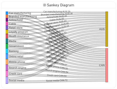
A Sankey diagram is a data visualization method that emphasizes the flow or change from one state (the source) to another (the destination). In theory it could be used to map the items to the dimensions and encode the values in the width of the lines (see I). Unfortunately, the diagram becomes challenging to read because all the lines and most of the labels intersect. Probably this could be solved with more flexible formatting and a rework of the algorithm used for the display of the labels (e.g. align the labels for AUS to the left, while the ones for CAN to the right).

Sankey Diagram

Data Preparation

A variation of the above image with the Aster Plots which contains only the plots was used in ChatGPT to generate the basis data as a table via the following prompts:

  • retrieve the labels from the four charts by country and value in a table
  • consolidate the values in a matrix table by label country and value
The first step generated 4 tables, which were consolidated in a matrix table in the second step. Frankly, the data generated in the first step should have been enough because using the matrix table required an additional step in DAX.

Here is the data imported in Power BI as the Industries query:

let
    Source = #table({"Label","Australia","Canada","U.S.","Japan"}
, {
 {"Credit card","67","64","66","68"}
, {"Online retail","55","57","48","53"}
, {"Banking","58","53","57","48"}
, {"Mobile phone","62","55","44","48"}
, {"Social media","74","72","62","47"}
, {"Search engine","66","64","56","42"}
, {"Government","52","52","58","39"}
, {"Health insurance","44","48","50","36"}
, {"Media","52","50","39","23"}
, {"Retail store","44","40","33","23"}
, {"Car manufacturing","29","29","26","20"}
, {"Airline/hotel","35","37","29","16"}
, {"Branded manufacturing","36","33","25","16"}
, {"Loyalty program","45","41","32","12"}
, {"Cable","40","39","29","9"}
}
),
    #"Changed Types" = Table.TransformColumnTypes(Source,{{"Australia", Int64.Type}, {"Canada", Int64.Type}, {"U.S.", Number.Type}, {"Japan", Number.Type}})
in
    #"Changed Types"

Transforming (unpivoting) the matrix to a table with the values by country:

IndustriesT = UNION (
    SUMMARIZECOLUMNS(
     Industries[Label]
     , Industries[Australia]
     , "Country", "Australia"
    )
    , SUMMARIZECOLUMNS(
     Industries[Label]
     , Industries[Canada]
     , "Country", "Canada"
    )
    , SUMMARIZECOLUMNS(
     Industries[Label]
     , Industries[U.S.]
     , "Country", "U.S."
    )
    ,  SUMMARIZECOLUMNS(
     Industries[Label]
     , Industries[Japan]
     , "Country", "Japan"
    )
)

Notes:
The slopechart from MAQ Software requires several R language libraries to be installed (see how to install the R language and optionally the RStudio). Run the following scripts, then reopen Power BI Desktop and enable running visual's scripts.

install.packages("XML")
install.packages("htmlwidgets")
install.packages("ggplot2")
install.packages("plotly")

Happy (de)coding!

29 May 2024

Graphical Representation: Graphics We Live By (Part VII: Reading a Conversion Rates Chart with ChatGPT and Copilot)

Graphical Representation Series

One of the areas where ChatGPT, Copilot and other similar AI-based chatbots can help is in summarizing a chart saved as image. Ideally, the chatbots should be able also to approximate the points from the chart as well (an image is made of pixels and thus areas should be easy to delimit). So, I was wondering how far the chatbots can be used for these purposes. I used first an image copied from the web, though I realized that not all visual elements could be read (e.g. Copilot had issues retrieving the values for some months) and I had no basis data for comparisons to identify how big the deviations are. 

So, I created a chart in Power BI based on the below chart (see original data):

Conversion Rates Dual Axes Chart

Here's the output based on Copilot over several attempts:
Original data First attempt Second attempt Third attempt Fourth attempt
Sorting Month Conv. Conv. Rate Conv. Conv. Rate Conv. Conv. Rate Conv. Conv. Rate Conv. Conv. Rate
1 Jul 8 4 10 1 10 1 8 4 8 4
2 Aug 280 16 275 15 275 15 275 18 275 18
3 Sep 100 13 225 12 225 10 225 12 225 12
4 Oct 280 14 275 12 275 11 275 11 275 11
5 Nov 90 4 75 5 75 6 75 6 75 6
6 Dec 85 3.5 100 5 100 5 100 5 100 5
7 Jan 70 4.5 50 3 50 3 50 4 50 4
8 Feb 30 1.5 50 3 25 2 50 2.5 50 2.5
9 Mar 70 4 25 1 50 2.5 25 1.5 25 1.5
10 Apr 185 11 200 10 200 10 200 10 200 10
11 May 25 3.5 50 4 50 4 50 3.5 50 3.5
12 Jun 195 4 225 10 225 10 225 11 195 4

Please note that same values were repeated to identify whether the chatbot is able to identify the resemblance correctly. 

Based on the data several tests were made with ChatGPT4o, where the following prompts were given:

  1. generate the data behind the chart as excel list (see 'First attempt' in the table)
  2. generate the data behind the chart as excel list where blue is represented on the left axis and orange on the right axis (see 'Second attempt');
  3. reevaluate the values from the previous output considering that the values for Jul are 8, respectively 4% (see 'Third attempt');
  4. reevaluate the values from the previous output considering that the values for Jun are 195, respectively 4% (see 'Fourth attempt');
  5. generate the data behind the dual axis chart as list from the last conversation;
  6. summarize the chart by revealing trends and other statistics.
From attempt to attempt, the values get closer to the original data, corrections being made, though there are points in the final output that diverge considerably. ChatGPT does generate a table which can be easily copied to MS Excel, and even gives some instructions on how to generate a dual axis chart. 

It's great that one can use data between sessions and improve maybe the output. ChatGPT's summary is better than expected and it leverages the latest corrections. However, the estimations need to improve so that the inferences can be correct. 

Here's the output based on the same prompts in Copilot:
Original data First attempt Second attempt Third attempt Fourth attempt
Sorting Month Conv. Conv. Rate Conv. Conv. Rate Conv. Conv. Rate Conv. Conv. Rate Conv. Conv. Rate
1 Jul 8 4 300 18 300 18 8 4 8 4
2 Aug 280 16 250 16 250 16 250 16 250 16
3 Sep 100 13 200 14 200 14 200 14 200 14
4 Oct 280 14 150 12 150 12 150 12 150 12
5 Nov 90 4 100 10 100 10 100 10 100 10
6 Dec 85 3.5 50 8 50 8 50 8 50 8
7 Jan 70 4.5 300 18 300 18 300 18 300 18
8 Feb 30 1.5 250 16 250 16 250 16 250 16
9 Mar 70 4 200 14 200 14 200 14 200 14
10 Apr 185 11 150 12 150 12 150 12 150 12
11 May 25 3.5 100 10 100 10 100 10 100 10
12 Jun 195 4 50 8 50 8 50 8 195 4

Copilot's estimations are higher than the ones made by ChatGPT and deviate more from the original data. No reevaluations are done between prompts for the other values. The summary provides information that can be used to complement ChatGPT's output. 

Overall, ChatGPT seems to perform better than Copilot, at least for this example (though we might talk here about different "generations"). Unfortunately, given that the estimations provided by both chatbots deviate considerably from the expectation, the output needs to be revised and corrected, which decreases the usability of such chatbots. In fact, one can use them to generate an initial set of data and correct then the deviations.

The outputs of other chatbots like Google's Gemini or Claude-3-Haiku (via Poe) can't be compared with the ones from ChatGPT or Copilot yet. Claude-3-Haiku does provide estimated values (even with comma), though they deviate considerably from the original data. 

It would be interesting to test how other charts and plots are processed by chatbots, respectively whether the various visual elements (e.g. gridlines, ticks, markers) make a difference.

Previous Post <<||>> Next Post

27 May 2024

Graphical Representation: Graphics We Live By (Part VI: Conversion Rates in Power BI)

Graphical Representation Series

Introduction

Conversion rates record the percentage of users, customers and other entities who completed a desired action within a set of steps, typically as part of a process. Conversion rates are a way to evaluate the performance of digital marketing processes in respect to marketing campaigns, website traffic and other similar actions. 

In data visualizations the conversion rates can be displayed occasionally alone over a time unit (e.g. months, weeks, quarters), though they make sense only in the context of some numbers that reveal the magnitude, either the conversions or the total number of users (as one value can be calculated then based on the other). Thus, it is needed to display two data series with different scales if one considers the conversion rates, respectively display the conversions and the total number of users on the same scale. 

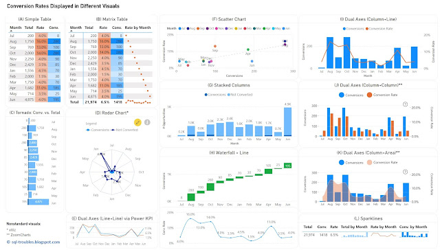
For the first approach, one can use (1) a table or heatmap, if the number of values is small (see A, B) or the data can be easily aggregated (see L); (2) a visual with dual axis where the values are displayed as columns, lines or even areas (see E, I, J, K); (3) two different visuals where the X axis represents the time unit (see H); (4) a visual that can handle by default data series with different axis - a scatter chart (see F). For the second approach, one has a wider set of display methods (see C, D, G), though there are other challenges involved.

Conversion Rates in Power BI

Tables/Heatmaps

When the number of values is small, as in the current case, a table with the unaltered values can occasionally be the best approach in terms of clarity, understandability, explicitness, or economy of space. The table can display additional statistics including ranking or moving averages. Moreover, the values contained can be represented as colors or color saturation, with different smooth color gradients for each important column, which allows to easily identify high/low values, respectively values from the same row with different orders of magnitude (see the values for September).

In Power BI, a simple table (see A) allows to display the values as they are, though it doesn't allow to display totals. Conversely, a matrix table (see B) allows to display the totals, though one needs to use measures to calculate the values, and to use sparklines, even if in this case the values displayed are meaningless except the totals. Probably, a better approach would be to display the totals with sparklines in an additional table (see L), which is based on a matrix table. Sparklines better use the space and can be represented inline in tables, though each sparkline follows its own scale of values (which can be advantageous or disadvantageous upon case).

Column/Bar Charts 

Column or bar charts are usually the easiest way to encode values as they represent magnitude by their length and are thus easy to decode. To use a single axis one is forced to use the conversions against the totals, and this may work in many cases. Unfortunately, in this case the number of conversions is small compared with the number of "actions", which makes it challenging to make inferences on conversion rates' approximate values. Independently of this, it's probably a good idea to show a visual with the conversion rates anyway (or use dual axes).

In Power BI, besides the standard column/bar chart visuals (see G), one can use also the Tornado visual from Microsoft (see C), which needs to be added manually and is less customizable than the former. It allows to display two data series in mirror and is thus more appropriate for bipartite data (e.g. males vs females), though it allows to display the data labels clearly for both series, and thus more convenient in certain cases. 

Dual Axes 

A dual-axis chart is usually used to represent the relationship between two variables with different amplitude or scale, encoding more information in a smaller place than two separate visuals would do. The primary disadvantage of such representations is that they take more time and effort to decode, not all users being accustomed with them. However, once the audience is used to interpreting such charts, they can prove to be very useful.

One can use columns/bars, lines and even areas to encode the values, though the standard visuals might not support all the combinations. Power BI provides dual axis support for the line chart, the area chart, the line and staked/clustered column charts (see I), respectively the Power KPI chart (see E). Alternatively, custom visuals from ZoomCharts and other similar vendors could offer more flexibility.  For example, ZoomCharts's Drill Down Combo PRO allows to mix  columns/bars, lines, and areas with or without smooth lines (see J, K).

Currently, Power BI standard visuals don't allow column/bar charts on both axes concomitantly. In general, using the same encoding on both sides of the axes might not be a good idea because audience's tendency is to compare the values on the same axis as the encoding looks the same. For example, if the values on both sides are encoded as column lengths (see J), the audience may start comparing the length without considering that the scales are different. One needs to translate first the scale equivalence (e.g. 1:3) and might be a good idea to reflect this (e.g. in subtitle or annotation). Therefore, the combination column and line (see I) or column and area (see K) might work better. In the end, the choice depends on the audience or one's feeling what may work. 

Radar Chart

Radar charts are seldom an ideal solution for visualizing data, though they can be used occasionally for displaying categorical-like data, in this case monthly based data series. The main advantage of radar charts is that they allow to compare areas overlapping of two or more series when their overlap is not too cluttered. Encoding values as areas is in general not recommended, as areas are more difficult to decode, though in this case the area is a secondary outcome which allows upon case some comparisons.

Scatter Chart

Scatter charts (and bubble charts) allow by design to represent the relationship between two variables with different amplitude or scale, while allowing to infer further information - the type of relationship, respectively how strong the relationship between the variables is. However, each month needs to be considered here as a category, which makes color decoding more challenging, though labels can facilitate the process, even if they might overlap. 

Using Distinct Visuals

As soon as one uses distinct visuals to represent each data series, the power of comparison decreases based on the appropriateness of the visuals used. Conversely, one can use the most appropriate visual for each data series. For example, a waterfall chart can be used for conversions, and a line chart for conversion rates (see H). When the time axis scales similarly across both charts, one can remove it.

The Data

The data comes from a chart with dual axes similar to the visual considered in (J). Here's is the Power Query script used to create the table used for the above charts:

let
    Source = #table({"Sorting", "Month" ,"Conversions", "Conversion Rate"}
, {
{1,"Jul",8,0.04},
{2,"Aug",280,0.16},
{3,"Sep",100,0.13},
{4,"Oct",280,0.14},
{5,"Nov",90,0.04},
{6,"Dec",85,0.035},
{7,"Jan",70,0.045},
{8,"Feb",30,0.015},
{9,"Mar",70,0.04},
{10,"Apr",185,0.11},
{11,"May",25,0.035},
{12,"Jun",195,0.04}
}
),
    #"Changed Types" = Table.TransformColumnTypes(Source,{{"Sorting", Int64.Type}, {"Conversions", Int64.Type}, {"Conversion Rate", Number.Type}})
in
    #"Changed Types"

Conclusion

Upon case, depending also on the bigger picture, each of the above visuals can be used. I would go with (H) or an alternative of it (e.g. column chart instead of waterfall chart) because it shows the values for both data series. If the values aren't important and the audience is comfortable with dual axes, then probably I would go with (K) or (I), with a plus for (I) because the line encodes the conversion rates better than an area. 

Happy (de)coding!

Previous Post <<||>> Next Post

18 May 2024

Graphical Representation: Graphics We Live By (Part IV: Area Charts in MS Excel)

Graphical Representation

An area chart or area graph (see A) is a graphical representation of quantitative data based on a line chart for which the areas between axis and the lines of the series are commonly emphasized with colors, textures, or hatchings (Wikipedia). It resembles a combination between line and bar charts. Each data series results in the formation of a region (aka area), allowing thus to identify the overlapping and do comparisons between the lines within the same visual display. This approach works usually well for two or three data series if the lines don't overlap, though if more data series are added to the chart, the higher are the chances for lines to overlap or for one area to be covered by another (see B). This can easily become more than the chart can handle, even if the data series can be filtered dynamically.

Area Charts
Area Charts

Stacked area charts are a variation of area charts in which the areas are stacked, much like stacked bar charts (see C). Research papers abound with such charts, probably because they allow to stack together multiple data series within a small area, reflecting thus the many variables involved. Such charts allow to track individual as well as intermediary and total aggregated trends.

Stacked Area Charts
Stacked Area Charts

Unfortunately, besides the fact that some areas are barely distinguishable or that distant areas can't be compared (especially when one area in between has strong fluctuations), the lack of ticks and/or gridlines (see D) makes it difficult to interpret such charts. Moreover, when the lines are smoothed, it becomes even more difficult to identify the actual points. To address this it makes sense to use markers for data points to show that one works with discrete and not continuous points (see further paragraphs).

In general, it's recommended to reduce the number of data series to 3-5. For example, one can split the data series into 2-3 groups or categories based on series' characteristics (e.g. concentrate on the high values in one chart, respectively the low values in another, or group the low values under an "others" category) which would allow to make better comparisons.

Being able to sort the time series on their average value or other criteria (e.g. showing the areas with minimal variations first) can improve the readability of such charts.

Moreover, areas under curves can easily hide missing data (see F) and occasionally negative values (which is the case of the 8th example), or distort the rate of change when the charts are wider than needed (compare F with C). 

Line Chart, respectively Area Chart based on a subset
Area Charts Variations

Area charts seem to encode a dimension as area, though that's not necessarily the case. It seems natural to display time series of different granularities (day, month, quarter, year), though one needs to be careful about one important aspect! On a time scale, the more one moves away from the day to weeks and months as time units, the bigger the distance between points is. In the end, all the points in a series are discrete points (not continuous), though the bigger the distance, the more category-like these series become (compare F with C, the charts have the same width).

Using the area under the curve as dimension makes sense when there's continuity or the discrete points are close enough to each other to resemble continuity. Thus, area charts are useful when the number of points is high (and the distance between them becomes neglectable), e.g. showing daily values within a year or the months over several years. 

According to [2], [3] and several other sources, using the area to encode quantitative information is a poor graphical method and this applies to pie charts and area charts altogether. By contrast, for a bar chart (see G) one has either height or width to use for comparisons while the points are always as bars delimited. Scatter plots (see H), even if they might miss the time dimension, they better reflect the dispersion of the points along the lines delimited by encoding the color (compare H with E). 

Column Chart and Scatter Plot
Alternatives for Area Charts

The more category-like and the fewer data points the data series have, the higher the chances for other graphical representation tools to be able to better represent the data. For example, year or even quarter-based data can be better visualized with Sankey charts (unfortunately, not available as standard Excel visual yet).

Conversely, there are situations in which the area chart isn't supposed to convey specific values but to get a feeling of areas' shape, or its simplicity is more appropriate, situations in which area charts do a good job. In the end, a graphical representation's utility is linked to a chart's purpose (and audience, of course). 

References:
[1] Wikipedia (2023) Area charts (link)
[2] William S Cleveland (1993) Visualizing Data
[3] Robert L Harris (1996) Information Graphics: A Comprehensive Illustrated Reference

19 October 2023

Graphical Representation: Graphics We Live By II (Discount Rates in MS Excel)

Graphical Representation
Graphical Representation Series

It's difficult, if not impossible, to give general rules on how data visualizations should be built. However, the data professional can use a set of principles, which are less strict than rules, and validate one's work against them. Even then one might need to make concessions and go against the principles or common sense, though such cases should be few, at least in theory. One of such important principles is reflected in Tufte's statement that "if the statistics are boring, then you've got the wrong numbers" [1].

So, the numbers we show should not be boring, but that's the case with most of the numbers we need to show, or we consume in news and other media sources. Unfortunately, in many cases we need to go with the numbers we have and find a way to represent them, ideally by facilitating the reader to make sense of the respective data. This should be our first goal when visualizing data. Secondly, because everybody talks about insights nowadays, one should identify the opportunity for providing views into the data that go beyond the simple visualization, even if this puts more burden on data professional's shoulder. Frankly, from making sense of a set of data and facilitating an 'Aha' moment is a long leap. Thirdly, one should find or use the proper tools and channels for communicating the findings. 

A basic requirement for the data professional to be able to address these goals is to have clear definitions of the numbers, have a good understanding of how the numbers reflect the reality, respectively how the numbers can be put into the broader context. Unfortunately, all these assumptions seem to be a luxury. On the other side, the type of data we work with allows us to address at least the first goal. Upon case, our previous experience can help, though there will be also cases in which we can try to do our best. 

Let's consider a simple set of data retrieved recently from another post - Discount rates (in percentage) per State, in which the values for 5 neighboring States are considered (see the first two columns from diagram A). Without knowing the meaning of data, one could easily create a chart in Excel or any other visualization tool. Because the State has categorical values, probably some visualization tools will suggest using bar and not column charts. Either by own choice or by using the default settings, the data professional might end up with a column chart (see diagram B), which is Ok for some visualizations. 


One can start with a few related questions:
(1) Does it make sense to use a chart to represent 5 values which have small variability (the difference between the first and last value is of only 6%)? 
(2) Does it make sense to use a chart only for the sake of visualizing the data?
(3) Where is the benefit for using a chart as long there's no information conveyed? 

One can see similar examples in the media where non-aggregated values are shown in a chart just for the sake of visualizing the data. Sometimes the authors compensate for the lack of meaning with junk elements, fancy titles or other tricks. Usually, sense-making in a chart takes longer than looking at the values in a table as there are more dimensions or elements to consider. For a table there's the title, headers and the values, nothing more! For a chart one has in addition the axes and some visualization elements that can facilitate or complicate visualization's decoding. Where to add that there are also many tricks to distort the data. 

Tables tend to maximize the amount of digital ink used to represent the data, and minimize the amount used to represent everything else not important to understanding. It's what Tufte calls the data-to-ink ratio (see [1]), a second important principle. This can be translated in (a) removing the border of the chart area, (b) minimizing the number of gridlines shown, (c) minimizing the number of ticks on the axis without leading to information lost, (d) removing redundant information, (e) or information that doesn't help the reader. 

However, the more data is available in the table, the more difficult it becomes to navigate the data. But again, if the chart shows the individual data without any information gained, a table might be still more effective. One shouldn't be afraid to show a table where is the case!

(4) I have a data visualization, what's next?

Ideally, the data professional should try to obtain the maximum of effect with minimum of elements. If this principle aims for the efficiency of design, a fourth related principle aims for the efficiency of effort - one should achieve a good enough visualization with a minimum of effort. Therefore, it's enough maybe if we settle to any of the two above results. 

On the other side, maybe by investing a bit more effort certain aspects can be improved. In this area beginners start playing with the colors, formatting the different elements of the chart. Unfortunately, even if color plays a major role in the encoding and decoding of meaning, is often misused/overused. 

(5) Is there any meaning in the colors used?

In the next examples taken from the web (diagram C and D), the author changed the color of the column with the minimal value to red to contrast it with the other values. Red is usually associated with danger, error, warning, or other similar characteristics with negative impact. The chances are high that the reader will associate the value with a negative connotation, even if red is used also for conveying important information (usually in text). Moreover, the reader will try to interpret the meaning of the other colors. In practice, the color grey has a neutral tone (and calming effect on the mind). Therefore, it's safe to use grey in visualization (see diagram D in contrast with diagram C). Some even advise setting grey as default for the visualization and changing the colors as needed later

In these charts, the author signalized in titles that red denotes the lowest value, though it just reduces the confusion. One can meet titles in which several colors are used, reminding of a Christmas tree. Frankly, this type of encoding is not esthetically pleasing, and it can annoy the reader. 

(6) What's in a name?

The titles and, upon case, the subtitles are important elements in communicating what the data reflects. The title should be in general short and succinct in the information it conveys, having the role of introducing, respectively identifying the chart, especially when multiple charts are used. Some charts can also use a subtitle, which can be longer than the title and have more of a storytelling character by highlighting the message and/or the finding in the data. In diagrams C and D the subtitles were considered as tiles, which is not considerably wrong. 

In the media and presentations with influencing character, subtitles help the user understand the message or the main findings, though it's not appropriate for hardcoding the same in dynamic dashboards. Even if a logic was identified to handle the various scenarios, this shifts users' attention, and the chance is high that they'll stop further investigating the visualization. A data professional should present the facts with minimal interference in how the audience and/or users perceive the data. 

As a recommendation, one should aim for clear general titles and avoid transmitting own message in charts. As a principle this can be summarized as "aim for clarity and equidistance".

(7) What about meaning?

Until now we barely considered the meaning of data. Unfortunately, there's no information about what the Discount rate means. It could be "the minimum interest rate set by the US Federal Reserve (and some other national banks) for lending to other banks" or "a rate used for discounting bills of exchange", to use the definitions given by the Oxford dictionary. Searching on the web, the results lead to discount rates for royalty savings, resident tuitions, or retail for discount transactions. Most probably the Discount rates from the data set refer to the latter.

We need a definition of the Discount rate to understand what the values represent when they are ordered. For example, when Texas has a value of 25% (see B), does this value have a negative or a positive impact when compared with other values? It depends on how it's used in the associated formula. The last two charts consider that the minimum value has a negative impact, though without more information the encoding might be wrong! 

Important formulas and definitions should be considered as side information in the visualization, accompanying text or documentation! If further resources are required for understanding the data, then links to the required resources should be provided as well. At least this assures that the reader can acquire the right information without major overhead. 

(8) What do readers look for? 

Frankly, this should have been the first question! Readers have different expectations from data visualizations. First of all, it's the curiosity - how the data look in row and/or aggregated form, or in more advanced form how are they shaped (e.g. statistical characteristics like dispersion, variance, outliers). Secondly, readers look in the first phase to understand mainly whether the "results" are good or bad, even if there are many shades of grey in between. Further on, there must be made distinction between readers who want to learn more about the data, models, and processes behind, respectively readers who just want a confirmation of their expectations, opinions and beliefs (aka bias). And, in the end, there are also people who are not interested in the data and what it tells, where the title and/or subtitle provide enough information. 

Besides this there are further categories of readers segmented by their role in the decision making, the planning and execution of operational, tactical, or strategic activities. Each of these categories has different needs. However, this exceeds the scope of our analysis. 

Returning to our example, one can expect that the average reader will try to identify the smallest and highest Discount rates from the data set, respectively try to compare the values between the different States. Sorting the data and having the values close to each other facilitates the comparison and ranking, otherwise the reader needing to do this by himself/herself. This latter aspect and the fact that bar charts better handle the display of categorical data such as length and number, make from bar charts the tool of choice (see diagram E). So, whenever you see categorical data, consider using a bar chart!

Despite sorting the data, the reader might still need to subtract the various values to identify and compare the differences. The higher the differences between the values, the more complex these operations become. Diagram F is supposed to help in this area, the comparison to the minimal value being shown in orange. Unfortunately, small variances make numbers' display more challenging especially when the visualization tools don't offer display alternatives.

For showing the data from Diagram F were added in the table the third and fourth columns (see diagram A). There's a fifth column which designates the percentage from a percentage (what's the increase in percentages between the current and minimal value). Even if that's mathematically possible, the gain from using such data is neglectable and can create confusion. This opens the door for another principle that applies in other areas as well: "just because you can, it doesn't mean you should!". One should weigh design decisions against common sense or one's intuition on how something can be (mis)used and/or (mis)understood!

The downside of Diagram F is that the comparisons are made only in relation to the minimum value. The variations are small and allow further comparisons. The higher the differences, the more challenging it becomes to make further comparisons. A matrix display (see diagram G) which compares any two values will help if the number of points is manageable. The upper side of the numbers situated on and above the main diagonal were grayed (and can be removed) because they are either nonmeaningful, or the negatives of the numbers found below the diagram. Such diagrams are seldom used, though upon case they prove to be useful.

Choropleth maps (diagram H) are met almost everywhere data have a geographical dimension. Like all the other visuals they have their own advantages (e.g. relative location on the map) and disadvantages (e.g. encoding or displaying data). The diagram shows only the regions with data (remember the data-to-ink ratio principle).


(9) How about the shape of data?

When dealing with numerical data series, it's useful to show aggregated summaries like the average, quartiles, or standard deviation to understand how the data are shaped. Such summaries don't really make sense for our data set given the nature of the numbers (five values with small variance). One can still calculate them and show them in a box plot, though the benefit is neglectable. 

(10) Which chart should be used?

As mentioned above, each chart has advantages and disadvantages. Given the simplicity and the number of data points, any of the above diagrams will do. A table is simple enough despite not using any visualization effects. Also, the bar charts are simple enough to use, with a plus maybe for diagram F which shows a further dimension of the data. The choropleth map adds the geographical dimension, which could be important for some readers. The matrix table is more appropriate for technical readers and involves more effort to understand, at least at first sight, though the learning curve is small. The column charts were considered only for exemplification purposes, though they might work as well. 

In the end one should go with own experience and consider the audience and the communication channels used. One can also choose 2 different diagrams, especially when they are complementary and offer an additional dimension (e.g. diagrams F and H), though the context may dictate whether their use is appropriate or not. The diagrams should be simple to read and understand, but this doesn't mean that one should stick to the standard visuals. The data professional should explore other means of representing the data, a fresh view having the opportunity of catching the reader's attention.

As a closing remark, nowadays data visualization tools allow building such diagrams without much effort. Conversely, it takes more effort to go beyond the basic functionality and provide more value for thyself and the readers. One should be able to evaluate upfront how much time it makes sense to invest. Hopefully, the few methods, principles and recommendations presented here will help further!

Previous Post <<||>> Next Post

Resources:
[1] Edward R Tufte (1983) "The Visual Display of Quantitative Information"

17 February 2021

Python: Plotting Data with the Radar Chart

Today's task was to display a set of data using the radar chart available with the matplotlib.pyplot library. For this I considered the iris dataset available with the sklearn learning library. The dataset is stored as an array, therefore for further manipulation was converted into a data frame. As the radar chart allows comparing only a small set of numerical values, I considered displaying only the mean values for each type of iris (setosas versicolor, virginica). 

Unfortunately, the radar chart doesn't seem to complete the polygons based on the available dataset, therefore as workaround I had to duplicate the first column within the result data frame. (It seems that the Ploty library does a better job at displaying radar charts, see example).

Radar Chart

Here's the code:

import numpy as np
import matplotlib.pyplot as plt
from sklearn import datasets  
import pandas as pd

#preparing the data frame 
iris = datasets.load_iris()

ds = pd.DataFrame(data = iris.data, columns = iris.feature_names)
dr = ds.assign(target = iris.target) #iris type

group_by_iris = dr.groupby('target').mean()
group_by_iris[''] = group_by_iris[iris.feature_names[0]] #duplicating the first column

# creating the graph
fig = plt.subplots()

angle = np.linspace(start=0, stop=2 * np.pi, num=len(group_by_iris.columns))

plt.figure(figsize=(5, 5))
plt.subplot(polar=True)

values = group_by_iris[:1].values[0]
plt.plot(angle, values, label='Iris-setosa', color='r')
plt.fill(angle, values, 'r', alpha=0.2)

values = group_by_iris[1:2].values[0]
plt.plot(angle, values, label='Iris-versicolor', color='g')
plt.fill(angle, values, 'g', alpha=0.2)

values = group_by_iris[2:3].values[0]
plt.plot(angle, values, label='Iris-virginica', color='b')
plt.fill(angle, values, 'b', alpha=0.2)

#labels
plt.title('Iris comparison', size=15)
labels = plt.thetagrids(np.degrees(angle), labels=group_by_iris.columns.values)
plt.legend()

plt.show()

Happy coding!

31 December 2020

Graphical Representation: Graphics We Live by (Part V: Pie Charts in MS Excel)

Graphical Representation

From business dashboards to newspapers and other forms of content that capture the attention of average readers, pie charts seem to be one of the most used forms of graphical representation. Unfortunately, their characteristics make them inappropriate for displaying certain types of data, and of being misused. Therefore, there are many voices who advice against using them for any form of display.

It’s hard to agree with radical statements like ‘avoid (using) pie charts’ or ’pie charts are bad’. Each form of graphical representation (aka graphical tool, graphic) has advantages and disadvantages, which makes it appropriate or inappropriate for displaying data having certain characteristics. In addition, each tool can be easily misused, especially when basic representational practices are ignored. Avoiding one representational tool doesn’t mean that the use of another tool will be correct. Therefore, it’s important to make people aware of these aspects and let them decide which tools they should use. 

From a graphical tool is expected to represent and describe a dataset in a small area without distorting the reality, while encouraging the reader to compare the different pieces of information, when possible at different levels of details [1] or how they change over time. As form of communication, they encode information and meaning; the reader needs to be able to read, understand and think critically about graphics and data – what is known as graphical/data literacy.

A pie chart consists of a circle split into wedge-shaped slices (aka edges, segments), each slice representing a group or category (aka component). It resembles with the spokes of a wheel, however with a few exceptions they are seldom equidistant. The size of each slice is proportional to the percentage of the component when compared to the whole. Therefore, pie charts are ideal when displaying percentages or values that can be converted into percentages. Thus, the percentages must sum up to 100% (at least that’s readers’ expectation).

Within or besides the slices are displayed components’ name and sometimes the percentages or other numeric or textual information associated with them (Fig. 1-4).  The percentages become important when the slices seem to be of equal sizes. As long the slices have the same radius, comparison of the different components resumes in comparing arcs of circles or the chords defined by them, thing not always straightforward. 3-dimensional displays can upon case make the comparison more difficult.

Pie Chart Examples

The comparison increases in difficulty with the number of slices increases beyond a certain number. Therefore, it’s not recommended displaying more than 5-10 components within the same chart. If the components exceed this limit, the exceeding components can be summed up within an “other” component. 

Within a graphic one needs a reference point that can be used as starting point for exploration. Typically for categorical data this reference point is the biggest or the smallest value, the other values being sorted in ascending, respectively descending order, fact that facilitates comparing the values. For pie charts, this would mean sorting the slices based on their sizes, except the slice for “others” which is typically considered last.

The slices can be filled optionally with meaningful colors or (hashing) patterns. When the same color pallet is used, the size can be reflected in colors’ hue, however this can generate confusion when not applied adequately. It’s recommended to provide further (textual) information when the graphical elements can lead to misinterpretations. 

Pie charts can be used occasionally for comparing the changes of the same components between different points in time, geographies (Fig. 5-6) or other types of segmentation. Having the charts displayed besides each other and marking each component with a characteristic color or pattern facilitate the comparison. 

Pie Charts - Geographies

Related Posts Plugin for WordPress, Blogger...

About Me

My photo
IT Professional with more than 24 years experience in IT in the area of full life-cycle of Web/Desktop/Database Applications Development, Software Engineering, Consultancy, Data Management, Data Quality, Data Migrations, Reporting, ERP implementations & support, Team/Project/IT Management, etc.