Showing posts with label Power Query. Show all posts

01 June 2024

📊Graphical Representation: Graphics We Live By (Part VIII: List of Items in Power BI)

Graphical Representation Series

Introduction

There are situations in which one needs to visualize only the rating, other values, or ranking of a list of items (e.g. shopping cart, survey items) on a scale (e.g. 1 to 100, 1 to 10) for a given dimension (e.g. country, department). Besides tables, in Power BI there are 3 main visuals that can be used for this purpose: the clustered bar chart, the line chart (aka line graph), respectively the slopegraph:

Main Display Methods

Main Display Methods

For a small list of items and dimension values probably the best choice would be to use a clustered bar chart (see A). If the chart is big enough, one can display also the values as above. However, the more items in the list, respectively values in the dimension, the more space is needed. One can maybe focus then only on a subset of items from the list (e.g. by grouping several items under a category), respectively choose which dimension values to consider. Another important downside of this method is that one needs to remember the color encodings. 

This downside applies also to the next method - the use of a line chart (see B) with categorical data, however applying labels to each line simplifies its navigation and decoding. With line charts the audience can directly see the order of the items, the local and general trends. Moreover, a line chart can better scale with the number of items and dimension values.

The third option (see C), the slopegraph, looks like a line chart though it focuses only on two dimension values (points) and categorizes the line as "down" (downward slope), "neutral" (no change) and "up" (upward slope). For this purpose, one can use parameters fields with measures. Unfortunately, the slopegraph implementation is pretty basic and the labels overlap which makes the graph more difficult to read. Probably, with the new set of changes planned by Microsoft, the use of conditional formatting of lines would allow to implement slope graphs with line charts, creating thus a mix between (B) and (C).

This is one of the cases in which the Y-axis (see B and C) could be broken and start with the meaningful values. 

Table Based Displays

Especially when combined with color encodings (see C & G) to create heatmap-like displays or sparklines (see E), tables can provide an alternative navigation of the same data. The color encodings allow to identify the areas of focus (low, average, or high values), while the sparklines allow to show inline the trends. Ideally, it should be possible to combine the two displays.  

Table Displays and the Aster Plot

One can vary the use of tables. For example, one can display only the deviations from one of the data series (see F), where the values for the other countries are based on AUS. In (G), with the help of visual calculations one can also display values' ranking. 

Pie Charts

Pie charts and their variations appear nowadays almost everywhere. The Aster plot is a variation of the pie charts in which the values are encoded in the height of the pieces. This method was considered because the data used above were encoded in 4 similar plots. Unfortunately, the settings available in Power BI are quite basic - it's not possible to use gradient colors or link the labels as below:

Source Data as Aster Plots

Sankey Diagram

A Sankey diagram is a data visualization method that emphasizes the flow or change from one state (the source) to another (the destination). In theory it could be used to map the items to the dimensions and encode the values in the width of the lines (see I). Unfortunately, the diagram becomes challenging to read because all the lines and most of the labels intersect. Probably this could be solved with more flexible formatting and a rework of the algorithm used for the display of the labels (e.g. align the labels for AUS to the left, while the ones for CAN to the right).
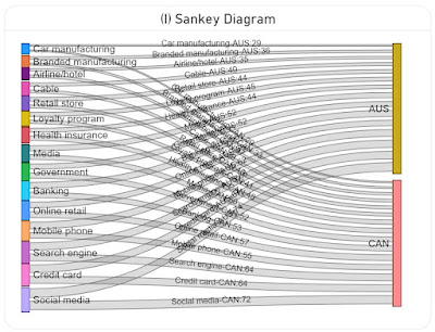
Sankey Diagram

Data Preparation

A variation of the above image with the Aster Plots which contains only the plots was used in ChatGPT to generate the basis data as a table via the following prompts:

  • retrieve the labels from the four charts by country and value in a table
  • consolidate the values in a matrix table by label country and value
The first step generated 4 tables, which were consolidated in a matrix table in the second step. Frankly, the data generated in the first step should have been enough because using the matrix table required an additional step in DAX.

Here is the data imported in Power BI as the Industries query:

let
    Source = #table({"Label","Australia","Canada","U.S.","Japan"}
, {
 {"Credit card","67","64","66","68"}
, {"Online retail","55","57","48","53"}
, {"Banking","58","53","57","48"}
, {"Mobile phone","62","55","44","48"}
, {"Social media","74","72","62","47"}
, {"Search engine","66","64","56","42"}
, {"Government","52","52","58","39"}
, {"Health insurance","44","48","50","36"}
, {"Media","52","50","39","23"}
, {"Retail store","44","40","33","23"}
, {"Car manufacturing","29","29","26","20"}
, {"Airline/hotel","35","37","29","16"}
, {"Branded manufacturing","36","33","25","16"}
, {"Loyalty program","45","41","32","12"}
, {"Cable","40","39","29","9"}
}
),
    #"Changed Types" = Table.TransformColumnTypes(Source,{{"Australia", Int64.Type}, {"Canada", Int64.Type}, {"U.S.", Number.Type}, {"Japan", Number.Type}})
in
    #"Changed Types"

Transforming (unpivoting) the matrix to a table with the values by country:

IndustriesT = UNION (
    SUMMARIZECOLUMNS(
     Industries[Label]
     , Industries[Australia]
     , "Country", "Australia"
    )
    , SUMMARIZECOLUMNS(
     Industries[Label]
     , Industries[Canada]
     , "Country", "Canada"
    )
    , SUMMARIZECOLUMNS(
     Industries[Label]
     , Industries[U.S.]
     , "Country", "U.S."
    )
    ,  SUMMARIZECOLUMNS(
     Industries[Label]
     , Industries[Japan]
     , "Country", "Japan"
    )
)

Notes:
The slopechart from MAQ Software requires several R language libraries to be installed (see how to install the R language and optionally the RStudio). Run the following scripts, then reopen Power BI Desktop and enable running visual's scripts.

install.packages("XML")
install.packages("htmlwidgets")
install.packages("ggplot2")
install.packages("plotly")

Happy (de)coding!

29 April 2024

⚡️Power BI: Working with Visual Calculations (Part II: Simple Tables with Square Numbers as Example)

Introduction

The records behind a visual can be mentally represented as a matrix, the visual calculations allowing to tap into this structure intuitively and simplify many of the visualizations used. After a general test drive of the functionality, it makes sense to dive deeper into the topic to understand more about the limitations, functions behavior and what it takes to fill the gaps. This post focuses on simple tables, following in a next post to focus on matrices and a few other topics. 

For exemplification, it makes sense to use a simple set of small numbers that are easy to work with, and magic squares seem to match this profile. A magic square is a matrix of positive sequential numbers in which each row, each column, and both main diagonals are the same [1]. Thus, a square of order N has N*N numbers from 1 to N*N, the non-trivial case being order 3. However, from the case of non-trivial squares, the one of order 5 provides a low order and allows hopefully the minimum needed for exemplification:

18252911
46132022
15172418
213101219
71416235
17131925

Data Modeling

One magic square should be enough to exemplify the various operations, though for testing purposes it makes sense to have a few more squares readily available. Each square has an [Id], [C1] to [C5] corresponds to matrix's columns, while [R] stores a row identifier which allows to sort the values the way they are stored in the matrix:

let
    Source = #table({"Id","C1","C2","C3","C4","C5","R"}
, {
{1,18,25,2,9,11,"R1"},
{1,4,6,13,20,22,"R2"},
{1,15,17,24,1,8,"R3"},
{1,21,3,10,12,19,"R4"},
{1,7,14,16,23,5,"R5"},
{2,1,7,13,19,25,"R1"},
{2,14,20,21,2,5,"R2"},
{2,22,3,9,15,16,"R3"},
{2,10,11,17,23,4,"R4"},
{2,18,24,5,6,12,"R5"},
{3,1,2,22,25,15,"R1"},
{3,9,10,16,11,19,"R2"},
{3,17,23,13,5,7,"R3"},
{3,24,12,6,20,3,"R4"},
{3,14,18,8,4,21,"R5"},
{4,22,6,3,18,16,"R1"},
{4,4,14,11,15,21,"R2"},
{4,5,8,12,23,17,"R3"},
{4,25,13,19,7,1,"R4"},
{4,9,24,20,2,10,"R5"},
{5,5,9,20,25,6,"R1"},
{5,13,15,2,11,24,"R2"},
{5,21,1,23,3,17,"R3"},
{5,19,18,4,14,10,"R4"},
{5,7,22,16,12,8,"R5"}
}
),
    #"Changed Type to Number" = Table.TransformColumnTypes(Source,{{"C1", Int64.Type}, {"C2", Int64.Type}, {"C3", Int64.Type}, {"C4", Int64.Type}, {"C5", Int64.Type}}),
    #"Sorted Rows" = Table.Sort(#"Changed Type to Number",{{"Id", Order.Ascending}, {"R", Order.Ascending}}),
    #"Added Index" = Table.AddIndexColumn(#"Sorted Rows", "Index", 0, 1, Int64.Type)
in
    #"Added Index"

The column names and the row identifier could have been numeric values from 1 to 5, though it could have been confounded with the actual numeric values.

In addition, the columns [C1] to [C5] were formatted as integers and an index was added after sorting the values after [Id] and [R]. Copy the above code as a Blank Query in Power BI and change the name to Magic5. 

Prerequisites

For the further steps you'll need to enable visual calculations in Power BI Developer via:
File >> Options and settings >> Options >> Preview features >> Visual calculations >> (check)

Into a Table visual drag and drop [R], [C1] to [C5] as column and make sure that the records are sorted ascending by [R]. To select only a square, add a filter based on the [Id] and select the first square. Use further copies of this visual for further tests. 

Some basic notions of Algebra are recommended but not a must. If you worked with formulas in Excel, then you are set to go. 

In Mathematics a matrix starts from the top left side and one moves on the rows (e.g. 18, 25, 2, ...) and then on the columns. With a few exceptions in which the reference is based on the latest value from a series (see Exchange rates), this is the direction that will be followed. 

Basic Operations

Same as in Excel [C1] + [C2] creates a third column in the matrix that stores the sum of the two. The sum can be further applies to all the columns:

Sum(C) = [C1] + [C2] + [C3] + [C4] + [C5] -- sum of all columns (should amount to 65)

The column can be called "Sum", "Sum(C)" or any other allowed unique name, though the names should be meaningful, useful, and succinct, when possible.

Similarly, one can work with constants, linear or nonlinear transformations (each formula is a distinct calculation):

constant = 1 -- constant value
linear = 2*[C1] + 1 -- linear translation: 2*x+1
linear2 = 2*[C1] + [constant] -- linear translation: 2*x+1
quadratic = Power([C1],2) + 2*[C1] + 1 -- quadratic translation: x^2+2*x+1 quadratic2 = Power([C1],2) + [linear] -- quadratic translation: x^2+2*x+1
Output:
R C1 constant linear linear2 quadratic quadratic2
R1 18 1 37 37 361 361
R2 4 1 9 9 25 25
R3 15 1 31 31 256 256
R4 21 1 43 43 484 484
R5 7 1 15 15 64 64
Please note that the output was duplicated in Excel (instead of making screenshots).

Similarly, can be build any type of formulas based on one or more columns.

With a simple trick, one can use DAX functions like SUMX, PRODUCTX, MINX or MAXX as well:

Sum2(C) = SUMX({[C1], [C2], [C3], [C4], [C5]}, [Value]) -- sum of all columns
Prod(C) = PRODUCTX({[C1], [C2], [C3], [C4], [C5]}, [Value]) -- product of all columns
Avg(C) = AVERAGEX({[C1], [C2], [C3], [C4], [C5]}, [Value]) -- average of all columns
Min(C) = MINX({[C1], [C2], [C3], [C4], [C5]}, [Value]) -- minimum value of all columns
Max(C) = MAXX({[C1], [C2], [C3], [C4], [C5]}, [Value]) -- maximum value of all columns
Count(C) = COUNTX({[C1], [C2], [C3], [C4], [C5]},[Value]) -- counts the number of columns
Output:
C1 C2 C3 C4 C5 Sum(C) Avg(C) Prod(C) Min(C) Max(C) Count(C)
18 25 2 9 11 65 13 89100 2 25 5
4 6 13 20 22 65 13 137280 4 22 5
15 17 24 1 8 65 13 48960 1 24 5
21 3 10 12 19 65 13 143640 3 21 5
7 14 16 23 5 65 13 180320 5 23 5

Unfortunately, currently there seems to be no way available for applying such calculations without referencing the individual columns. 

Working across Rows

ROWNUMBER and RANK allow to rank a cell within a column independently, respectively dependently of its value:

Ranking = ROWNUMBER() -- returns the rank in the column (independently of the value)
RankA(C) = RANK(DENSE, ORDERBY([C1], ASC)) -- ranking of the value (ascending) 
RankD(C) = RANK(DENSE, ORDERBY([C1], DESC)) -- ranking of the value (descending) 
Output:
R C1 Ranking RankA(C) RankD(C)
R1 18 1 4 2
R2 4 2 1 5
R3 15 3 3 3
R4 21 4 5 1
R5 7 5 2 4

PREVIOUS, NEXT, LAST and FIRST allow to refer to the values of other cells within the same column:

Prev(C) = PREVIOUS([C1]) -- previous cell
Next(C) = NEXT([C1])  -- next cell
First(C) = FIRST([C1]) -- first cell
Last(C) = LAST([C1]) -- last cell
Output:
R C1 Prev(C) NextC) First(C) Last(C)
R1 18 4 18 7
R2 4 18 15 18 7
R3 15 4 21 18 7
R4 21 15 7 18 7
R5 7 21 18 7

OFFSET is a generalization of these functions

offset(2) = calculate([C1], offset(2)) -- 
offset(-2) = calculate([C1], offset(-2))
Ind = ROWNUMBER() -- index
inverse = calculate([C1], offset(6-2*[Ind])) -- inversing the values based on index
Output:
R C1 offset(2) offset(-2) ind inverse
R1 18 15 1 7
R2 4 21 2 21
R3 15 7 18 3 15
R4 21 4 4 4
R5 7 15 5 18

The same functions allow to calculate the differences for consecutive values:

DiffToPrev(C) = [C1] - PREVIOUS([C1]) -- difference to previous 
DiffToNext(C) = [C1] - PREVIOUS([C1]) -- difference to next 
DiffTtoFirst(C) = [C1] - FIRST([C1]) -- difference to first
DiffToLast(C) = [C1] - LAST([C1]) -- difference to last
Output:
R C1 DiffToPrev(C) DiffToNextC) DiffToFirst(C) DiffToLast(C)
R1 18 18 14 0 11
R2 4 -14 -11 -14 -3
R3 15 11 -6 -3 8
R4 21 6 14 3 14
R5 7 -14 7 -11 0

DAX makes available several functions for working across the rows of the same column. Two of the useful functions are RUNNINGSUM and MOVINGAVERAGE:

Run Sum(C) = RUNNINGSUM([C1]) -- running sum
Moving Avg3(C) = MOVINGAVERAGE([C1], 3) -- moving average for the past 3 values
Moving Avg2(C) = MOVINGAVERAGE([C1], 2) -- moving average for the past 2 values

Unfortunately, one can use only the default sorting of the table with the functions that don't support the ORDERBY parameter. Therefore, when the table needs to be sorted descending and the RUNNINGSUM calculated ascending, for the moment there's no solution to achieve this behavior. However, it appears that Microsoft is planning to implement a solution for this issue.

RUNNINGSUM together with ROWNUMBER can be used to calculate a running average:

Run Avg(C) = DIVIDE(RUNNINGSUM([C1]), ROWNUMBER()) -- running average
Output:
R C1 Run Sum(C) Moving Avg3(C) Moving Avg2(C) Run Avg(C)
R1 18 18 18 18 18
R2 4 22 11 11 11
R3 15 37 12.33 9.5 12.33
R4 21 58 13.33 18 14.5
R5 7 65 14.33 14 13

With a mathematical trick that allows to transform a product into a sum of elements by applying the Exp (exponential) and Log (logarithm) functions (see the solution in SQL), one can run the PRODUCT across rows, though the values must be small enough to allow their multiplication without running into issues:

Ln(C) = IFERROR(LN([C1]), Blank()) -- applying the natural logarithm
Sum(Ln(C)) = RUNNINGSUM([Ln(C)]) -- running sum
Run Prod(C) = IF(NOT(ISBLANK([Sum(Ln(C))])), Exp([Sum(Ln(C))])) -- product across rows
Output:
R C1 Ln(C) Sum(Ln(C)) Run Prod(C)
R1 18 2.89 2.89 18
R2 4 1.39 4.28 72
R3 15 2.71 6.98 1080
R4 21 3.04 10.03 22680
R5 7 1.95 11.98 158760

These three calculations could be brought into a single formula, though the result could be more difficult to troubleshoot. The test via IsBlank is necessary because otherwise the exponential for the total raises an error. 

Considering that when traversing a column it's enough to remember the previous value, one can build MIN and MAX functionality across a column: 

Run Min = IF(OR(Previous([C1]) > [C1], IsBlank(Previous([C1]))), [C1], Previous([C1])) -- minimum value across rows
Run Max = IF(OR(Previous([C1]) < [C1], IsBlank(Previous([C1]))), [C1], Previous([C1])) -- maximum across rows

Happy coding!

Previous Post <<||>> Next Post

References:
[1] Wikipedia (2024) Magic Squares (online)
[2] Microsoft Learn (2024) Power BI: Using visual calculations [preview] (link)

Related Posts Plugin for WordPress, Blogger...

About Me

My photo
Koeln, NRW, Germany
IT Professional with more than 24 years experience in IT in the area of full life-cycle of Web/Desktop/Database Applications Development, Software Engineering, Consultancy, Data Management, Data Quality, Data Migrations, Reporting, ERP implementations & support, Team/Project/IT Management, etc.