One of the greatest aspects of KQL and its environment is that creating a chart is just one instruction away from the dataset generated in the process. Of course, the data still need to be in an appropriate form to be used as source for a visual, though the effort is minimal. Let's consider the example used in the previous post based ln the ContosoSales data, where the visualization part is everything that comes after "| render":
// visualizations by Country: various charts
NewSales
| where SalesAmount <> 0 and ProductCategoryName == 'TV and Video'
| where DateKey >=date(2023-02-01) and DateKey < datetime(2023-03-01)
| summarize count_customers = count_distinct(CustomerKey) by RegionCountryName
| order by count_customers desc
//| render table
//| render linechart
//| render areachart
//| render stackedchart//| render columnchart
| render piechart
    with (xtitle="Country", ytitle="# Customers",
    title="# Customers by Country (pie chart)", legend=hidden)

|
| # Customers by Country (various charts) |
It's enough to use "render" with the chart type without specifying the additional information provided under "with", though the legend can facilitate data's understanding. Unfortunately, the available properties are relatively limited, at least for now.
Adding one more dimension is quite simple, even if the display may be sometimes confusing as there's no clear delimitation between the entities represented while the legend grows linearly with the number of points. It might be a good idea to use additional charts for the further dimensions in scope.
// visualizations by Region & Country: various charts
NewSales
| where SalesAmount <> 0 and ProductCategoryName == 'TV and Video'
| where DateKey >=date(2023-02-01) and DateKey < datetime(2023-03-01)
| summarize count_customers = count_distinct(CustomerKey) by ContinentName, RegionCountryName
| order by count_customers desc
//| render stackedareachart
//| render linechart
//| render table
//| render areachart
//| render piechart
| render columnchart
    with (xtitle="Region/Country", ytitle="# Customers",
    title="#Customers by Continent & Country", legend=hidden)

|
| # Customers by Continent & Country (column chart) |
Sometimes, it makes sense to reduce the number of values, recommendation that applies mainly to pie charts:
// visualizations by Zone: pie chart
NewSales
| where SalesAmount <> 0 and ProductCategoryName == 'TV and Video'
| where DateKey >=date(2023-02-01) and DateKey < datetime(2023-03-01)
| summarize count_customers = count_distinct(CustomerKey) by iif(RegionCountryName in ('United States', 'Canada'), RegionCountryName, 'Others')
| render piechart
    with (xtitle="Country", ytitle="Sales volume",
    title="Sales volume by Zone")
.jpg)
|
| # Customers by Zone (pie chart) |
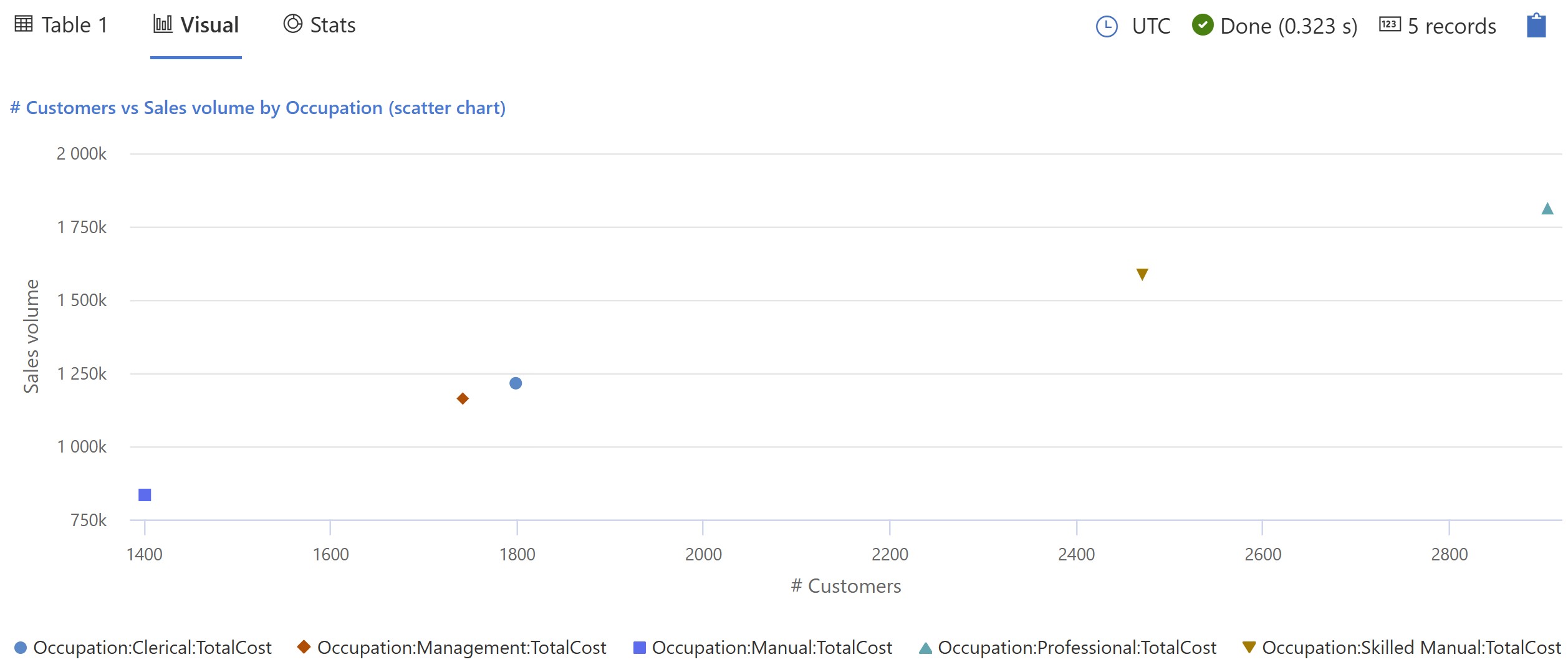
Adding a second set of values (e.g. Total cost) allows to easily create a scatter chart:
// visualization by Occupation: scatter chart
NewSales
| where SalesAmount <> 0 and ProductCategoryName == 'TV and Video'
| where DateKey >=date(2023-02-01) and DateKey < datetime(2023-03-01)
| summarize count_customers = count_distinct(CustomerKey)
    , TotalCost = sum(TotalCost) by Occupation
| order by count_customers desc
| render scatterchart
    with (xtitle="# Customers", ytitle="Sales volume",
    title="# Customers vs Sales volume by Occupation", legend=visible )
|
| # Customers vs Sales volume by Occupation (scatter chart) |
The visualizations are pretty simple to build, though one shouldn't expect that one can build a visualization on top of any dataset, at least not without further formatting and eventually code changes. For example, considering the query from the previous post, with a small change one can use the data with a column chart, though this approach might have some limitation (e.g. it doesn't work pie charts):
// calculating percentages from totals: column chart
NewSales
| where SalesAmount <> 0 and ProductCategoryName == 'TV and Video'
//| where DateKey >=date(2023-02-01) and DateKey < datetime(2023-03-01)
| summarize count_customers = count_distinct(CustomerKey)
    , count_customers_US = count_distinctif(CustomerKey, RegionCountryName == 'United States')
    , count_customers_CA = count_distinctif(CustomerKey, RegionCountryName == 'Canada')
    , count_customers_other = count_distinctif(CustomerKey, not(RegionCountryName in ('United States', 'Canada')))
| project Charting = "Country"
    , US = count_customers_US
    , CA = count_customers_CA
    , other = count_customers_other
| render columnchart
    with (xtitle="Region", ytitle="# Customers",
    title="# Customers by Region")
|
|
| # Customers by Region (column chart) |
There are a few more visuals that will be considered in a next post. Despite the relatively limited set of visuals and properties, the visualizations are useful to get a sense of data's shape, and this with a minimum of changes. Ad-hoc visualizations can help also in data modeling, validating the logic and/or identifying issues in the data when creating the queries, which makes it a great feature.
Happy coding!


