Showing posts with label graphics. Show all posts

02 August 2025

📉Graphical Representation: Orientation (Just the Quotes)

"The scales of any curve-chart should be so selected that the chart will not be exaggerated in either the horizontal or the vertical direction. It is possible to cause a visual exaggeration of data by carelessly or intentionally selecting a scale which unduly stretches the chart in either the horizontal or the vertical direction. Just as the English language can be used to exaggerate to the ear, so charts can exaggerate to the eye." (Willard C Brinton, "Graphic Methods for Presenting Facts", 1919)

"If a chart contains a number of series which vary widely in individual magnitude, optical distortion may result from the necessarily sharp changes in the angle of the curves. The space between steeply rising or falling curves always appears narrower than the vertical distance between the plotting points." (Rufus R Lutz, "Graphic Presentation Simplified", 1949)

"The circle graph, or pie chart, appears to simple and 'nonstatistical', so it is a popular form of presentation for general readers. However, since the eye can compare linear distances more easily and accurately than angles or areas, the component parts of a total usually can be shown more effectively in a chart using linear measurement." (Peter H Selby, "Interpreting Graphs and Tables", 1976)

"First, it is generally inadvisable to attempt to portray a series of more than four or five categories by means of pie charts. If, for example, there are six, eight, or more categories, it may be very confusing to differentiate the relative values portrayed, especially if several small sectors are of approximately the same size. Second, the pie chart may lose its effectiveness if an attempt is made to compare the component values of several circles, as might be found in a temporal or geographical series. In such case the one-hundred percent bar or column chart is more appropriate. Third, although the proportionate values portrayed in a pie chart are measured as distances along arcs about the circle, actually there is a tendency to estimate values in terms of areas of sectors or by the size of subtended angles at the center of the circle." (Calvin F Schmid, "Handbook of Graphic Presentation", 1954)

"Stacked bar graphs do not show data structure well. A trend in one of the stacked variables has to be deduced by scanning along the vertical bars. This becomes especially difficult when the categories do not move in the same direction." (Gerald van Belle, "Statistical Rules of Thumb", 2002)

"We make angle judgments when we read a pie chart, but we don't judge angles very well. These judgments are biased; we underestimate acute angles (angles less than 90°) and overestimate obtuse angles" (angles greater than 90°). Also, angles with horizontal bisectors" (when the line dividing the angle in two is horizontal) appear larger than angles with vertical bisectors." (Naomi B Robbins, "Creating More effective Graphs", 2005)

"Before calculating a confidence interval for a mean, first check that one of the situations just described holds. To determine whether the data are bell-shaped or skewed, and to check for outliers, plot the data using a histogram, dotplot, or stemplot. A boxplot can reveal outliers and will sometimes reveal skewness, but it cannot be used to determine the shape otherwise. The sample mean and median can also be compared to each other. Differences between the mean and the median usually occur if the data are skewed - that is, are much more spread out in one direction than in the other." (Jessica M Utts & Robert F Heckard, "Mind on Statistics", 2007)

"The donut, its spelling betrays its origins, is nearly always more deceit friendly than the pie, despite being modelled on a life-saving ring. This is because the hole destroys the second most important value- defining element, by hiding the slice angles in the middle." (Nicholas Strange, "Smoke and Mirrors: How to bend facts and figures to your advantage", 2007)

"Mosaic plots are defined recursively, i.e., each variable that is introduced in a mosaic plot is plotted conditioned on the groups already established in the plot. As with barcharts, the area of bars or tiles is proportional to the number of observations (or the sum of the observation weights of a class). The direction along which bars are divided by a newly introduced variable is usually alternating, starting with the x-direction." (Martin Theus & Simon Urbanek, "Interactive Graphics for Data Analysis: Principles and Examples", 2009)

"Communication is the primary goal of data visualization. Any element that hinders - rather than helps - the reader, then, needs to be changed or removed: labels and tags that are in the way, colors that confuse or simply add no value, uncomfortable scales or angles. Each element needs to serve a particular purpose toward the goal of communicating and explaining information. Efficiency matters, because if you’re wasting a viewer’s time or energy, they’re going to move on without receiving your message." (Noah Iliinsky & Julie Steel, "Designing Data Visualizations", 2011)

"Correlation measures the degree to which two phenomena are related to one another. [...] Two variables are positively correlated if a change in one is associated with a change in the other in the same direction, such as the relationship between height and weight. [...] A correlation is negative if a positive change in one variable is associated with a negative change in the other, such as the relationship between exercise and weight." (Charles Wheelan, "Naked Statistics: Stripping the Dread from the Data", 2012)

"New information is constantly flowing in, and your brain is constantly integrating it into this statistical distribution that creates your next perception" (so in this sense 'reality' is just the product of your brain’s ever-evolving database of consequence). As such, your perception is subject to a statistical phenomenon known in probability theory as kurtosis. Kurtosis in essence means that things tend to become increasingly steep in their distribution [...] that is, skewed in one direction. This applies to ways of seeing everything from current events to ourselves as we lean 'skewedly' toward one interpretation, positive or negative. Things that are highly kurtotic, or skewed, are hard to shift away from. This is another way of saying that seeing differently isn’t just conceptually difficult - it’s statistically difficult." (Beau Lotto, "Deviate: The Science of Seeing Differently", 2017)

"Skewed data means data that is shifted in one direction or the other. Skewness can cause machine learning models to underperform. Many machine learning models assume normally distributed data or data structures to follow the Gaussian structure. Any deviation from the assumed Gaussian structure, which is the popular bell curve, can affect model performance. A very effective area where we can apply feature engineering is by looking at the skewness of data and then correcting the skewness through normalization of the data." (Anthony So et al, "The Data Science Workshop" 2nd Ed., 2020)

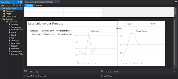
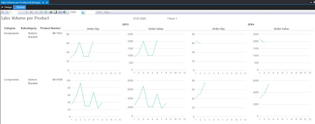
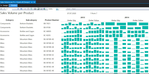
"Sparklines focus on the trend over time and the direction rather than the actual values. Sparklines are used to visualize volatility or outliers. They are usually kept quite narrow on dashboards but still maintain an aspect ratio of 2:3." (Lorna Brown, "Tableau Desktop Cookbook", 2020)

"Another word of caution for dot plots that show changes over time. The dot plot is, by definition, a summary chart. It does not show all of the data in the intervening years. If the data between the two dots generally move in the same direction, a dot plot is sufficient. But if the data contain sharp variations year by year, a dot plot will obscure that pattern" (as it also does for bar charts)." (Jonathan Schwabish, "Better Data Visualizations: A guide for scholars, researchers, and wonks", 2021)


27 July 2025

📉Graphical Representation: Pitfalls (Just the Quotes)

Disclaimer: the following quotes are intended as a list of the things to avoid in Graphical Representation. For the full quotes see the previous post

"[...] avoid complicating the diagram by including too much data." (Armand Julin, "Summary for a Course of Statistics, General and Applied", 1910) 

"In general, the comparison of two circles of different size should be strictly avoided." (Willard C Brinton, "Graphic Methods for Presenting Facts", 1919)

"Try telling the story in words different from those on the charts. […] If the chart shows a picture, describe the picture. Tell what it shows and why it is shown. If it is a diagram, explain it. Don't leave the audience to figure it out." (Edward J Hegarty, "How to Use a Set of Display Charts", The American Statistician Vol. 2" (5), 1948)

"It is not enough to avoid outright falsehood; one must be on the alert to detect possible distortion of truth." (Anna C Rogers, "Graphic Charts Handbook", 1961)

"[...] avoid distortion or misrepresentation." (Anna C Rogers, "Graphic Charts Handbook", 1961)

"The designer normally should place no more than three data paths on the graph to prevent confusion - particularly if the data paths intersect at one or more points on the Cartesian plane." (Cecil H Meyers, "Handbook of Basic Graphs: A modern approach", 1970)

"There are two kinds of misrepresentation. In one, the numerical data do not agree with the data in the graph, or certain relevant data are omitted. This kind of misleading presentation, while perhaps hard to determine, clearly is wrong and can be avoided. In the second kind of misrepresentation, the meaning of the data is different to the preparer and to the user." (Anker V Andersen, "Graphing Financial Information: How accountants can use graphs to communicate", 1983)

"Do not allow data labels in the data region to interfere with the quantitative data or to clutter the graph. […] Avoid putting notes, keys, and markers in the data region. Put keys and markers just outside the data region and put notes in the legend or in the text." (William S Cleveland, "The Elements of Graphing Data", 1985)

"Make the data stand out and avoid superfluity are two broad strategies that serve as an overall guide to the specific principles. " (William S Cleveland, "The Elements of Graphing Data", 1985)

"Shorten long labels; avoid abbreviations unless they are universally understood; avoid repetition on the same graph." (Mary H Briscoe, "Preparing Scientific Illustrations: A guide to better posters, presentations, and publications" 2nd ed., 1995) 

"[...] avoid those graphical features that are purely decorative [...]" (Phillip I Good & James W Hardin, "Common Errors in Statistics" (and How to Avoid Them)", 2003)

"[...] avoid useless graphics." (Jacques Bertin [interview], 2003)

"If a break cannot be avoided, use a full scale break." (Naomi B Robbins, "Creating More effective Graphs", 2005)

"[...] when labels abandon the data points, then a code is often needed to relink names to numbers. Such codes, keys, and legends are impediments to learning, causing the reader's brow to furrow." (Edward R Tufte, "Beautiful Evidence", 2006) [argumentation against Cleveland's recommendation of not using words on data plots]

"Generally pie charts are to be avoided, as they can be difficult to interpret particularly when the number of categories is greater than five." (Jenny Freeman et al, "How to Display Data", 2008)

"Spurious precision should be avoided although when certain measures are to be used for further calculations or when presenting the results of analyses, greater precision may sometimes be appropriate." (Jenny Freeman et al, "How to Display Data", 2008)

"The data [in tables] should not be so spaced out that it is difficult to follow or so cramped that it looks trapped. Keep columns close together; do not spread them out more than is necessary." (Dennis K Lieu & Sheryl Sorby, "Visualization, Modeling, and Graphics for Engineering Design", 2009)

"[...] it is often best to avoid round charts and graphs." (Brian Suda, "A Practical Guide to Designing with Data", 2010)

"Avoid countering conventions where possible in order to avoid creating cognitive dissonance, a clash of habitual interpretation with the underlying message you are sending." (Noah Iliinsky & Julie Steel, "Designing Data Visualizations", 2011)

"The unseen data may be just as important, or even more important, than the seen data. To avoid survivor bias, start in the past and look forward." (Gary Smith, "Standard Deviations", 2014)

"Highlighting one aspect can make other things harder to see one word of warning in using preattentive attributes: when you highlight one point in your story, it can actually make other points harder to see. When you’re doing exploratory analysis, you should mostly avoid the use of preattentive attributes for this reason." (Cole N Knaflic, "Storytelling with Data: A Data Visualization Guide for Business Professionals", 2015)

"Collecting data through sampling therefore becomes a never-ending battle to avoid sources of bias. [...] While trying to obtain a random sample, researchers sometimes make errors in judgment about whether every person or thing is equally likely to be sampled." (Daniel J Levitin, "Weaponized Lies", 2017)

"[...] avoid pure colors that are bright and saturated." (Kate Strachnyi, "ColorWise: A Data Storyteller’s Guide to the Intentional Use of Color", 2023)

26 July 2025

📉Graphical Representation: Taboos (Just the Quotes)

"The essential quality of graphic representations is clarity. If the diagram fails to give a clearer impression than the tables of figures it replaces, it is useless. To this end, we will avoid complicating the diagram by including too much data." (Armand Julin, "Summary for a Course of Statistics, General and Applied", 1910)

"Comparison between circles of different size should be absolutely avoided. It is inexcusable when we have available simple methods of charting so good and so convenient from every point of view as the horizontal bar." (Willard C Brinton, "Graphic Methods for Presenting Facts", 1919)

"In general, the comparison of two circles of different size should be strictly avoided. Many excellent works on statistics approve the comparison of circles of different size, and state that the circles should always be drawn to represent the facts on an area basis rather than on a diameter basis. The rule, however, is not always followed and the reader has no way of telling whether the circles compared have been drawn on a diameter basis or on an area basis, unless the actual figures for the data are given so that the dimensions may be verified." (Willard C Brinton, "Graphic Methods for Presenting Facts", 1919)

"Judgment must be used in the showing of figures in any chart or numerical presentation, so that the figures may not give an appearance of greater accuracy than their method of collection would warrant. Too many otherwise excellent reports contain figures which give the impression of great accuracy when in reality the figures may be only the crudest approximations. Except in financial statements, it is a safe rule to use ciphers whenever possible at the right of all numbers of great size. The use of the ciphers greatly simplifies the grasping of the figures by the reader, and, at the same time, it helps to avoid the impression of an accuracy which is not warranted by the methods of collecting the data." (Willard C Brinton, "Graphic Methods for Presenting Facts", 1919)

"Many people use statistics as a drunkard uses a street lamp - for support rather than illumination. It is not enough to avoid outright falsehood; one must be on the alert to detect possible distortion of truth. One can hardly pick up a newspaper without seeing some sensational headline based on scanty or doubtful data." (Anna C Rogers, "Graphic Charts Handbook", 1961)

"Simplicity, accuracy, appropriate size, proper proportion, correct emphasis, and skilled execution - these are the factors that produce the effective chart. To achieve simplicity your chart must be designed with a definite audience in mind, show only essential information. Technical terms should be absent as far as possible. And in case of doubt it is wiser to oversimplify than to make matters unduly complex. Be careful to avoid distortion or misrepresentation. Accuracy in graphics is more a matter of portraying a clear reliable picture than reiterating exact values. Selecting the right scales and employing authoritative titles and legends are as important as precision plotting. The right size of a chart depends on its probable use, its importance, and the amount of detail involved." (Anna C Rogers, "Graphic Charts Handbook", 1961)

"If two or more data paths ate to appear on the graph. it is essential that these lines be labeled clearly, or at least a reference should be provided for the reader to make the necessary identifications. While clarity seems to be a most obvious goal. graphs with inadequate or confusing labeling do appear in publications, The user should not find identification of data paths troublesome or subject to misunderstanding. The designer normally should place no more than three data paths on the graph to prevent confusion - particularly if the data paths intersect at one or more points on the Cartesian plane." (Cecil H Meyers, "Handbook of Basic Graphs: A modern approach", 1970)

"There are two kinds of misrepresentation. In one, the numerical data do not agree with the data in the graph, or certain relevant data are omitted. This kind of misleading presentation, while perhaps hard to determine, clearly is wrong and can be avoided. In the second kind of misrepresentation, the meaning of the data is different to the preparer and to the user." (Anker V Andersen, "Graphing Financial Information: How accountants can use graphs to communicate", 1983)

"Do not allow data labels in the data region to interfere with the quantitative data or to clutter the graph. […] Avoid putting notes, keys, and markers in the data region. Put keys and markers just outside the data region and put notes in the legend or in the text." (William S Cleveland, "The Elements of Graphing Data", 1985)

"Make the data stand out and avoid superfluity are two broad strategies that serve as an overall guide to the specific principles […] The data - the quantitative and qualitative information in the data region - are the reason for the existence of the graph. The data should stand out. […] We should eliminate superfluity in graphs. Unnecessary parts of a graph add to the clutter and increase the difficulty of making the necessary elements - the data - stand out." (William S Cleveland, "The Elements of Graphing Data", 1985)

"Labels should be complete but succinct. Long and complicated labels will defeat the viewer and therefore the purpose of the graph. Treat a label as a cue to jog the memory or to complete comprehension. Shorten long labels; avoid abbreviations unless they are universally understood; avoid repetition on the same graph. A title, for instance, should not repeat what is already in the axis labels. Be consistent in terminology." (Mary H Briscoe, "Preparing Scientific Illustrations: A guide to better posters, presentations, and publications" 2nd ed., 1995)

"Principal components and factor analysis are methods for data reduction. They seek a few underlying dimensions that account for patterns of variation among the observed variables underlying dimensions imply ways to combine variables, simplifying subsequent analysis. For example, a few combined variables could replace many original variables in a regression. Advantages of this approach include more parsimonious models, improved measurement of indirectly observed concepts, new graphical displays, and the avoidance of multicollinearity." (Lawrence C Hamilton, "Regression with Graphics: A second course in applied statistics", 1991)

"Graphical illustrations should be simple and pleasing to the eye, but the presentation must remain scientific. In other words, we want to avoid those graphical features that are purely decorative while keeping a critical eye open for opportunities to enhance the scientific inference we expect from the reader. A good graphical design should maximize the proportion of the ink used for communicating scientific information in the overall display." (Phillip I Good & James W Hardin, "Common Errors in Statistics" (and How to Avoid Them)", 2003)

"These questions can be applied to every kind of problem. They measure the usefulness of whatever construction or graphical invention allowing you to avoid useless graphics." (Jacques Bertin [interview], 2003)

"Use a scale break only when necessary. If a break cannot be avoided, use a full scale break. Taking logs can cure the need for a break." (Naomi B Robbins, "Creating More effective Graphs", 2005)

"Conflicting with the idea of integrating evidence regardless of its these guidelines provoke several issues: First, labels are data. even intriguing data. [...] Second, when labels abandon the data points, then a code is often needed to relink names to numbers. Such codes, keys, and legends are impediments to learning, causing the reader's brow to furrow. Third, segregating nouns from data-dots breaks up evidence on the basis of mode" (verbal vs. nonverbal), a distinction lacking substantive relevance. Such separation is uncartographic; contradicting the methods of map design often causes trouble for any type of graphical display. Fourth, design strategies that reduce data-resolution take evidence displays in the wrong direction. Fifth, what clutter? Even this supposedly cluttered graph clearly shows the main ideas: brain and body mass are roughly linear in logarithms, and as both variables increase, this linearity becomes less tight." (Edward R Tufte, "Beautiful Evidence", 2006) [argumentation against Cleveland's recommendation of not using words on data plots]

"Generally pie charts are to be avoided, as they can be difficult to interpret particularly when the number of categories is greater than five. Small proportions can be very hard to discern […] In addition, unless the percentages in each of the individual categories are given as numbers it can be much more diff i cult to estimate them from a pie chart than from a bar chart […]." (Jenny Freeman et al, "How to Display Data", 2008)

"Numerical precision should be consistent throughout and summary statistics such as means and standard deviations should not have more than one extra decimal place" (or significant digit) compared to the raw data. Spurious precision should be avoided although when certain measures are to be used for further calculations or when presenting the results of analyses, greater precision may sometimes be appropriate." (Jenny Freeman et al, "How to Display Data", 2008)

"The data [in tables] should not be so spaced out that it is difficult to follow or so cramped that it looks trapped. Keep columns close together; do not spread them out more than is necessary. If the columns must be spread out to fit a particular area, such as the width of a page, use a graphic device such as a line or screen to guide the reader’s eye across the row." (Dennis K Lieu & Sheryl Sorby, "Visualization, Modeling, and Graphics for Engineering Design", 2009)

"Dealing with a circular visualization and trying to compare its radial portions is always problematic. When designing with data, the story should always be told as clearly as possible. To do so, it is often best to avoid round charts and graphs." (Brian Suda, "A Practical Guide to Designing with Data", 2010)

"[...] you should not rely on social or cultural conventions to convey information. However, these conventions can be very powerful, and you should be aware that your reader brings them to the table. Making use of them, when possible, to reinforce your message will help you convey information efficiently. Avoid countering conventions where possible in order to avoid creating cognitive dissonance, a clash of habitual interpretation with the underlying message you are sending." (Noah Iliinsky & Julie Steel, "Designing Data Visualizations", 2011)

"We naturally draw conclusions from what we see […]. We should also think about what we do not see […]. The unseen data may be just as important, or even more important, than the seen data. To avoid survivor bias, start in the past and look forward." (Gary Smith, "Standard Deviations", 2014)

"Highlighting one aspect can make other things harder to see one word of warning in using preattentive attributes: when you highlight one point in your story, it can actually make other points harder to see. When you’re doing exploratory analysis, you should mostly avoid the use of preattentive attributes for this reason. When it comes to explanatory analysis, however, you should have a specific story you are communicating to your audience. Leverage preattentive attributes to help make that story visually clear." (Cole N Knaflic, "Storytelling with Data: A Data Visualization Guide for Business Professionals", 2015)

"My base color is grey, not black, to allow for greater contrast since color stands out more against grey than black. For my attention-grabbing color, I often use blue for a number of reasons: (1) I like it, (2) you avoid issues of colorblindness that we’ll discuss momentarily, and (3) it prints well in black-and-white. That said, blue is certainly not your only option (and you’ll see many examples where I deviate from my typical blue for various reasons)." (Cole N Knaflic, "Storytelling with Data: A Data Visualization Guide for Business Professionals", 2015)

"Sometimes bar charts are avoided because they are common. This is a mistake. Rather, bar charts should be leveraged because they are common, as this means less of a learning curve for your audience." (Cole N Knaflic, "Storytelling with Data: A Data Visualization Guide for Business Professionals", 2015)

"Effective data scientists know that they are trying to convey accurate information in an easily understood way. We have never seen a pie chart that was an improvement over a simple table. Even worse, the creative addition of pictures, colors, shading, blots, and splotches may produce chartjunk that confuses the reader and strains the eyes." (Gary Smith & Jay Cordes, "The 9 Pitfalls of Data Science", 2019)

"A semantic approach to visualization focuses on the interplay between charts, not just the selection of charts themselves. The approach unites the structural content of charts with the context and knowledge of those interacting with the composition. It avoids undue and excessive repetition by instead using referential devices, such as filtering or providing detail-on-demand. A cohesive analytical conversation also builds guardrails to keep users from derailing from the conversation or finding themselves lost without context. Functional aesthetics around color, sequence, style, use of space, alignment, framing, and other visual encodings can affect how users follow the script." (Vidya Setlur & Bridget Cogley, "Functional Aesthetics for data visualization", 2022)

"One tip to keep an audience focused on your story without overwhelming them is to reduce the saturation of the colors [...] When you lower the brightness and intensity, you are reducing the cognitive load that your audience has to bear. [...] Regardless of what combinations you decide on, you need to avoid pure colors that are bright and saturated." (Kate Strachnyi, "ColorWise: A Data Storyteller’s Guide to the Intentional Use of Color", 2023)

12 December 2024

🧭💹Business Intelligence: Perspectives (Part 19: Data Visualization between Art, Pragmatism and Kitsch)

Business Intelligence Series

The data visualizations (aka dataviz) presented in the media, especially the ones coming from graphical artists, have the power to help us develop what is called graphical intelligence, graphical culture, graphical sense, etc., though without a tutor-like experience the process is suboptimal because it depends on our ability of identifying what is important and which are the steps needed for decoding and interpreting such work, respectively for integrating their messages in our overall understanding about the world.

When such skillset is lacking, without explicit annotations or other form of support, the reader might misinterpret or fail to observe important visual cues even for simple visualizations, with all the implications deriving from this – a false understanding, and further aspects deriving from it, this being probably the most important aspect to consider. Unfortunately, even the most elaborate work can fail if the reader doesn’t have a basic understanding of all that’s implied in the process.

The books of Willard Brinton, Ana Rogers, Jacques Bertin, William Cleveland, Leland Wilkinson, Stephen Few, Albert Cairo, Soctt Berinato and many others can help the readers build a general understanding of the dataviz process and how data visualizations or simple graphics can be used/misused effectively, though each reader must follow his/her own journey. It’s also true that the basics can be easily learned, though the deeper one dives, the more interesting and nontrivial the journey becomes. Fortunately, the average reader can stick to the basics and many visualizations are simple enough to be understood.

To grasp the full extent of the implications, one can make comparisons with the domain of poetry where the author uses basic constructs like metaphor, comparisons, rhythm and epithets to create, communicate and imprint in reader’s mind old and new meanings, images and feelings altogether. Artistic data visualizations tend to offer similar charge as poetry does, even if the impact might not appeal so much to our artistic sensibility. Though dataviz from this perspective is or at least resembles an art form.

Many people can write verses, though only a fraction can write good meaningful poetry, from which a smaller fraction get poems, respectively even fewer get books published. Conversely, not everything can be expressed in verses unless one finds good metaphors and other aspects that can be leveraged in the process. Same can be said about good dataviz.

One can argue that in dataviz the author can explore and learn especially by failing fast (seeing what works and what doesn’t). One can also innovate, though the creator has probably a limited set of tools and rules for communication. Enabling readers to see the obvious or the hidden in complex visualizations or contexts requires skill and some kind of mastery of the visual form.

Therefore, dataviz must be more pragmatic and show the facts. In art one has the freedom to distort or move things around to create new meanings, while in dataviz it’s important for the meaning to be rooted in 'truth', at least by definition. The more the creator of a dataviz innovates, the higher the chances of being misunderstood. Moreover, readers need to be educated in interpreting the new meanings and get used to their continuous use.

Kitsch is a term applied to art and design that is perceived as naïve imitation to the degree that it becomes a waste of resources even if somebody pays the tag price. There’s a trend in dataviz to add elements to visualizations that don’t bring any intrinsic value – images, colors and other elements can be misused to the degree that the result resembles kitsch, and the overall value of the visualization is diminished considerably.

14 June 2024

📊Graphical Representation: Graphics We Live By (Part IX: Word Clouds in Power BI)

Graphical Representation Series

A word cloud (aka tag cloud) is a visual representation of textual data in the form of a cloud - a mass of words in which each word is shown with a different font size and/or color based on its frequency, significance or categorization in the dataset considered. It is used to depict keyword metadata on websites, to visualize free form text or the frequency of specific values within a categorical dimension, respectively to navigate the same. 

Words can be categorized as single or compounded, where special characters like hyphen can be used. A tag is a special type of a word, usually a single word. One can use different direction or arrangement for displaying each word, independently of whether the value is numerical or alphanumerical. Word clouds are usually not sorted, even if the values could be sorted using a spiraled arrangement, which offers and easier way to navigate and compare the data.

Most of the representations are based on words' frequency, though occasionally the frequency is considered against a background corpus (e.g. Wikipedia). The use of tags as categorization methods for content items is seldom done, though needs to be considered as well. 

It makes sense to use word clouds only with categorical data (see below) for which the chances of multiple occurrences is high. Numerical values (see A & D) can be displayed as well when their range is narrow. Moreover, when the number of distinct values is high, one can consider only the top N values. Continuous data may be challenging to represent, though occasionally they can be represented as well, especially when reducing the precision

Word clouds allow to see at a glance what values are available and can be used as an alternative to choropleth maps for filtering and navigating the data. They aren't good for precise comparisons, though further information can be provided in the tooltip. 

In Power BI there are currently two visuals that allow to display word clouds - from Microsoft, respectively Powerviz, which was added recently (see Jun-2024 release [2]). They provide similar functionality, though Powerviz's visual offers more flexibility in what concerns the word options (case, styling, delimiters) direction, shapes (displaying the values within a form), ranking (top vs bottom), exclusion rules and formational formatting. It uses also a radial arrangement, which allows to select or exclude a set of values via the lasso functionality (see E). 

Word Clouds

Previous Post <<||>> Next Post

References:
[1] Wikipedia (2024) Tag cloud (link)
[2] Microsoft Power BI Blog (2004) Power BI June 2024 Feature Summary (link)


25 April 2024

📊Graphical Representation: Graphics We Live By (Part III: Exchange Rates in Power BI)

Graphical Representation Series

An exchange rate (XR) is the rate at which one currency will be exchanged for another currency, and thus XRs are used in everything related to trades, several processes in Finance relying on them. There are various sources for the XR like the European Central Bank (ECB) that provide the row data and various analyses including graphical representations varying in complexity. Conversely, XRs' processing offers some opportunities for learning techniques for data visualization. 

On ECB there are monthlyyearly, daily and biannually XRs from EUR to the various currencies which by triangulation allow to create XRs for any of the currencies involved. If N currencies are involved for one time unit in the process (e.g. N-1 XRs) , the triangulation generates NxN values for only one time division, the result being tedious to navigate. A matrix like the one below facilitates identifying the value between any of the currencies:


The table needs to be multiplied by 12, the number of months, respectively by the number of years, and filter allowing to navigate the data as needed. For many operations is just needed to look use the EX for a given time division. There are however operations in which is needed to have a deeper understanding of one or more XR's evolution over time (e.g. GBP to NOK). 

Moreover, for some operations is enough to work with two decimals, while for others one needs to use up to 6 or even more decimals for each XR. Occasionally, one can compromise and use 3 decimals, which should be enough for most of the scenarios. Making sense of such numbers is not easy for most of us, especially when is needed to compare at first sight values across multiple columns. Summary tables can help:

Statistics like Min. (minimum), Max. (maximum), Max. - Min. (range), Avg. (average) or even StdDev. (standard deviation) can provide some basis for further analysis, while sparklines are ideal for showing trends over a time interval (e.g. months).

Usually, a heatmap helps to some degree to navigate the data, especially when there's a plot associated with it:

In this case filtering by column in the heatmap allows to see how an XR changed for the same month over the years, while the trendline allows to identify the overall tendency (which is sensitive to the number of years considered). Showing tendencies or patterns for the same month over several years complements the yearly perspective shown via sparklines.

Fortunately, there are techniques to reduce the representational complexity of such numbers. For example, one can use as basis the XRs for January (see Base Jan), and represent the other XRs only as differences from the respective XR. Thus, in the below table for February is shown the XR difference between February and January (13.32-13.22=0.10). The column for January is zero and could be omitted, though it can still be useful in further calculations (e.g. in the calculation of averages) based on the respective data..

This technique works when the variations are relatively small (e.g. the values vary around 0). The above plots show the respective differences for the whole year, respectively only for four months. Given a bigger sequence (e.g. 24, 28 months) one can attempt to use the same technique, though there's a point beyond which it becomes difficult to make sense of the results. One can also use the year end XR or even the yearly average for the same, though it adds unnecessary complexity to the calculations when the values for the whole year aren't available. 

Usually, it's recommended to show only 3-5 series in a plot, as one can better distinguish the trends. However, plotting all series allows to grasp the overall pattern, if any. Thus, in the first plot is not important to identify the individual series but to see their tendencies. The two perspectives can be aggregated into one plot obtained by applying different filtering. 

Of course, a similar perspective can be obtained by looking at the whole XRs:

The Max.-Min. and StdDev (standard deviation for population) between the last and previous tables must match. 

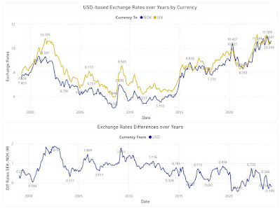
Certain operations require comparing the trends of two currencies. The first plot shows the evolution NOK and SEK in respect to EUR, while the second shows only the differences between the two XRs:


The first plot will show different values when performed against other currency (e.g. USD), however the second plot will look similarly, even if the points deviate slightly:

Another important difference is the one between monthly and yearly XRs, difference depicted by the below plot:

The value differences between the two XR types can have considerable impact on reporting. Therefore, one must reflect in analyses the rate type used in the actual process. 

Attempting to project data into the future can require complex techniques, however, sometimes is enough to highlight a probable area, which depends also on the confidence interval (e.g. 85%) and the forecast length (e.g. 10 months):

Every perspective into the data tends to provide something new that helps in sense-making. For some users the first table with flexible filtering (e.g. time unit, currency type, currency from/to) is enough, while for others multiple perspectives are needed. When possible, one should  allow users to explore the various perspectives and use the feedback to remove or even add more perspectives. Including a feedback loop in graphical representation is important not only for tailoring the visuals to users' needs but also for managing their expectations,  respectively of learning what works and what doesn't.

Comments:
1) I used GBP to NOK XRs to provide an example based on  triangulation.
2) Some experts advise against using borders or grid lines. Borders, as the name indicates allow to delimitate between various areas, while grid lines allow to make comparisons within a section without needing to sway between broader areas, adding thus precision to our senses-making. Choosing grey as color for the elements from the background minimizes the overhead for coping with more information while allowing to better use the available space.
3) Trend lines are recommended where the number of points is relatively small and only one series is involved, though, as always, there are exceptions too. 
4) In heatmaps one can use a gradient between two colors to show the tendencies of moving toward an extreme or another. One should avoid colors like red or green.
5) Ideally, a color should be used for only one encoding (e.g. one color for the same month across all graphics), though the more elements need to be encoded, the more difficult it becomes to respect this rule. The above graphics might slightly deviate from this as the purpose is to show a representation technique. 
6) In some graphics the XRs are displayed only with two decimals because currently the technique used (visual calculations) doesn't support formatting.
7) All the above graphical elements are based on a Power BI solution. Unfortunately, the tool has its representational limitations, especially when one wants to add additional information into the plots. 
8) Unfortunately, the daily XR values are not easily available from the same source. There are special scenarios for which a daily, hourly or even minute-based analysis is needed.
9) It's a good idea to validate the results against the similar results available on the web (see the ECB website).

Previous Post  <<||>> Next Post

19 March 2024

📊R Language: Drawing Function Plots (Part II - Basic Curves & Inflection Points)

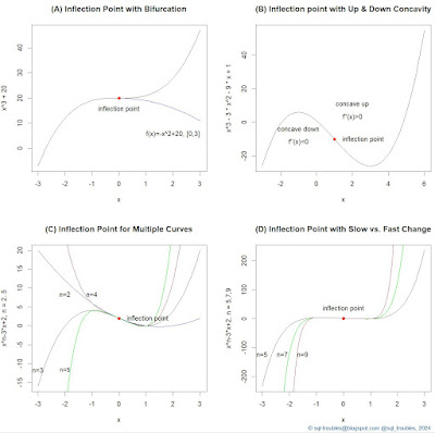
For a previous post on inflection points I needed a few examples, so I thought to write the code in the R language, which I did. Here's the final output:

Examples of Inflection Points

And, here's the code used to generate the above graphic:

par(mfrow = c(2,2)) #2x2 matrix display

# Example A: Inflection point with bifurcation
curve(x^3+20, -3,3, col = "black", main="(A) Inflection Point with Bifurcation")
curve(-x^2+20, 0, 3, add=TRUE, col="blue")
text (2, 10, "f(x)=-x^2+20, [0,3]", pos=1, offset = 1) #label inflection point
points(0, 20, col = "red", pch = 19) #inflection point 
text (0, 20, "inflection point", pos=1, offset = 1) #label inflection point


# Example B: Inflection point with Up & Down Concavity
curve(x^3-3*x^2-9*x+1, -3,6, main="(B) Inflection point with Up & Down Concavity")
points(1, -10, col = "red", pch = 19) #inflection point 
text (1, -10, "inflection point", pos=4, offset = 1) #label inflection point
text (-1, -10, "concave down", pos=3, offset = 1) 
text (-1, -10, "f''(x)<0", pos=1, offset = 0) 
text (2, 5, "concave up", pos=3, offset = 1)
text (2, 5, "f''(x)>0", pos=1, offset = 0) 


# Example C: Inflection point for multiple curves
curve(x^3-3*x+2, -3,3, col ="black", ylab="x^n-3*x+2, n = 2..5", main="(C) Inflection Point for Multiple Curves")
text (-3, -10, "n=3", pos=1) #label curve
curve(x^2-3*x+2,-3,3, add=TRUE, col="blue")
text (-2, 10, "n=2", pos=1) #label curve
curve(x^4-3*x+2,-3,3, add=TRUE, col="brown")
text (-1, 10, "n=4", pos=1) #label curve
curve(x^5-3*x+2,-3,3, add=TRUE, col="green")
text (-2, -10, "n=5", pos=1) #label curve
points(0, 2, col = "red", pch = 19) #inflection point 
text (0, 2, "inflection point", pos=4, offset = 1) #label inflection point
title("", line = -3, outer = TRUE)


# Example D: Inflection Point with fast change
curve(x^5-3*x+2,-3,3, col="black", ylab="x^n-3*x+2, n = 5,7,9", main="(D) Inflection Point with Slow vs. Fast Change")
text (-3, -100, "n=5", pos=1) #label curve
curve(x^7-3*x+2, add=TRUE, col="green")
text (-2.25, -100, "n=7", pos=1) #label curve
curve(x^9-3*x+2, add=TRUE, col="brown")
text (-1.5, -100, "n=9", pos=1) #label curve
points(0, 2, col = "red", pch = 19) #inflection point 
text (0, 2, "inflection point", pos=3, offset = 1) #label inflection point

mtext("© sql-troubles@blogspot.com @sql_troubles, 2024", side = 1, line = 4, adj = 1, col = "dodgerblue4", cex = .7)
#title("Examples of Inflection Points", line = -1, outer = TRUE)

Mathematically, an inflection point is a point on a smooth (plane) curve at which the curvature changes sign and where the second derivative is 0 [1]. The curvature intuitively measures the amount by which a curve deviates from being a straight line.

In example A, the main function has an inflection point, while the second function defined only for the interval [0,3] is used to represent a descending curve (aka bifurcation) for which the same point is a maximum point.  

In example B, the function was chosen to represent an example with a concave down (for which the second derivative is negative) and a concave up (for which the second derivative is positive) section. So what comes after an inflection point is not necessarily a monotonic increasing function. 

In example C are depicted several functions based on a varying power of the first coefficient which have the same inflection point. One could have shown only the behavior of the functions after the inflection point, while before choosing only one of the functions (see example A).

In example D is the same function as in example C with varying powers of the first coefficient considered, though for higher powers than in example C. I kept the function for n=5 to offer a basis for comparison. Apparently, the strange thing is that around the inflection point the change seems to be small and linear, which is not the case. The two graphics are correct though, because as basis is considered the scale for n=5, while in C the basis is n=3 (one scales the graphic further away from the inflection point). If one adds n=3 as the first function in the example D, the new chart will resemble C. Unfortunately, this behavior can be misused to show something like being linear around the inflection point, which is not the case. 

# Example E: Inflection Point with slow vs. fast change extended
curve(x^3-3*x+2,-3,3, col="black", ylab="x^n-3*x+2, n = 3,5,7,9", main="(E) Inflection Point with Slow vs. Fast Change")
text (-3, -10, "n=3", pos=1) #label curve
curve(x^5-3*x+2,-3,3, add=TRUE, col="brown")
text (-2, -10, "n=5", pos=1) #label curve
curve(x^7-3*x+2, add=TRUE, col="green")
text (-1.5, -10, "n=7", pos=1) #label curve
curve(x^9-3*x+2, add=TRUE, col="orange")
text (-1, -5, "n=9", pos=1) #label curve
points(0, 2, col = "red", pch = 19) #inflection point 
text (0, 2, "inflection point", pos=3, offset = 1) #label inflection point

Comments:
(1) I cheated a bit calculating the second derivative manually, which is an easy task for polynomials. There seems to be methods for calculating the inflection point, though the focus was on providing the examples. 
(2) The examples C and D could have been implemented as part of a loop, though I needed anyway to add the labels for each curve individually. Here's the modified code to support a loop:

# Example F: Inflection Point with slow vs. fast change with loop
n <- list(5,7,9)
color <- list("brown", "green", "orange")

curve(x^3-3*x+2,-3,3, col="black", ylab="x^n-3*x+2, n = 3,5,7,9", main="(F) Inflection Point with Slow vs. Fast Change")
for (i in seq_along(n))
{
ind <- as.numeric(n[i])
curve(x^ind-3*x+2,-3,3, add=TRUE, col=toString(color[i]))
}

text (-3, -10, "n=3", pos=1) #label curve
text (-2, -10, "n=5", pos=1) #label curve
text (-1, -5, "n=9", pos=1) #label curve
text (-1.5, -10, "n=7", pos=1) #label curve

Happy coding!

Previous Post <<||>> Next Post

21 October 2023

📊Graphical Representation: Overreaching in Data Visualizations

Graphical Representation
Graphical Representation Series 

One of the most important aspects to stress in the context of graphical design is the purpose of graphical representations and the medium in which they are communicated. For example, one needs to differentiate between the graphics propagated on the various media channels that target the public consumption and potential customers (books, newspapers, articles in paper or paperless form, respectively blog posts and similar content) and graphics made for organizational use (reports, dashboards or presentations).

If the former graphics are supposed to back up a story, the reader being led into one direction or another, the author having the freedom of choosing the direction and the message, in the latter, unless the content is supposed to support, persuade or force a decision, the facts and data need to be presented in an equidistant manner, in a form that support insights, decision making or further inference. This applies to data professionals as well to the business users preparing the data.

Data visualization authors tend to use the title and subtitle to highlight in reports and dashboards the most important findings as per their perception, sometimes even stating the obvious. One of the issues with this approach is that the audience might just pick up the respective information without further looking at the chart, missing maybe more important facts. Just highlighting an element in the graphic or providing explanatory headlines is not storytelling, even if it helps in the process. Ideally, the data itself as depicted by the visuals should tell the story! Further information with storytelling character should be provided in the presentation of the data and taylored accordingly for the audience!

With a few exceptions, the information and decisions shouldn't be forced on the audience. There are so many such examples on the various social networks in which data analysts or other types of data professionals seem to imply this in the content they share and this is so wrong on many levels!

No matter how deep a data professional is involved into the business and no matter how extensive is his/her knowledge about the systems, data and processes, the business user and the manager are the closest to the business context and needs, while data professionals might not be aware of the full extent. This lack of context makes it challenging to interpret the trends depicted by the data, respectively to associate the changes observed in trends with decisions made or issues the business dealt with. When such knowledge is not available the data professional tends to extrapolate instead of identifying the chain of causality together with the business (and here annotation capabilities would help considerably). 

Moreover, it falls on management's shoulders to decide which facts, data, metrics, KPIs and information are important for the organization. A data professional can make recommendations, can play with the data and communicate certain insights, gaps or courses of action, though the management decides what's important and how the respective information should be communicated! Overstepping the boundaries can easily lead to unnecessary conflict in which the data professional can easily lose, even if the facts are in his favor. It's enough to deal with missing or incorrect information for the whole story to fall apart. 

It's true that some of the books on graphical design use various highlighting techniques in the explanation process, but they are intended for the readers to understand what the authors want to say. Unfortunately, there are also examples improperly used or authors' opinion diverge from the common sense. Independently of this, the data professional should develop own visual critical thinking and validate the techniques used against own judgement! 

Previous Post <<||>> Next Post

16 April 2023

🔖Book Review: Willard C Brinton's Graphic Methods for Presenting Facts (1919)

"It is often with impotent exasperation that a person having the knowledge sees some fallacious conclusion accepted, or some wrong policy adopted, just because known facts cannot be marshalled and presented in such manner as to be effective." 

This is the conclusion phrase from the first paragraph of Willard C Brinton's "Graphic Methods for Presenting Facts", in which the author expresses his disappointment about the impossibility of bridging the important gap existing between data collection and presentation on side, and the decision-making on the other. Despite being written more than a century ago (1915), the issue seems to be so actual, the average data professional probably met this kind of situation at least once in a lifetime, if not on a regular basis. 

I found out about this book from Bridget Cogley & Vidya Setlur's "Functional Aesthetics for Data Visualization" (2020), which credits Brinton for "shaping the path toward broad use of charts". I found a digitized copy of the book at Internet Archive and browsing though it I found it appealing for a deeper reading and a first review. 

Written in a simple style stripped of any mathematical or statistical formulae, and thus approachable by the average nontechnical reader, the book addresses the techniques and challenges of graphical authors in preparing charts and other graphical content for their consumption in organizations for insight and decision-making, as well for the masses. It mentions also the projecting of graphs as lantern slides to accompany a talk, a precursor of nowadays' forms of presentations.

The engineering and statistical background of the author can be seen in the meticulosity with which the book was written. The book discusses the graphic methods for presenting facts in graphical form, which are the component parts and how can be used to attract readers' attention, respectively present them in an effective manner. Several principle-like statements are considered though the book and listed together in the last chapters, rules that can be found in modern books as well, though probably less exemplified. 

From organization charts to maps, from circle and bar charts to time plots, the number and variety of graphical displays is overwhelming and at the same time surprising for a book that old, especially when we consider the publishing technologies available. As mentioned by the author, color printing of the book was prohibitive given the costs, only one ink color being used. However, this doesn't diminish the quality of visuals considered. Compared with nowadays' books, which seem to attempt compensating the lack of novelty with too much color and mentions of technologies, book's graphics stand out in their simplicity and richness of exemplifications. It is sad to remark that the graphical displays are better chosen and the book is better written than some of nowadays books on data visualization.

Comparing the language and vocabulary used nowadays with the one used then, the reader can see the difficulties of approaching a subject found in its early years, the author recognizing the lack of standards and the difficulties of showing quantitative facts in true proportions. It's also true that more modern authors like Tufte or Cleveland were facing same challenge 70 years later. 

About the author is worth mentioning that he was chairman of the "Joint Committee on Standards for Graphic Presentation" initiated in 1913, committee that published in 1915 their first brief report which consisted of 17 simply basic rules, a first attempt of standardizing the principles of graphic presentation. In 1939 Brinton published a second book on "Graphic Presentation", with less text and abundant colorful graphical displays. Even if some charts are available in the second book as well, overall, the two books seem to complement each other and should be a lecture for the data professional as well for the average reader interested in understanding the use of graphical methods.

Previous Post <<||>>  Next Post

References:
[1] Willard C Brinton, "Graphic Methods for Presenting Facts", 1919 (link)
[2] Bridget Cogley & Vidya Setlur, "Functional Aesthetics for Data Visualization" (2020)
[3] Willard C Brinton, "Graphic Presentation", 1939 (link)
[4] Joint Committee on Standards for Graphic Presentation, "Publications of the American Statistical Association" Vol.14 (112), 1915 (Jstor)

17 February 2021

📊🐍Python: Plotting Data with the Radar Chart

Today's task was to display a set of data using the radar chart available with the matplotlib.pyplot library. For this I considered the iris dataset available with the sklearn learning library. The dataset is stored as an array, therefore for further manipulation was converted into a data frame. As the radar chart allows comparing only a small set of numerical values, I considered displaying only the mean values for each type of iris (setosas versicolor, virginica). 

Unfortunately, the radar chart doesn't seem to complete the polygons based on the available dataset, therefore as workaround I had to duplicate the first column within the result data frame. (It seems that the Ploty library does a better job at displaying radar charts, see example).

Radar Chart

Here's the code:

import numpy as np
import matplotlib.pyplot as plt
from sklearn import datasets  
import pandas as pd

#preparing the data frame 
iris = datasets.load_iris()

ds = pd.DataFrame(data = iris.data, columns = iris.feature_names)
dr = ds.assign(target = iris.target) #iris type

group_by_iris = dr.groupby('target').mean()
group_by_iris[''] = group_by_iris[iris.feature_names[0]] #duplicating the first column

# creating the graph
fig = plt.subplots()

angle = np.linspace(start=0, stop=2 * np.pi, num=len(group_by_iris.columns))

plt.figure(figsize=(5, 5))
plt.subplot(polar=True)

values = group_by_iris[:1].values[0]
plt.plot(angle, values, label='Iris-setosa', color='r')
plt.fill(angle, values, 'r', alpha=0.2)

values = group_by_iris[1:2].values[0]
plt.plot(angle, values, label='Iris-versicolor', color='g')
plt.fill(angle, values, 'g', alpha=0.2)

values = group_by_iris[2:3].values[0]
plt.plot(angle, values, label='Iris-virginica', color='b')
plt.fill(angle, values, 'b', alpha=0.2)

#labels
plt.title('Iris comparison', size=15)
labels = plt.thetagrids(np.degrees(angle), labels=group_by_iris.columns.values)
plt.legend()

plt.show()

Happy coding!

16 February 2021

📊🐍Python: Drawing Concentric Circles with matplotlib.pyplot

Today I tried using for the first time the matplotlib library for drawing a few concentric circles, though it proved to be a bit more challenging than expected, as the circles were distorted given the scale differences between x and y axis. Because of this the circles displayed via the Circle class (in blue) seem to be displayed as ellipses. To show the difference I used  trigonometric functions to draw the circles (in green) by applying a 5/7.5 multiplication factor for the x axis:

And here's the code:

import numpy as np
import math as m
import matplotlib.pyplot as plt

axis_dimensions = [-100,100, -100,100] #dimensions axis
dx=10       #distance between ticks on x axis 
dy=10       #distance between ticks on y axis
sfx = 5/7.5 #scale factor for x axis
r= 50       #radius

#drawing the grid
plt.axis(axis_dimensions)
plt.axis('on')
plt.grid(True, color='gray')
plt.xticks(np.arange(axis_dimensions[0], axis_dimensions[1], dx))
plt.yticks(np.arange(axis_dimensions[2], axis_dimensions[3], dy))

#adding labels
plt.title('Circles')
plt.xlabel('x axis')
plt.ylabel('y axis')

#drawing the geometric figures
for i in range(0,51,10):
    for angle in np.arange(m.radians(0),m.radians(360),m.radians(2)):
        #drawing circles via trigonometric functions
        x = (r+i)*m.cos(angle)*sfx
        y = (r+i)*m.sin(angle)
        plt.scatter(x,y,s=2,color ='g')
        
    #drawing with circles
    circle = plt.Circle((0,0),r+i,color='b', fill=False)
    plt.gca().add_patch(circle)

plt.show()

Happy coding!

Related Posts Plugin for WordPress, Blogger...

About Me

My photo
Koeln, NRW, Germany
IT Professional with more than 25 years experience in IT in the area of full life-cycle of Web/Desktop/Database Applications Development, Software Engineering, Consultancy, Data Management, Data Quality, Data Migrations, Reporting, ERP implementations & support, Team/Project/IT Management, etc.