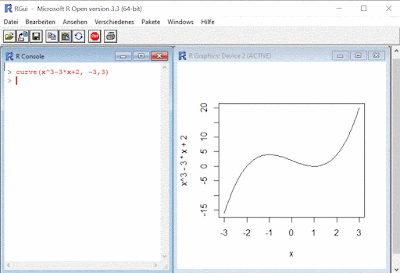
For example, to draw the function f(x) = x^3-3*x+2 all one needs to do is to type the following command into the console:
curve(x^3-3*x+2, -3,3)
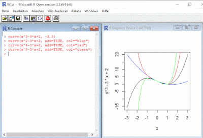
One can display a second function into the same chart by adding a second command and repeat the process further as needed:
curve(x^2-3*x+2, add=TRUE, col="blue")
curve(x^4-3*x+2, add=TRUE, col="red")
curve(x^5-3*x+2, add=TRUE, col="green")
As one can see a pattern emerges already …
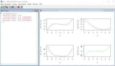
One could easily display the plots in their one section by defining an array on the display device, allowing thus to focus on special characteristics of the functions:
par(mfrow=c(2,2))
curve(x^3-3*x+2, -3,3)
curve(x^2-3*x+2, -3,3, col="blue")
curve(x^4-3*x+2, -3,3, col="red")
curve(x^5-3*x+2, -3,3, col="green")
One can be creative and display the functions using a loop:
par(mfrow=c(2,2))
for(n in c(2:5)){
curve(x^n-3*x+2, -3,3)
}
Similarly, one can plot trigonometric functions:
par(mfrow=c(2,3))
curve(sin(x),-pi,pi)
curve(cos(x),-pi,pi)
curve(tan(x),-pi,pi)
curve(1/tan(x),-pi,pi)
curve(asin(x),-1,1)
curve(acos(x),-1,1)
The possibilities are endless. For complex functions one can include the function into an r function:
myFunction<- function(x) sin(cos(x)*exp(-x/2))
curve(myFunction, -15, 15, n=1000)
For the SQL Server developers, what’s even greater is the possibility of using Management Studio for the same, though that’s a topic for another post.
Happy coding!
|>> Next Post


No comments:
Post a Comment