29 September 2020

𖣯🧮Strategic Management: Simplicity V (ERP Implementations' Story I)

Strategic Management

Probably ERP Implementations are one of the most complex type of projects one deals with in the IT world, however their complexity seldom resides in technologies themselves, but in the effort that needs to be made by organizations before, during and post-implementations. Through their transformative nature ERP implementations have the potential of changing the whole organization if their potential is exploited accordingly, which is unfortunately not always the case. Therefore, the challenges don’t resume only to managing a project or implementing a technology, but also in managing change, and that usually happens or needs to happen at several levels. 

Typically, the change is considered mainly at IT infrastructure and processual level, because at these levels most of the visible changes happen – that’s what steals the show. For the whole project duration is about replacing one or more legacy systems, making sure that the new infrastructure works as expected. The more an organization deviates from the standard the more effort is needed, and this effort can exhaust an organization’s resources to the degree that will need some time to recover after that, financially, but maybe more important from a vital point of view.

Even if the technological and processual layers are important, as they form the foundation on which an organization builds upon, besides the financial and material flow there are also the data, informational and knowledge flows, which seems to be neglected. Quite often that’s where the transformational potential resides. If an organization is not able to change positively these flows, on the long term the implementation will deal with problems people wished to be addressed much earlier, when the effort and effect would have met the lowest resistance, respectively the highest impact. 

An ERP implementation involves the migration of data between source(s) and target(s), the data requirements, including the one of appropriate quality, being regarded in respect to the target system(s). As within the data migration steps the data are extracted from the various sources, enriched, and prepared for import into the target system(s), there is the potential of bringing data quality to a level which would help the organization further. It’s probably simpler to imagine the process of taking the data from one place, cleaning and enriching the data to bring it to the needed form, and then putting the data into the new system. It’s a unique chance of improving data quality without touching the source or target system(s) while getting a considerable value.

Unfortunately, many organizations’ efforts to improve the quality of their data stop after the implementation. If there’s no focus and there are no structures in place to continue the effort, sooner or later data’s quality will decrease despite the earlier made efforts. Investing for example in a long-term data quality improvement or even a data management initiative might prove to be an exploratory and iterative process in which mistakes are maybe made, the direction might need to be changed, though, as long learning is involved, in this often resides the power of changing for the better.

When one talks about information there are two aspects to it: how an organization arrives from data to actionable information that reach timely the people who need it, respectively how information is further aggregated, recombined, shared, and harnessed into knowledge. These are the first three layers of knowledge (aka DIKW) pyramid, and an organization’s real success story is in how can manage these flows together, while increasing the value they provide for the organization. It’s an effort that must start with the implementation itself, or even earlier, and continue after the implementation, as an organization seems fit.

Previous Post <<||>> Next Post

Written: Sep-2020, Last Reviewed: Mar-2024

27 September 2020

𖣯Strategic Management: Strategy Design (Part IV: Designing for Simplicity)


More than two centuries ago, in his course on the importance of Style in Literature, George Lewes wisely remarked that 'the first obligation of Simplicity is that of using the simplest means to secure the fullest effect' [1]. This is probably the most important aspect the adopters of the KISS mantra seem to ignore – solutions need to be simple while covering all or most important aspects to assure the maximum benefit. The challenge for many resides in defining what the maximum benefit is about. This state of art is typically poorly understood, especially when people don’t understand what’s possible, respectively of what’s necessary to make things work smoothly. 

To make the simplicity principle work, one must envision the desired state of a product or solution and trace back what’s needed to achieve that vision. One can aim for the maximum or for the minimum possible, respectively for anything in between. That’s at least true in theory, in praxis there are constraints that limit the range of achievement, constraints ranging from the availability of resources, their maturity or the available time, respectively to the limits for growth - the learning capacity of individuals and organization as a whole. 

On the other side following the 80/20 principle, one could achieve in theory 80% of a working solution with 20% of the effort needed in achieving the full 100%. This principle comes with a trick too because one needs to focus on the important components or aspects of the solution for this to work. Otherwise, one is forced to do exploratory work in which the learning is gradually assimilated into the solution. This implies continuous feedback, respectively changing the targets as one progresses in multiple iterations. The approach is typically common to ERP implementations, BI and Data Management initiatives, or similar transformative projects which attempt changing an organization’s data, information, or knowledge flows - the backbones organizations are built upon.     

These two principles can be used together to shape an organization. While simplicity sets a target or compass for quality, the 80/20 principle provides the means of splitting the roadmap and effort into manageable targets while allowing to identify and prioritize the critical components, and they seldom resume only to technology. While technologies provide a potential for transformation, in the end is an organization’s setup that has the transformative role. 

For transformational synergies to happen, each person involved in the process must have a minimum of necessary skillset, knowledge and awareness of what’s required and how a solution can be harnessed. This minimum can be initially addressed through training and self-learning, however without certain mechanisms in place, the magic will not happen by itself. Change needs to be managed from within as part of an organization’s culture, by the people close to the flow, and when necessary, also from the outside, by the ones who can provide guiding direction. Ideally, a strategic approach is needed the vision, mission, goals, objectives, and roadmap are sketched, where intermediary targets are adequately mapped and pursued, and the progress is adequately tracked.

Thus, besides the technological components is needed to consider the required organizational components to support and manage change. These components form a structure which needs to adhere by design to the same principle of simplicity. According to Lewes, the 'simplicity of structure means organic unity' [1], which can imply harmony, robustness, variety, balance, economy or proportion. Without these qualities the structure of the resulting edifice can break under its own weight. Moreover, paraphrasing Eric Hoffer, simplicity marks the end of a continuous process of designing, building, and refining, while complexity marks a primitive stage.

Previous Post <<||>> Next Post

Written: Sep-2020, Last Reviewed: Mar-2024

References:
[1] George H Lewes (1865) "The Principles of Success in Literature"

Considered quotes:
"Simplicity of structure means organic unity, whether the organism be simple or complex; and hence in all times the emphasis which critics have laid upon Simplicity, though they have not unfrequently confounded it with narrowness of range." (George H Lewes, "The Principles of Success in Literature", 1865)
"The first obligation of Simplicity is that of using the simplest means to secure the fullest effect. But although the mind instinctively rejects all needless complexity, we shall greatly err if we fail to recognise the fact, that what the mind recoils from is not the complexity, but the needlessness." (George H Lewes, "The Principles of Success in Literature", 1865)
"In products of the human mind, simplicity marks the end of a process of refining, while complexity marks a primitive stage." (Eric Hoffer, 1954)

13 September 2020

🎓Knowledge Management: Definitions II (What's in a Name)

Knowledge Management

Browsing through the various books on databases and programming appeared over the past 20-30 years, it’s probably hard not to notice the differences between the definitions given even for straightforward and basic concepts like the ones of view, stored procedure or function. Quite often the definitions lack precision and rigor, are circular and barely differentiate the defined term (aka concept) from other terms. In addition, probably in the attempt of making the definitions concise, important definitory characteristics are omitted.

Unfortunately, the same can be said about other non-scientific books, where the lack of appropriate definitions make the understanding of the content and presented concepts more difficult. Even if the reader can arrive in time to an approximate understanding of what is meant, one might have the feeling that builds castles in the air as long there is no solid basis to build upon – and that should be the purpose of a definition – to offer the foundation on which the reader can build upon. Especially for the readers coming from the scientific areas this lack of appropriateness and moreover, the lack of definitions, feels maybe more important than for the professional who already mastered the respective areas.

In general, a definition of a term is a well-defined descriptive statement which serves to differentiate it from related concepts. A well-defined definition should be meaningful, explicit, concise, precise, non-circular, distinct, context-dependent, relevant, rigorous, and rooted in common sense. In addition, each definition needs to be consistent through all the content and when possible, consistent with the other definitions provided. Ideally the definitions should cover as much of possible from the needed foundation and provide a unitary consistent multilayered non-circular and hierarchical structure that facilitates the reading and understanding of the given material.

Thus, one can consider the following requirements for a definition:

Meaningful: the description should be worthwhile and convey the required meaning for understanding the concept.

Explicit: the description must state clearly and provide enough information/detail so it can leave no room for confusion or doubt.

Context-dependent: the description should provide upon case the context in which the term is defined.

Concise: the description should be as succinct as possible – obtaining the maximum of understanding from a minimum of words.

Precise: the description should be made using unambiguous words that provide the appropriate meaning individually and as a whole.

Intrinsic non-circularity: requires that the term defined should not be used as basis for definitions, leading thus to trivial definitions like “A is A”.

Distinct: the description should provide enough detail to differentiate the term from other similar others.

Relevant: the description should be closely connected or appropriate to what is being discussed or presented.

Rigorous: the descriptions should be the result of a thorough and careful thought process in which the multiple usages and forms are considered.  

Extrinsic non-circularity: requires that the definitions of two distinct terms should not be circular (e.g. term A’s definition is based on B, while B’s definition is based on A), situation usually met occasionally in dictionaries.

Rooted in common sense: the description should not deviate from the common-sense acceptance of the terms used, typically resulted from socially constructed or dictionary-based definitions.

Unitary consistent multilayered hierarchical structure: the definitions should be given in an evolutive structure that facilitates learning, typically in the order in which the concepts need to be introduced without requiring big jumps in understanding. Even if concepts have in general a networked structure, hierarchies can be determined, especially based on the way concepts use other concepts in their definitions. In addition, the definitions must be consistent – hold together – respectively be unitary – form a whole.

04 August 2020

💼Project Management: Project Execution (Part I: Redefining Projects' Success I)

Mismanagement

A project is typically considered as successful if has met the beforehand defined objectives within the allocated budget, timeframe and expected quality levels. Any negative deviation from any of these equates with a project failure. In other words, the success or failure of a project is judged as black or white with no grays in between, which is utopic, especially for mid to big software projects, typically associated with lot of uncertainty. According to this definition a project which had a delay of a few months, or the budget was overrun by 10%, or the users got only 90% from the planned functionality, or any combination of these negative deviations, can be considered as failed.

If a small project needed 6 instead of 3 months to complete, which is normal for projects with reduced priority, as long the project costs haven’t changed, then the increase in duration can be ignored. In exchange, 3 months of a delay for a 2 years project is normal, especially when the project is complex. Even if additional costs incurred within this timeframe, as long they are a small percentage in comparison with the overall project costs, then the impact can be acceptable for the business. On the other side, when the delays have an exponential growth with further implications, then the problem changes dramatically.

Big projects have typically a strategic importance. It’s the case of ERP implementations, which besides the technology changes have in theory have the potential to transform an organization pushing it to reach further performance levels. Such projects are estimated to take on average one to two years for a medium organization, however the delays can easily reach 50% to 100% from the initial estimation. Independently of what caused the delay, as long the organization achieved the intended goals and can cover project’s costs, one can say that the project made a (positive) difference.

Independently of project’s size, if 90% of the important functionality is available, then more likely the 10% can be covered in a first step with manual work, following in time to further invest into the system as part of a continuous improvement process. It’s maybe not ideal for the users, however the approach incorporates also the learning curve of working with the system and understanding ist possibilities and limitations. Of course, when the percentage of the available functionality decreases below a given limit, system’s acceptance is endangered, which users eventually start looking for alternatives.

There are also projects which opened the door to new possibilities and which require more investments to leverage the full capabilities. Some ERP implementations have this potential, despite overruns. Some of such investments are entitled while others are not. Related to this last category, there are projects which are on time, on budget, and the deliverables satisfy the quality criteria and objectives, however they make no difference for the organization despite the important investments made. Sure, some of the projects from this category are a must (e.g. updates, upgrade, technology changes), however there are also projects which can be considered as self-occupational hazard. In extremis such projects run in the background and cost organizations lot of energy and resources, while their effects are questionable.

At least from these examples the definition of a project's success needs to be changed or maybe standardized to consider not only intrinsic but also extrinsic aspects. In theory, that is the role of a Project Management Office (PMO), however it’s challenging to find an evaluation methodology that fits all needs. Further on, from same considerations, benchmarking projects across organizations and industries can prove to be a foolhardy attempt.

07 July 2020

🪄SSRS: Graphical Representations II (Sixth Magic Class)

Introduction 

Using a single chart to display multiple series in SQL Server Reporting Services (SSRS) or any other reporting tool works well when the number of series is somehow manageable - usually being enough to display 2-10 series within the same chart. The more series one adds, the more complicated will be for users to read the chart. One has the choice to find either
-  a level of detail (e.g. Category) which, when grouping the data, leads to a number of manageable series,
-  compare the data within a certain grouping (e.g. Category),
-  displaying the individual trends (e.g. for each Product). 

Let's consider the last choice. The report from this post will display the Sales Volume per Product and Year/Month of the Sales Orders available in the AdventureWorks2014 database. The logic uses the Sales.SalesOrderDetail and Sales.SalesOrderHeader tables, respectively the Production.vProducts view created in a previous post

Note:
A Sales Volume report is more appropriate to be built using a data warehouse's data, which are already aggregated and prepared for such reports. There's actually an AdventureWorksDW2014 data warehouse model made available which can be used to display the same information, however the intent is to demonstrate the techniques of working with data in an OLTP environment. 

Preparing the Data

Creating a view to build the Sales Orders details is usually recommended, though for the current report we just need the Product Category, Subcategory, Number and Name, respectively Sales Date, Quantity and Value, which is only a small part from the attributes available. Another choice to consider is whether to use the raw data, though then the number of records sent to the client can be considerably high, or aggregate the data and the lowermost level of detail needed for the report, in this case the Category, Subcategory, Product, Month and Year:


-- Sales volume per Product   
SELECT ITM.Category
, ITM.Subcategory
, ITM.ProductNumber
, ITM.Name
, Month(SOH.OrderDate) [Month]
, Year(SOH.OrderDate) [Year]
, Sum(SOD.OrderQty) OrderQty
, Sum(SOD.LineTotal) OrderValue
FROM Sales.SalesOrderDetail SOD
     JOIN Sales.SalesOrderHeader SOH
       ON SOD.SalesOrderID = SOH.SalesOrderID
     JOIN Production.vProducts ITM
       ON SOD.ProductId = ITM.Productid 
WHERE ITM.ProductNumber IN ('BB-7421', 'BB-9108')
GROUP BY ITM.Category
, ITM.Subcategory
, ITM.ProductNumber
, ITM.Name
, Month(SOH.OrderDate)
, Year(SOH.OrderDate)
ORDER BY ITM.Category
, ITM.Subcategory
, ITM.ProductNumber
, [Year]
, [Month]

The query contains all the needed data, however one could have more flexibility if the data would contain cumulative or total values as well: 


-- Sales volume per Product (extended)  
SELECT SOD.Category
, SOD.Subcategory
, SOD.ProductNumber
, SOD.Name
, SOD.[Month]
, SOD.[Year]
, SOD.OrderQty
, SOD.OrderValue
, SUM(SOD.OrderQty) OVER (PARTITION BY SOD.ProductNumber) TotalQty
, SUM(SOD.OrderValue) OVER (PARTITION BY SOD.ProductNumber) TotalValue
, SUM(SOD.OrderQty) OVER (PARTITION BY SOD.ProductNumber ORDER BY [Year], [Month]) CumulatedQty
, SUM(SOD.OrderValue) OVER (PARTITION BY SOD.ProductNumber ORDER BY [Year], [Month]) CumulatedValue
FROM (-- cumulated values
 SELECT ITM.Category
 , ITM.Subcategory
 , ITM.ProductNumber
 , ITM.Name
 , Month(SOH.OrderDate) [Month]
 , Year(SOH.OrderDate) [Year]
 , Sum(SOD.OrderQty) OrderQty
 , Sum(SOD.LineTotal) OrderValue
 FROM Sales.SalesOrderDetail SOD
   JOIN Sales.SalesOrderHeader SOH
    ON SOD.SalesOrderID = SOH.SalesOrderID
   JOIN [Production].[vProducts] ITM
     ON SOD.ProductId = ITM.Productid 
 WHERE ITM.ProductNumber IN ('BB-7421', 'BB-9108')
 GROUP BY ITM.Category
    , ITM.Subcategory
 , ITM.ProductNumber
 , ITM.Name
 , Month(SOH.OrderDate)
 , Year(SOH.OrderDate)
  ) SOD
ORDER BY SOD.Category
, SOD.Subcategory
, SOD.ProductNumber
, SOD.[Year]
, SOD.[Month]
In the end one can use any of the above queries.
Note:When prototyping a report is usually recommended to consider only a small number of records (e.g. only two Products). In addition, do not forget to validate the number or records considered by the logic:

-- checking the view for internal data consistency
SELECT count(*)
FROM Sales.SalesOrderDetail SOD
     JOIN Sales.SalesOrderHeader SOH
   ON SOD.SalesOrderID = SOH.SalesOrderID
  JOIN Production.vProducts ITM
    ON SOD.ProductId = ITM.Productid 
Creating the Report
Using the Report Wizard create a new matrix report called "Sales Volume per Product" based on either of the above queries (I considered the second). Within "Design the Matrix" select the attributes as follows:
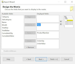
Design the Matrix

This will create the backbone for our report:
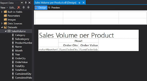
First draft in Design mode

Which is pretty basic, if we consider the output:
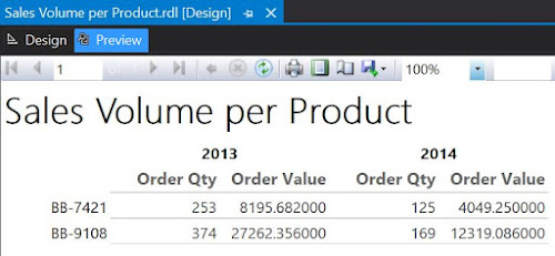
First draft in Preview mode

Now, returning in Design mode, right click on the "Sum of OrderQty" cell and from the floating menu select Insert/Chart, while from the list of available charts select Line. Do the same for "Sum of OrderValue". And here's the result:
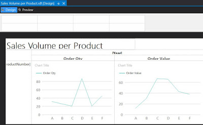
Second draft in Design mode

As only one series will be displayed, select the Chart Title and delete the respective label. Delete the Series label as well. When running the report you'll observe that the horizontal axis values are not really appealing. To dix this right click on the respective area and from the floating menu select Horizontal Axis Properties. Within Axis Options section change the Axis type as 'Scalar', enter '1' as Minimum, '12' as Maximum, '1' as Interval and 'Number' as Interval type:
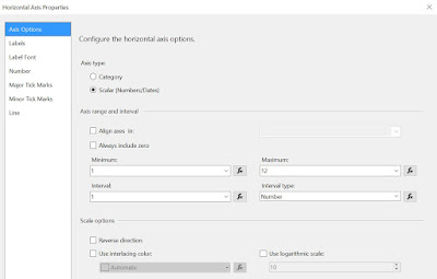
Horizontal Axis Properties

In the same window, within the Labels section select 'Enable auto-fit' and uncheck the "Labels can be offset", respectively the "Labels can be rotated" checkboxes. 

To include the Category, Subcategory and eventually the Product Name, select the Product Number cell, right click on it, and from the floating menu select Insert Column/Inside Group - Left, then select from the Category as attribute:
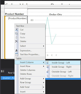
Inserting a column within the group

Repeat the process to add the Subcategory. Eventually you can add also the Product Name, though for it you'll have to select "Inside Group - Right". 

To improve the design, you can add a Page Header and move the report's title into it add a timestamp, respectively a page count textbox, resize the boxes to fit the columns. You can also align the column header values to the center, change the font to 10pt, etc.
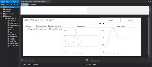
Third draft in Design mode

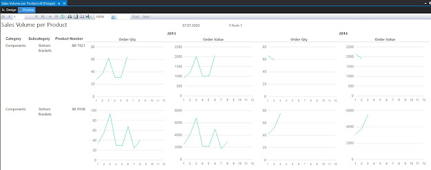
Here's the report in preview mode:

Third draft in Preview mode

One can use the report the way it is, or add the Category and Subcategory as parameters. Similarly, one can use the cumulative values as input for the charts. 

Revamping the Report with Sparklines

Even if the charts allow displaying the scales, the problem with them is that they are too big, which makes it difficult to compare the data across records. One can correct this by using the other types of graphics available in reports, e.g. sparklines. For this make a copy of the report already built, and within the Detail cells select a Sparkine Column instead of a chart:
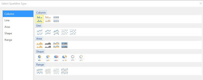
Sparkline types


In comparison with Lines, Column-based representations allow to see how many data points are represented. Because spartklines are more compact as graphic forms, you can resize the cells as follows:

Fourth draft in Design mode

And here's the report in preview mode (the constraints from the source query were removed):
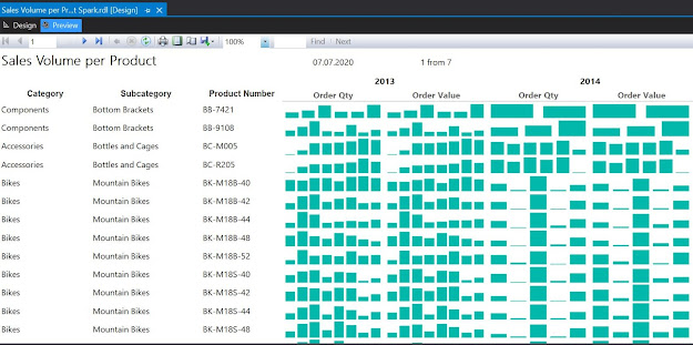
Fourth draft in Preview mode

As can be seen one can easily identify the trends however the volume scale was lost, being impossible to compare which of the Products sold better. One can bring the Total Quantity and Value as display information and sort the dataset from the highest to lowest value. One can even select a top x, to reduce the focus only to the most sold Products.

If the prices remained relatively constant over time, there's actually almost no difference between the graphic displays for Order Quantity, respectively for Order Value. Therefore one can remove one of them (e.g. Order Quantity). Being more compact, sparkline-based representations allow to better use the space, therefore you can add more fields into the report. 

Happy coding!

06 July 2020

🪄SSRS: Graphical Representations I (SQL Server CPU Utilization)

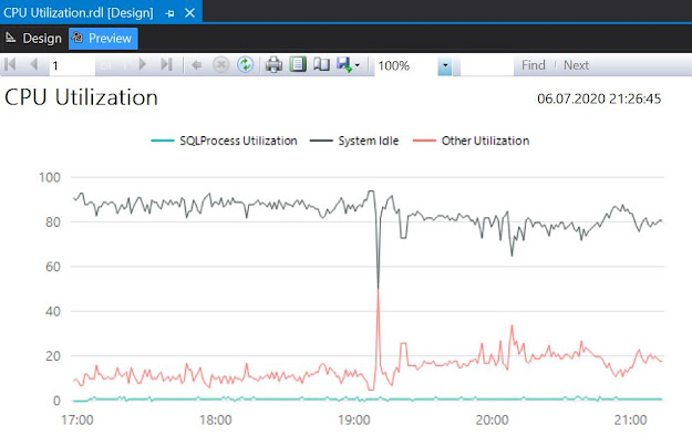
As described in a previous post, the Scheduler Monitor buffer exposed via the sys.dm_os_ring_buffers  data management view (DMV) provides a history of 4 hours uptime with minute by minute data points (in total 256 entries) with the CPU utilization for the SQL Server, other processes, respectively the system idle time as percentages. SSRS is ideal for showing the respective information within a chart.

For this create a new report (e.g. CPU Utilization) by using the Report Wizard based on the following query: 

-- cpu utilization for SQL Server and other applications
DECLARE @ts_now bigint = (SELECT cpu_ticks/(cpu_ticks/ms_ticks)
        FROM sys.dm_os_sys_info); 

SELECT DAT.record_id
, DAT.EventTime
, DAT.SQLProcessUtilization 
, DAT.SystemIdle 
, 100 - (DAT.SystemIdle + DAT.SQLProcessUtilization) OtherUtilization
FROM ( 
 SELECT record.value('(./Record/@id)[1]', 'int') record_id
 , record.value('(./Record/SchedulerMonitorEvent/SystemHealth/SystemIdle)[1]', 'int') SystemIdle 
 , record.value('(./Record/SchedulerMonitorEvent/SystemHealth/ProcessUtilization)[1]', 'int') SQLProcessUtilization
 , EventTime 
 FROM ( 
  SELECT DATEADD(ms, -1 * (@ts_now - [timestamp]), GETDATE()) EventTime
  , [timestamp]
  , CONVERT(xml, record) AS [record] 
  FROM sys.dm_os_ring_buffers 
  WHERE ring_buffer_type = N'RING_BUFFER_SCHEDULER_MONITOR' 
    AND record LIKE N'%<SystemHealth>%') AS x 
 ) AS DAT
ORDER BY DAT.record_id DESC;

After creating the report delete the available table and add a chart by right-clicking inside the report and from the floating menu choose Inser/Chart. Within the Select Chart Type select Line/Shape as chart type:


Resize the chart to provide an acceptable level of detail, then click within the chart area and add the SQLProcesUtilization, SystemIdle and OtherUtilization as values Values, respectively the EventTime as Category Group. 


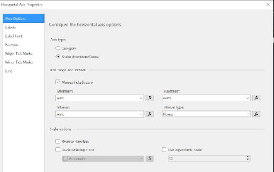
It is needed to edit horizontal's axis properties - select the respective region and from the floating menu chose Horizontal Axis Properties. Within Axis Options chose Scalar as axis type, ideal for numeric and date values:
Axis Options

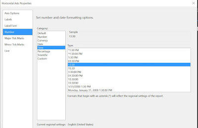
Within the Number section select the Time as category and provide the type as below (e.g. 13:30):

Number Section

As last change, add a header, move report's title within the header and add a text box next to it with the following formula to show the time when the report was run:
= Now().ToString("dd.MM.yyyy HH:mm:ss")

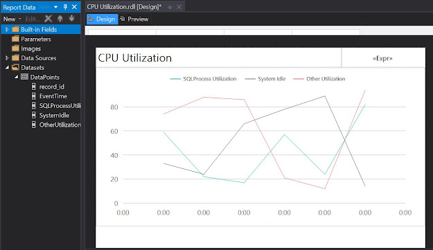
With these changes the report is set to be run:

Design mode

Here's the preview

Preview mode

Unfortunately the default choice of colors is not really ideal as red is used for warnings, and green for positive trends, which is not necessarily the case for a CPU's utilization. 

One can play with the various chart types, for example by selecting the chart area and changing the chart type as Area/Range one can obtain the following chart (it is needed to change the Axis Type as Scalar again):


Happy coding!

🪄SSRS (& Paginated Reports): Ranking Rows in Reports

Introduction

In almost all the reports I built, unless it was explicitly requested no to, I prefer adding a running number (aka ranking) for each record contained into the report, while providing different background colors for consecutive rows. The ranking allows easily identify a record when discussing about it within the report or extracts, while the different background colors allow differentiating between two records while following the values which scrolling horizontally. The logic for the background color can be based on two (or more) colors using the ranking as basis.

Tabular Reports

In a tabular report the RowNumber() function is the straightforward way for providing a ranking. One just needs to add a column into the report before the other columns, giving a meaningful name (e.g. RankingNo) and provide the following formula within its Expression:
= RowNumber(Nothing)

When 'Nothing' is provided as parameter, the ranking is performed across all the report. If is needed to restrict the Ranking only to a grouping (e.g. Category), then group's name needs to be provided as parameter:
= RowNumber("Category")

Matrix Reports

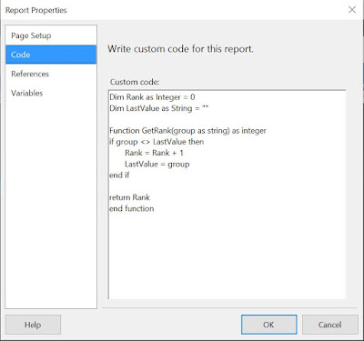
Unfortunately, in a matrix report based on aggregation of raw data the RowNumber() function stops working, the values shown being incorrect. The solution I use to solve this is based on the custom GetRank() VB function:

Dim Rank as Integer = 0
Dim LastValue as String = ""

Function GetRank(group as string) as integer
if group <> LastValue then
       Rank = Rank + 1
       LastValue = group
end if

return Rank
end function

The function compares the values provided in the call against a global scope LastValue text value. If the values are different, then a global scope Rank value is incremented by1, while the LastValue is initialized to the new value, otherwise the values remaining the same. The logic is basic also for a non-programmer.

The above code needs to be added into the Code section of Report's Properties for the function to be available:
Adding the code in Report Properties
Once the function added, a new column should be added similarly as for a tabular report,  providing the following code within its Expression in exchange:
=Code.GetRank(Fields!ProductNumber.Value)

Note:
As it seems, on the version of Reporting Services Extension I use, the function has only a page scope, the value being reset after each page. However when exporting the data with Excel the ranking is applied to the whole dataset.

Providing Alternate Colors

Independently of the report type, one can provide an alternate color for table's rows by selecting the row with the data and adding the following expression into the BackaroundColor property:
=Iif(ReportItems!RankingNo.Value Mod 2, "White", "LightSteelBlue")

Notes:
1) For a tabular report the cost of calling the RowNumber function instead of referring to the RankingNo cell is relatively small. One can write it also like this:
=llf(RowNumber(Nothing) Mod 2 = 0, "White", "LightSteelBlue")

Power BI Paginated Reports

The pieces of code considered above can be used also in Power BI Paginated Reports. Even if there's no functionality for adding custom code in the standard UI, one can make changes to the rdl file in Visual Studio or even in Notepad. For example, one can add the code within the "Code" tag at the end of the file before the closing tag for the report:

<Code>Dim Rank as Integer = 0
Dim LastValue as String = ""
Dim Concatenation = ""

Function GetRank(group as string) as integer
if group <> LastValue then
       Rank = Rank + 1
       LastValue = group
end if

Concatenation = Concatenation & vbCrLf & Rank & "/" & group &amp; "/" & LastValue
return Rank
end function</Code>
</Report>

Note:
One can consider using a pipeline "|" instead of a forward slash.

🪄SSRS (& Paginated Reports): Matrix Report Display (Fifth Magic Class)

Introduction

SQL Server Reporting Services (SSRS) allows grouping data into a matrix format based on one or more groups. By using the Report Wizard one can simplify considerably the volume of work.

The considered example is based on the AdventureWorks2014 database and considers Product's Inventory as base for building the report. 

Preparing the Data

Usually it's useful to incorporate the logic for a report in one or more views, allowing thus to reuse the views in multiple reports. For the current report is needed to create two views, one for the Products, respectively Production.vProductInventory for the inventory. 

-- dropping the vProducts view (cleaning after)
--DROP VIEW IF EXISTS [Production].[vProducts]

-- creating the vProducts view
CREATE VIEW [Production].[vProducts]
AS 
SELECT p.[ProductID] 
, p.ProductNumber
, p.[Name] 
, IsNull(p.Size, '') + IsNull(' ' + p.SizeUnitMeasureCode, '') Size
, p.Color
, P.Style
, p.ProductModelID
, pm.[Name] AS [ProductModel] 
, p.StandardCost 
, P.ListPrice
, P.SafetyStockLevel
, P.ReorderPoint
, p.SellStartDate 
, p.SellEndDate
, p.ProductSubcategoryID
, PPS.Name Subcategory
, PPS.ProductCategoryID
, PPC.Name Category
, P.MakeFlag
, P.FinishedGoodsFlag
FROM [Production].[Product] p 
     LEFT JOIN [Production].[ProductModel] pm 
       ON p.[ProductModelID] = pm.[ProductModelID] 
	 LEFT JOIN Production.ProductSubcategory PPS
	   ON P.ProductSubcategoryID = PPS.ProductSubcategoryID 
	      LEFT JOIN Production.ProductCategory PPC
		    ON PPS.ProductCategoryID = PPC.ProductCategoryID 
GO

-- reviewing the data 
SELECT *
FROM [Production].[vProducts]

-- checking the view for internal data consistency
SELECT count(*)
FROM [Production].[Product] p 
     LEFT JOIN [Production].[ProductModel] pm 
       ON p.[ProductModelID] = pm.[ProductModelID] 
	 LEFT JOIN Production.ProductSubcategory PPS
	   ON P.ProductSubcategoryID = PPS.ProductSubcategoryID 
	      LEFT JOIN Production.ProductCategory PPC
		    ON PPS.ProductCategoryID = PPC.ProductCategoryID 


-- dropping the vProductInventory view (cleaning after)
--DROP VIEW IF EXISTS Production.vProductInventory

-- creating the view 
CREATE VIEW Production.vProductInventory
AS
SELECT PPI.ProductId 
, PPD.ProductNumber
, PPD.Name ProductName 
, PPD.ProductModel
, PPD.Size
, PPD.Category
, PPD.Subcategory
, PPD.Style
, PPD.StandardCost
, PPD.ListPrice 
, PPD.StandardCost * PPI.Quantity InventoryValue 
, PPD.ListPrice * PPI.Quantity SalesValue
, PPD.MakeFlag
, PPI.Locationid 
, PPL.Name Location 
, PPI.Shelf 
, PPI.Bin 
, PPI.Quantity 
FROM [Production].[ProductInventory] PPI
     JOIN [Production].[vProducts] PPD
	   ON PPI.ProductID = PPD.ProductID
	 JOIN [Production].[Location] PPL
	   ON PPI.LocationID = PPL.LocationID

-- reviewing the data
SELECT *
FROM Production.vProductInventory

-- checking the view for internal data consistency
SELECT count(*)
FROM [Production].[ProductInventory] PPI
     JOIN [Production].[vProducts] PPD
	   ON PPI.ProductID = PPD.ProductID
	 JOIN [Production].[Location] PPL
	   ON PPI.LocationID = PPL.LocationID

Note:
It's important to check the internal consistency of the views or queries used, on whether the logic removes or duplicates data. For this one can run the query for the uppermost table, and add repeatedly one more join for each run to see whether the number of records remains the same. One can shortcut the validation by checking only the number of records from the base table and for the whole query, and only if there are differences use the previously mentioned approach. (This is how I observed that the Production.vProductDetails view is not usable, because it considers only the Products having a valid Model.)

Creating the Report 

We can now use  the Production.vProductInventory view to create the Product Inventory by Location report based on the following query:

-- Product Inventory by Location
SELECT PPI.Category
, PPI.Subcategory
, PPI.ProductNumber
, PPI.ProductName 
, PPI.ProductModel
, PPI.Size
, PPI.Style
, PPI.StandardCost
, PPI.ListPrice
, PPI.Location 
, PPI.Quantity 
, PPI.InventoryValue 
, PPI.SalesValue 
FROM Production.vProductInventory PPI
ORDER BY PPI.Category
, PPI.Subcategory
, PPI.ProductNumber

Note:
The attributes can be provided in the order in which they should be displayed in the report, reducing thus the overhead in the further steps. 

Using the Reporting Wizard via the Add New Report select in the first step the data source, while in the next step provide the above query:

Design the Query

In the next step select the "Matrix" Report Type:

Select the Report Type

Within the "Design the Matrix" section assign the fields as follows (all the fields except the ones considered as Columns and Details will be considered as Rows):

Design the Matrix

Into the last step give the report a meaningful name (e.g. Product Inventory by Location):

Completing the Wizard

In theory the report is ready to run, however before doing that change the formatting by aligning the headers to the center and eventually change their size from 11 to 10 pixels, respectively rename the dataset (e.g. Inventory). To obtain the same information about the grouping as below change into the "Advanced Mode".

Design View

And here's the output (I had to scroll through the pages to find meaningful values, therefore part of the Details header is not shown):

Preview

Restructuring the Grouping

As can be seen into the Design Mode, the wizard created a grouping for each attribute provider into the Details (see matrix1_Category, matrix1_Subcategory, etc.). Therefore, the values will not be repeated for each row, which is typically desirable for visualizations but not when exporting the data to Excel for further processing. I prefer the latter version, therefore to obtain this behavior one can go on and delete all the grouping via "Delete group only" except the matrix1_Category:

Deleting the groups

This action deleted unfortunately all the Detailed headers except Category. To bring them back into the grouping double click on the and add each field into the Group expressions as below:

Group Properties

As final change before running the report one can add header names for the Detail attributes. After these changes reports' design looks as follows:

Report Design with one grouping

And here's the final report with the values repeating for each row:

Preview Report without formatting

Note:
To avoid removing the groupings, I prefer to add only one Detail field into the query, typically the field which will make the row unique into the output (e.g. Product Number) and add the further fields (actually replace the below query with the one above) after the Wizard created the report. One still needs to add the columns manually into the report. In the end the effort is similar. 

-- Product Inventory by Location
SELECT PPI.ProductNumber
, PPI.Location 
, PPI.Quantity 
, PPI.InventoryValue 
, PPI.SalesValue 
FROM Production.vProductInventory PPI
ORDER BY PPI.Category
, PPI.Subcategory
, PPI.ProductNumber

Changing the Design

Report's design can be slightly improved by adding various formatting of the cells or values. One can use similar formatting as the ones consider in the previous post. The only thing difficult to implement will be a ranking function (see Ranking Rows in Reports). After the design changes here's the report:

Final Report

Note:
Of course, together with parameters one can also add totals after each Category or Subcategory to the report if needed, though the latter is more appropriate for design purposes and not for further data consumption. 

Happy coding!

Related Posts Plugin for WordPress, Blogger...

About Me

My photo
Koeln, NRW, Germany
IT Professional with more than 24 years experience in IT in the area of full life-cycle of Web/Desktop/Database Applications Development, Software Engineering, Consultancy, Data Management, Data Quality, Data Migrations, Reporting, ERP implementations & support, Team/Project/IT Management, etc.