For this create a new report (e.g. CPU Utilization) by using the Report Wizard based on the following query:
-- cpu utilization for SQL Server and other applications
DECLARE @ts_now bigint = (SELECT cpu_ticks/(cpu_ticks/ms_ticks)
        FROM sys.dm_os_sys_info);

SELECT DAT.record_id
, DAT.EventTime
, DAT.SQLProcessUtilization
, DAT.SystemIdle
, 100 - (DAT.SystemIdle + DAT.SQLProcessUtilization) OtherUtilization
FROM (
 SELECT record.value('(./Record/@id)[1]', 'int') record_id
 , record.value('(./Record/SchedulerMonitorEvent/SystemHealth/SystemIdle)[1]', 'int') SystemIdle
 , record.value('(./Record/SchedulerMonitorEvent/SystemHealth/ProcessUtilization)[1]', 'int') SQLProcessUtilization
 , EventTime
 FROM (
  SELECT DATEADD(ms, -1 * (@ts_now - [timestamp]), GETDATE()) EventTime
  , [timestamp]
  , CONVERT(xml, record) AS [record]
  FROM sys.dm_os_ring_buffers
  WHERE ring_buffer_type = N'RING_BUFFER_SCHEDULER_MONITOR'
    AND record LIKE N'%<SystemHealth>%') AS x
 ) AS DAT
ORDER BY DAT.record_id DESC;
After creating the report delete the available table and add a chart by right-clicking inside the report and from the floating menu choose Inser/Chart. Within the Select Chart Type select Line/Shape as chart type:

Resize the chart to provide an acceptable level of detail, then click within the chart area and add the SQLProcesUtilization, SystemIdle and OtherUtilization as values Values, respectively the EventTime as Category Group.
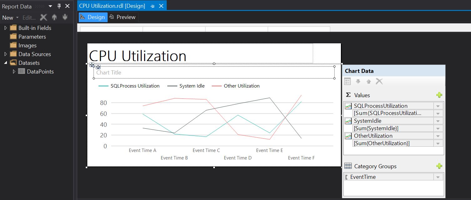
It is needed to edit horizontal's axis properties - select the respective region and from the floating menu chose Horizontal Axis Properties. Within Axis Options chose Scalar as axis type, ideal for numeric and date values:
 |
| Axis Options |
Within the Number section select the Time as category and provide the type as below (e.g. 13:30):
 |
| Number Section |
As last change, add a header, move report's title within the header and add a text box next to it with the following formula to show the time when the report was run:
= Now().ToString("dd.MM.yyyy HH:mm:ss")
With these changes the report is set to be run:
 |
| Design mode |
Here's the preview
 |
| Preview mode |
Unfortunately the default choice of colors is not really ideal as red is used for warnings, and green for positive trends, which is not necessarily the case for a CPU's utilization.
One can play with the various chart types, for example by selecting the chart area and changing the chart type as Area/Range one can obtain the following chart (it is needed to change the Axis Type as Scalar again):

Happy coding!


No comments:
Post a Comment