19 April 2024

⚡️🗒️Power BI: Working with Visual Calculations (Part I: Test Drive) [new feature]

Introduction

I recently watched a webcast with Jeroen (Jay) ter Heerdt (see [2]) in which he introduces visual calculations, a type of DAX calculation that's defined and executed directly on a visual [1]. Visual calculations provide an approach of treating a set of data much like an Excel table, allowing to refer to any field available on a visual and write formulas, which simplifies considerably the solutions used currently for ranking records, running averages and other windowing functions. 

The records behind a visual can be mentally represented as a matrix, while the visual calculations can refer to any column from the matrix, allowing to add new columns and include the respective columns in further calculations. Moreover, if a column is used in a formula, it's not recalculated as is the case of measures, which should improve the performance of DAX formulas considerably. 

Currently, one can copy a formula between visuals and if the formula contains fields not available in the targeted visual, they are added as well. Conversely, it's possible to build such a visual, copy it and then replace the dimension on which the analysis is made (e.g. Customer with Product), without being needed to make further changes. Unfortunately, there are also downsides: (1) the calculations are visible only within the visual in which were defined; (2) currently, the visual's data can't be exported if a visual calculation is added; (3) no formatting is supported, etc.

Ranking and Differences

I started to build a solution based on publicly available sales data, which offers a good basis for testing the use of visual calculations. Based on a Power BI visual table made of [Customer Name], [Sales Amount], [Revenue] and [Total Discount], I've added several calculations:

-- percentages
Sales % = 100*DIVIDE([Sales Amount], COLLAPSE([Sales Amount], ROWS))
Revenue % = 100*DIVIDE([Revenue],[Sales Amount])
Discount % = 100*DIVIDE([Total  Discount], [Total  Discount]+[Sales Amount])

-- rankings 
Rank Sales = Rank(DENSE, ORDERBY([Sales Amount], DESC))
Rank Revenue = Rank(DENSE, ORDERBY([Revenue], DESC))

-- differences between consecutive values
Diff. to Prev. Sales = IF([Rank Sales]>1, INDEX([Rank Sales]-1, , ORDERBY([Sales Amount], DESC)) - [Sales Amount] , BLANK())
Diff. to Prev. Rev. = IF([Rank Revenue]>1, INDEX([Rank Revenue]-1, , ORDERBY([Revenue], DESC)) - [Revenue] , BLANK())

Here's the output considered only for the first 10 records sorted by [Sales Amount]:

Customer Name Sales Amount Sales % Revenue Revenue % Total Discount Discount % Rank Sales Diff. to Prev. Sales. Rank Rev. Diff. to Prev. Rev.
Medline 1058923.78 3.76 307761.99 3.75 126601.02 10.68 1 1
Ei 707663.21 2.51 229866.98 2.8 95124.09 11.85 2 351260.57 2 77895.01
Elorac, Corp 702911.91 2.49 209078.76 2.55 83192.39 10.58 3 4751.3 6 20788.22
Sundial 694918.98 2.47 213362.1 2.6 78401.72 10.14 4 7992.93 4 -4283.34
OUR Ltd 691687.4 2.45 196396.26 2.4 78732.2 10.22 5 3231.58 10 16965.84
Eminence Corp 681612.78 2.42 213002.78 2.6 86904.03 11.31 6 10074.62 5 -16606.52
Apotheca, Ltd 667283.99 2.37 157435.56 1.92 101453.91 13.2 7 14328.79 31 55567.22
Rochester Ltd 662943.9 2.35 224918.2 2.74 81158.11 10.91 8 4340.09 3 -67482.64
ETUDE Ltd 658370.48 2.34 205432.79 2.51 89322.72 11.95 9 4573.42 9 19485.41
Llorens Ltd 646779.31 2.29 206567.4 2.52 82897.59 11.36 10 11591.17 8 -1134.61

Comments:
1) One could use [Total Amount] = [Total  Discount]+[Sales Amount] as a separate column.
2) The [Rank Sales] is different from the [Rank Rev.] because of the discount applied.
3) In the last two formulas a blank was considered for the first item from the ranking.
4) It's not possible to control when the totals should be displayed, however one can change the color for the not needed total to match the background.

Visualizing Differences 

Once the formulas are added, one can hide the basis columns and visualize the data as needed. To obtain the below chart I copied the visual and changed the column as follows:

Diff. to Prev. Rev. = IF([Rank Revenue]>1, [Revenue]- INDEX([Rank Revenue]-1, , ORDERBY([Revenue], DESC)) , [Revenue]) -- modified column

Differences Revenue between Customers

Comments:
1) Instead of showing the full revenue, the chart shows only the differences from the highest revenue, where the column in green is the highest revenue, while the columns in red are the differences of the current customer's revenue to the previous customer, as the data are sorted by the highest revenue. At least in this case it results in a lower data-ink ratio (see Tufte).
2) The values are sorted by the [Revenue] descending. 
3) Unfortunately, it's not possible to change the names from the legend.

Simple Moving Averages (SMAs)

Based on the [Sales Amount], [Revenue] and [Month] one can add the following DAX formulas to the table for calculating the SMA:

Sales Amount (SMA) = MOVINGAVERAGE([Sales Amount],6)
Revenue (SMA) = MOVINGAVERAGE([Revenue],6)

The chart becomes:


Comments:
1) Unfortunately, the formula can't project the values into the feature, at least not without the proper dates.
2) "Show items with not data" feature seems to be disabled when visual calculations are used.
3) The SMA was created via a template formula. Similarly, calculating a running sum is reduced to applying a formula:
Running Sales Amount = RUNNINGSUM([Sales Amount])

Wrap Up

It's easier to start with a table for the visual, construct the needed formulas and then use the proper visual while eliminating the not needed fields. 

The feature is still in public preview and changes can still occur. Unfortunately, there's still no information available on the general availability date. From the first tests, it provides considerable power with a minimum of effort, which is great! I don't want to think how long I would have needed to obtain the same results without it!

Happy coding!

Previous Post <<||>> Next Post

References
[1] Microsoft Learn (2024) Power BI: Using visual calculations [preview] (link)
[2] SSBI Central (2024) Visual Calculations - Making DAX easier, with Jeroen ter Heerdt (link)

⚡️Power BI: Preparatory Steps for Creating a Power BI Report

When creating a Power BI report consider the following steps when starting the actual work. The first five steps can be saved to a "template" that can be reused as starting point for each report.

Step 0: Check Power BI Desktop's version

Check whether you have the latest version, otherwise you can download it from the Microsoft website.
Given that most of the documentation, books and other resources are in English, it might be a good idea to install the English version.

Step 1: Enable the recommended options

File >> Options and settings >> Options >> Global >> Data Load:
.>> Time intelligence >> Auto date/time for new files >> (uncheck)
.>> Regional settings >> Application language >> set to English (United States)
.>> Regional settings >> Model language >> set to English (United States)

You can consider upon case also the following options (e.g. when the relationships are more complex than the feature can handle):
File >> Options and settings >> Options >> Current >> Data load:
.>> Relationship >> Import relationships from data sources on first load >> (uncheck)
.>> Relationship >> Autodetect new relationships after data is loaded >> (uncheck)

Step 2: Enable the options needed by the report

For example, you can enable visual calculations:
File >> Options and settings >> Options >> Preview features >> Visual calculations >> (check)

Comment:
Given that not all preview features are stable enough, instead of activating several features at once, it might be a good idea to do it individually and test first whether they work as expected. 

Step 3: Add a table for managing the measures

Add a new table (e.g. "dummy" with one column "OK"):

Results = ROW("dummy", "OK")

Add a dummy measure that could be deleted later when there's at least one other measure:
Test = ""

Hide the "OK" column and with this the table is moved to the top. The measures can be further organized within folders for easier maintenance. 

Step 4: Add the Calendar if time analysis is needed

Add a new table (e.g. "Calendar" with a "Date" column):

Calendar = Calendar(Date(Year(Today()-3*365),1,1),Date(Year(Today()+1*365),12,31))

Add the columns:

Year = Year('Calendar'[Date])
YearQuarter = 'Calendar'[Year] & "-Q" & 'Calendar'[Quarter]
Quarter = Quarter('Calendar'[Date])
QuarterName = "Q" & Quarter('Calendar'[Date])
Month = Month('Calendar'[Date])
MonthName = FORMAT('Calendar'[Date], "mmm")

Even if errors appear (as the columns aren't listed in the order of their dependencies), create first all the columns. Format the Date in a standard format (e.g. dd-mmm-yy) including for Date/Time for which the Time is not needed.

To get the values in the visual sorted by the MonthName:
Table view >> (select MonthName) >> Column tools >> Sort by column >> (select Month)

To get the values in the visual sorted by the QuarterName:
Table view >> (select QuarterName) >> Column tools >> Sort by column >> (select Quarter)

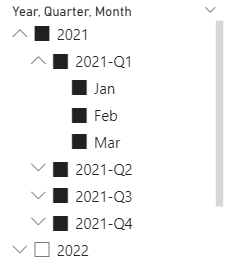
With these changes the filter could look like this:


Step 5: Add the corporate/personal theme

Consider using a corporate/personal theme at this stage. Without this the volume of work that needs to be done later can increase considerably. 

There are also themes generators, e.g. see powerbitips.com, a tool that simplifies the process of creating complex theme files. The tool is free however, users can save their theme files via a subscription service.

Set canvas settings (e.g. 1080 x 1920 pixels).

Step 6: Get the data

Consider the appropriate connectors for getting the data into the report. 

Step 7: Set/Validate the relationships

Check whether the relationships between tables set by default are correct, respectively set the relationships accordingly.

Step 8: Optimize the data model

Look for ways to optimize the data model.

Step 9: Apply the formatting

Format numeric values to represent their precision accordingly.
Format the dates in a standard format (e.g. "dd-mmm-yy") including for Date/Time for which the Time is not needed.

The formatting needs to be considered for the fields, measures and metrics added later as well. 

Step 10: Define the filters

Identify the filters that will be used more likely in pages and use the Sync slicers to synchronize the filters between pages, when appropriate:
View >> Sync slicers >> (select Page name) >> (check Synch) >> (check Visible)

Step 11: Add the visuals

At least for report's validation, consider using a visual that holds the detail data as represented in the other visuals on the page. Besides the fact that it allows users to validate the report, it also provides transparence, which facilitates report's adoption. 
18 April 2024

🏭Data Warehousing: Microsoft Fabric (Part II: Data(base) Mirroring) [New feature]

Data Warehousing
Data Warehousing Series

Microsoft recently announced [4] the preview of a new Fabric feature called Mirroring, a low-cost, low-latency fully managed service that allows to replicate data from various systems together into OneLake [1]. Currently only Azure SQL Database, Azure Cosmos DB, and Snowflake are supported, though probably more database vendors will be targeted soon. 

For Microsoft Fabric's data engineers, data scientists and data warehouse professionals this feature is huge as importance because they don't need to care anymore about making the data available in Microsoft Fabric, which involves a considerable amount of work. 

Usually, at least for flexibility, transparence, performance and standardization, data professionals prefer to extract the data 1:1 from the source systems into a landing zone in the data warehouse or data/delta lake from where the data are further processed as needed. One data pipeline is thus built for every table in scope, which sometimes is a 10–15-minute effort per table, when the process is standardized, though upon case the effort is much higher if troubleshooting (e.g. data type incompatibility or support) or further logic changes are involved. Maintaining such data pipelines can prove to be costly over time, especially when periodic changes are needed. 

Microsoft lists other downsides of the ETL approach - restricted access to data changes, friction between people, processes, and technology, respectively the effort needed to create the pipelines, and the time needed for importing the data [1]. There's some truth is each of these points, though everything is relative. For big tables, however, refreshing all the data overnight can prove to be time-consuming and costly, especially when the data don't lie within the same region, respectively data center. Unless the data can be refreshed incrementally, the night runs can extend into the day, will all the implications that derive from this - not having actual data, which decreases the trust in reports, etc. There are tricks to speed up the process, though there are limits to what can be done. 

With mirroring, the replication of data between data sources and the analytics platform is handled in the background, after an initial replication, the changes in the source systems being reflected with a near real-time latency into OneLake, which is amazing! This allows building near real-time reporting solutions which can help the business in many ways - reviewing (and correcting in the data source) records en masse, faster overview of what's happening in the organizations, faster basis for decision-making, etc. Moreover, the mechanism is fully managed by Microsoft, which is thus responsible for making sure that the data are correctly synchronized. Only from this perspective 10-20% from the effort of building an analytics solution is probably reduced.

Mirroring in Microsoft Fabric
Mirroring in Microsoft Fabric (adapted after [2])

According to the documentation, one can replicate a whole database or choose individual regular tables (currently views aren't supported [3]), stop, restart, or remove a table from a mirroring. Moreover, through sharing, users can grant to other users or groups of users access to a mirrored database without giving access to the workspace and the rest of its items [1]. 

The data professionals and citizens can write then cross-database queries against the mirrored databases, warehouses, and the SQL analytics endpoints of lakehouses, combining data from all these sources into a single T-SQL query, which opens lot of opportunities especially in what concerns the creation of an enterprise semantic model, which should be differentiated from the semantic model created by default by the mirroring together with the SQL analytics endpoint.

Considering that the data is replicated into delta tables, one can take advantage of all the capabilities available with such tables - data versioning, time travel, interoperability and/or performance, respectively direct consumption in Power BI.

Previous Post <<||>> Next Post

References:
[1] Microsoft Learn - Microsoft Fabric (2024) What is Mirroring in Fabric? (link)
[2] Microsoft Learn - Microsoft Fabric (2024) Mirroring Azure SQL Database [Preview] (link)
[3] Microsoft Learn - Microsoft Fabric (2024) Frequently asked questions for Mirroring Azure SQL Database in Microsoft Fabric [Preview] (link)
[4] Microsoft Fabric Updates Blog (2024) Announcing the Public Preview of Mirroring in Microsoft Fabric, by Charles Webb (link)

🏭🗒️Microsoft Fabric: Mirroring [Notes]

Disclaimer: This is work in progress intended to consolidate information from various sources for learning purposes. For the latest information please consult the documentation (see the links below)! 

Last updated: 18-Apr-2024

Mirroring in Microsoft Fabric
Mirroring in Microsoft Fabric (adapted after [2])

[Microsoft Fabric] Mirroring

  • low-cost, low-latency fully managed service that allows to replicate data from various systems together into OneLake [1]
    • supported in Azure SQL Database, Azure Cosmos DB, Snowflake [1]
    • ⇒ replaces ETL pipelines
    • ⇐ manages the replication of data into OneLake and conversion to Parquet [1]
    • changes have a near real-time latency [3]
    • uses the source database’s CDC feature [4]
  • {benefit} allows users to use a highly integrated, end-to-end, and easy-to-use service [1]
    • the mirrored data can be used in Power BI
      • ⇐ since tables are all v-ordered delta tables [3]
  • {benefit} the delta tables can then be used in every Fabric experience, allowing users to accelerate their journey into Fabric [1]
    • {restriction} replication of views is currently not supported [3]
  • {benefit} allows to write cross-database queries against the mirrored databases, warehouses, and the SQL analytics endpoints of Lakehouses in a single T-SQL query [1]
  • landing zone in OneLake 
    • stores both the snapshot and change data [3]
      • ⇐ improves performance when converting files into delta verti-parquet [3]
  • {operation} enable the mirroring 
    • by creating a secure connection to the operational data source
    • an entire database or individual tables can be replicated 
    • creates three items in the targeted workspace:
      • the mirrored database
      • a SQL analytics endpoint
      • a Default semantic model
    • the same source database can be mirrored multiple times
      • ⇐ though usually not needed
        • scenario: replicating data to different types of environments
  • {operation} stopping the mirroring
    • stops the replication in the source database, but a copy of the tables is kept in OneLake [3]
  • {operation} restarting the mirroring 
    • results in all data being replicated from the start [3]
  • {operation} remove a table from mirroring
    • the table is no longer replicated and its data is deleted from OneLake [3]
  • {operation} sharing
    • users grant other users or groups of users access to a mirrored database without giving access to the workspace and the rest of its items [1]
      • access is also granted to the SQL analytics endpoint and associated default semantic model [1]
      • shared mirrored databases can be found through either
        • Data Hub
        • Shared with Me section in Microsoft Fabric
    • triggers an initial replication
  • {requirement} [licensing] requires Power BI Premium, Fabric Capacity, or Trial Capacity
  • {feature} monitoring
    • {benefit} allows to gain insights into mirroring operations and when the replica in Fabric OneLake was last refreshed [4]
  • [Azure SQL Database] 
    • {restriction} doesn't support Azure SQL Database logical servers behind an AVN or private networking [2]
      • {requirement} update the Azure SQL logical server firewall rules to Allow public network access [2]
      • {requirement} enable the Allow Azure services option to connect to your Azure SQL Database logical server [2]
    • {restriction}
      •  access through the Power BI Gateway or behind a firewall is unsupported [3]
    • authentication
      • SQL authentication with user name and password
      • Microsoft Entra ID
      • Service Principal
    • {troubleshooting} check if the changes properly flow
      • via sys.dm_change_feed_log_scan_sessions DMV
    • {troubleshooting} check if there are any problems reported
      • via sys.dm_change_feed_errors DMV
    • {troubleshooting} check if the mirroring was properly enabled
      • via sp_help_change_feed stored procedure 
    • {troubleshooting} disable mirroring
      • via sp_change_feed_disable_db stored procedure
Acronyms:
AVN - Azure Virtual Network
CDC - Change Data Capture
ETL - Extract, Transfer, Load
DMV - Dynamic Management View

References:
[1] Microsoft Learn - Microsoft Fabric (2024) What is Mirroring in Fabric? (link)
[2] Microsoft Learn - Microsoft Fabric (2024) Mirroring Azure SQL Database [Preview] (link)
[3] Microsoft Learn - Microsoft Fabric (2024) Frequently asked questions for Mirroring Azure SQL Database in Microsoft Fabric [Preview] (link)
[4] Microsoft Fabric Updates Blog (2023) (link)

Resources:
[1] Tutorial: Configure Microsoft Fabric mirrored databases from Azure SQL Database [Preview] (link)
[2] Microsoft Fabric Updates Blog (2024) Announcing the Public Preview of Mirroring in Microsoft Fabric, by Charles Webb (link)

13 April 2024

📊R Language: Using the lessR Package in Microsoft Fabric's Notebooks (Test Drive)

I've started to use again the R languages for data visualizations. Discovering the lessR package, which simplifies considerably the verbose syntax of the R language by encapsulating the functionality behind simple functions, I wondered whether it can be installed in Microsoft Fabric and used from notebooks. Besides the available documentation, for learning I used also David W Berging's book on R visualizations [3].

Into a new notebook, I used one cell for each installation or package retrieval (see [1], [2]):

#installing packages
#install.packages("tidyverse") #is in Microsoft Fabric preinstalled
install.packages("lessR")

#retrieve packages from library
library("tidyverse")
library("lessR")

I attempted to read the data from a http location via the lessR Read function and it worked 

d <- Read("http://lessRstats.com/data/employee.xlsx")

head(d)

However, attempting to use any of the lessR functions used for visualization displayed only the text output and not the visualizations. No matter what I did - suppressing the text, suppressing the generation of PDF files, the result was the same. It seems to be a problem with the output device, though I'm not sure how to solve this yet. 

# supressing the text
style(quiet=TRUE)

# reenabling the text
style(quiet=FALSE)

# supressing PDF  generation
pdf(NULL)

# retrieving current device used 
options()$device

I was able to run the ggplot2 scripts from [3] though only when the lessR was also installed (each script should be run in its own cell, otherwise only the last plot is shown):

# bard charts 
ggplot(d) + geom_bar(aes(Dept)) 

# histogram
ggplot(d, aes(Salary)) + geom_histogram(binwidth=10000) 

# integrated violin/box/scatterplot
ggplot(d, aes(x="", y=Salary)) +
geom_violin(fill="gray90", bw=9500, alpha=.3) +
geom_boxplot(fill="gray75", outlier.color="black", width=0.25) +
geom_jitter(shape=16, position=position_jitter(0.05)) +
theme(axis.title.y=element_blank()) +
coord_flip()

# enhanced scatterplot 
ggplot(d, aes(Years, Salary)) + geom_point() +
geom_smooth(method=lm, color="black") +
stat_ellipse(type="norm") +
geom_vline(aes(xintercept=mean(Years, na.rm=TRUE)), color="gray70") +
geom_hline(aes(yintercept=mean(Salary), na.rm=TRUE), color="gray70")

Similar results could be obtained by using the following lessR syntax in RStudio:

# bard charts 
BarChart(Dept)

# histogram
Histogram(Salary) 

# integrated violin/box/scatterplot
Plot(Salary)

# enhanced scatterplot 
Plot(Years, Salary, enhance=TRUE)

Trying to see whether I can access the data from a lakehouse via SparkR, I've downloaded the file from the support website [3], loaded the data into an available lakehouse (e.g. UAT), respectiveley loaded the data to a new table:

-- creating the table
CREATE TABLE [dbo].[employee](
	[Name] [varchar](8000) NULL,
	[Years] [int] NULL,
	[Gender] [varchar](8000) NULL,
	[Dept] [varchar](8000) NULL,
	[Salary] [float] NULL,
	[JobSat] [varchar](8000) NULL,
	[Plan] [int] NULL,
	[Pre] [int] NULL,
	[Post] [int] NULL
) ON [PRIMARY]
GO

-- checking the data
SELECT *
FROM [dbo].[employee]

I was able to access the content of the imported file via the following script:

#access the file from lakehouse
#csv_file <- "https://onelake.dfs.fabric.microsoft.com/<file_system>/<account_name>/Files/OpenSource/employee.csv"
#csv_file <- "abfss://<file_system>.dfs.fabric.microsoft.com/<account_name>/Files/OpenSource/employee.csv"

csv_file <- "Files/OpenSource/employee.csv"

df <- read.df(csv_file, source= "csv", header = "true", inferSchema = "true")

display(df)

Initially, I wasn't able to access the table directly, though in the end I was able to retrieve the data (without and with the catalog's name):

# creating a data frame via SparkSQL
dfEmp <- sql("SELECT * FROM Employee")

head(dfEmp)

Comments:
1) Once the sessions timeout, it seems that one needs to rerun the scripts, which proves to be time-consuming as the installation takes about 5 minutes. 
2) Being able to use lessR directly in Microsoft Fabric could be a real win given its simple syntax. I run most of the tests from the book [3] plus some of the recommended scripts and the results are satisfactory. 
3) The connection via the ABFS path to the lakehouse works as well, but not via URL. 

References:
[1] Microsoft Learn - Microsoft Fabric (2023) R library management(link)
[2] lessR (2024) Data (link)
[3] David W Gerbing (2020) R Visualizations: Derive Meaning from Data
[4] CRAN=R (2024) Package lassR (link)

10 April 2024

💎🏭SQL Reloaded: Microsoft Fabric's Delta Tables in Action - Import data from CSV Files into Delta Table

Microsoft provides a set of labs and exercises that can be used to learn working with data in Fabric, however the real learning comes when one considers an example that introduces something new. As I've downloaded some time ago an archive with several datasets on Sales forecast from the Kaggle website, I tried to import the Features dataset in different ways and see how it goes.

Store,Date,Temperature,Fuel_Price,MarkDown1,MarkDown2,MarkDown3,MarkDown4,MarkDown5,CPI,Unemployment,IsHoliday
1,2010-02-05,42.31,2.572,NA,NA,NA,NA,NA,211.0963582,8.106,FALSE
1,2010-02-12,38.51,2.548,NA,NA,NA,NA,NA,211.2421698,8.106,TRUE
1,2010-02-19,39.93,2.514,NA,NA,NA,NA,NA,211.2891429,8.106,FALSE
1,2010-02-26,46.63,2.561,NA,NA,NA,NA,NA,211.3196429,8.106,FALSE
1,2010-03-05,46.5,2.625,NA,NA,NA,NA,NA,211.3501429,8.106,FALSE

Within an existing lakehouse, one can import the CSV as it is via 'Files/Upload' and once the data is imported, once can navigate to the file and use 'Load to Tables/New Table' to important the data into a managed table. Unfortunately, because some of the numeric fields include also literal values "NA" for the columns with NULLs, their data type is considered as varchar(8000), which is not ideal for calculations:

-- table created via Load to Tables
CREATE TABLE [dbo].[walmart_features](
	[Store] [int] NULL,
	[Date] [date] NULL,
	[Temperature] [float] NULL,
	[Fuel_Price] [float] NULL,
	[MarkDown1] [varchar](8000) NULL,
	[MarkDown2] [varchar](8000) NULL,
	[MarkDown3] [varchar](8000) NULL,
	[MarkDown4] [varchar](8000) NULL,
	[MarkDown5] [varchar](8000) NULL,
	[CPI] [varchar](8000) NULL,
	[Unemployment] [varchar](8000) NULL,
	[IsHoliday] [bit] NULL
) ON [PRIMARY]

This could be fixed by replacing the NA values with an empty value, which I did and used this version for the next steps. 

I tried then using Spark to import the data, though then all the fields are defined as varchar(8000).

-- table created via Spark
CREATE TABLE [dbo].[walmart_features2](
	[Store] [varchar](8000) NULL,
	[Date] [varchar](8000) NULL,
	[Temperature] [varchar](8000) NULL,
	[Fuel_Price] [varchar](8000) NULL,
	[MarkDown1] [varchar](8000) NULL,
	[MarkDown2] [varchar](8000) NULL,
	[MarkDown3] [varchar](8000) NULL,
	[MarkDown4] [varchar](8000) NULL,
	[MarkDown5] [varchar](8000) NULL,
	[CPI] [varchar](8000) NULL,
	[Unemployment] [varchar](8000) NULL,
	[IsHoliday] [varchar](8000) NULL
) ON [PRIMARY]
GO

So, is needed to define the schema explicitly, however I had to import the IsHoliday as string and cast the value explicitly to a Boolean using a second data frame (see alternatives):

from pyspark.sql.types import *
from pyspark.sql.functions import *

#define schema
featuresSchema = StructType([
      StructField("Store", IntegerType())
    , StructField("Date", DateType())
    , StructField("Temperature",  DecimalType(13,2))
    , StructField("Fuel_Price", DecimalType(13,2))
    , StructField("MarkDown1", DecimalType(13,2))
    , StructField("MarkDown2", DecimalType(13,2))
    , StructField("MarkDown3", DecimalType(13,2))
    , StructField("MarkDown4", DecimalType(13,2))
    , StructField("MarkDown5", DecimalType(13,2))
    , StructField("CPI", DecimalType(18,6))
    , StructField("Unemployment", DecimalType(13,2))
    , StructField("IsHoliday", StringType())
])

# Load a file into a dataframe
df = spark.read.load('Files/OpenSource/features2.csv'
    , format='csv'
    , schema = featuresSchema
    , header=True)

# do the conversion for isHoliday
df2 = df.withColumn("IsHoliday", df.IsHoliday.cast(BooleanType())) # Save the dataframe as a delta table df2.write.format("delta").saveAsTable("walmart_features3")

Now, table's definition looks much better:

-- table created via Spark with explicit schema
CREATE TABLE [dbo].[walmart_features3](
	[Store] [int] NULL,
	[Date] [date] NULL,
	[Temperature] [decimal](13, 2) NULL,
	[Fuel_Price] [decimal](13, 2) NULL,
	[MarkDown1] [decimal](13, 2) NULL,
	[MarkDown2] [decimal](13, 2) NULL,
	[MarkDown3] [decimal](13, 2) NULL,
	[MarkDown4] [decimal](13, 2) NULL,
	[MarkDown5] [decimal](13, 2) NULL,
	[CPI] [decimal](18, 6) NULL,
	[Unemployment] [decimal](13, 2) NULL,
	[IsHoliday] [bit] NULL
) ON [PRIMARY]
GO

Comments:
(1) I tried to apply the schema change directly on the initial data frame, though the schema didn't change:

df.withColumn("IsHoliday", df.IsHoliday.cast(BooleanType()))

(2) For the third method one could have left the NA in because by the conversion a NULL will be considered. Conversely, it might be needed to check if there are other values that fail the conversion. 

(3) The following warning in the Notebook when running the above code is a hint that something went wrong during the conversion (e.g. decimals were cut): 

"Your file(s) might include corrupted records"

(4) Especially for the transformed values it makes sense to look at the values (at last when the dataset isn't too big):

-- validating the values for the Boolean data field
SELECT IsHoliday
, count(*) NoRecords
FROM dbo.walmart_features3
GROUP BY IsHoliday
ORDER BY 1

(5) The tables can be deleted directly in the lakehouse or via PySpark (observe the catalog.table_name):

#dropping the table
spark.sql('DROP TABLE IF EXISTS UAT.walmart_features3') 

At the beginning probably it makes sense to remove "IF EXISTS" to make sure that the table is available.

(6) For those who run into a similar issue, the SQL Endpoint for the lakehouse is read only, therefore attempting to delete a table via SSMS will result in such an error:

Drop failed for Table 'dbo.walmart_features2'.  (Microsoft.SqlServer.Smo)
The external policy action 'Microsoft.Sql/Sqlservers/Databases/Schemas/Tables/Drop' was denied on the requested resource.
Cannot drop the table 'walmart_features2', because it does not exist or you do not have permission.

Happy coding!

🧭Business Intelligence: Perspectives (Part XI: Ways of Thinking about Data)

Business Intelligence Series

One can observe sometimes the tendency of data professionals to move from a business problem directly to data and data modeling without trying to understand the processes behind the data. One could say that the behavior is driven by the eagerness of exploring the data, though even later there are seldom questions considered about the processes themselves. One can argue that maybe the processes are self-explanatory, though that’s seldom the case. 

Conversely, looking at the datasets available on the web, usually there’s a fact table and the associated dimensions, the data describing only one process. It’s natural to presume that there are data professionals who don’t think much about, or better said in terms of processes. A similar big jump can be observed in blog posts on dashboards and/or reports, bloggers moving from the data directly to the data model. 

In the world of complex systems like Enterprise Resource Planning (ERP) systems thinking in terms of processes is mandatory because a fact table can hold the data for different processes, while processes can span over multiple fact-like tables, and have thus multiple levels of detail. Moreover, processes are broken down into sub-processes and procedures that have a counterpart in the data as well. 

Moreover, within a process there can be multiple perspectives that are usually module or role dependent. A perspective is a role’s orientation to the word for which the data belongs to, and it’s slightly different from what the data professional considers as view, the perspective being a projection over a set of processes within the data, while a view is a projection of the perspectives into the data structure. 

For example, considering the order-to-cash process there are several sub-processes like order fulfillment, invoicing, and payment collection, though there can be several other processes involved like credit management or production and manufacturing. Creating, respectively updating, or canceling an order can be examples of procedures. 

The sales representative, the shop worker and the accountant will have different perspectives projected into the data, focusing on the projection of the data on the modules they work with. Thinking in terms of modules is probably the easiest way to identify the boundaries of the perspectives, though the rules are occasionally more complex than this.

When defining and/or attempting to understand a problem it’s important to understand which perspective needs to be considered. For example, the sales volume can be projected based on Sales orders or on invoiced Sales orders, respectively on the General ledger postings, and the three views can result in different numbers. Moreover, there are partitions within these perspectives based on business rules that determine what to include or exclude from the logic. 

One can define a business rule as a set of conditional logic that constraints some part of the data in the data structures by specifying what is allowed or not, though usually we refer to a special type called selection business rule that determines what data are selected (e.g. open Purchase orders, Products with Inventory, etc.). However, when building the data model we need to consider business rules as well, though we might need to check whether they are enforced as well. 

Moreover, it’s useful to think also in terms of (data) entities and sub-entities, in which the data entity is an abstraction from the physical implementation of database tables. A data entity encapsulates (hides internal details) a business concept and/or perspective into an abstraction (simplified representation) that makes development, integration, and data processing easier. In certain systems like Dynamics 365 is important to think at this level because data entities can simplify data modelling considerably.

Previous Post <<||>>  Next Post

09 April 2024

💎SQL Server: Copilot in Azure SQL Database is in Private Preview (SQL Reloaded) [new feature]

Following the news on Copilot and its adoption in the various areas, probably you asked yourself when it will become available in SQL Server. The good news is that the Copilot in Azure SQL Database is already in Private Preview (see [1], [2]). The bad news is that for the early adoption program, Microsoft looks only for customers that can provide feedback based on real-world use cases, and one will need a valid Tenant ID for signing up for the PP.

The new feature comes with two Azure portal experiences:

  • Natural language to SQL: within the Azure portal query editor the natural language prompts are translated into SQL;
  • Azure Copilot integration: provides customers with self-guided assistance for managing databases and troubleshooting. 
In the Data Exposed webcast with Anna Hoffman [1], the invitee, Joe Sack, showcases the use of both experiences. In what concerns the first experience, besides simple joins, Joe also showcased the use of a PIVOT based on the prompt:

"Show me a pivot summary table that displays the total number of properties sold in each year from 2020 to 2023".

-- output from Copilot
SELECT *
FROM 
(
	SELECT YEAR(SaleDate) AS Year, COUNT(*) AS TotalPropertiesSold
	FROM [PropertySearch].[dbo].[PropertyHistory]
	WHERE YEAR(SaleDate) BETWEEN 2020 AND 2023
	GROUP BY YEAR(SalesDate)
) AS PivotDate
PIVOT
(
	SUM(TotalPropertiesSold)
	FOR Year IN ([2020], [2021], [2022], [2023]
) AS PivotTable;

Even if this is a modest example, the great thing is that it generates the skeleton on which the logic can be built, which can really help beginners, though it can be also useful for more seasoned data professionals as it saves time. Probably, in a first phase this will be the main benefit of Copilot - to generate skeletons or templates on which further logic can be built. Hopefully in time it will do much more than that.

I wonder how complex the prompts can become and how can the logic be structured to create a multistep scenario. The Copilot versions from other areas showed that complex prompts give results, the question is whether Copilot can devise the steps in an optimum manner, much like a seasoned data professional does. 

The feature utilizes for the moment the table and view names, column names, primary key, and foreign key metadata to generate T-SQL code. Probably, it makes sense to also use index and statistics information, query hints and all the arsenal usually needed by data professionals to optimize a query. Conversely, maybe the second experience could be used for optimizing and troubleshooting the query. 

I'd really love to test this feature, though probably I'll need to wait until it becomes publicly available. In the meanwhile, one can play with the GitHub Copilot [3] or install Copilot in Azure Data Studio [4].

References:
[1] Data Exposed (2024) Introducing Copilot in Azure SQL Database (Private Preview) (link)
[2] Azure SQL Blog (2024) Microsoft Copilot in Azure extends capabilities to Azure SQL Database (Private Preview) by Joe Sack (link)
[3] Azure SQL Blog (2023) GitHub Copilot for SQL Developers: Turbocharge your SQL Development, by Subhojit Basak (link)
[4] Microsoft Developer (2023) Copilot is now in Azure Data Studio and this is how it can help you! (link)

🧭Business Intelligence: Why Data Projects Fail to Deliver Real-Life Impact (Part IV: Making It in the Statistics)

Business Intelligence
Business Intelligence Series

Various sources (e.g., [1], [2], [3]) advance the failure rates for data projects somewhere between 70% and 85%, rates which are a bit higher than the failure of standard projects estimated at 60-75% but not by much. This means that only 2-3 out of 10 projects will succeed and that’s another reason to plan for failure, respectively embrace the failure

Unfortunately, the statistics advanced on project failure have no solid fundament and should be regarded with circumspection as long the methodology and information about the population used for the estimates aren’t shared, though they do reflect an important point – many data projects do fail! It would be foolish to think that your project will not fail just because you’re a big company, and you have the best resources, and you have a proven rate of success, and you took all the precautions for the project not to fail.

Usually at the end of a project the team meets together to document the lessons learned in the hope that the next projects will benefit from them. The team did learn something, though as the practice shows even if the team managed to avoid some issues, other issues will impact the next similar project, leading to similar variances. One can summarize this as "on the average the impact of new issues and avoided known issues tends to zero out" or "on average, the plusses and minuses balance each other across projects". It’s probably a question of focus – if organizations focus too much on certain aspects, other aspects are ignored and/or unseen. 

So, your first data project will more likely fail. The question is: what do you do about it? It’s important to be aware of why projects and data projects fail, though starting to consider and monitor each possible issue can prove to be ineffective. One can, however, create a risk register from the list and estimate the rates for each of the potential failures, respectively focus on only the top 3-5 which have the highest risk. Of course, one should reevaluate the estimates on a regular basis though that’s Risk Management 101. 

Besides this, one should focus on how the team can make the project succeed. When adopting a technology, methodology or set of processes, it’s recommended to start with a proof-of-concept (PoC). To make the PoC a helpful experience it’s probably important to start with a topic that’s not too big to handle, but that also involves some complexity that would allow the organization to evaluate the targeted set of tools and technologies. It can also be a topic for which other organizations have made important progress, respectively succeed. The temptation is big to approach the most stringent issues in the organization, respectively to build something big that can have an enormous impact for the organization. Jumping too soon into such topics can just increase the chances of failure. 

One can also formulate the goals, objectives and further requirements in a form that allows the organization to build upon them even if the project fails. A PoC is about learning, building a foundation, doing the groundwork, exploring, mapping the unknown, and identifying what's still missing to make progress, respectively closing the full circle. A PoC is less about overachievement and a big impact, which can happen, though is a consequence of the good work done in the PoC. 

The bottom line, no matter whether you succeed or fail, once you start a project, you’ll still make it in the statistics! More important is what you’ve learnt after the first data project, respectively how you can use the respective knowledge in further projects to make a difference!

Previous Post <<||>> Next Post

References:
[1] Harvard Business Review (2023) Keep Your AI Projects on Track, by Iavor Bojinov (link)
[2] Cognilytica (2023) The Shocking Truth: 70-80% of AI Projects Fail! (link)
[3] VentureBeat (2019) Why do 87% of data science projects never make it into production? (link)

08 April 2024

🧭Business Intelligence: Why Data Projects Fail to Deliver Real-Life Impact (Part III: Failure through the Looking Glass)

Business Intelligence
Business Intelligence Series

There’s a huge volume of material available on project failure – resources that document why individual projects failed, why in general projects fail, why project members, managers and/or executives think projects fail, and there seems to be no other more rewarding activity at the end of a project than to theorize why a project failed, the topic culminating occasionally with the blaming game. Success may generate applause, though it's failure that attracts and stirs the most waves (irony, disapproval, and other similar behavior) and everybody seems to be an expert after the consumed endeavor. 

The mere definition of a project failure – not fulfilling project’s objectives within the set budget and timeframe - is a misnomer because budgets and timelines are estimated based on the information available at the beginning of the project, the amount of uncertainty for many projects being considerable, and data projects are no exceptions from it. The higher the uncertainty the less probable are the two estimates. Even simple projects can reveal uncertainty especially when the broader context of the projects is considered. 

Even if it’s not a common practice, one way to cope with uncertainty is to add a tolerance for the estimates, though even this practice probably will not always accommodate the full extent of the unknown as the tolerances are usually small. The general expectation is to have an accurate and precise landing, which for big or exploratory projects is seldom possible!

Moreover, the assumptions under which the estimates hold are easily invalidated in praxis – resources’ availability, first time right, executive’s support to set priorities, requirements’ quality, technologies’ maturity, etc. If one looks beyond the reasons why projects fail in general, quite often the issues are more organizational than technological, the lack of knowledge and experience being some of the factors. 

Conversely, many projects will not get approved if the estimates don’t look positive, and therefore people are pressured in one way or another to make the numbers fit the expectations. Some projects, given their importance, need to be done even if the numbers don’t look good or can’t be quantified correctly. Other projects represent people’s subsistence on the job, respectively people's self-occupation to create motion, though they can occasionally have also a positive impact for the organizations. These kinds of aspects almost never make it in statistics or surveys. Neither do the big issues people are afraid to talk about. Where to consider that in the light of politics and office’s grapevine the facts get distorted!

Data projects reflect all the symptoms of failure projects have in general, though when words like AI, Statistics or Machine Learning are used, the chances for failure are even higher given that the respective fields require a higher level of expertise, the appropriate use of technologies and adherence to the scientific process for the results to be valid. If projects can benefit from general recipes, respectively established procedures and methods, their range of applicability decreases when the mentioned areas are involved. 

Many data projects have an exploratory nature – seeing what’s possible - and therefore a considerable percentage will not reach production. Moreover, even those that reach that far might arrive to be stopped or discarded sooner or later if they don’t deliver the expected value, and probably many of the models created in the process are biased, irrelevant, or incorrectly apply the theory. Where to add that the mere use of tools and algorithms is not Data Science or Data Analysis. 

The challenge for many data projects is to identify which Project Management (PM) best practices to consider. Following all or no practices at all just increases the risks of failure!

Previous Post <<||>> Next Post

06 April 2024

🧭Business Intelligence: Why Data Projects Fail to Deliver Real-Life Impact (Part II: There's Value in Failure)

Business Intelligence
Business Intelligence Series

"Results are nothing; the energies which produce them
and which again spring from them are everything."
(Wilhelm von Humboldt,  "On Language", 1836)

When the data is not available and is needed on a continuous basis then usually the solution is to redesign the processes and make sure the data becomes available at the needed quality level. Redesign involves additional costs for the business; therefore, it might be tempting to cancel or postpone data projects, at least until they become feasible, though they’re seldom feasible. 

Just because there’s a set of data, this doesn’t mean that there is important knowledge to be extracted from it, respectively that the investment is feasible. There’s however value in building experience in the internal resources, in identifying the challenges and the opportunities, in identifying what needs to be changed for harnessing the data. Unfortunately, organizations expect that somebody else will do the work for them instead of doing the jump by themselves, and this approach more likely will fail. It’s like expecting to get enlightened after a few theoretical sessions with a guru than walking the path by oneself. 

This is reflected also in organizations’ readiness to do the required endeavors for making the jump on the maturity scale. If organizations can’t approach such topics systematically and address the assumptions, opportunities, and risks adequately, respectively to manage the various aspects, it’s hard to believe that their data journey will be positive. 

A data journey shouldn’t be about politics even if some minds need to be changed in the process, at management as well as at lower level. If the leadership doesn’t recognize the importance of becoming an enabler for such initiatives, then the organization probably deserves to keep the status quo. The drive for change should come from the leadership even if we talk about data culture, data strategy, decision-making, or any critical aspect.

An organization will always need to find the balance between time, scope, cost, and quality, and this applies to operations, tactics, and strategies as well as to projects.  There are hard limits and lot of uncertainty associated with data projects and the tasks involved, limits reflected in cost and time estimations (which frankly are just expert’s rough guesses that can change for the worst in the light of new information). Therefore, especially in data projects one needs to be able to compromise, to change scope and timelines as seems fit, and why not, to cancel the projects if the objectives aren’t feasible anymore, respectively if compromises can’t be reached.

An organization must be able to take the risks and invest in failure, otherwise the opportunities for growth don’t change. Being able to split a roadmap into small iterative steps that allow besides breaking down the complexity and making progress to evaluate the progress and the knowledge resulted, respectively incorporate the feedback and knowledge in the next steps, can prove to be what organizations lack in coping with the high uncertainty. Instead, organizations seem to be fascinated by the big bang, thinking that technology can automatically fill the organizational gaps.

Doing the same thing repeatedly and expecting different results is called insanity. Unfortunately, this is what organizations and service providers do in what concerns Project Management in general and data projects in particular. Building something without a foundation, without making sure that the employees have the skillset, maturity and culture to manage the data-related tasks, challenges and opportunities is pure insanity!

Bottom line, harnessing the data requires a certain maturity and it starts with recognizing and pursuing opportunities, setting goals, following roadmaps, learning to fail and getting value from failure, respectively controlling the failure. Growth or instant enlightenment without a fair amount of sweat is possible, though that’s an exception for few in sight!

Previous Post <<||>> Next Post

Related Posts Plugin for WordPress, Blogger...

About Me

My photo
Koeln, NRW, Germany
IT Professional with more than 24 years experience in IT in the area of full life-cycle of Web/Desktop/Database Applications Development, Software Engineering, Consultancy, Data Management, Data Quality, Data Migrations, Reporting, ERP implementations & support, Team/Project/IT Management, etc.