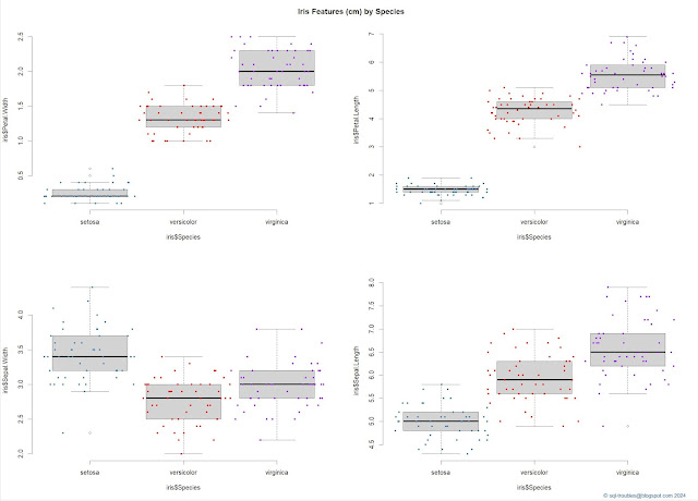
When working with a dataset that has several numeric features, it's useful to visualize it to understand the shapes of each feature, usually by category or in the case of the iris dataset by species. For this purpose one can use a combination between a boxplot and a stripchart to obtain a visualization like the one below (click on the image for a better resolution):

|
| Iris features by species (box & jitter plots combined) |
And here's the code used to obtain the above visualization:
par(mfrow = c(2,2)) #2x2 matrix display

boxplot(iris$Petal.Width ~ iris$Species)
stripchart(iris$Petal.Width ~ iris$Species
	, method = "jitter"
	, add = TRUE
	, vertical = TRUE
	, pch = 20
	, jitter = .5
	, col = c('steelblue', 'red', 'purple'))

boxplot(iris$Petal.Length ~ iris$Species)
stripchart(iris$Petal.Length ~ iris$Species
	, method = "jitter"
	, add = TRUE
	, vertical = TRUE
	, pch = 20
	, jitter = .5
	, col = c('steelblue', 'red', 'purple'))

boxplot(iris$Sepal.Width ~ iris$Species)
stripchart(iris$Sepal.Width ~ iris$Species
	, method = "jitter"
	, add = TRUE
	, vertical = TRUE
	, pch = 20
	, jitter = .5
	, col = c('steelblue', 'red', 'purple'))

boxplot(iris$Sepal.Length ~ iris$Species)
stripchart(iris$Sepal.Length ~ iris$Species
	, method = "jitter"
	, add = TRUE
	, vertical = TRUE
	, pch = 20
	, jitter = .5
	, col = c('steelblue', 'red', 'purple'))

mtext("© sql-troubles@blogspot.com 2024", side = 1, line = 4, adj = 1, col = "dodgerblue4", cex = .7)
title("Iris Features (cm) by Species", line = -2, outer = TRUE)
By contrast, one can obtain a similar visualization with just a command:
plot(iris, col = c('steelblue', 'red', 'purple'), pch = 20)
title("Iris Features (cm) by Species", line = -1, outer = TRUE)
mtext("© sql-troubles@blogspot.com 2024", side = 1, line = 4, adj = 1, col = "dodgerblue4", cex = .7)
And here's the output:

|
| Iris features by species (general plot) |
One can improve the visualization by using a bigger contrast between colors (I preferred to use the same colors as in the previous visualization).
I find the first data visualization easier to understand and it provides more information about the shape of data even it requires more work.
Histograms make it easier to understand the distribution of values, though the visualizations make sense only when done by species:

|
| Histograms of Setosa's features |
And, here's the code:
par(mfrow = c(2,2)) #2x2 matrix display
setosa = subset(iris, Species == 'setosa') #focus only on setosa
hist(setosa$Sepal.Width)
hist(setosa$Sepal.Length)
hist(setosa$Petal.Width)
hist(setosa$Petal.Length)
title("Setosa's Features (cm)", line = -1, outer = TRUE)
mtext("© sql-troubles@blogspot.com 2024", side = 1, line = 4, adj = 1, col = "dodgerblue4", cex = .7)
#installing plotrix & multcomp
install.packages("plotrix")
install.packages("plotrix")
library(plotrix)
library(multcomp)

par(mfrow = c(2,2)) #1x2 matrix display

histStack(iris$Sepal.Width
	, z = iris$Species
	, col = c('steelblue', 'red', 'purple')
	, main = "Sepal.Width"
	, xlab = "Width"
	, legend.pos = "topright")

histStack(iris$Sepal.Length
	, z = iris$Species
	, col = c('steelblue', 'red', 'purple')
	, main = "Sepal.Length"
	, xlab = "Length"
	, legend.pos = "topright")

histStack(iris$Petal.Width
	, z = iris$Species
	, col = c('steelblue', 'red', 'purple')
	, main = "Petal.Width"
	, xlab = "Width"
	, legend.pos = "topright")

histStack(iris$Petal.Length
	, z = iris$Species
	, col = c('steelblue', 'red', 'purple')
	, main = "Petal.Length"
	, xlab = "Length"
	, legend.pos = "topright")
title("Iris Features (cm) by Species - Histograms", line = -1, outer = TRUE)
mtext("© sql-troubles@blogspot.com 2024", side = 1, line = 4, adj = 1, col = "dodgerblue4", cex = .7)
par(mfrow = c(2,2)) #1x2 matrix display

hist(iris$Sepal.Width
	, main = "Sepal.Width"
	, xlab = "Width"
	, las = 1, cex.axis = .8, freq = F)
eq = density(iris$Sepal.Width) # estimate density curve
lines(eq, lwd = 2) # plot density curve

hist(iris$Sepal.Length
	, main = "Sepal.Length"
	, xlab = "Length"
	, las = 1, cex.axis = .8, freq = F)
eq = density(iris$Sepal.Length) # estimate density curve
lines(eq, lwd = 2) # plot density curve

hist(iris$Petal.Width
	, main = "Petal.Width"
	, xlab = "Width"
	, las = 1, cex.axis = .8, freq = F)
eq = density(iris$Petal.Width) # estimate density curve
lines(eq, lwd = 2) # plot density curve

hist(iris$Petal.Length
	, main = "Petal.Length"
	, xlab = "Length"
	, las = 1, cex.axis = .8, freq = F)
eq = density(iris$Petal.Length) # estimate density curve
lines(eq, lwd = 2) # plot density curve

title("Iris Features (cm) by Species - Density plots", line = -1, outer = TRUE)
mtext("© sql-troubles@blogspot.com 2024", side = 1, line = 4, adj = 1, col = "dodgerblue4", cex = .7)

|
| Iris features aggregated (histograms with density plots) |
par(mfrow = c(1,2)) #1x2 matrix display
plot(iris$Sepal.Width, iris$Sepal.Length, main = "Sepal Width vs Length", col = iris$Species)
plot(iris$Petal.Width, iris$Petal.Length, main = "Petal Width vs Length", col = iris$Species)
title("Iris Features (cm) by Species - Scatter Plots", line = -1, outer = TRUE)
mtext("© sql-troubles@blogspot.com 2024", side = 1, line = 4, adj = 1, col = "dodgerblue4", cex = .7)


No comments:
Post a Comment