21 August 2024

🧭Business Intelligence: Perspectives (Part IV: From Data to Storytelling II)

Business Intelligence Series

Being snapshots in people and organizations’ lives, data arrive to tell a story, even if the story might not be worth telling or might be important only in certain contexts. In fact each record in a dataset has the potential of bringing a story to life, though business people are more interested in the hidden patterns and “stories” the data reveal through more or less complex techniques. Therefore, data are usually tortured until they confess something, and unfortunately people stop analyzing the data with the first confession(s). 

Even if it looks like torture, data need to be processed to reveal certain characteristics, trends or patterns that could help us in sense-making, decision-making or similar specific business purposes. Unfortunately, the volume of data increases with an incredible velocity to which further characteristics like variety, veracity, volume, velocity, value, veracity and variability may add up. 

The data in a dashboard, presentation or even a report should ideally tell a story otherwise the data might not be worthy looking at, at least from some people’s perspective. Probably, that’s one of the reason why man dashboards remain unused shortly after they were made available, even if considerable time and money were invested in them. Seeing the same dull numbers gives the illusion that nothing changed, that nothing is worth reviewing, revealing or considering, which might be occasionally true, though one can’t take this as a rule! Lot of important facts could remain hidden or not considered. 

One can suppose that there are businesses in which something important seldom happens and an alert can do a better job than reviewing a dashboard or a report frequently. Probably an alert is a better choice than reporting metrics nobody looks at! 

Organizations usually define a set of KPIs (key performance indicators) and other types of metrics they (intend to) review periodically. Ideally, the numbers collected should define and reflect the critical points (aka pain points) of an organization, if they can be known in advance. Unfortunately, in dynamic businesses the focus can change considerably from one day to another. Moreover, in systemic contexts critical points can remain undiscovered in time if the set of metrics defined doesn’t consider them adequately. 

Typically only one’s experience and current or past issues can tell what one should consider or ignore, which are the critical/pain points or important areas that must be monitored. Ideally, one should implement alerts for the critical points that require a immediate response and use KPIs for the recurring topics (though the two approaches may overlap). 

Following the flow of goods, money and other resources one can look at the processes and identify the areas that must be monitored, prioritize them and identify the metrics that are worth tracking, respectively that reflect strengths, weaknesses, opportunities, threats and the risks associated with them. 

One can start with what changed by how much, what caused the change(s) and what further impact is expected directly or indirectly, by what magnitude, respectively why nothing changed in the considered time unit. Causality diagrams can help in the process even if the representations can become quite complex. 

The deeper one dives and the more questions one attempts to answer, the higher the chances to find a story. However, can we find a story that’s worth telling in any set of data? At least this is the point some adepts of storytelling try to make. Conversely, the data can be dull, especially when one doesn’t track or consider the right data. There are many aspects of a business that may look boring, and many metrics seem to track the boring but probably important aspects. 

18 August 2024

🧭Business Intelligence: Mea Culpa (Part III: Problem Solving)

Business Intelligence Series

I've been working for more than 20 years in BI and Data Analytics area, in combination with Software Engineering, ERP implementations, Project Management, IT services and several other areas, which allowed me to look at many recurring problems from different perspectives. One of the things I learnt is that problems are more complex and more dynamic than they seem, respectively that they may require tailored dynamic solutions. Unfortunately, people usually focus on one or two immediate perspectives, ignoring the dynamics and the multilayered character of the problems!

Sometimes, a quick fix and limited perspective is what we need to get started and fix the symptoms, and problem-solvers usually stop there. When left unsupervised, the problems tend to kick back, build up momentum and appear under more complex forms in various places. Moreover, the symptoms can remain hidden until is too late. To this also adds the political agendas and the further limitations existing in organizations (people, money, know-how, etc.).

It seems much easier to involve external people (individual experts, consultancy companies) to solve the problem(s), though unless they get a deep understanding of the business and the issues existing in it, the chances are high that they solve the wrong problems and/or implement the wrong solutions. Therefore, it's more advisable to have internal experts, when feasible, and that's the point where business people with technical expertise and/or IT people with business expertise can help. Ideally, one should have a good mix and the so called competency centers can do a great job in handling the challenges of organizations. 

Between business and IT people there's a gap that can be higher or lower depending on resources know-how or the effort made by organizations to reduce it. To this adds the nature of the issues existing in organizations, which can vary considerable across departments, organizations or any other form of establishment. Conversely, the specific skillset can be transmuted where needed, which might happen naturally, though upon case also considerable effort needs to be involved in the process.

Being involved in similar tasks, one may get the impression that one can do whatever the others can do. This can happen in IT as well on the business side. There can be activities that can be done by parties from the other group, though there are also many exceptions in both directions, especially when one considers that one can’t generalize the applicability and/or transmutation of skillset. 

A more concrete example is the know-how needed by a businessperson to use the BI infrastructure for answering business questions, and ideally for doing all or at least most of the activities a BI professional can do. Ideally, as part of the learning path, it would be helpful to have a pursuable path in between the two points. The mastery of tools helps in the process though there are different mindsets involved.

Unfortunately, the data-related fields are full of overconfident people who get the problem-solving process wrong. Data-based problem-solving resumes in gathering the right facts and data, building the right conceptual model, identifying the right questions to ask, collecting more data, refining methods and solutions, etc. There’s aways an easy wrong way to solve a problem!

The mastery of tools doesn’t imply the mastery of business domains! What people from the business side can bring is deeper insight in the business problems, though getting from there to implementing solutions can prove a long way, especially when problems require different approaches, different levels of approximations, etc. No tool alone can bridge such gaps yet! Frankly, this is the most difficult to learn and unfortunately many data professionals seem to get this wrong!

Previous Post <<||>> Next Post

16 August 2024

🧭Business Intelligence: Perspectives (Part III: From Data to Storytelling I)

Business Intelligence Series

Data is an amalgam of signs, words, numbers and other visual or auditory elements used together to memorize, interpret, communicate and do whatever operation may seem appropriate with them. However, the data we use is usually part of one or multiple stories - how something came into being, what it represents, how is used in the various mental and non-mental processes - respectively, the facts, concepts, ideas, contexts places or other physical and nonphysical elements that are brought in connection with.

When we are the active creators of a story, we can in theory easily look at how the story came into being, the data used and its role in the bigger picture, respective the transformative elements considered or left out, etc. However, as soon we deal with a set of data, facts, or any other elements of a story we are not familiar with, we need to extrapolate the hypothetical elements that seem to be connected to the story. We need to make sense of these elements and consider all that seems meaningful, what we considered or left out shaping the story differently. 

As children and maybe even later, all of us dealt with stories in one way or another, we all got fascinated by metaphors' wisdom and felt the energy that kept us awake, focused and even transformed by the words coming from narrator's voice, probably without thinking too much at the whole picture, but letting the words do their magic. Growing up, the stories grew in complexity, probably became richer in meaning and contexts, as we were able to decipher the metaphors and other elements, as we included more knowledge about the world around, about stories and storytelling.

In the professional context, storytelling became associated with our profession - data, information, knowledge and wisdom being created, assimilated and exchanged in more complex processes. From, this perspective, data storytelling is about putting data into a (business) context to seed cultural ground, to promote decision making and better understanding by building a narrative around the data, problems, challenges, opportunities, and further organizational context.

Further on, from a BI's perspective, all these cognitive processes impact on how data, information and knowledge are created, (pre)processed, used and communicated in organizations especially when considering data visualizations and their constituent elements (e.g. data, text, labels, metaphors, visual cues), the narratives that seem compelling and resonate with the auditorium. 

There's no wonder that data storytelling has become something not to neglect in many business contexts. Storytelling has proved that words, images and metaphors can transmit ideas and knowledge, be transformative, make people think, or even act without much thinking. Stories have the power to seed memes, ideas, or more complex constructs into our minds, they can be used (for noble purposes) or misused. 

A story's author usually takes compelling images, metaphors, and further elements, manipulates them to the degree they become interesting to himself/herself, to the auditorium, to the degree they are transformative and become an element of the business vocabulary, respectively culture, without the need to reiterate them when needed to bring more complex concepts, ideas or metaphors into being.  

A story can be seen as a replication of the constituting elements, while storytelling is a set of functions that operate on them and change the initial structure and content into something that might look or not like the initial story. Through retelling and reprocessing in any form, the story changes independently of its initial form and content. Sometimes, the auditorium makes connections not recognized or intended by the storyteller. Other times, the use and manipulation of language makes the story change as seems fit. 

Previous Post <<||>> Next Post

07 August 2024

🧭Business Intelligence: Perspectives (Part II: From Data to Data Models)

Business Intelligence Series

A data model can be defined as an abstract, self-contained, logical definition of the data structures available in a database or similar repositories. It’s typically an abstraction of the data structures underpinning a set of processes, procedures and business logic used for a predefined purpose. A data model can be formed also of unrelated micromodels, depicting thus various aspects of a business. 

The association between data and data models is bidirectional. Given a set of data, a data model can be built to underpin the respective data. Conversely, one can create or generate data based on a data model. However, in business setups a bidirectional relationship between data and the data model(s) underpinning them is more realistic as the business evolves. In extremis, the data model can be used to reflect a business’ needs, at least when the respective needs are addressed accordingly by extending the data model(s).

Given a set of data (e.g. the data stored in one or more spreadsheets or other type of files) there can be defined in theory multiple data models to reflect the respective data. Within a data model, the fields (aka attributes) are partitioned into a set of data entities, where a data entity is thus a nonunique grouping of attributes that attempt to define together one unitary aspect of the world. Customers, Vendors, Products, Invoices or Sales Orders are examples of such data entities, though entities can have a broader granularity (e.g. Customers can be modeled over several tables like Entity, Addresses, Contact information, etc.). 

From an operational database’s perspective, a data entity is based on one or more tables, though several entities can share some of the tables. From a BI artifact’s perspective, an entity should be easy to create from the underlying tables, with a minimal set of transformations. Ideally, the BI data model should be as close as possible to the needed entity for reporting, however an optimal solution lies usually somewhere in between. In this resides the complexity of modeling BI solutions – providing an optimal data model which can be easily built on the source tables, and which allows addressing all or at least most of the BI requirements.

In other words, we deal with two optimization problems of two distinct data models. On one side the business data model must be flexible enough to provide fast read/write operations while keeping the referential data’s granularity efficient. Conversely, a BI data model needs to abstract these entities and provide a fast way of processing the data, while making data reads extremely efficient. These perspectives must apply when we move to Microsoft Fabric too. 

The operational data layer must provide this abstraction, and in this resides the complexity of building optimal BI solutions. This is the layer at which the modeling problems need to be tackled. The challenge of BI and Analytics resides in finding an optimal data model that allows us to address most or ideally all the BI requirements. Several overlapping layers of abstraction may be built in the process.

Looking at the data modeling techniques used in notebooks and other similar solutions, data modeling has the chance of becoming a redundant practice prone to errors. Moreover, data models have a tendency of being multilayered and of being based on certain perspectives into the processes they model. Providing reliable flexible models involves finding the right view into the data for modeling aspects of the business. Database views allow us to easily model such perspectives, often in a unique way. Moving away from them just shifts the burden on the multiple solutions built around the base data, which can create other important challenges. 

Previous Post <<||>> Next Post

06 August 2024

🧭Business Intelligence: Perspectives (Part VI: On the Cusps of Complexity)

Business Intelligence Series

We live in a complex world, which makes it difficult to model and work with the complex models that attempt to represent it. Thus, we try to simplify it to the degree that it becomes processable and understandable for us, while further simplification is needed when we try to depict it by digital means that make it processable by machines, respectively by us. Whenever we simplify something, we lose some aspects, which might be acceptable in many cases, but create issues in a broader number of ways.

With each layer of simplification results a model that addresses some parts while ignoring some parts of it, which restricts models’ usability to the degree that makes them unusable. The more one moves toward the extremes of oversimplification or complexification, the higher the chances for models to become unusable.

This aspect is relevant also in what concerns the business processes we deal with. Many processes are oversimplified to the degree that we track the entry and exit points, respectively the quantitative aspects we are interested in. In theory this information should be enough when answering some business questions, though might be insufficient when one dives deeper into processes. One can try to approximate, however there are high chances that such approximations deviate too much from the value approximated, which can lead to strange outcomes.

Therefore, when a date or other values are important, organizations consider adding more fields to reflect the implemented process with higher accuracy. Unfortunately, unless we save a history of all the important changes in the data, it becomes challenging to derive the snapshots we need for our analyses. Moreover, it is more challenging to obtain consistent snapshots. There are systems which attempt to obtain such snapshots through the implementation of the processes, though also this approach involves some complexity and other challenges.

Looking at the way business processes are implemented (see ERP, CRM and other similar systems), the systems track the created, modified and a few other dates that allow only limited perspectives. The fields typically provide the perspectives we need for data analysis. For many processes, it would be interesting to track other events and maybe other values taken in between.

There is theoretical potential in tracking more detailed data, but also a complexity that’s difficult to transpose into useful information about the processes themselves. Despite tracking more data and the effort involved in such activities, processes can still behave like black boxes, especially when we have no or minimal information about the processes implemented in Information Systems.

There’s another important aspect - even if systems provide similar implementations of similar processes, the behavior of users can make an important difference. The best example is the behavior of people entering the relevant data only when a process closes and ignoring the steps happening in between (dates, price or quantity changes).

There is a lot of missing data/information not tracked by such a system, especially in what concerns users’ behavior. It’s true that such behavior can be tracked to some degree, though that happens only when data are modified physically. One can suppose that there are many activities happening outside of the system.

The data gathered represents only the projection of certain events, which might not represent accurately and completely the processes or users’ behavior. We have the illusion of transparency, though we work with black boxes. There can be a lot of effort happening outside of these borders.  

Fortunately, we can handle oversimplified processes and data maintenance, though one can but wonder how many important things can be found beyond the oversimplifications we work with, respectively what we miss in the process. 

Previous Post <<||>> Next Post

04 August 2024

📊Graphical Representation: Graphics We Live By (Part X: Pie and Donut Charts in Power BI and Excel)

Graphical Representation Series

Pie charts are loved and hated by many altogether, and there are many entitled reasons to use them and avoid them, though the most important criteria to evaluate them is whether they do the intended job in an acceptable manner, especially when compared to other representational means. The most important aspect they depict is the part to whole ratio, which even if can be depicted by other graphical tools, few tools are efficient in representing it. 

The pie chart works well as a visualization tool when it has only 3-5 values that are easily recognizable in the visualization, however as soon the size or the number of pieces vary considerably, the more difficult it is to visualize and interpret them, in case their representation has more negative than positive effects. There are many topics that form something like a long tail - the portion of the distribution having many occurrences far from the head or beginning. Displaying the items from the long tail together with the other components together can totally obscure the distribution of the items from the long tail as they become unrecognizable in the diagram. 

One approach to handle this is to group all the items from the long tail together under a piece (e.g. Other) and use a second form of representation to display them separately. For example,  Microsoft Excel offers a way to zoom in the section of a pie chart with small percentages by displaying them in a second pie chart (pie of pie) or bar chart (bar of pie), something like a "zoom in" perspective (see image below). Unfortunately, the feature seems to limit itself only to small percentages, and thus can't be used currently to offer a broader perspective. Ideally, it would be useful to zoom in on any piece of the pie, especially when the items are categorized as a hierarchy with two or even more levels. 


Unfortunately, even modern visualization tools offer limited features in displaying this kind of perspective into a flexible unitary visualization, and thus users are forced to use their creativity in providing proper solutions. In the below example the "Renewables" piece of pie is further broken down into several components of a full pie, an ensemble supposed to function as a single form of representation. With a bit of effort, the reader probably will understand the meaning behind the two pie charts, however the encoding of colors and other elements used are suboptimal in the decoding process. 

Pie Charts - Original Solution

In the above example, the arrow may suggest that in between the two donut charts exists a relationship, reflected also in the description provided, however the readers may still have difficulties in correctly interpreting the diagrams, especially when there's some kind of overlapping or other type of implied or unimplied resemblance. If the colors overlap or have other similarities, are they intentional? If the circles have the same size, does this observed resemblance have a meaning? The reader shouldn't bother himself with this type of questions, but see the resemblance and the meaning of the various elements with a minimum of effort while decoding a chart's elements. Of course, when the meaning is not clear, some guidance should be ideally provided!

Unfortunately, Power BI doesn't seem to have a similar visual like the one from Excel yet, however with a bit of effort one can obtain similar results, even if there are other minor or important limitations. For example, the lines between the two pie charts can't be drawn, so one is forced to use other encodings to show that there's a connection between the Renewable slice and the small pie chart. Moreover, the ensemble thus created isn't treated unitary and handled accordingly. Frankly, the maturity of a graphical representation environment can and should be judged also from this perspective!

The below representation built in Power BI uses a few tricks to display two pie charts together. The smaller pie chart representing the breakdown and pieces' colors are variations of parent's color, attempting to show that there's a relationship between the slice from the first chart and the pie chart with the details. Unfortunately, it wasn't possible to use similar lines like in Excel to show the relation between the two sections. 

Pie of Pie in Power BI

Instead of a pie chart, one can use a donut, like in the original representation. Even if the donut uses a smaller area for representation, in theory the pie chart offers a better basis for comparisons, at least in theory. Stacked column charts can be used as well (see C), however one loses the certainty that the pieces must add up to 100%. Further limitations can appear when one wants to achieve more with the visualizations.

Custom charts can be used as well. The pie chart coming from xViz (see D) allows to increase the size of a pie piece by using another radius, technique which could be used to highlight the piece represented in the second chart. Frankly, sunburst diagrams (see E) are better at representing the parent to child proportions, where the same color encoding has been used. Unfortunately, the more information is shown, the more loaded the visualization seems to be.

Pie of Pie Alternatives in Power BI I

A treemap can prove to be a better representation alternative because it encodes proportions in a unitary way, much like pie charts do, though it takes more space if one wants to make the labels visible. Radial charts (see G) and Aster plots (see I) can be occasionally better choices, especially because they use less space as they display only the main categories. A second diagram chart can be used to display the subcategories, much like in A and B. Sankey charts (see H) can be used as well, even if they don't allow representing any quantitative values unless one encodes them directly in the labels. 

Pie of Pie Alternatives in Power BI II

When one dives into the world of diagrams and goes behind the still limited representational choices provided by the standard tools, one can be surprised by the additional representational choices. However, their appropriateness should be considered against readers' skillset to read and interpret them! Frankly, the alternatives considered above could be a better choice when they will reach a representational maturity. 

Many thanks to Christopher Chin, who in his weekly post on data visualization blunders, suggested the examples used as basis for this post (see [1])!

Previous Post <<||>> Next Post

References:
[1] LinkedIn (2024) Christopher Chin's post (link)

15 June 2024

🗒️Graphical Representation: Bar & Column Charts (Notes)

Disclaimer: This is work in progress intended to consolidate information from various sources and may deviate from them. Please consult the sources for the exact content!
Last updated: 15-Jun-2024

Bar & Column Charts with Variations
Bar & Column Charts (Graphs) 

  • {definition} graphical representation of categorical data with rectangular figures (aka boxes) whose heights (column chart) or lengths (bar chart) are proportional to the values that they represent
  • {benefit} allow to visually encode/decode quantitative information-size as magnitude and area based on the relative position of the end of the box along the common scale
    • if the width of the box is the same, it's enough to compare the length
      • ⇒ the basis of comparison is one-dimensional [1]
      • ⇐ orient the reader to the relative magnitudes of the boxes
    • area is typically encoded when the width varies
      • ⇐ encoding by area is a poor encoding method as it can mislead
    • can represent negative and positive values 
    • one of the most useful, simple, and adaptable techniques in graphic presentation [1]
      • easily understood by readers
      • sometimes avoided because they are so common
      • almost everything could be a bar chart
    • the length of each bar is proportional to the quantity or amount of each category represented [1]
      • ⇒the zero line must be shown [1]
      • ⇒the scale must not be broken [1]
        • {exception} an excessively long bar in a series of bars may be broken off at the end, and the amount involved shown directly beyond it [1]
  • {benefit} allow to visually represent categorical data
    • ⇒ occasionally represented without scales, grid lines or tick marks
    • the more data elements are presented, the more difficult it becomes to navigate and/or display the data
  • {benefit} allow us to easily compare magnitudes 
    • sometimes without looking at the actual values
  • {type} bar chart
    • the box is shown horizontally
    • represents magnitude by length
    • allows comparing different items as of a specific time
  • {type} column chart
    • the box is shown vertically
    • represents magnitude by height
    • allows comparing different items over time
      • ⇐ it still displays discrete points
    • recommended for comparing similar items for different time periods [2]
    • effective way to show most types of comparisons [2]
  • {subtype} stacked chart
    • variation of bar/column charts in which the boxes of a dimension's components are staked over each other
      • {exception} spaces can be used between boxes if the values aren't cumulative [3]
    • {benefit} allows encoding a further dimension where the values are staked within the same box
    • {drawback} do not show data structure well
      • ⇒ make it challenging to compare values across boxes
  • {subtype} 100-percent chart
    • variation of stacked chart in which the magnitude totals to 100%
    • {benefit} allows to display part to whole relationships
      • ⇐ preferable to circle chart's angle and area comparison [1]
  • {subtype} clustered chart (aka grouped chart)
    • variation of bar/column charts that allows encoding further quantitative information in distinct boxes tacked together which occasionally overlap
      • ⇐ if there's space, it is usually kept to a minimum
      • e.g. can be used to display multiple data series 
    • can be used with a secondary axis
    • {benefit} allows comparisons within the cluster/group as well between clusters/groups
    • {drawback} more challenging to make comparisons across points
  • {subtype} area chart (variable-width/variwide chart/graph
    • variation of bar/column charts in which the height/width have significance being proportional to some measure or characteristics of the data elements represented [3]
    • {benefit} allow encoding a further dimension as part of the area
  • {subtype} deviation chart 
    • variation of bar/column charts that display positive and negative values 
  • {subtype} joined chart
    • variation of bar/column charts in which the boxes are tacked together
    • {benefit} allow to better use the space available 
  • {subtype} paired chart 
    • variation of bar/column charts in which the boxes are paired in mirror based on an axis
      • e.g. the values of one data series are displayed to the left, while the values for a second data series are displayed to the right 
    • {benefit} allows to study the correlation and/or other relationships between the values of two data series
    • the hidden axes can have different scales 
  • {subtype} circular chart (aka radial chart)
    • variation of bar/column charts in which the boxes are wrapped into a circle, the various categories being uniformly spaced along the radial or category axis [3]
    • the value scale can have any upper or lower value and can progress in either direction [3]
    • {benefit} useful to represent data that have a circular dimension in an aesthetic form
      • e.g. months, hours
  • {subtype} waterfall chart (aka progressing chart)
    • variation of bar/column charts in which the boxes are displayed progressively, the start of a box corresponding the end of the previous box 
    • time and activity charts can be considered as variations of this subtype [3]
    • {advantage} allows to determine cumulative values, respectively the increase/decrease between consecutive boxes
  • {subtype}composite chart (aka mixed chartcombination chart, overlay chart)
    • variation of bar/column charts in besides boxes are used other graphic types of encoding (line, area)
      • ⇐ the different data graphics are overlaid on one another [3]
    • {benefit} allows to improve clarity or highlight the relationships between several data series [3]
    • {drawback} overlaying can result in clutter 
  • used to  
    • display totals, averages or frequencies
    • display time series
    • display the relationship between two or more items
    • make a comparison among several items
    • make a comparison between parts and the whole
  • can be confounded with 
    • [histograms]
      • show distribution through the frequency of quantitative values against defined intervals of quantitative values
      • used for continuous numerical data or data that can be effectively modelled as continuous
      • it doesn't have spaces between bars
        • ⇐ older use of bar/column charts don't use spaces
        • if this aspect is ignored, histograms can be considered as a special type of area chart
    • [vertical line chart] (aka price chart, bar chart)
      • vertical line charts are sometimes referred as bar charts (see [3])
  • things to consider
    • distance between bars
      • the more distant the bars, the more difficult it becomes to make comparisons and the accuracy of judgment decreases
    • sorting
      • sorting the bars/columns by their size facilitates comparisons, though it can impede items' search, especially when there are many categories involved
        • {exception} not recommended for time series
    • clutter
      • displaying too many items in a cluster and/or too many labels can lead to clutter
      • {recommendation} display at maximum 3-4 clustered boxes
    • color
      • one should follow the general recommendations 
    • trend lines
      • can be used especially with time series especially to represent the linear regression line
    • dual axis
      • {benefit} allows to compare the magnitudes of two data series by employing a secondary axis
    • overlapping
      • overlapping boxes can make charts easier to read
    • symbols
      • can be used to designate reference points of comparison for each of the bars [3]
  • {alternative} pie chart
    • can be used to dramatize comparisons in relation to the whole [2]
    • one should consider the drawbacks 
  • {alternative} choropleth maps
    • more adequate for geographical dimensions
    • provide minimal encoding 
  • {alternative} line charts
    • can be much more informative
    • provides an optimal dat-ink ratio
    • reduces the chart junk feeling
  • {alternative} dot plots
    • are closer to the original data

References:
[1] Anna C Rogers (1961) "Graphic Charts Handbook"
[2] Robert Lefferts (1981) "Elements of Graphics: How to prepare charts and graphs for effective reports"
[3] Robert L Harris (1996) "Information Graphics: A Comprehensive Illustrated Reference"

14 June 2024

📊Graphical Representation: Graphics We Live By (Part IX: Word Clouds in Power BI)

Graphical Representation Series

A word cloud (aka tag cloud) is a visual representation of textual data in the form of a cloud - a mass of words in which each word is shown with a different font size and/or color based on its frequency, significance or categorization in the dataset considered. It is used to depict keyword metadata on websites, to visualize free form text or the frequency of specific values within a categorical dimension, respectively to navigate the same. 

Words can be categorized as single or compounded, where special characters like hyphen can be used. A tag is a special type of a word, usually a single word. One can use different direction or arrangement for displaying each word, independently of whether the value is numerical or alphanumerical. Word clouds are usually not sorted, even if the values could be sorted using a spiraled arrangement, which offers and easier way to navigate and compare the data.

Most of the representations are based on words' frequency, though occasionally the frequency is considered against a background corpus (e.g. Wikipedia). The use of tags as categorization methods for content items is seldom done, though needs to be considered as well. 

It makes sense to use word clouds only with categorical data (see below) for which the chances of multiple occurrences is high. Numerical values (see A & D) can be displayed as well when their range is narrow. Moreover, when the number of distinct values is high, one can consider only the top N values. Continuous data may be challenging to represent, though occasionally they can be represented as well, especially when reducing the precision

Word clouds allow to see at a glance what values are available and can be used as an alternative to choropleth maps for filtering and navigating the data. They aren't good for precise comparisons, though further information can be provided in the tooltip. 

In Power BI there are currently two visuals that allow to display word clouds - from Microsoft, respectively Powerviz, which was added recently (see Jun-2024 release [2]). They provide similar functionality, though Powerviz's visual offers more flexibility in what concerns the word options (case, styling, delimiters) direction, shapes (displaying the values within a form), ranking (top vs bottom), exclusion rules and formational formatting. It uses also a radial arrangement, which allows to select or exclude a set of values via the lasso functionality (see E). 

Word Clouds

Previous Post <<||>> Next Post

References:
[1] Wikipedia (2024) Tag cloud (link)
[2] Microsoft Power BI Blog (2004) Power BI June 2024 Feature Summary (link)


13 June 2024

🧭Business Intelligence: Microsoft Fabric (Part III: One Person Can’t Learn or Do Everything)

Business Intelligence Series

Today’s Explicit Measures webcast [1] considered an article written by Kurt Buhler (The Data Goblins): [Microsoft] "Fabric is a Team Sport: One Person Can’t Learn or Do Everything" [2]. It’s a well-written article that deserves some thought as there are several important points made. I can’t say I agree with the full extent of some statements, even if some disagreements are probably just a matter of semantics.

My main disagreement starts with the title “One Person Can’t Learn or Do Everything”. As clarified in webcast's chat, the author defines “everything" as an umbrella for “all the capabilities and experiences that comprise Fabric including both technical (like Power BI) or non-technical (like adoption data literacy) and everything in between” [1].

For me “everything” is relative and considers a domain's core set of knowledge, while "expertise" (≠ "mastery") refers to the degree to which a person can use the respective knowledge to build back-to-back solutions for a given area. I’d say that it becomes more and more challenging for beginners or average data professionals to cover the core features. Moreover, I’d separate the non-technical skills because then one will also need to consider topics like Data, Project, Information or Knowledge Management.

There are different levels of expertise, and they can vary in depth (specialization) or breadth (covering multiple areas), respectively depend on previous experience (whether one worked with similar technologies). Usually, there’s a minimum of requirements that need to be covered for being considered as expert (e.g. certification, building a solution from beginning to the end, troubleshooting, performance optimization, etc.). It’s also challenging to roughly define when one’s expertise starts (or ends), as there are different perspectives on the topics. 

Conversely, the term expert is in general misused extensively, sometimes even with a mischievous intent. As “expert” is usually considered an external consultant or a person who got certified in an area, even if the person may not be able to build solutions that address a customer’s needs. 

Even data professionals with many years of experience can be overwhelmed by the volume of knowledge, especially when one considers the different experiences available in MF, respectively the volume of new features released monthly. Conversely, expertise can be considered in respect to only one or more MF experiences or for one area within a certain layer. Lot of the knowledge can be transported from other areas – writing SQL and complex database objects, modelling (enterprise) semantic layers, programming in Python, R or Power Query, building data pipelines, managing SQL databases, etc. 

Besides the standard documentation, training sessions, and some reference architectures, Microsoft made available also some labs and other material, which helps discovering the features available, though it doesn’t teach people how to build complete solutions. I find more important than declaring explicitly the role-based audience, the creation of learning paths for the various roles.

During the past 6-7 months I've spent on average 2 days per week learning MF topics. My problem is not the documentation but the lack of maturity of some features, the gaps in functionality, identifying the respective gaps, knowing what and when new features will be made available. The fact that features are made available or changed while learning makes the process more challenging. 

My goal is to be able to provide back-to-back solutions and I believe that’s possible, even if I might not consider all the experiences available. During the past 22 years, at least until MF, I could build complete BI solutions starting from requirements elicitation, data extraction, modeling and processing for data consumption, respectively data consumption for the various purposes. At least this was the journey of a Software Engineer into the world of data. 

References:
[1] Explicit Measures (2024) Power BI tips Ep.328: Microsoft Fabric is a Team Sport (link)
[2] Data Goblins (2024) Fabric is a Team Sport: One Person Can’t Learn or Do Everything (link)

11 June 2024

🏭🧭Business Intelligence: Microsoft Fabric (Part I: Is Microsoft Fabric Ready?)

Business Intelligence Series

When writing a Business Case, besides the problem and solution(s) high-level descriptions, is important to roughly estimate how much it costs, how long it takes, respectively how many resources are needed and for what activities. A proof-of-concept (PoC) might not need an explicit business case, though the same high-level information is needed at least for the planning of resources and a formal approval.

Given that there are several analytical experiences in Microsoft Fabric (MF), it’s clear that can’t be anymore a reference architecture that can be recommended for customers. Frankly, that ship has sailed even since the introduction of Microsoft Synapse, if not earlier, with the movement to the cloud. Also, there’s no one size fits all as certain building blocks make sense only in certain scenarios (e.g. organization scale, data volume or source’s type). Moreover, even if MF has been generally available for quite some time, customers and service providers ask themselves whether the available features are enough for building analytics solutions based on it. 

“Is Fabric Ready?” was the topic of today’s Explicit Measures webcast [1]. Probably the answer is as usual “it depends” and the general recommendation is to do a PoC to check solution's feasibility. Conversely, MF may be the best approach to consider if integration with other systems (e.g. Dynamics 365, Dataverse) is needed. 

What the customers need are some rough realistic estimates they can base any planning upon (at least for a PoC if not for the whole project) in terms of making the data available into OneLake, building a semantic model, respectively processing and making the data available for consumption. Ideally, one needs a translation of the various steps as done earlier. For example, how long it takes to make the data available in OneLake, how long it takes to move the data physically or logically though the various layers, to build semantic models, etc. 

Probably, some things can be achieved in a matter of days, at least if one knows what one’s doing. However, we are talking here about a new architecture that may resemble for some of an unknow territory. Even if old and new techniques can be mixed, there are further implications or improvements that can be considered. There are many webcasts, blog posts and other material on how to do things, on what’s possible, though building a functioning solution from beginning to the end, even as PoC, requires more than putting all this together. 

Just making the data flow from point A to B or C is not enough - data security, data governance and a few other topics like scalability and availability need to be considered as well. Security and governance are also the areas in which probably more features must be considered. For many customers starting now with MF, the hope is that most of these features will be available during the time the solutions are ready for production.

From a cost perspective, there’s the cost of data at rest, in transit, the licensing for MF and the other components involved. Ideally, one should start small and increase capacities as needed, though small can vary from case to case, while it’s important to find out the optimum. Starting in the middle could be an alternative approach even if may involve higher costs. If one starts small, the costs for PoC can be neglectable, though sooner or later a compromise is needed to provide an acceptable performance. 

In terms of human resources, the topic is more complex (see [2]), and it depends largely on the nature of the project. The pool of skillsets is the most important constraint or enabler such projects can have.

Previous Post <<||>> Next Post

References:
[1] Explicit Measures (2024) Power BI tips Ep.327: Is Fabric Ready? (link)
[2] Explicit Measures (2024) Power BI tips Ep.321: Building and BI Team (link)

01 June 2024

📊Graphical Representation: Graphics We Live By (Part VIII: List of Items in Power BI)

Graphical Representation Series

Introduction

There are situations in which one needs to visualize only the rating, other values, or ranking of a list of items (e.g. shopping cart, survey items) on a scale (e.g. 1 to 100, 1 to 10) for a given dimension (e.g. country, department). Besides tables, in Power BI there are 3 main visuals that can be used for this purpose: the clustered bar chart, the line chart (aka line graph), respectively the slopegraph:

Main Display Methods

Main Display Methods

For a small list of items and dimension values probably the best choice would be to use a clustered bar chart (see A). If the chart is big enough, one can display also the values as above. However, the more items in the list, respectively values in the dimension, the more space is needed. One can maybe focus then only on a subset of items from the list (e.g. by grouping several items under a category), respectively choose which dimension values to consider. Another important downside of this method is that one needs to remember the color encodings. 

This downside applies also to the next method - the use of a line chart (see B) with categorical data, however applying labels to each line simplifies its navigation and decoding. With line charts the audience can directly see the order of the items, the local and general trends. Moreover, a line chart can better scale with the number of items and dimension values.

The third option (see C), the slopegraph, looks like a line chart though it focuses only on two dimension values (points) and categorizes the line as "down" (downward slope), "neutral" (no change) and "up" (upward slope). For this purpose, one can use parameters fields with measures. Unfortunately, the slopegraph implementation is pretty basic and the labels overlap which makes the graph more difficult to read. Probably, with the new set of changes planned by Microsoft, the use of conditional formatting of lines would allow to implement slope graphs with line charts, creating thus a mix between (B) and (C).

This is one of the cases in which the Y-axis (see B and C) could be broken and start with the meaningful values. 

Table Based Displays

Especially when combined with color encodings (see C & G) to create heatmap-like displays or sparklines (see E), tables can provide an alternative navigation of the same data. The color encodings allow to identify the areas of focus (low, average, or high values), while the sparklines allow to show inline the trends. Ideally, it should be possible to combine the two displays.  

Table Displays and the Aster Plot

One can vary the use of tables. For example, one can display only the deviations from one of the data series (see F), where the values for the other countries are based on AUS. In (G), with the help of visual calculations one can also display values' ranking. 

Pie Charts

Pie charts and their variations appear nowadays almost everywhere. The Aster plot is a variation of the pie charts in which the values are encoded in the height of the pieces. This method was considered because the data used above were encoded in 4 similar plots. Unfortunately, the settings available in Power BI are quite basic - it's not possible to use gradient colors or link the labels as below:

Source Data as Aster Plots

Sankey Diagram

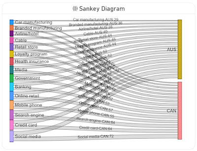
A Sankey diagram is a data visualization method that emphasizes the flow or change from one state (the source) to another (the destination). In theory it could be used to map the items to the dimensions and encode the values in the width of the lines (see I). Unfortunately, the diagram becomes challenging to read because all the lines and most of the labels intersect. Probably this could be solved with more flexible formatting and a rework of the algorithm used for the display of the labels (e.g. align the labels for AUS to the left, while the ones for CAN to the right).

Sankey Diagram

Data Preparation

A variation of the above image with the Aster Plots which contains only the plots was used in ChatGPT to generate the basis data as a table via the following prompts:

  • retrieve the labels from the four charts by country and value in a table
  • consolidate the values in a matrix table by label country and value
The first step generated 4 tables, which were consolidated in a matrix table in the second step. Frankly, the data generated in the first step should have been enough because using the matrix table required an additional step in DAX.

Here is the data imported in Power BI as the Industries query:

let
    Source = #table({"Label","Australia","Canada","U.S.","Japan"}
, {
 {"Credit card","67","64","66","68"}
, {"Online retail","55","57","48","53"}
, {"Banking","58","53","57","48"}
, {"Mobile phone","62","55","44","48"}
, {"Social media","74","72","62","47"}
, {"Search engine","66","64","56","42"}
, {"Government","52","52","58","39"}
, {"Health insurance","44","48","50","36"}
, {"Media","52","50","39","23"}
, {"Retail store","44","40","33","23"}
, {"Car manufacturing","29","29","26","20"}
, {"Airline/hotel","35","37","29","16"}
, {"Branded manufacturing","36","33","25","16"}
, {"Loyalty program","45","41","32","12"}
, {"Cable","40","39","29","9"}
}
),
    #"Changed Types" = Table.TransformColumnTypes(Source,{{"Australia", Int64.Type}, {"Canada", Int64.Type}, {"U.S.", Number.Type}, {"Japan", Number.Type}})
in
    #"Changed Types"

Transforming (unpivoting) the matrix to a table with the values by country:

IndustriesT = UNION (
    SUMMARIZECOLUMNS(
     Industries[Label]
     , Industries[Australia]
     , "Country", "Australia"
    )
    , SUMMARIZECOLUMNS(
     Industries[Label]
     , Industries[Canada]
     , "Country", "Canada"
    )
    , SUMMARIZECOLUMNS(
     Industries[Label]
     , Industries[U.S.]
     , "Country", "U.S."
    )
    ,  SUMMARIZECOLUMNS(
     Industries[Label]
     , Industries[Japan]
     , "Country", "Japan"
    )
)

Notes:
The slopechart from MAQ Software requires several R language libraries to be installed (see how to install the R language and optionally the RStudio). Run the following scripts, then reopen Power BI Desktop and enable running visual's scripts.

install.packages("XML")
install.packages("htmlwidgets")
install.packages("ggplot2")
install.packages("plotly")

Happy (de)coding!

29 May 2024

📊Graphical Representation: Graphics We Live By (Part VII: Reading a Conversion Rates Chart with ChatGPT and Copilot)

Graphical Representation Series

One of the areas where ChatGPT, Copilot and other similar AI-based chatbots can help is in summarizing a chart saved as image. Ideally, the chatbots should be able also to approximate the points from the chart as well (an image is made of pixels and thus areas should be easy to delimit). So, I was wondering how far the chatbots can be used for these purposes. I used first an image copied from the web, though I realized that not all visual elements could be read (e.g. Copilot had issues retrieving the values for some months) and I had no basis data for comparisons to identify how big the deviations are. 

So, I created a chart in Power BI based on the below chart (see original data):

Conversion Rates Dual Axes Chart

Here's the output based on Copilot over several attempts:
Original data First attempt Second attempt Third attempt Fourth attempt
Sorting Month Conv. Conv. Rate Conv. Conv. Rate Conv. Conv. Rate Conv. Conv. Rate Conv. Conv. Rate
1 Jul 8 4 10 1 10 1 8 4 8 4
2 Aug 280 16 275 15 275 15 275 18 275 18
3 Sep 100 13 225 12 225 10 225 12 225 12
4 Oct 280 14 275 12 275 11 275 11 275 11
5 Nov 90 4 75 5 75 6 75 6 75 6
6 Dec 85 3.5 100 5 100 5 100 5 100 5
7 Jan 70 4.5 50 3 50 3 50 4 50 4
8 Feb 30 1.5 50 3 25 2 50 2.5 50 2.5
9 Mar 70 4 25 1 50 2.5 25 1.5 25 1.5
10 Apr 185 11 200 10 200 10 200 10 200 10
11 May 25 3.5 50 4 50 4 50 3.5 50 3.5
12 Jun 195 4 225 10 225 10 225 11 195 4

Please note that same values were repeated to identify whether the chatbot is able to identify the resemblance correctly. 

Based on the data several tests were made with ChatGPT4o, where the following prompts were given:

  1. generate the data behind the chart as excel list (see 'First attempt' in the table)
  2. generate the data behind the chart as excel list where blue is represented on the left axis and orange on the right axis (see 'Second attempt');
  3. reevaluate the values from the previous output considering that the values for Jul are 8, respectively 4% (see 'Third attempt');
  4. reevaluate the values from the previous output considering that the values for Jun are 195, respectively 4% (see 'Fourth attempt');
  5. generate the data behind the dual axis chart as list from the last conversation;
  6. summarize the chart by revealing trends and other statistics.
From attempt to attempt, the values get closer to the original data, corrections being made, though there are points in the final output that diverge considerably. ChatGPT does generate a table which can be easily copied to MS Excel, and even gives some instructions on how to generate a dual axis chart. 

It's great that one can use data between sessions and improve maybe the output. ChatGPT's summary is better than expected and it leverages the latest corrections. However, the estimations need to improve so that the inferences can be correct. 

Here's the output based on the same prompts in Copilot:
Original data First attempt Second attempt Third attempt Fourth attempt
Sorting Month Conv. Conv. Rate Conv. Conv. Rate Conv. Conv. Rate Conv. Conv. Rate Conv. Conv. Rate
1 Jul 8 4 300 18 300 18 8 4 8 4
2 Aug 280 16 250 16 250 16 250 16 250 16
3 Sep 100 13 200 14 200 14 200 14 200 14
4 Oct 280 14 150 12 150 12 150 12 150 12
5 Nov 90 4 100 10 100 10 100 10 100 10
6 Dec 85 3.5 50 8 50 8 50 8 50 8
7 Jan 70 4.5 300 18 300 18 300 18 300 18
8 Feb 30 1.5 250 16 250 16 250 16 250 16
9 Mar 70 4 200 14 200 14 200 14 200 14
10 Apr 185 11 150 12 150 12 150 12 150 12
11 May 25 3.5 100 10 100 10 100 10 100 10
12 Jun 195 4 50 8 50 8 50 8 195 4

Copilot's estimations are higher than the ones made by ChatGPT and deviate more from the original data. No reevaluations are done between prompts for the other values. The summary provides information that can be used to complement ChatGPT's output. 

Overall, ChatGPT seems to perform better than Copilot, at least for this example (though we might talk here about different "generations"). Unfortunately, given that the estimations provided by both chatbots deviate considerably from the expectation, the output needs to be revised and corrected, which decreases the usability of such chatbots. In fact, one can use them to generate an initial set of data and correct then the deviations.

The outputs of other chatbots like Google's Gemini or Claude-3-Haiku (via Poe) can't be compared with the ones from ChatGPT or Copilot yet. Claude-3-Haiku does provide estimated values (even with comma), though they deviate considerably from the original data. 

It would be interesting to test how other charts and plots are processed by chatbots, respectively whether the various visual elements (e.g. gridlines, ticks, markers) make a difference.

Previous Post <<||>> Next Post

Related Posts Plugin for WordPress, Blogger...

About Me

My photo
Koeln, NRW, Germany
IT Professional with more than 24 years experience in IT in the area of full life-cycle of Web/Desktop/Database Applications Development, Software Engineering, Consultancy, Data Management, Data Quality, Data Migrations, Reporting, ERP implementations & support, Team/Project/IT Management, etc.