Introduction
I recently watched a webcast with Jeroen (Jay) ter Heerdt (see [2]) in which he introduces visual calculations, a type of DAX calculation that's defined and executed directly on a visual [1]. Visual calculations provide an approach of treating a set of data much like an Excel table, allowing to refer to any field available on a visual and write formulas, which simplifies considerably the solutions used currently for ranking records, running averages and other windowing functions.
The records behind a visual can be mentally represented as a matrix, while the visual calculations can refer to any column from the matrix, allowing to add new columns and include the respective columns in further calculations. Moreover, if a column is used in a formula, it's not recalculated as is the case of measures, which should improve the performance of DAX formulas considerably.
Currently, one can copy a formula between visuals and if the formula contains fields not available in the targeted visual, they are added as well. Conversely, it's possible to build such a visual, copy it and then replace the dimension on which the analysis is made (e.g. Customer with Product), without being needed to make further changes. Unfortunately, there are also downsides: (1) the calculations are visible only within the visual in which were defined; (2) currently, the visual's data can't be exported if a visual calculation is added; (3) no formatting is supported, etc.
Ranking and Differences
I started to build a solution based on publicly available sales data, which offers a good basis for testing the use of visual calculations. Based on a Power BI visual table made of [Customer Name], [Sales Amount], [Revenue] and [Total Discount], I've added several calculations:
-- percentages
Sales % = 100*DIVIDE([Sales Amount], COLLAPSE([Sales Amount], ROWS))
Revenue % = 100*DIVIDE([Revenue],[Sales Amount])
Discount % = 100*DIVIDE([Total  Discount], [Total  Discount]+[Sales Amount])

-- rankings
Rank Sales = Rank(DENSE, ORDERBY([Sales Amount], DESC))
Rank Revenue = Rank(DENSE, ORDERBY([Revenue], DESC))

-- differences between consecutive values
Diff. to Prev. Sales = IF([Rank Sales]>1, INDEX([Rank Sales]-1, , ORDERBY([Sales Amount], DESC)) - [Sales Amount] , BLANK())
Diff. to Prev. Rev. = IF([Rank Revenue]>1, INDEX([Rank Revenue]-1, , ORDERBY([Revenue], DESC)) - [Revenue] , BLANK())
Here's the output considered only for the first 10 records sorted by [Sales Amount]:
| Customer Name | Sales Amount | Sales % | Revenue | Revenue % | Total Discount | Discount % | Rank Sales | Diff. to Prev. Sales. | Rank Rev. | Diff. to Prev. Rev. |
| Medline | 1058923.78 | 3.76 | 307761.99 | 3.75 | 126601.02 | 10.68 | 1 | 1 | ||
| Ei | 707663.21 | 2.51 | 229866.98 | 2.8 | 95124.09 | 11.85 | 2 | 351260.57 | 2 | 77895.01 |
| Elorac, Corp | 702911.91 | 2.49 | 209078.76 | 2.55 | 83192.39 | 10.58 | 3 | 4751.3 | 6 | 20788.22 |
| Sundial | 694918.98 | 2.47 | 213362.1 | 2.6 | 78401.72 | 10.14 | 4 | 7992.93 | 4 | -4283.34 |
| OUR Ltd | 691687.4 | 2.45 | 196396.26 | 2.4 | 78732.2 | 10.22 | 5 | 3231.58 | 10 | 16965.84 |
| Eminence Corp | 681612.78 | 2.42 | 213002.78 | 2.6 | 86904.03 | 11.31 | 6 | 10074.62 | 5 | -16606.52 |
| Apotheca, Ltd | 667283.99 | 2.37 | 157435.56 | 1.92 | 101453.91 | 13.2 | 7 | 14328.79 | 31 | 55567.22 |
| Rochester Ltd | 662943.9 | 2.35 | 224918.2 | 2.74 | 81158.11 | 10.91 | 8 | 4340.09 | 3 | -67482.64 |
| ETUDE Ltd | 658370.48 | 2.34 | 205432.79 | 2.51 | 89322.72 | 11.95 | 9 | 4573.42 | 9 | 19485.41 |
| Llorens Ltd | 646779.31 | 2.29 | 206567.4 | 2.52 | 82897.59 | 11.36 | 10 | 11591.17 | 8 | -1134.61 |
Comments:
1) One could use [Total Amount] = [Total Discount]+[Sales Amount] as a separate column.
2) The [Rank Sales] is different from the [Rank Rev.] because of the discount applied.
3) In the last two formulas a blank was considered for the first item from the ranking.
4) It's not possible to control when the totals should be displayed, however one can change the color for the not needed total to match the background.
Visualizing Differences
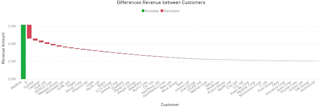
Once the formulas are added, one can hide the basis columns and visualize the data as needed. To obtain the below chart I copied the visual and changed the column as follows:
Diff. to Prev. Rev. = IF([Rank Revenue]>1, [Revenue]- INDEX([Rank Revenue]-1, , ORDERBY([Revenue], DESC)) , [Revenue]) -- modified column
 |
Sales Amount (SMA) = MOVINGAVERAGE([Sales Amount],6)
Revenue (SMA) = MOVINGAVERAGE([Revenue],6)
2) "Show items with not data" feature seems to be disabled when visual calculations are used.
Running Sales Amount = RUNNINGSUM([Sales Amount])
Previous Post <<||>> Next Post
References:
[1] Microsoft Learn (2024) Power BI: Using visual calculations [preview] (link)
[2] SSBI Central (2024) Visual Calculations - Making DAX easier, with Jeroen ter Heerdt (link)


