25 April 2024

📊Graphical Representation: Graphics We Live By (Part III: Exchange Rates in Power BI)

Graphical Representation Series

An exchange rate (XR) is the rate at which one currency will be exchanged for another currency, and thus XRs are used in everything related to trades, several processes in Finance relying on them. There are various sources for the XR like the European Central Bank (ECB) that provide the row data and various analyses including graphical representations varying in complexity. Conversely, XRs' processing offers some opportunities for learning techniques for data visualization. 

On ECB there are monthlyyearly, daily and biannually XRs from EUR to the various currencies which by triangulation allow to create XRs for any of the currencies involved. If N currencies are involved for one time unit in the process (e.g. N-1 XRs) , the triangulation generates NxN values for only one time division, the result being tedious to navigate. A matrix like the one below facilitates identifying the value between any of the currencies:


The table needs to be multiplied by 12, the number of months, respectively by the number of years, and filter allowing to navigate the data as needed. For many operations is just needed to look use the EX for a given time division. There are however operations in which is needed to have a deeper understanding of one or more XR's evolution over time (e.g. GBP to NOK). 

Moreover, for some operations is enough to work with two decimals, while for others one needs to use up to 6 or even more decimals for each XR. Occasionally, one can compromise and use 3 decimals, which should be enough for most of the scenarios. Making sense of such numbers is not easy for most of us, especially when is needed to compare at first sight values across multiple columns. Summary tables can help:

Statistics like Min. (minimum), Max. (maximum), Max. - Min. (range), Avg. (average) or even StdDev. (standard deviation) can provide some basis for further analysis, while sparklines are ideal for showing trends over a time interval (e.g. months).

Usually, a heatmap helps to some degree to navigate the data, especially when there's a plot associated with it:

In this case filtering by column in the heatmap allows to see how an XR changed for the same month over the years, while the trendline allows to identify the overall tendency (which is sensitive to the number of years considered). Showing tendencies or patterns for the same month over several years complements the yearly perspective shown via sparklines.

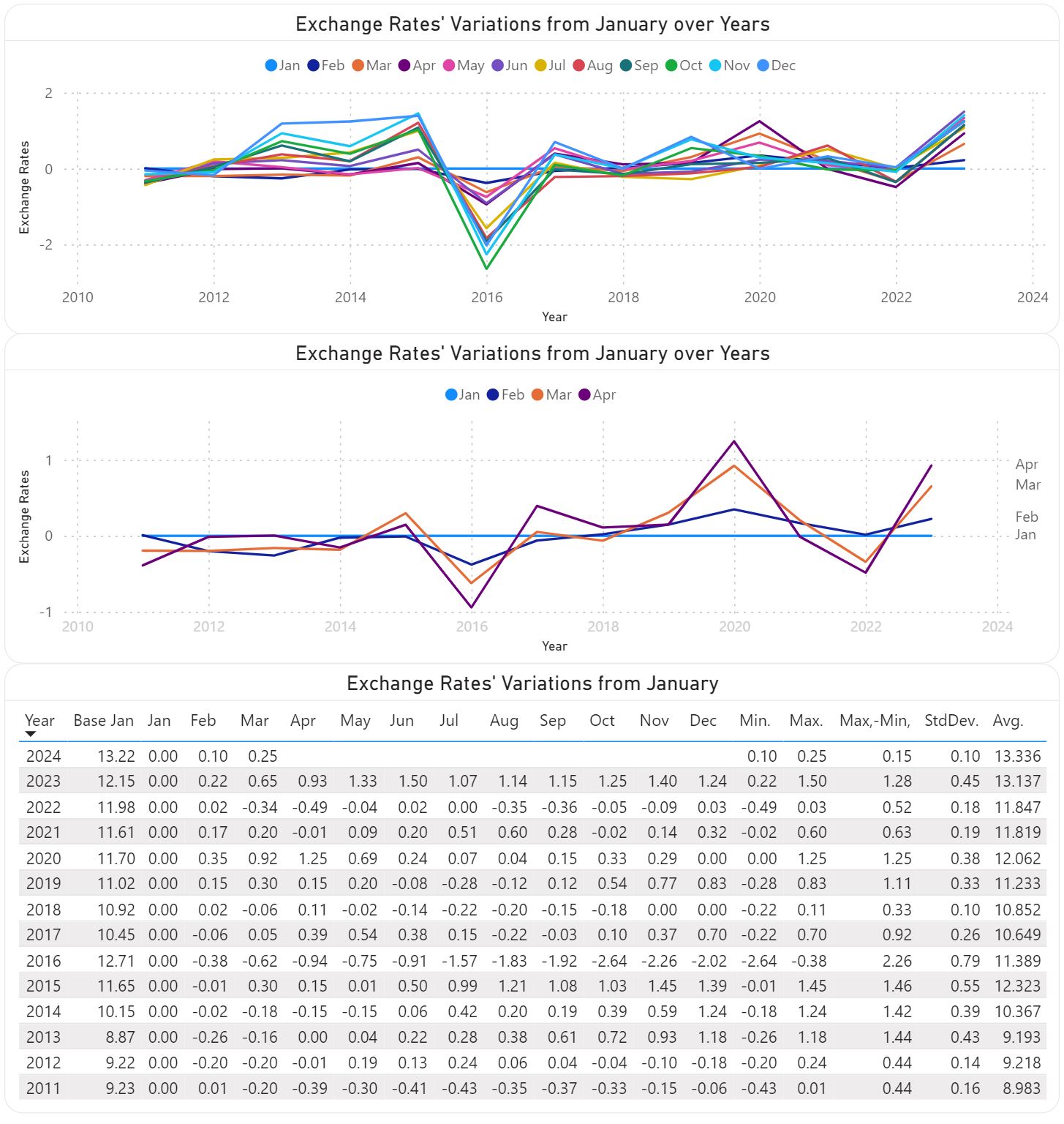
Fortunately, there are techniques to reduce the representational complexity of such numbers. For example, one can use as basis the XRs for January (see Base Jan), and represent the other XRs only as differences from the respective XR. Thus, in the below table for February is shown the XR difference between February and January (13.32-13.22=0.10). The column for January is zero and could be omitted, though it can still be useful in further calculations (e.g. in the calculation of averages) based on the respective data..

This technique works when the variations are relatively small (e.g. the values vary around 0). The above plots show the respective differences for the whole year, respectively only for four months. Given a bigger sequence (e.g. 24, 28 months) one can attempt to use the same technique, though there's a point beyond which it becomes difficult to make sense of the results. One can also use the year end XR or even the yearly average for the same, though it adds unnecessary complexity to the calculations when the values for the whole year aren't available. 

Usually, it's recommended to show only 3-5 series in a plot, as one can better distinguish the trends. However, plotting all series allows to grasp the overall pattern, if any. Thus, in the first plot is not important to identify the individual series but to see their tendencies. The two perspectives can be aggregated into one plot obtained by applying different filtering. 

Of course, a similar perspective can be obtained by looking at the whole XRs:

The Max.-Min. and StdDev (standard deviation for population) between the last and previous tables must match. 

Certain operations require comparing the trends of two currencies. The first plot shows the evolution NOK and SEK in respect to EUR, while the second shows only the differences between the two XRs:


The first plot will show different values when performed against other currency (e.g. USD), however the second plot will look similarly, even if the points deviate slightly:

Another important difference is the one between monthly and yearly XRs, difference depicted by the below plot:

The value differences between the two XR types can have considerable impact on reporting. Therefore, one must reflect in analyses the rate type used in the actual process. 

Attempting to project data into the future can require complex techniques, however, sometimes is enough to highlight a probable area, which depends also on the confidence interval (e.g. 85%) and the forecast length (e.g. 10 months):

Every perspective into the data tends to provide something new that helps in sense-making. For some users the first table with flexible filtering (e.g. time unit, currency type, currency from/to) is enough, while for others multiple perspectives are needed. When possible, one should  allow users to explore the various perspectives and use the feedback to remove or even add more perspectives. Including a feedback loop in graphical representation is important not only for tailoring the visuals to users' needs but also for managing their expectations,  respectively of learning what works and what doesn't.

Comments:
1) I used GBP to NOK XRs to provide an example based on  triangulation.
2) Some experts advise against using borders or grid lines. Borders, as the name indicates allow to delimitate between various areas, while grid lines allow to make comparisons within a section without needing to sway between broader areas, adding thus precision to our senses-making. Choosing grey as color for the elements from the background minimizes the overhead for coping with more information while allowing to better use the available space.
3) Trend lines are recommended where the number of points is relatively small and only one series is involved, though, as always, there are exceptions too. 
4) In heatmaps one can use a gradient between two colors to show the tendencies of moving toward an extreme or another. One should avoid colors like red or green.
5) Ideally, a color should be used for only one encoding (e.g. one color for the same month across all graphics), though the more elements need to be encoded, the more difficult it becomes to respect this rule. The above graphics might slightly deviate from this as the purpose is to show a representation technique. 
6) In some graphics the XRs are displayed only with two decimals because currently the technique used (visual calculations) doesn't support formatting.
7) All the above graphical elements are based on a Power BI solution. Unfortunately, the tool has its representational limitations, especially when one wants to add additional information into the plots. 
8) Unfortunately, the daily XR values are not easily available from the same source. There are special scenarios for which a daily, hourly or even minute-based analysis is needed.
9) It's a good idea to validate the results against the similar results available on the web (see the ECB website).

Previous Post  <<||>> Next Post

20 April 2024

⚡️🗒️Power BI: Visual Calculations [Notes]

Disclaimer: This is work in progress intended to consolidate information from various sources for learning purposes. For the latest information please consult the documentation (see the links below)! 

Last updated: 4-Jul-2026

[feature] Visual Calculations (aka Visual Calcs)

  • {definition} a type of DAX calculation that's defined and executed in the scope of a visual [1] [5]
  • are new columns added to this virtual table of filtered and aggregated data, which is not directly connected to the rest of the semantic model [5]
  • {benefit} make it easier to create calculations (that were previously hard to create) 
    • leads to simpler DAX, easier maintenance, and better performance [1]
    • reuse the results from its components [2]
    • simpler than measures, more trustworthy than Excel [5]
  • {benefit} the visual context in which they operate not only describes what data is on the visual (which is then iterated over in a row context) but also the structure of the visual 
    • ⇒a visual calculation can refer to the axes of a visual, such as the x-axis or the y-axis instead of the actual field [5]
    • ⇐ enables visual calculations to be highly flexible [5]
      • ⇐ a visual calculation can continue to work even if the field that is on the x-axis changes by simply referring to the axis instead of the actual field [5]
  • {benefit} highly visual [5] always show the data the calculation works on, and tools are provided to easily validate the results [5]
  • {benefit} should perform better than measures 
    • ⇐because they’re executed as part of the DAX query to fetch the results instead of independently [5]
  • a single query is sent to the source 
    • ⇐ no such guarantee exists for analysis that relies on measures [5] 
    • ⇐ how pronounced the effects are depends on the size of your data and the complexity of the DAX used [5]
  • defined and evaluated only on the filtered and aggregated data that is visible in the visual and thus in the visual matrix in which the visual calculation is created [5] aka calculations table that’s defined in the DAX query [5]
  • evaluate at runtime (like measures do) 
  • ⇒they can be fully dynamic in the context of the visual [5]
  • {limitation} unaware of the semantic model (as they are not part of the semantic model) [5]
    • ⇒ DAX functions that perform actions on that model don’t work (return an error) [5]
      •  e. g. RELATED, USERELATIONSHIP
  • {limitation} can’t be reused across multiple reports [5] 
    • ⇒ leads to code duplication [5]
    • <-- only live on the visual, which will avoid cluttering of the semantic model [5]
    • they’re saved in the metadata of the report, inside the visual definition. [5]
    • can only be used inside one report and that definitions cannot be shared across multiple reports that share the same semantic model [5]
  • (limitation) do not work together with the 'show items with no data' option, because it would result in performance issues.[5]
  • {recommended} create measures for any key calculations that should be reused across multiple reports [5]
  • {default} executed on a row-by-row basis, much like a calculated column [5]
    • calculated on the fly, like a measure [5]
    • are stored on the visual
    • ⇒aren’t part of the semantic model [5]
    • ⇒can refer to any data in the visual 
      • incl. columns, measures, or other visual calculations [1]
    • ⇒ anything in the model must be added to the visual before the visual calculation can refer to it [1]
    • ⇒ no need to worry about filter context [5]
    • the filter context dictates what the measures and fields on the visual return, and the visual calculation takes those values as input for its evaluation [5]
      • ⇐ a visual calculation is only indirectly affected by filter context, not directly, the way a measure or field reference is [5]
    •  ⇒ they can refer to the visual structure
      • ⇒ leads to more flexibility
  • combine the simplicity of context from calculated columns with the on-demand calculation flexibility from measures [1]
    • ⇐ the context is 'visible'
    • share behaviors with calculated columns and measures but also have important differences, particularly in how they can be used, where they are stored, and when they are computed [5]
  • operate on aggregated data instead of the detail level [1]
    • ⇒ leads to performance benefits
  • introduce a set of functions specific to visual calculations [1]
    • {category} medium-level functions
      • {function} COLLAPSE
        • the calculation is evaluated at a higher level of the axis [1]
        • navigate to a higher level in the lattice formed by the fields on the axes of the visual matrix [5] 
        • most often used for percentage of parent, grandparent, and total calculations [5]
      • {function} COLLAPSEALL
        • the calculation is evaluated at the total level of the axis [1]
        • does not take extra parameters because it always moves to the highest level on the axis [5] navigate to the highest level of the lattice on the axis specified [5]
      • {function} EXPAND
        • the calculation is evaluated at a lower level of the axis [1]
        • navigate to a lower level in the lattice formed by the fields on the axes of the visual matrix [5]
        • often used for aggregated descendant averages [5]
        • the reverse of COLLAPSE
      • {function}EXPANDALL
        • the calculation is evaluated at the leaf level of the axis [1]
        • always moves down to the lowest level (leaf level) on the axis and doesn’t take these parameters [5]
        • the reverse of COLLAPSEALL [5]
      • {function} FIRST
        • retrieves a value from the first element on a specified axis [5]
        • often used to compare against a base period or entity [5]
        • retrieves the value of the column in the first element on the specified axis since the last time the calculation was reset [5]
        • an easier-to-use shortcut to the INDEX function with the position parameter set to 1 [5]
      • {function} ISATLEVEL
        • checks whether specified columns are on the current level of the axis [5]
        • returns a Boolean (True/False) value
        • guaranteed to work correctly in visual calculations with functions that navigate the levels of the lattice [5]
        • unlike ISINSCOPE, ISFILTERED inspection functions [5]
      • {function} LAST
        • refers to the last row of an axis [1]
        • retrieves a value from the last element on a specified axis [5]
        • the reverse of FIRST
        • often used to compare against the most recent entry [5]
      • {function} LOOKUP
        • evaluates an expression with a value from a cell in the provided visual matrix using filters [5]
        • anything that is not specified is inferred from the context [5]
        • often used to compare against a specific value in the visual matrix [5]
      • {function} LOOKUPWITHTOTALS
        • uses the total for any filter that is not specified [5]
        • returns the value of the expression provided at the specified coordinates after filters have been applied [5]
          • any filter that is not specified is treated as referring to the total
          • if no single value can be determined, an error is returned [5]
          • ⇐ instead of using the context to infer any filter that is not specified like LOOKUP does [5]
        • relies on absolute navigation in the visual matrix [5]
          • ⇐ COLLAPSE and COLLAPSEALL rely on relative navigation on the lattice [5]
            • ⇐ upon case can be used to retrieve same result [5]
      • {function} NEXT
        • retrieves a value from a next element on a specified axis [5]
        • retrieves the value of the column from a next element on the specified axis since the last time the calculation was reset [5]
        • provides a shortcut to the OFFSET function with a positive value provided for the delta parameter [5]
      • {function} PREVIOUS
        • retrieves a value from a previous element on a specified axis [5]
        • retrieves the value of the column from an earlier element on the specified axis since the last time the calculation was reset [5]
        • provides a shortcut to the OFFSET function with a negative value provided for the delta parameter [5]
      • {function} RANGE
        • provides a range of rows relative from the current position on the axis [5]
        • shortcut to WINDOW 
        • returns a context 
          • ⇒ it must be used with other functions, such as CALCULATE, to actually perform a calculation [5]
        • often employed to calculate a moving sum [5]
    • {category} high-level functions
      • {function} MOVINGAVERAGE
        • adds a moving average on an axis [1]
        • involves selecting a slice of the values on an axis and returning the average over that slice [5]
        • most often used to calculate averages across periods [5]
        • provides an easier-to-use shortcut to the WINDOW function [5]
      • {function} RUNNINGSUM
        • returns the sum of all values in a column on the axis since the last time the calculation was reset, up to and including the current value [5]
          • if no reset is defined, RUNNINGSUM starts at the top of the visual matrix and continues to the end, following the sort order [5]
        • created specifically for visual calculations [5]
          • often used for Pareto analysis [5]
        • provides an easier-to-use shortcut to the WINDOW function [5]
        • it’s possible to write a running sum in a measure, though the code becomes more complex to write [5] 
          • ⇐ include explicit references to columns on which the calculation works [5]
            • ⇒if the user changes the columns on the visual, the measure will return unexpected results and will have to be updated to reflect the changes [5]
    • {category} low-level functions
      • ⇐ {exception} are available in standard DAX
      • these functions are easier to use, though they are less flexible than their foundational counterparts [5]
      • {recommendation} rewrite visual calculation using DAX for more flexibility [5]
        • {recommendation} start with the easier-to-use visual calculations exclusive functions and resort to other functions only when needed [5]
    • {category}foundational functions
      • {parameter} relation 
        • table expression that defines from which output a value is returned, namely a table expression [5]
        • name of a table or a DAX statement that returns a table, such as ADDCOLUMNS or SUMMARIZECOLUMNS
        • any columns specified in the partitionBy parameter must come from the relation parameter or from a related table [5]
      • {parameter} orderBy
        • specifies how each partition on the relation or axis is sorted [5]
        • accepts only the ORDERBY function
        • partitions are defined by using either partitionBy or reset [5]
        • {default} ordering by every column that is in the relation or on the axis that is not specified in partitionBy or reset [5]
      • {parameter} blanks
        • specify how blank values on the axis should be ordered while the calculation traverses the axis (in a visual calculation) or the relation [5]
        • does not sort anything in the values of the visual matrix (e.g. visual calculations or measures) [5] it sorts the values of the fields on the axis used [5]
        • {value} DEFAULT
          • indicates that blank numerical values are ordered between zero and negative values. For blank textual values, the blank values are ordered before all text values, including empty text values [5]
        • {value} FIRST 
          • blank values are always ordered at the beginning, regardless of ascending or descending sorting order [5]
        • {value] LAST 
          • blank values are always ordered at the end, regardless of ascending or descending sorting order [5]
      • {parameter} partitionBy
        • specifies how the relation or axis is partitioned [5]
        • accepts the PARTITIONBY function [5]
        • {recommendation} use reset instead of partitionBy  
          • ⇐ it’s the easiest way of achieving the same result [5]
      • {parameter} matchBy
        • defines how to match data to identify unique rows [5]
        • use this parameter if you do not have anything that can uniquely identify the rows in your relation (aka composite key) [5]
        • when using axis in visual calculations, there's not need to use matchBy in visual calculations because the axis always has unique identifiers [5]
          • if no matchBy is specified and the columns in orderBy and partitionBy cannot uniquely identify every row in the relation, the foundational function will try to find the least number of additional columns required to uniquely identify the rows and append these to the orderBy value (even if you did not specify orderBy) [5] 
      • {parameter} resets
        • accepts the MATCHBY function
        • available only for visual calculations
        • the calculation is reset by dividing the data on the axis into slices, the same way partitionBy does [5]
        • {limitation} one cannot specify both reset and partitionBy
          • one can think of the reset parameter as being mapped to the partitionBy parameter, however reset automatically includes parent levels and partitionBy does not [5]
      • {function} INDEX
        • returns a row in an absolute position
        • position parameter defines the absolute position on the relation or axis from which to obtain the data.
      • {function} OFFSET
        • returns a row in a relative position
        • {parameter} delta
          • specifies the relative position on the relation or axis from which to obtain the data [5]
          • when specifying a delta that causes a relative movement that does not exist on the partition, when specifying  0 or BLANK(), then OFFSET will not perform a relative movement, and the context is set to the current row [5]
          • any DAX expression that returns a scalar value is valid [5]
      • {function} RANK
        • provides a ranking of each row within a partition, sorted by the specified sort order [5]
        • returns a blank value for total rows when used in measures but returns a value on those rows when used in visual calculations [5]
        • expects a table and applies an expression to rank the rows in the table [5]
        • {warning} it's not the column-based version of RANKX [5]
        • {parameter} ties parameter
          • {value|default} SKIP
            • if two rows end up with the same rank, they will both be assigned the same rank and the next rank number will be skipped [5]
          • {value}DENSE
            • the next rank number will not be skipped [5]
      • {function} ROWNUMBER
        • returns a unique ranking of each row within a partition, sorted by the specified sort order [5]
        • returns an error if it cannot uniquely identify each row [5]
          • ⇒ guarantees that the same number will never be assigned twice [5]
      • {function}WINDOW
        • returns multiple rows, which are positioned at a selectable absolute or relative interval [5]
        • {parameter} from
          • indicate where the window start
        • {parameter} to
          • indicate where the window ends
        • {parameter} from_type
          • specifies whether the window starts at either 
          • {default} relative position (REL)
            • then a negative value provided for this parameter specifies the number of rows to go back from the current position to get the first (or last) row in the window [5]
          • absolute position (ABS) [4]
            • indicate the 1-based absolute position in the current partition of the start and end of the window [4]
            • 1= first row, -1 = last row
        • {parameter} to_type
          • see from_type
      • {category} supportive functions
        • used as inputs to specific foundational function parameters with the same name [5]
        • on their own, these functions provide no value [5]
        • {recommendation) specify an axis value for the relation parameter and use reset as needed when using foundational functions in visual calculations [5]
      • {function} ORDERBY
        • define the sorting order within each partition of the relation or axis on which the function operates [5]
      • {function} PARTITIONBY
        • indicates if and how to slice up the data in the relation or axis on which the foundational function operates [5]
        • it can be skept if no slices are defined [5]
      • {function} MATCHBY
        • instruct DAX on how to determine the current row [5]
  • {category} shared functions
    • DAX functions which are shared across all experiences [5]
  • {category} exclusive functions 
    • functions introduced in DAX solely for visual calculations [5]
  • {category} blocked functions 
    • functions that reach out to the model [5]
  • {default} most of them are evaluated row-by-row [1]
    • ⇐ like a calculated column
    • there's no need to add an aggregation function [1]
      •  it's better not to add such aggregates when they're not necessary [1]
  • {operation} create calculation
    • adds the visual calculation to the visual
    • it's possible to create visual calculations directly in the service [5]
    • allows to create very complex visual calculations in steps and hide any irrelevant intermediate results [5]
    • creation is not traced as activity in audit logs but is covered in a generic activity named Update Report Content [5]
  • {operation} hide calculation
    • calculations that aren't needed in the visual can be hidden [2]
    • hidden fields enable users to hide elements from the visual [5]
  • {operation} copy calculation
    • copies the calculation between visuals and if intermediary steps are not there, they will be copied as well [planned] [2]
  • {operation} formatting 
    • ⇐do not take on the format of any measures used to create them [5]
  • {operation} view a visual as a visual matrix 
    • enables users to add more calculations, which can be seen as new columns in the visual matrix [5]
  • {feature} templates 
    • ready available calculation constructs 
    • {benefit} make it easier to write common calculations [1]
  • {feature|planned} support for Scanner API [2]
  • {feature} explore
    • new experience that allows to explore data in a focused way [4]
    • allows adding visual calculations to visuals [4]
  • {feature} parameter pickers
    • allows to create visual calculations faster by picking parameters [3]
    • {limitation} only available for required parameters on functions that are exclusive to visual calculations (and select other functions) that have a defined list of options [3]
      •  required parameters that can take any text, or numerical value will not get a parameter picker, and neither will many DAX functions [3]
  • {feature} visual preview 
    • shows users what the visual will look like when leaving the visual calculations edit mode and returning to the report [5]
    • allows users to see what impact newly added visual calculations have on the visual, and how the visual will look like if certain measures or visual calculations are hidden [5]
  • {feature} visual matrix
    • the data representation of your visual 
      • ⇐ shows you the outcomes of all newly added calculations [5] 
      • ⇐ the simplest representation of the data used to create the visual [5]
    • offers a way to structure data dynamically based on rows and columns in a WYSIWYG fashion [5]
    • doesn't display any formatting that may be applied to the visual itself [5]
    • every value in a visual calculation must exist in the visual matrix
      • ⇒both the original value residing in the model and the visual calculation will be shown in the resulting visual [5]
  • {feature} formula bar 
  • allows to write and edit visual calculations [5]
  • {parameter} axis 
    • influences how the visual calculation traverses the visual matrix [1] 
      • ⇐ defines the direction in which the running sum should be calculate [5]
    • can be seen as the axis of a chart, which has an x-axis and a y-axis [5]
    • not available in measures, calculated columns, or calculated tables [5]
    • defines the direction in which the running sum should be calculated: over rows, columns, or a combination [5]
    • {default} set to the first axis in the visual
    • {value} ROWS
      • the visual calculation is evaluated row-by-row in the visual matrix, from top to bottom. [1]
    • {value} COLUMNS
      • the visual calculation is evaluated row-by-row in the visual matrix, from left to right [1]
    • {value} ROWS COLUMNS
      • calculates vertically across rows from top to bottom, continuing column by column from left to right [1]
    • {value} COLUMNS ROWS
      • calculates horizontally across columns from left to right, continuing row by row from top to bottom [1]
    • {warning} not all visuals provide all axes, and some visuals provide no axes [1]
      • references to a non-existent or invalid axis is permissible and will be ignored [3]
  • {parameter} reset 
    • influences if and when the function resets its value to 0 or switches to a different scope while traversing the visual matrix [1]
    • expects there to be multiple levels on the axis [1]
      • ⇐ use PARTITIONBY if there's only one level on the axis [1]
    • {value|default} NONE
      • means the visual calculation is never restarted [1]
    • {value} HIGHESTPARENT 
      • resets the calculation when the value of the highest parent on the axis changes [1]
    • {value} LOWESTPARENT 
      • resets the calculations when the value of the lowest parent on the axis changes [1]
    • {value} numerical value
      • refers to the fields on the axis, with the highest field being one [1]
  • {concept} lattice
    • formed by all the fields on all the axes [5]
    • visual calculations calculate results on various levels on the lattice [5]
    • lattice navigation functions allow users to explicitly move around in the lattice [5]
      • e.g. COLLAPSE, COLLAPSEALL, EXPAND, EXPANDALL
    • {default} the data type of a visual calculation is decimal number [5]
  • {concept} format strings
    • allow for a more fine-grained level of formatting
  • {feature} traceability 
    • prevents redundancy and conflicting definitions by identifying inconsistent calculations [5] 
    • using audit trails and versioning systems further enhances accountability and enables swift corrections when needed [5]
  • {limitation} functions that rely on model relationships  aren't available
    • e.g. USERELATIONSHIP, RELATED or RELATEDTABLE
  • {limitation} not all visual types are supported [1]
    • ⇐ for the full list of limitations see [1]
  • {limitation} one can't filter on visual calculations [1]
  • {limitation} underlying data can't be exported [1]
  • {limitation} don't support conditional formatting
  • {concept} skippable parameters
    • introduced with visual calculations [5]
    • allow for cleaner code because users can simply omit any unnecessary optional parameters [5]
      • ⇐ unlike with DAX functions that do not support skippable parameters [5]
  • {concept} telemetry 
    • the collection and analysis of data to monitor, measure, and optimize system performance[5]
    • can provide valuable insights into the usage patterns, dependencies, and performance of visual calculations [5]
    • allows administrators can identify discrepancies and ensure that visual calculations align with organizational standards [5]

References
[1] Microsoft Learn (2024) Power BI: Using visual calculations [preview] [link]
[2] SSBI Central (2024) Visual Calculations - Making DAX easier, with Jeroen ter Heerdt [link]
[3] Microsoft Power BI Updates (2025) Power BI June 2025 Feature Summary [link]
[4] Microsoft Learn (2025) Power BI: Use Explore (preview) in the Power BI service [link]

[5] Jeroen ter Heerdt et al (2026) Microsoft Power BI Visual Calculations: Simplifying DAX 

19 April 2024

⚡️🗒️Power BI: Working with Visual Calculations (Part I: Test Drive) 🆕

Introduction

I recently watched a webcast with Jeroen (Jay) ter Heerdt (see [2]) in which he introduces visual calculations, a type of DAX calculation that's defined and executed directly on a visual [1]. Visual calculations provide an approach of treating a set of data much like an Excel table, allowing to refer to any field available on a visual and write formulas, which simplifies considerably the solutions used currently for ranking records, running averages and other windowing functions. 

The records behind a visual can be mentally represented as a matrix, while the visual calculations can refer to any column from the matrix, allowing to add new columns and include the respective columns in further calculations. Moreover, if a column is used in a formula, it's not recalculated as is the case of measures, which should improve the performance of DAX formulas considerably. 

Currently, one can copy a formula between visuals and if the formula contains fields not available in the targeted visual, they are added as well. Conversely, it's possible to build such a visual, copy it and then replace the dimension on which the analysis is made (e.g. Customer with Product), without being needed to make further changes. Unfortunately, there are also downsides: (1) the calculations are visible only within the visual in which were defined; (2) currently, the visual's data can't be exported if a visual calculation is added; (3) no formatting is supported, etc.

Ranking and Differences

I started to build a solution based on publicly available sales data, which offers a good basis for testing the use of visual calculations. Based on a Power BI visual table made of [Customer Name], [Sales Amount], [Revenue] and [Total Discount], I've added several calculations:

-- percentages
Sales % = 100*DIVIDE([Sales Amount], COLLAPSE([Sales Amount], ROWS))
Revenue % = 100*DIVIDE([Revenue],[Sales Amount])
Discount % = 100*DIVIDE([Total  Discount], [Total  Discount]+[Sales Amount])

-- rankings 
Rank Sales = Rank(DENSE, ORDERBY([Sales Amount], DESC))
Rank Revenue = Rank(DENSE, ORDERBY([Revenue], DESC))

-- differences between consecutive values
Diff. to Prev. Sales = IF([Rank Sales]>1, INDEX([Rank Sales]-1, , ORDERBY([Sales Amount], DESC)) - [Sales Amount] , BLANK())
Diff. to Prev. Rev. = IF([Rank Revenue]>1, INDEX([Rank Revenue]-1, , ORDERBY([Revenue], DESC)) - [Revenue] , BLANK())

Here's the output considered only for the first 10 records sorted by [Sales Amount]:

Customer Name Sales Amount Sales % Revenue Revenue % Total Discount Discount % Rank Sales Diff. to Prev. Sales. Rank Rev. Diff. to Prev. Rev.
Medline 1058923.78 3.76 307761.99 3.75 126601.02 10.68 1 1
Ei 707663.21 2.51 229866.98 2.8 95124.09 11.85 2 351260.57 2 77895.01
Elorac, Corp 702911.91 2.49 209078.76 2.55 83192.39 10.58 3 4751.3 6 20788.22
Sundial 694918.98 2.47 213362.1 2.6 78401.72 10.14 4 7992.93 4 -4283.34
OUR Ltd 691687.4 2.45 196396.26 2.4 78732.2 10.22 5 3231.58 10 16965.84
Eminence Corp 681612.78 2.42 213002.78 2.6 86904.03 11.31 6 10074.62 5 -16606.52
Apotheca, Ltd 667283.99 2.37 157435.56 1.92 101453.91 13.2 7 14328.79 31 55567.22
Rochester Ltd 662943.9 2.35 224918.2 2.74 81158.11 10.91 8 4340.09 3 -67482.64
ETUDE Ltd 658370.48 2.34 205432.79 2.51 89322.72 11.95 9 4573.42 9 19485.41
Llorens Ltd 646779.31 2.29 206567.4 2.52 82897.59 11.36 10 11591.17 8 -1134.61

Comments:
1) One could use [Total Amount] = [Total  Discount]+[Sales Amount] as a separate column.
2) The [Rank Sales] is different from the [Rank Rev.] because of the discount applied.
3) In the last two formulas a blank was considered for the first item from the ranking.
4) It's not possible to control when the totals should be displayed, however one can change the color for the not needed total to match the background.

Visualizing Differences 

Once the formulas are added, one can hide the basis columns and visualize the data as needed. To obtain the below chart I copied the visual and changed the column as follows:

Diff. to Prev. Rev. = IF([Rank Revenue]>1, [Revenue]- INDEX([Rank Revenue]-1, , ORDERBY([Revenue], DESC)) , [Revenue]) -- modified column

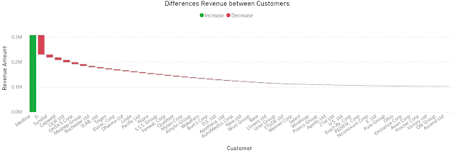
Differences Revenue between Customers

Comments:
1) Instead of showing the full revenue, the chart shows only the differences from the highest revenue, where the column in green is the highest revenue, while the columns in red are the differences of the current customer's revenue to the previous customer, as the data are sorted by the highest revenue. At least in this case it results in a lower data-ink ratio (see Tufte).
2) The values are sorted by the [Revenue] descending. 
3) Unfortunately, it's not possible to change the names from the legend.

Simple Moving Averages (SMAs)

Based on the [Sales Amount], [Revenue] and [Month] one can add the following DAX formulas to the table for calculating the SMA:

Sales Amount (SMA) = MOVINGAVERAGE([Sales Amount],6)
Revenue (SMA) = MOVINGAVERAGE([Revenue],6)

The chart becomes:


Comments:
1) Unfortunately, the formula can't project the values into the feature, at least not without the proper dates.
2) "Show items with not data" feature seems to be disabled when visual calculations are used.
3) The SMA was created via a template formula. Similarly, calculating a running sum is reduced to applying a formula:
Running Sales Amount = RUNNINGSUM([Sales Amount])

Wrap Up

It's easier to start with a table for the visual, construct the needed formulas and then use the proper visual while eliminating the not needed fields. 

The feature is still in public preview and changes can still occur. Unfortunately, there's still no information available on the general availability date. From the first tests, it provides considerable power with a minimum of effort, which is great! I don't want to think how long I would have needed to obtain the same results without it!

Happy coding!

Previous Post <<||>> Next Post

References
[1] Microsoft Learn (2024) Power BI: Using visual calculations [preview] (link)
[2] SSBI Central (2024) Visual Calculations - Making DAX easier, with Jeroen ter Heerdt (link)

⚡️Power BI: Preparatory Steps for Creating a Power BI Report

When creating a Power BI report consider the following steps when starting the actual work. The first five steps can be saved to a "template" that can be reused as starting point for each report.

Step 0: Check Power BI Desktop's version

Check whether you have the latest version, otherwise you can download it from the Microsoft website.
Given that most of the documentation, books and other resources are in English, it might be a good idea to install the English version.

Step 1: Enable the recommended options

File >> Options and settings >> Options >> Global >> Data Load:
.>> Time intelligence >> Auto date/time for new files >> (uncheck)
.>> Regional settings >> Application language >> set to English (United States)
.>> Regional settings >> Model language >> set to English (United States)

You can consider upon case also the following options (e.g. when the relationships are more complex than the feature can handle):
File >> Options and settings >> Options >> Current >> Data load:
.>> Relationship >> Import relationships from data sources on first load >> (uncheck)
.>> Relationship >> Autodetect new relationships after data is loaded >> (uncheck)

Step 2: Enable the options needed by the report

For example, you can enable visual calculations:
File >> Options and settings >> Options >> Preview features >> Visual calculations >> (check)

Comment:
Given that not all preview features are stable enough, instead of activating several features at once, it might be a good idea to do it individually and test first whether they work as expected. 

Step 3: Add a table for managing the measures

Add a new table (e.g. "dummy" with one column "OK"):

Results = ROW("dummy", "OK")

Add a dummy measure that could be deleted later when there's at least one other measure:
Test = ""

Hide the "OK" column and with this the table is moved to the top. The measures can be further organized within folders for easier maintenance. 

Step 4: Add the Calendar if time analysis is needed

Add a new table (e.g. "Calendar" with a "Date" column):

Calendar = Calendar(Date(Year(Today()-3*365),1,1),Date(Year(Today()+1*365),12,31))

Add the columns:

Year = Year('Calendar'[Date])
YearQuarter = 'Calendar'[Year] & "-Q" & 'Calendar'[Quarter]
Quarter = Quarter('Calendar'[Date])
QuarterName = "Q" & Quarter('Calendar'[Date])
Month = Month('Calendar'[Date])
MonthName = FORMAT('Calendar'[Date], "mmm")

Even if errors appear (as the columns aren't listed in the order of their dependencies), create first all the columns. Format the Date in a standard format (e.g. dd-mmm-yy) including for Date/Time for which the Time is not needed.

To get the values in the visual sorted by the MonthName:
Table view >> (select MonthName) >> Column tools >> Sort by column >> (select Month)

To get the values in the visual sorted by the QuarterName:
Table view >> (select QuarterName) >> Column tools >> Sort by column >> (select Quarter)

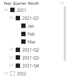
With these changes the filter could look like this:


Step 5: Add the corporate/personal theme

Consider using a corporate/personal theme at this stage. Without this the volume of work that needs to be done later can increase considerably. 

There are also themes generators, e.g. see powerbitips.com, a tool that simplifies the process of creating complex theme files. The tool is free however, users can save their theme files via a subscription service.

Set canvas settings (e.g. 1080 x 1920 pixels).

Step 6: Get the data

Consider the appropriate connectors for getting the data into the report. 

Step 7: Set/Validate the relationships

Check whether the relationships between tables set by default are correct, respectively set the relationships accordingly.

Step 8: Optimize the data model

Look for ways to optimize the data model.

Step 9: Apply the formatting

Format numeric values to represent their precision accordingly.
Format the dates in a standard format (e.g. "dd-mmm-yy") including for Date/Time for which the Time is not needed.

The formatting needs to be considered for the fields, measures and metrics added later as well. 

Step 10: Define the filters

Identify the filters that will be used more likely in pages and use the Sync slicers to synchronize the filters between pages, when appropriate:
View >> Sync slicers >> (select Page name) >> (check Synch) >> (check Visible)

Step 11: Add the visuals

At least for report's validation, consider using a visual that holds the detail data as represented in the other visuals on the page. Besides the fact that it allows users to validate the report, it also provides transparence, which facilitates report's adoption. 

18 April 2024

🏭Data Warehousing: Microsoft Fabric (Part II: Data(base) Mirroring) [New feature]

Data Warehousing
Data Warehousing Series

Microsoft recently announced [4] the preview of a new Fabric feature called Mirroring, a low-cost, low-latency fully managed service that allows to replicate data from various systems together into OneLake [1]. Currently only Azure SQL Database, Azure Cosmos DB, and Snowflake are supported, though probably more database vendors will be targeted soon. 

For Microsoft Fabric's data engineers, data scientists and data warehouse professionals this feature is huge as importance because they don't need to care anymore about making the data available in Microsoft Fabric, which involves a considerable amount of work. 

Usually, at least for flexibility, transparence, performance and standardization, data professionals prefer to extract the data 1:1 from the source systems into a landing zone in the data warehouse or data/delta lake from where the data are further processed as needed. One data pipeline is thus built for every table in scope, which sometimes is a 10–15-minute effort per table, when the process is standardized, though upon case the effort is much higher if troubleshooting (e.g. data type incompatibility or support) or further logic changes are involved. Maintaining such data pipelines can prove to be costly over time, especially when periodic changes are needed. 

Microsoft lists other downsides of the ETL approach - restricted access to data changes, friction between people, processes, and technology, respectively the effort needed to create the pipelines, and the time needed for importing the data [1]. There's some truth is each of these points, though everything is relative. For big tables, however, refreshing all the data overnight can prove to be time-consuming and costly, especially when the data don't lie within the same region, respectively data center. Unless the data can be refreshed incrementally, the night runs can extend into the day, will all the implications that derive from this - not having actual data, which decreases the trust in reports, etc. There are tricks to speed up the process, though there are limits to what can be done. 

With mirroring, the replication of data between data sources and the analytics platform is handled in the background, after an initial replication, the changes in the source systems being reflected with a near real-time latency into OneLake, which is amazing! This allows building near real-time reporting solutions which can help the business in many ways - reviewing (and correcting in the data source) records en masse, faster overview of what's happening in the organizations, faster basis for decision-making, etc. Moreover, the mechanism is fully managed by Microsoft, which is thus responsible for making sure that the data are correctly synchronized. Only from this perspective 10-20% from the effort of building an analytics solution is probably reduced.

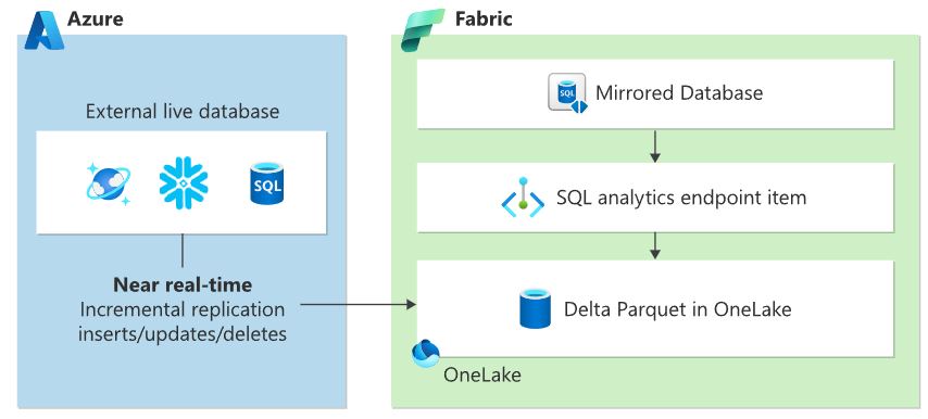
Mirroring in Microsoft Fabric
Mirroring in Microsoft Fabric (adapted after [2])

According to the documentation, one can replicate a whole database or choose individual regular tables (currently views aren't supported [3]), stop, restart, or remove a table from a mirroring. Moreover, through sharing, users can grant to other users or groups of users access to a mirrored database without giving access to the workspace and the rest of its items [1]. 

The data professionals and citizens can write then cross-database queries against the mirrored databases, warehouses, and the SQL analytics endpoints of lakehouses, combining data from all these sources into a single T-SQL query, which opens lot of opportunities especially in what concerns the creation of an enterprise semantic model, which should be differentiated from the semantic model created by default by the mirroring together with the SQL analytics endpoint.

Considering that the data is replicated into delta tables, one can take advantage of all the capabilities available with such tables - data versioning, time travel, interoperability and/or performance, respectively direct consumption in Power BI.

Previous Post <<||>> Next Post

References:
[1] Microsoft Learn - Microsoft Fabric (2024) What is Mirroring in Fabric? (link)
[2] Microsoft Learn - Microsoft Fabric (2024) Mirroring Azure SQL Database [Preview] (link)
[3] Microsoft Learn - Microsoft Fabric (2024) Frequently asked questions for Mirroring Azure SQL Database in Microsoft Fabric [Preview] (link)
[4] Microsoft Fabric Updates Blog (2024) Announcing the Public Preview of Mirroring in Microsoft Fabric, by Charles Webb (link)

🏭🗒️Microsoft Fabric: Mirroring [Notes]

Disclaimer: This is work in progress intended to consolidate information from various sources for learning purposes. For the latest information please consult the documentation (see the links below)! 

Last updated: 30-Jan-2026

Mirroring in Microsoft Fabric

Mirroring in Microsoft Fabric (high-level design adapted after [2])   


Mirroring in Microsoft Fabric ([10]) 

[Microsoft Fabric] Mirroring

  • low-cost, low-latency fully managed service that allows to replicate data from various systems together into OneLake [1]
    • supported in Azure SQL Database, Azure Cosmos DB, Snowflake [1]
    • ⇒ replaces ETL pipelines
    • ⇐ manages the replication of data into OneLake and conversion to Parquet [1]
    • changes have a near real-time latency [3]
    • uses the source database’s CDC feature [4]
    • zero-ETL, fully managed, and high-performance data movement mechanism [8] 
  • {benefit} allows users to use a highly integrated, end-to-end, and easy-to-use service [1]
    • the mirrored data can be used in Power BI
      • ⇐ since tables are all v-ordered delta tables [3]
  • {benefit} allows users to accelerate their journey into Fabric [1]
    • the delta tables can be used in every Fabric experience
    • {restriction} replication of views is currently not supported [3]
  • {benefit} allows to write cross-database queries against the mirrored databases, warehouses, and the SQL analytics endpoints of Lakehouses in a single T-SQL query [1]
  • {benefit} free Mirroring compute and storage for replicas in OneLake [5]
    • storage for replicas is free up to a limit
      • based on the capacity size [5]
      • mirroring offers a free TB of mirroring storage for every CU purchased [5]
    • compute is free and not consume capacity 
      • ⇐ used to replicate data into OneLake [5]
  • landing zone in OneLake 
    • stores both the snapshot and change data [3]
      • ⇐ improves performance when converting files into delta verti-parquet [3]
  • {operation} enable the mirroring 
    • by creating a secure connection to the operational data source
    • an entire database or individual tables can be replicated 
    • creates three items in the targeted workspace
      • the mirrored database
      • a SQL analytics endpoint
      • a Default semantic model
    • the same source database can be mirrored multiple times
      • ⇐ though usually not needed
        • scenario: replicating data to different types of environments
  • {operation} stopping the mirroring
    • stops the replication in the source database, but a copy of the tables is kept in OneLake [3]
  • {operation} restarting the mirroring 
    • results in all data being replicated from the start [3]
  • {operation} remove a table from mirroring
    • the table is no longer replicated and its data is deleted from OneLake [3]
  • {operation} sharing
    • users grant other users or groups of users access to a mirrored database without giving access to the workspace and the rest of its items [1]
      • access is also granted to the SQL analytics endpoint and associated default semantic model [1]
      • shared mirrored databases can be found through either
        • Data Hub
        • Shared with Me section in Microsoft Fabric
    • triggers an initial replication
  • {requirement} [licensing] requires Power BI Premium, Fabric Capacity, or Trial Capacity
  • {feature} monitoring
    • {benefit} allows to gain insights into mirroring operations and when the replica in Fabric OneLake was last refreshed [4]
  • [Azure SQL Database] 
    • {restriction} doesn't support Azure SQL Database logical servers behind an AVN or private networking [2]
      • {requirement} update the Azure SQL logical server firewall rules to Allow public network access [2]
      • {requirement} enable the Allow Azure services option to connect to your Azure SQL Database logical server [2]
    • {restriction}
      •  access through the Power BI Gateway or behind a firewall is unsupported [3]
    • authentication
      • SQL authentication with user name and password
      • Microsoft Entra ID
      • Service Principal
    • {troubleshooting} check if the changes properly flow
      • via sys.dm_change_feed_log_scan_sessions DMV
    • {troubleshooting} check if there are any problems reported
      • via sys.dm_change_feed_errors DMV
    • {troubleshooting} check if the mirroring was properly enabled
      • via sp_help_change_feed stored procedure 
    • {troubleshooting} disable mirroring
      • via sp_change_feed_disable_db stored procedure
  • [SQL Server] [preview] 
    • creates an initial snapshot in Fabric OneLake after which data is kept in sync in near-real time [7]
    • [SQL Server 2016-2022] 
      • relies on CDC to capture an initial snapshot of all the tables selected for mirroring and there after replicate the changes [7]
        • the mirroring services connects to read the initial snapshot as well as the changes and pulls the data into OneLake and converts into an analytics-ready format in Fabric [7]
      • via on-premises data gateway (OPDG) 
        • must be installed in the SQL Server environment [7]
      • applies to VMs and on-premises altogether [5] 
    • [SQL Server 2025] supports the latest change feed technology for replicating changes to ensure that there is minimal impact to operational workload [5]
      • keeps track and replicates the initial snapshot and changes to the landing zone in OneLake which is then converted to an analytics-ready format by the mirroring engine in Fabric [7]
      • {requirement} on-premises data gateway
        • primarily used as a control plane to connect and authenticate the on-premises environment to Fabric [7]
      • {requirement} Arc Agent
        • outbounds authentication from SQL Server to Fabric [7]
  • [Azure SQL MI]
    • {feature|preview} firewall support
      • via data gateway
        • ensures secure connections to the source databases via private endpoint [5]
          • removes the necessity of opening public access [5]
    • {feature|preview} mirror tables without PKs 
      • {benefit} increased flexibility
    • {feature|preview} expanded DDL
      •  allows to truncate tables while mirroring is actively replicating on data [5]
  • {feature} open mirroring
    • extension of Mirroring capabilities in Fabric [5]
      • creates a copy of the data in OneLake and keeps it up to date [6]
      • provides APIs to replicate data from anywhere
      • data is converted to parquet or CSV format and the API or UI is used to load the data into the OneLake landing zone along with any additional changes [6]
      • the Fabric replication technology converts everything to a Delta format making it optimized and ready for AI and BI workloads [6]
    • {benefit} empowers vendors to build their own Mirroring solutions 
      • leverages the same Mirroring engine to help manage inserts/updates/deletes efficiently [5]
    • cheaper for read-heavy data sources [8]
    • hreat for unique data requirements, regulated environments [8]
  • {feature} data access roles
    • defined directly on mirrored items [9]
      •   follows the same familiar experience used across other OneLake-backed workloads [9]
    • allows access to be granted at the table or folder level and enforced consistently at the OneLake layer [9]
    • {benefit} helps ensure a smooth transition for existing mirrored workloads while bringing them into the OneLake security model [9]
    • {benefit} improves collaboration scenarios [9]
    • {benefit} reduces data duplication (aka improves reuse) [9]
    • {benefit} simplifies governance [9]
    • {benefit} ensures consistent enforcement as data flows through Fabric
    • {feature} define fine-grained access controls at the source [9] 
    • {feature} users can create shortcuts only the data they are permitted to see [9]
  • {scenario} analyze operational data in near real-time [8]
  • {scenario} avoid managing ETL pipelines [8]
  • {scenario} single source of truth across both operational and analytical systems [8]
  • {scenario} building a Lakehouse architecture and want real-time updates [8]
Acronyms:
AVN - Azure Virtual Network
CDC - Change Data Capture
DDL - Data Definition Language
ETL - Extract, Transfer, Load
DMV - Dynamic Management View
MI - Managed Instance
PK - Primary Key
TB - terabyte

References:
[1] Microsoft Learn - Microsoft Fabric (2024) What is Mirroring in Fabric? [link]
[2] Microsoft Learn - Microsoft Fabric (2024) Mirroring Azure SQL Database [Preview] [link]
[3] Microsoft Learn - Microsoft Fabric (2024) Frequently asked questions for Mirroring Azure SQL Database in Microsoft Fabric [Preview] [link]
[4] Microsoft Fabric Updates Blog (2023) Introducing Mirroring in Microsoft Fabric [link]
[5] Microsoft Fabric Updates Blog (2025) What’s new with Mirroring in Fabric at Microsoft Build 2025 [link]
[6] Microsoft Fabric Updates Blog (2025) Announcing the General Availability of Open Mirroring [link]
[7] Microsoft Fabric Updates Blog (2025) Mirroring for SQL Server in Microsoft Fabric (Preview) [link][8] Microsoft Fabric Updates Blog (2025) Mirroring in Microsoft Fabric explained: benefits, use cases, and pricing demystified [link] 
[9] Microsoft Fabric Updates Blog (2026) Manage OneLake security for Mirrored Databases (Preview)[link]
[10] Microsoft Fabric Updates Blog (2025) Mirroring for SQL Server in Microsoft Fabric (Generally Available) [link]

Resources:
[R1] Tutorial: Configure Microsoft Fabric mirrored databases from Azure SQL Database [Preview] (link)
[R2] Microsoft Fabric Updates Blog (2024) Announcing the Public Preview of Mirroring in Microsoft Fabric, by Charles Webb (link)
[R3] Microsoft Learn (2025) Fabric: What's new in Microsoft Fabric? [link]
[R4] Microsoft (2025) Fabric Roadmap [link]

Related Posts Plugin for WordPress, Blogger...

About Me

My photo
Koeln, NRW, Germany
IT Professional with more than 25 years experience in IT in the area of full life-cycle of Web/Desktop/Database Applications Development, Software Engineering, Consultancy, Data Management, Data Quality, Data Migrations, Reporting, ERP implementations & support, Team/Project/IT Management, etc.