04 March 2024

🧭Business Intelligence: A Software Engineer's Perspective (Part VI: The Data Citizen)

Business Intelligence
Business Intelligence Series

More than a century ago, Jerbert G Wells wrote on mathematical literacy: "[...] the time may not be very remote when it will be understood that for complete initiation as an efficient citizen of one of the new great complex world-wide States that are now developing, it is as necessary to be able to compute, to think in averages and maxima and minima, as it is now to be able to read and write” [1]. The quote is occasionally misquoted as referring to Statistics, though frankly the boundaries of mathematical, statistical, numerical and data literacy tend to melt into each other, existing multiple dependencies between them.

In the age of big data, data citizens, business people able to use data, data processing and visualization tools for building solutions that enable their job, become steadily a necessity for businesses in their quest of making data-driven decisions, gaining insight and whatever valuable use data might have for the organizations. The need is not new,  Microsoft Access and Excel were used for similar purposes already in the 90s, becoming a maintenance nightmare for IT, data islands without proper backup or documentation existing through the organizations, diverse numbers being reported and contradicting each other. 

Then IT took over, trying to find alternatives for the data islands, implementing concepts like single source(s) of truth, quality gates and supporting processes, designing data models and infrastructures for self-service, allowing users to tap into the data for data exploration, discovery, reporting, etc. Getting all this right required to redesign existing infrastructures, making one step forward and a few steps back, in the end everything is a learning process. Such an effort can easily consume an organization's resources. 

Microsoft and other vendors for data-driven solutions keep insisting on how much potential exist in their tools for the data citizen, how the citizens can bring competitive advantage for organizations, automating business and supporting processes. The potential is not to neglect, though it requires a considerable investment from organizations in training and mentoring data citizens, in building data warehouses or data meshes that focus on end-user self-service needs. The data citizen needs time to learn, to play with the data, build solutions, test their usefulness in the daily tasks, respectively incorporate and disseminate the knowledge gained within the organization. 

There are many scenarios in which results can be obtained with a minimum of effort, however there are also hard limits. Besides the learning effort and the time available, there are cognitive, knowledge and ability limits that vary from person to person. Understanding what good architecture, design and techniques means is unfortunately not for everybody, and here's where the concept of citizen data analyst or citizen scientist breaks, and this independently of the tools used. There are also IT people who have similar challenges. 

It must be also recognized that the solutions built in the early stages by data citizens are primarily personal solutions that need to be reviewed and brought to the standards adopted by the organization. In time, it's expected to reduce considerably such effort by evolving data citizen's knowledge and skillset. Without this further work, the solutions built will tend to display some of the shortcomings of the solutions built on MS Access or Excel

The concept of data citizen can work as long the various assumptions and needs are adequately addressed, however progress will not happen overnight. The effort needs to become part of organization's long-term strategy, and the effort can be considerable for many organizations. Mentorship in terms of technical and non-technical support is needed. It's advisable to proceed in small iterative steps and integrate gradually the lessons learned.

Previous Post <<||>> Next Post

Resources:

[1] “Mankind in the Making”, by Herbert G Wells, 1903 [Source]

02 March 2024

🧭Business Intelligence: Microsoft Releases for the BI Technology Stack (Timeline)

Business Intelligence
Business Intelligence Series

I started some years back to put together a timeline for the most important events happening in the BI technology stack (work in progress):

2023: Microsoft announces Microsoft Fabric (>>)

  • Synapse Data Warehouse is the next generation of data warehousing in Microsoft Fabric with native support for the delta lake.
  • Data Engineering & Data Science workloads with support for lakehouses, notebooks, Spark Job definitions, models and experiments.
  • Real-Time Analytics is a robust platform tailored to deliver real-time data insights and observability analytics capabilities for a wide range of data types.
  • OneLake provides a single unified storage location for all your data analytics needs.

2022: Microsoft releases SQL Server 2022 (>>)

  • Synapse Link for SQL Server 2022 allows to seamlessly replicate operational data in near real-time to be able to have more powerful analytics.
  • Purview is a unified data governance and management service.

2019: Microsoft launches Azure Synapse Analytics service (formerly SQL Data Warehouse), a limitless analytics service, that brings together enterprise data warehousing and Big Data analytics. (>>)

2019: Microsoft releases SQL Server 2019 (>>)

  •  Big Data Clusters add-in for SQL Server allows to deploy scalable clusters of SQL Server, Spark, and HDFS containers running on Kubernetes (feature to be retired)

2018: Microsoft extends PowerQuery with ETL capabilities. (>>)

2018: Microsoft releases Azure Data Studio, a data management tool that enables to work with SQL Server, Azure SQL DB and SQL DW from Windows, macOS and Linux. (>>)

2017: Microsoft releases Power BI Report Server, an on-premises server that enables Power BI Pro users to publish Power BI reports and distribute them broadly across the enterprise, without requiring report consumers to be licensed individually per use (>>)

2017: Microsoft released SQL Server Data Tools (SSDT), which uses PowerQuery to import and prepare data in SSAS/AAS tabular models.

2017: Microsoft releases SQL Server 2017. (>>)

  • SSRS is no longer available to install through SQL Server setup.
  • Python support added, R Services renamed to Machine Learning Services. (>>)

2016: Microsoft releases SQL Server 2016 (What's new, >>)

  • Query Store allows to monitor and troubleshoot performance issues.
  • SQL Server R Services integrate the R programming language into SQL Server.
  • Direct Query for SSAS.
  • PolyBase for querying the data stored in HDFS. (>>)
  • Support for Support for HDFS in SSIS.
  • Azure SQL Data Warehouse is GA. (>>)
  • modern reports with SSRS. (>>)
  • Real-Time Operational Analytics. (>>)
2016: SQL Server 2014 Developer Edition becomes free. (>>)

2015: Microsoft announces elastic databases SQL Data Warehouse & Azure Data Lake. (>>)

  • Elastic databases allows to build SaaS applications to manage large numbers of databases that have unpredictable resource demand.
  •  Azure SQL Data Warehouse is an elastic data warehouse in the cloud that can dynamically grow, shrink and pause compute in seconds independent of storage.
  • Azure Data Lake is a hyper-scale data store for big data analytic workloads.

2015: Microsoft releases Power BI to the general public.

  • Power BI Designer renamed to Power BI Desktop.
2015: Microsoft releases several Azure services:
  • launches the SQL Server Cloud database.
  • Azure Data Factory (ADF), a fully managed service that does information production by orchestrating data with processing services as managed data pipelines. (>>)
  • Azure Stream Analytics, a fully managed stream processing engine that is designed to analyze and process large volumes of streaming data with sub-millisecond latencies. (>>)

2014: Microsoft released Power BI Designer unifying Power Query, Power Pivot & Power View.

2013: Microsoft announces Power BI for Office 365. (>>)

2012: Microsoft releases with SQL Server 2012. (>>)

  • BI Semantic Model for SSAS provides a single, scalable model for BI applications.
  • Parallel Data Warehouse with PolyBase capabilities. 
  • in-memory capabilities. (>>)
  • Windows Azure SQL Reporting service available (>>)
  • SQL Server Data Tools unifies SQL Server and cloud SQL Azure development for both professional database and application developers.

2010: Microsoft released 

  • Power Pivot as part of SQL Server R2.
  • Azure SQL Database.

2010: Microsoft releases SQL Server 2008 R2.

  • Master Data Services.
  • Power Pivot & Self-service BI capabilities in SSAS.

2008: Microsoft releases SQL Server 2008 (>>)

  • Table compression.
  • Change Data Capture (CDC).

2005: Microsoft releases SQL Server 2005

  • a greatly enhanced version of Analysis Services.
  • SQL Server Integration Services to replace DTS.

2004: Microsoft released SQL Server Reporting Services (SSRS) as add-on to SQL Server 2000.

2000: Microsoft released SQL Server Analysis Services (SSAS) with SQL Server 2000.

1998: Microsoft released SQL Server 7.

  • OLAP services & first MDX specifications.
  • Data Transformation Services (DTS) for ETL workloads.

29 February 2024

📊R Language: Visualizing the Iris Dataset

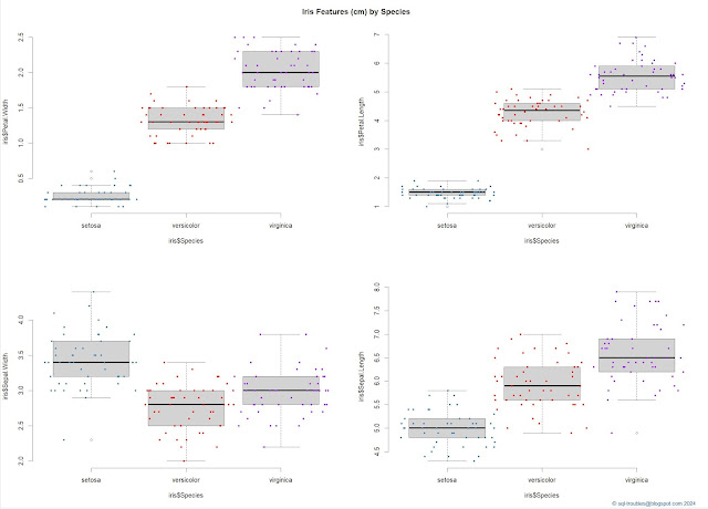
When working with a dataset that has several numeric features, it's useful to visualize it to understand the shapes of each feature, usually by category or in the case of the iris dataset by species. For this purpose one can use a combination between a boxplot and a stripchart to obtain a visualization like the one below (click on the image for a better resolution):

Iris features by species
Iris features by species (box & jitter plots combined)

And here's the code used to obtain the above visualization:

par(mfrow = c(2,2)) #2x2 matrix display

boxplot(iris$Petal.Width ~ iris$Species) 
stripchart(iris$Petal.Width ~ iris$Species
	, method = "jitter"
	, add = TRUE
	, vertical = TRUE
	, pch = 20
	, jitter = .5
	, col = c('steelblue', 'red', 'purple'))

boxplot(iris$Petal.Length ~ iris$Species) 
stripchart(iris$Petal.Length ~ iris$Species
	, method = "jitter"
	, add = TRUE
	, vertical = TRUE
	, pch = 20
	, jitter = .5
	, col = c('steelblue', 'red', 'purple'))

boxplot(iris$Sepal.Width ~ iris$Species) 
stripchart(iris$Sepal.Width ~ iris$Species
	, method = "jitter"
	, add = TRUE
	, vertical = TRUE
	, pch = 20
	, jitter = .5
	, col = c('steelblue', 'red', 'purple'))

boxplot(iris$Sepal.Length ~ iris$Species) 
stripchart(iris$Sepal.Length ~ iris$Species
	, method = "jitter"
	, add = TRUE
	, vertical = TRUE
	, pch = 20
	, jitter = .5
	, col = c('steelblue', 'red', 'purple'))

mtext("© sql-troubles@blogspot.com 2024", side = 1, line = 4, adj = 1, col = "dodgerblue4", cex = .7)
title("Iris Features (cm) by Species", line = -2, outer = TRUE)

By contrast, one can obtain a similar visualization with just a command:

plot(iris, col = c('steelblue', 'red', 'purple'), pch = 20)
title("Iris Features (cm) by Species", line = -1, outer = TRUE)
mtext("© sql-troubles@blogspot.com 2024", side = 1, line = 4, adj = 1, col = "dodgerblue4", cex = .7)

And here's the output:

Iris features by species (general plot)

One can improve the visualization by using a bigger contrast between colors (I preferred to use the same colors as in the previous visualization).

I find the first data visualization easier to understand and it provides more information about the shape of data even it requires more work.

Histograms make it easier to understand the distribution of values, though the visualizations make sense only when done by species:

Histograms of Setosa's features

And, here's the code:

par(mfrow = c(2,2)) #2x2 matrix display

setosa = subset(iris, Species == 'setosa') #focus only on setosa
hist(setosa$Sepal.Width)
hist(setosa$Sepal.Length)
hist(setosa$Petal.Width)
hist(setosa$Petal.Length)
title("Setosa's Features (cm)", line = -1, outer = TRUE)
mtext("© sql-troubles@blogspot.com 2024", side = 1, line = 4, adj = 1, col = "dodgerblue4", cex = .7)

There's however a visual called staked histogram that allows to delimit the data for each species:


Iris features by species (stacked histograms)

And, here's the code:

#installing plotrix & multcomp
install.packages("plotrix")
library(plotrix)
library(multcomp)

par(mfrow = c(2,2)) #1x2 matrix display

histStack(iris$Sepal.Width
	, z = iris$Species
	, col = c('steelblue', 'red', 'purple')
	, main = "Sepal.Width"
	, xlab = "Width"
	, legend.pos = "topright")

histStack(iris$Sepal.Length
	, z = iris$Species
	, col = c('steelblue', 'red', 'purple')
	, main = "Sepal.Length"
	, xlab = "Length"
	, legend.pos = "topright")

histStack(iris$Petal.Width
	, z = iris$Species
	, col = c('steelblue', 'red', 'purple')
	, main = "Petal.Width"
	, xlab = "Width"
	, legend.pos = "topright")

histStack(iris$Petal.Length
	, z = iris$Species
	, col = c('steelblue', 'red', 'purple')
	, main = "Petal.Length"
	, xlab = "Length"
	, legend.pos = "topright")
title("Iris Features (cm) by Species - Histograms", line = -1, outer = TRUE)
mtext("© sql-troubles@blogspot.com 2024", side = 1, line = 4, adj = 1, col = "dodgerblue4", cex = .7)

Conversely, the standard histogram allows drawing the density curves within its boundaries:

par(mfrow = c(2,2)) #1x2 matrix display 

hist(iris$Sepal.Width
	, main = "Sepal.Width"
	, xlab = "Width"
	, las = 1, cex.axis = .8, freq = F)
eq = density(iris$Sepal.Width) # estimate density curve
lines(eq, lwd = 2) # plot density curve

hist(iris$Sepal.Length
	, main = "Sepal.Length"
	, xlab = "Length"
	, las = 1, cex.axis = .8, freq = F)
eq = density(iris$Sepal.Length) # estimate density curve
lines(eq, lwd = 2) # plot density curve

hist(iris$Petal.Width
	, main = "Petal.Width"
	, xlab = "Width"
	, las = 1, cex.axis = .8, freq = F)
eq = density(iris$Petal.Width) # estimate density curve
lines(eq, lwd = 2) # plot density curve

hist(iris$Petal.Length
	, main = "Petal.Length"
	, xlab = "Length"
	, las = 1, cex.axis = .8, freq = F)
eq = density(iris$Petal.Length) # estimate density curve
lines(eq, lwd = 2) # plot density curve

title("Iris Features (cm) by Species - Density plots", line = -1, outer = TRUE)
mtext("© sql-troubles@blogspot.com 2024", side = 1, line = 4, adj = 1, col = "dodgerblue4", cex = .7)

And, here's the diagram:

Iris features aggregated (histograms with density plots)

As final visualization, one can also compare the width and length for the sepal, respectively petal:
 
par(mfrow = c(1,2)) #1x2 matrix display

plot(iris$Sepal.Width, iris$Sepal.Length, main = "Sepal Width vs Length", col = iris$Species)
plot(iris$Petal.Width, iris$Petal.Length, main = "Petal Width vs Length", col = iris$Species)

title("Iris Features (cm) by Species - Scatter Plots", line = -1, outer = TRUE)
mtext("© sql-troubles@blogspot.com 2024", side = 1, line = 4, adj = 1, col = "dodgerblue4", cex = .7)

And, here's the output:
 
Iris features by species (scatter plots)

Happy coding!

28 February 2024

🧭Business Intelligence: A Software Engineer's Perspective (Part V: From Process Management to Mental Models in Knowledge Gaps)

Business Intelligence Series
Business Intelligence Series 

An organization's business processes are probably one of its most important assets because they reflect the business model, philosophy and culture, respectively link the material, financial, decisional, informational and communicational flows across the whole organization with implication in efficiency, productivity, consistency, quality, adaptability, agility, control or governance. A common practice in organizations is to document the business-critical processes and manage them accordingly over their lifetime, making sure that the employees understand and respect them, respectively improve them continuously. 

In what concerns the creation of data artifacts, data without the processual context are often meaningless, no matter how much a data professional knows about data structures/models. Processes allow to delimit the flow and boundaries of data, respectively delimit the essential from non-essential. Moreover, it's the knowledge of processes that allows to reengineer the logic behind systems especially when no proper documentation about the logic is available. 

Therefore, the existence of documented processes allows to bridge the knowledge gaps existing on the factual side, and occasionally also on the technical side. In theory, the processes should provide a complete overview of the procedures, rules, policies and responsibilities existing in the organization, respectively how the business operates. However, even if people tend to understand how the world works locally, when broken down into parts, their understanding is systemically flawed, missing the implications of causal relationships that span time with delays, feedback, variable confusion, chaotic behavior, and/or other characteristics borrowed from the vocabulary of complex systems.  

Jay W Forrester [3], Peter M Senge [1], John D Sterman [2] and several other systems-thinking theoreticians stressed the importance of mental models in making-sense about the world especially in setups that reflect the characteristics of complex systems. Mental models frame our experience about the world in congruent mental constructs that are further used to think, understand and navigate the world. They are however tacit, fuzzy, incomplete, imprecisely stated, inaccurate, evolving simplifications with dual character, enabling on one side, while impeding on the other side cognitive processes like sense-making, learning, thinking or decision-making, limiting the range of action to what is familiar and comfortable. 

On one side one of the primary goals of Data Analytics is to provide new insights, while on the other side the new insights fail to be recognized and put into practice because they conflict with existing mental models, limiting employees to familiar ways of thinking and acting. 

Externalizing and sharing mental models allow besides making assumptions explicit and creating a world view also to strategize, make tests and simulations, respectively make sure that the barriers and further constraints don't impact the decisional process. Sange goes further and advances that mental models, especially at management level, offer a competitive advantage, allowing to maintain coherence and direction, people becoming more perceptive and responsive about environmental or circumstance changes.

The whole process isn't about creating a unique congruent mental model, even if several mental models may converge toward one or more holistic models, but of providing different diverse perspectives and enabling people to make leaps in abstraction (by moving from direct observations to generalizations) while blending advocacy and inquiry to promote collaborative learning. Gradually, people and organizations should recognize a shift from mental models dominated by events to mental models that recognize longer-tern patterns of change and the underlying structures producing those patterns [1].

Probably, for many the concept of mental models seems to be still too abstract, respectively that the effort associated with it is unnecessary, or at least questionable on whether it can make a difference. Conversely, being aware of the positive and negative implications the mental models hold, can makes us explore, even if ad-hoc, the roads they open.

Previous Post <<||>> Next Post

Resources:
[1] Peter M Senge (1990) The Fifth Discipline: The Art & Practice of The Learning Organization
[2] John D Sterman (2000) "Business Dynamics: Systems thinking and modeling for a complex world"
[3] Jay W Forrester (1971) "Counterintuitive Behaviour of Social Systems", Technology Review

27 February 2024

🔖Book Review: Rolf Hichert & Jürgen Faisst's International Business Communication Standards (IBCS Version 1.2)

Over the last months I found several references to Rolf Hichert & Jürgen Faisst's booklet on business communication standards [1]. It draw my attention especially because it attempts to provide a standard for reports and data visualizations, which frankly it seems like a tremendous endeavor if done right. The two authors founded the IBCS institute 20 years ago, which is a host, training institute, and certification body of the Creative Commons project called IBCS.

The 150 pages booklet considers various standardization techniques with the help of more than 180 instructive figures, the overall structure being based on a set of principles and rules rooted in an acronym that spells "SUCCESS" - Say, Unify, Condense, Check, Express, Simplify, Structure. On one side the principles seem to form a solid fundament, however the fundament seems to suffer from the same rigidity resulted from fitting something in a nicely-spelled acronym. 

Say or conveying a message reflects the principle that each report should convey a message, otherwise the report is just a data collection. According to this "definition" most of the operational reports are just collections of data. Conversely, lot of communication in organizations revolve around issues, metrics and decision making, scenarios in which the messages conveyed can be powerful though dependent on the business context. Settling on only one message can make the message fall short.

Unifying or applying semantic notation reflects the principle that things that have same meaning should look the same. There are many patterns out there that can be standardized, however it's questionable how much complex visualizations can be standardized, respectively how much liberty of expressing certain aspects the standardization allows. 

Condense or increasing the information density reflects the requirements that all information necessary to understanding the content should, if possible, be included on one page. This allows to easier navigate the content and prioritize what the audience is able to see. The principle however seems to have more to do with the ink-information ratio principle (see [2]). 

Check or ensuring the visual integrity reflects the principle that the information should be presented in the most truthful and the most easily understood way. This is something that many data visualizations out there lack.

Express or choosing the proper visualizations is based on the principle that the visuals considered should be as intuitive as possible. In theory, the more intuitive a visual the easier is to be understood and reused, however this depends on the "visual vocabulary" and "visual grammar" of each individual. Intuition is something that needs to grow through the interplay of these two areas. Having the expectation of displaying everything in terms of basic elements is unrealistic and suboptimal. 

Simplify or avoiding clutter refers to eliminating the unnecessary from a visualization, when there's nothing to take out without changing the meaning of a visualization. At least, the principle is correctly considered even if is in general difficult to apply because quite often one needs to build something more complex and reduce the complexity through iterative steps until the simple is obtained. 

Structure or organizing the content is based on the principle that content should follow (a logical consistent) structure. The interplay between function and structure is an important topic in itself.

Browsing through the many data visualizations given as example, I'd say that many of the recommendations make sense, though from there to a standardization is still a long way. The reader should evaluate against his/her own judgements the practices described and consider what seems to work. 

The book is available on the IBS website as PDF, though the Kindle version is 40% cheaper. Overall, it is worth a read. 

Previous Post <<||>>  Next Post

Resources:
[1] Rolf Hichert & Jürgen Faisst (2022) "International Business Communication Standards (IBCS Version 1.2): Conceptual, perceptual, and semantic design of comprehensible business reports, presentations, and dashboards" (link)
[2] Edward R Tufte (1983) "The Visual Display of Quantitative Information"
[3] IBCS Institude (2024) About (link)

26 February 2024

📊R Language: Data Summaries without Using a DataFrame

Coming back to the R language after several years and trying to remember some basic functions proved to be a bit challenging, even if the syntax is quite simple. Therefore, I considered putting together a few calls as refresher based on Youden-Beale data. To run the below code you'll need to install the R language and RStudio.

In case you don't have the package installed, run the next two lines:

install.packages("ACSWR") #install the Youden-Beale Experiment package
library(ACSWR)	#load the library
 
str(yb)		#display datasets' structure

  'data.frame': 8 obs. of 2 variables:
$ Preparation_1: int  31  20  18  17  9  8 10  7
$ Preparation_2: int  18  17  14  11 10 7   5  6

yb		#display the dataset

Preparation_1 Preparation_2
1          31                  18
2          20                  17
3          18                  14
4          17                  11
5            9                  10
6            8                   7
7          10                   5
8            7                   6

summary(yb) 	#display the summary for whole dataset

Preparation_1     Preparation_2
Min. : 7.00          Min. : 5.00
1st Qu.: 8.75       1st Qu.: 6.75
Median :13.50     Median :10.50
Mean :15.00        Mean :11.00
3rd Qu.:18.50      3rd Qu.:14.75
Max. :31.00         Max. :18.00

summary(yb$Preparation_1)	#display the summary for first column

Min. 1st Qu. Median   Mean   3rd Qu.   Max.
7.00      8.75     13.50   15.00     18.50    31.00

summary(yb$Preparation_2)	#display the summary for second column

Min. 1st Qu. Median    Mean   3rd Qu.  Max.
5.00     6.75      10.50    11.00     14.75   18.00

min(yb)	#display the minimum value for the whole dataset

[1] 5

min(yb$Preparation_1)	#display the mininun of first column

[1] 7

min(yb$Preparation_2)	#display the minimum of second column

[1] 5

sum(yb)	#display the sum of all values

[1] 208

sum(yb$Preparation_1)	#display the sum of first column

[1] 120

sum(yb$Preparation_2)	#display the sum of second column

[1] 88

#display the percentiles 
quantile(yb$Preparation_1,seq(0,1,.25))

0%    25%   50%   75%   100%
7.00  8.75  13.50  18.50  31.00

#display the percentiles 
quantile(yb$Preparation_2,seq(0,1,.25))

0%   25%   50%   75%   100%
5.00  6.75 10.50  14.75   18.00

#display the percentiles 
quantile(yb$Preparation_2,seq(0,1,.25))

0%  10%  20%  30%  40%  50%  60%  70%  80%  90%  100%
7.0    7.7     8.4    9.1     9.8  13.5   17.2  17.9  19.2   23.3   31.0

quantile(yb$Preparation_2,seq(0,1,.1))

0%   10%   20%  30%   40% 50%  60% 70%  80%  90% 100%
5.0     5.7     6.4      7.3     9.4 10.5   11.6 13.7  15.8   17.3  18.0

length(yb) 	#display the number of items 
ncol(yb) 	#display the number of columns

[1] 2

sort(yb$Preparation_1) #display the sorted values ascendingly 

[1] 7 8 9 10 17 18 20 31

sort(yb$Preparation_1, decreasing = TRUE)

[1] 31 20 18 17 10 9 8 7

#display a vertical poxplot
boxplot(yb, notch=FALSE)
title("A: Vertical Boxplot for Youden-Beale Data")

#display an horizontal poxplot
boxplot(yb, horizontal = TRUE)
title("B: Horizontal Boxplot for Youden-Beale Data")


plot(yb) #scatter diagram
title("Scatter diagram")

lsfit(yb$Preparation_1, yb$Preparation_2)$coefficients #list square fit coefficients 

Intercept         X 
2.8269231 0.5448718 
 
lsfit(yb$Preparation_1, yb$Preparation_2)$residuals #list square fit residuals

[1] -1.7179487  3.2756410  1.3653846 -1.0897436  2.2692308 -0.1858974
[7] -3.2756410 -0.6410256

  Happy coding!

21 February 2024

🧭Business Intelligence: A Software Engineer's Perspective (Part IV: The Loom of Interactions)

Business Intelligence Series
Business Intelligence Series 

The process of developing or creating a report is quite simple - there's a demand for data, usually a business problem, the user (aka requestor) defines a set of requirements, the data professional writes one or more queries to address the requirements, which are then used to build one or more reports. The report(s) is/are reviewed by the requestor and with this the process should be over in most of the cases. However, this is rather the exception - a long series of changes over multiple iterations are usually necessary, the queries and the reports get modified and even rewritten until they reach the final form, lot of effort being wasted in the process on both sides.

Common practices for improving the process behind resume to assuring that the requirements are complete and understood upfront, that best practices are followed, that the user gets an early review of the work and that there's a continuous communication, that process' performance is monitored, that controls are in place, etc. Standardizing the process helps to reduce the number of iterations, but only by a factor. Unfortunately, the bigger issue - the knowledge gap - is often ignored.

There's lot of literature on problem solving, on what steps to follow, on how to define the problem, what aspects should be considered, etc. Recipes are good when one knows how to follow them, respectively how to cook, and that can be a tedious process. It is said that framing the right problem is half the way to its solving, and that's so true. Part of the bigger issue is that users need data to better understand the problem, however the drives can be different - sometimes is problem's complexity, while other times the need is apparent, only with the first set of data the users start thinking seriously about the problem. 

So, the first major gap is between the problem and user's knowledge about the problem. Experience and theory can help reduce the gap, however the most important progress comes when the user understands the data behind the various processes that overlap with the problem. Sometimes, it's enough to explore the data visually, while other times deeper explorations are needed. Data literacy is important, though more important are the exposure to the data and problems of different variety and complexity, respectively having the time for this. 

The second gap concerns the data professional - building the data model and the logic for the report requires domain knowledge. The level of knowledge depends from case to case, and typically what one doesn't know has the biggest impact. A data professional can help to the degree of the information, respectively knowledge he has about the business. The expectation to provide a report based on a set of fields might be valid for simple requirements, though the more complex a problem, the more domain knowledge is needed. Moreover, the data professional might need to reengineer the logic from the source system, which can prove challenging only by looking at the data.

Ideally, the two parties should work together starting with problem's framing and build common ground while covering the knowledge gaps on both sides. Of course, the user doesn't need to dive into the technical knowledge unless the organization leverages this interaction further by adopting the data citizen mindset. Such interactions can help to build trust, respectively a basis for further collaboration. Conversely, the more isolated the two parties, the higher the chances for more iterations to occur. 

Covering the knowledge gaps might look like a redistribution of the effort, though by keeping the status quo there is little chance for growth!

18 February 2024

🧭Business Intelligence: A Software Engineer's Perspective (Part III: More of a One-Man Show)

Business Intelligence Series
Business Intelligence Series 

Probably, in some organizations there are still recounted stories about a hero who knew so much about the business and was technically proficient that he/she was able to provide data-driven answers to most business questions. Unfortunately, the times of solo representations are for long gone - the world moves too fast, there are too many questions looking for an answer, many of them requiring a solution before the problem was actually defined, a whole infrastructure is needed to be able to harness the potential of  technologies and data, the volume of knowledge required grows exponentially, etc. 

One of the approaches of handling the knowledge gap between the initial and required knowledge in solving problems based on data is to build all the required knowledge in one person, either on the business or the technical side. More common is to hire a data analyst and build the knowledge in the respective resource, and the approach has great chances to work until the volume of work exceeds a person's limits. The data analyst is forced to request to have the workload prioritized, which might work in certain occasions, while in others one needs to compromise on quality and/or do overtime, and all the issues deriving from this. 

There are also situations in which the complexity of the problem exceeds a person's ability to handle it, and that's not necessarily a matter of intelligence but of knowhow. Some organizations respond with complexity to complexity, while others are more creative and break the complexity in manageable pieces. In both cases, more resources are needed to cover the knowledge and resource gap. Hiring more data analysts can get the work done though it's not a recipe for success. The more diverse the team, the higher the chances to succeed, though again it's a matter of creativity and of covering the knowledge gaps. Sometimes, it's more productive to use the resources already available in organization, though this can involve other challenges. 

Even if much of the knowledge gets documented, as soon the data analyst leaves the organization a void is created until a similar resource is able to fill it. Organizations can better cope with these challenges if they disseminate the knowledge between data professionals respectively within the business. The more resources are involved the higher the level of retention and higher the chances of reusing the knowledge. However, the more people are involved, the higher the costs, especially the one associated with the waste of effort. 

Organizations can compromise by choosing 1-2 resources from each department to be involved in knowledge dissemination, ideally people with data and technology affinity. They shall become data citizens, people who use  data, data processing and visualization for building solutions that enable their job. Data citizens are expected to act as showmen in their knowledge domain and do their magic whenever such requirements arise.

Having a whole team of data citizens opens new opportunities for organizations, though such resources will need beside domain knowledge and data literacy also technical knowledge. Unfortunately, many people will reach their limitations in this area. Besides the learning effort, understanding what good architecture, design and techniques means is unfortunately not for everybody, and here's where the concept of citizen data analyst or citizen scientist breaks, and this independently of the tools used.

A data citizen's effort works best in data discovery, exploration and visualization scenarios where the rapid creation of prototypes reduces the time from idea to solution. However, the results are personal solutions that need to be validated by a technical person, pieces of the solutions maybe redesigned and moved until enterprise solutions result.

Previous Post <<||>> Next Post

17 February 2024

🧭Business Intelligence: A Software Engineer's Perspective (Part II: Major Knowledge Gaps)

Business Intelligence Series

Solving a problem requires a certain degree of knowledge in the areas affected by the problem, degree that varies exponentially with problem's complexity. This requirement applies to scientific fields with low allowance for errors, as well as to business scenarios where the allowance for errors is in theory more relaxed. Building a report or any other data artifact is closely connected with problem solving as the data artifacts are supposed to model the whole or parts of what is needed for solving the problem(s) in scope.

In general, creating data artifacts requires: (1) domain knowledge - knowledge of the concepts, processes, systems, data, data structures and data flows as available in the organization; (2) technical knowledge - knowledge about the tools, techniques, processes and methodologies used to produce the artifacts; (3) data literacy - critical thinking, the ability to understand and explore the implications of data, respectively communicating data in context; (4) activity management - managing the activities involved. 

At minimum, creating a report may require only narrower subsets from the areas mentioned above, depending on the complexity of the problem and the tasks involved. Ideally, a single person should be knowledgeable enough to handle all this alone, though that's seldom the case. Commonly, two or more parties are involved, though let's consider the two-parties scenario: on one side is the customer who has (in theory) a deep understanding of the domain, respectively on the other side is the data professional who has (in theory) a deep understanding of the technical aspects. Ideally, both parties should be data literates and have some basic knowledge of the other party's domain. 

To attack a business problem that requires one or more data artifacts both parties need to have a common understanding of the problem to be solved, of the requirements, constraints, assumptions, expectations, risks, and other important aspects associated with it. It's critical for the data professional to acquire the domain knowledge required by the problem, otherwise the solution has high chances to deviate from the expectations. The general issue is that there are multiple interactions that are iterative. Firstly, the interactions for building the needed common ground. Secondly, the interaction between the problem and reality. Thirdly, the interaction between the problem and parties’ mental models und understanding about the problem. 

The outcome of these interactions is that the problem and its requirements go through several iterations in which knowledge from the previous iterations are incorporated successively. With each important piece of knowledge gained, it's important to revise and refine the question(s), respectively the problem. If in each iteration there are also programming and further technical activities involved, the effort and costs resulted in the process can explode, while the timeline expands accordingly. 

There are several heuristics that could be devised to address these challenges: (1) build all the required knowledge in one person, either on the business or the technical side; (2) make sure that the parties have the required knowledge for approaching the problems in scope; (3) make sure that the gaps between reality and parties' mental models is minimal; (4) make sure that the requirements are complete and understood before starting the development; (5) adhere to methodologies that accommodate the necessary iterations and endeavor's particularities; (6) make sure that there's a halt condition for regularly reviewing the progress, respectively halting the work; (7) build an organizational culture to support all this. 

The list is open, and the heuristics aren't exclusive, so in theory any combination of them can be considered. Ideally, an organization should reflect all these heuristics in one form or another. The higher the coverage, the more mature the organization is. The question is how organizations with a suboptimal setup can change the status quo?

Previous Post <<||>> Next Post

🧭Business Intelligence: A Software Engineer's Perspective I (Houston, we have a Problem!)

Business Intelligence Series

One of the critics addressed to the BI/Data Analytics, Data Engineering and even Data Science fields is their resistance to applying Software Engineering (SE) methods in practice. SE can be regarded as the application of sound methods, methodologies, techniques, principles, and practices to obtain high quality economic software in a reproducible manner. At minimum, should be applied SE techniques and practices proven to work, for example the use of best practices, reference technologies, standardized processes for requirements gathering and management, etc. This doesn't mean that one should apply the full extent of SE but consider a minimum that makes sense to adopt.

Unfortunately, the creation of data artifacts (queries, reports, data models, data pipelines, data visualizations, etc.) as process seem to be done after the principle of least action, though least action means here the minimum interaction to push pieces on a board rather than getting the things done. At high level, the process is as follows: get the requirements, build something, present results, get more requirements, do changes, present the results, and the process is repeated ad infinitum.

Given that data artifact's creation finds itself at the intersection of two or more knowledge areas in which knowledge is exchanged in several iterations between the parties involved until a common ground is achieved, this process is totally inefficient from multiple perspectives. First of all, it takes considerably more time than planned to reach a solution, resources being wasted in the process, multiple forms of waste being involved. Secondly, the exchange and retention of knowledge resulting from the process is minimal, mainly on a need by basis. This might look as an efficient approach on the short term, but is inefficient overall.

BI reflects the general issues from SE - most of the issues can be traced back to requirements - if the requirements are incorrect and there's no magic involved in between, then one can't expect for the solution to be correct. The bigger the difference between the initial and final requirements elicited in the process, the more resources are wasted. The more time passes between the start of the development phase and the time a solution is presented to the customer, the longer it takes to build the final solution. Same impact have the time it takes to establish a common ground and other critical factors for success involved in the process.

One can address these issues through better requirements elicitation, rapid prototyping, the use of agile methodologies and similar approaches, though the general feeling is that even if they bring improvements, they don't address the root causes - lack of data literacy skills, lack of knowledge about the business, lack of maturity in planning and executing tasks, the inexistence of well-designed processes and procedures, respectively the lack of an engineering mindset.

These inefficiencies have low impact when building a report occasionally, though they accumulate and tend to create systemic issues in what concerns the overall BI effort. They are addressed locally by experts and in general through a strategic approach like the elaboration of a BI strategy, though organizations seldom pay attention to them. Some organizations consider that they are automatically addressed as part of the data culture, though data culture focuses in general on data literacy and not on the whole set of assumptions mentioned above.

An experienced data professional sees more likely the inefficiencies, tries to address them locally in his interactions with the various stakeholders, he/she can build a business case for addressing them, though it depends on organizations to recognize that they have a problem, respective address the inefficiencies in a strategic and systemic manner!

Previous Post <<||>> Next Post

🧭🏭Business Intelligence: Microsoft Fabric (Part IV: Notebooks)

Business Intelligence Series
Business Intelligence Series 

When several technologies make their entrance in a data-related field like Data Warehousing, Data Analitics or Data Science, one is forced to understand how the respective technologies can be used or misused, respectively what's their place in the bigger picture. Microsoft Fabric introduces several important technologies that will change the way data are stored, processed and consumed. 

The first important technology is the notebook - a web document-like cell-based container for writing and executing code in a collaborative manner. The concept is not new, Jupyter notebooks have been around for almost a decade. In Microsof Fabric, notebooks support multiple languages, from which a default one applies to the whole notebook, while on cell level any of the supported languages can be used. 

One can execute a single cell, multiple cells or the entire notebook in a sequential manner, mix languages for the various operations - load, transform, save, and visualize data when needed. Notebooks can be parametrized and run via the homonymous activity in Data Factory pipelines, automating thus data processing. Probably more functionality is to come. 

Data engineers seems to have great flexibility, though usually flexibility implies constraints and/or mischiefs in other areas. I see for example in presentations the overuse of temporary data objects (mainly views) in Spark SQL as part of complex logic. That's acceptable during prototyping, though such code becomes a danger as soon the logic is deployed into production. Data objects should be created outside of the logic that uses them and should be treated as artifacts, with version control and proper documentation. It's maybe true that temporary objects reduce the volume of objects in the metastore, though is this the way to go?

Temporary objects tend to lead to wheel's reinvention or they get duplicated across multiple notebooks, which can easily create a maintenance nightmare. One needs to consider that the business logic changes a lot, the requirements and the data sources change, and on the long term, the cost of maintaining the code can easily overweight the benefits. 

Notebooks remind me of the beginnings of web programming when HTML was mixed up with client scripting languages like VB Script or Javascript, CSS, respectively server-side scripting languages. It was kind of a spaghetti code, modified repeatedly by multiple programmers, unendingly duplicated, and through a miracle it worked, until it stopped working unexpectedly in strangest situations. The strangest part was when after removing  commented code from a section made the code run again. 

The debugging of another person's code was a nightmare. Code developed by two people for similar purposes was looking unrecognizable different in terms of structure, programming techniques and layout. The technical debt was high, increasing in exponential manner. One was aware that the code needed refactoring, though there were more important things to do or no time allocated for it.

In the meantime the maturity of programming languages, frameworks, methodologies, best practices, and hopefully of programmers improved the overall quality of software (at least on average). Thinking of software from an Engineer's perspective improved the efficiency and effectiveness of a programmer's endeavor. The average programmer is able to write quality code, though there's a considerable minimum of "engineering" knowledge involved beside the mere knowledge of languages and tools. 

Notebooks are good up to a point, beyond which one needs to take a step back, restructure, move the code where it belongs, take a few more steps back and review the good practices and their application, disseminate the knowledge inside the team and use it in the next iterations, respectively refractor the code when needed! Hopefully, people learned from the mistakes of the past. 

Resources:
[1] Microsoft Learn (2023) How to use Microsoft Fabric notebooks (link

16 February 2024

🧭Business Intelligence: Strategic Management (Part I: What is a BI Strategy?)

Business Intelligence Series

"A BI strategy is a plan to implement, use, and manage data and analytics to better enable your users to meet their business objectives. An effective BI strategy ensures that data and analytics support your business strategy." [1]

The definition is from Microsoft's guide on Power BI implementation planning, a long-awaited resource for those deploying Power BI in their organization. 

I read the definition repeatedly and, even if it looks logically correct, the general feeling is that it falls short, and I'm trying to understand why. A strategy is a plan indeed, even if various theorists use modifiers like unified, comprehensive, integrative, forward-looking, etc. Probably, because it talks about a BI strategy, the definition implies using a strategic plan. Conversely, using "strategic plan" in the definition seems to make the definition redundant, though it would pull then with it all what a strategy is about. 

A business strategy is about enabling users to meet organization's business objectives, otherwise it would fail by design. Implicitly, an organization's objectives become its employees' objectives. The definition kind of states the obvious. Conversely, it talks only about the users, and not all employees are users. Thus, it refers only to a subset. Shouldn't a BI strategy support everybody? 

Usually, data analytics refers to the procedures and techniques used for exploration and analysis. Isn't supposed to consider also the visualization of data? Did it forgot something else? Ideally, a definition shouldn't define what its terms are about individually, but what they are when used together.

BI as a set of technologies, architectures, methodologies, processes and practices is by definition an enabler if we take these components individually or as a whole. I would play devil's advocate and ask "better than what?". Many of the information systems used in organizations come with a set of reports or functionalities that enable users in their jobs without investing a cent in a BI infrastructure. 

One or two decades ago one of the big words used in sales pitches for BI tools was "competitive advantage". I was asking myself when and where did the word disappeared? Is BI technologies' success so common that the word makes no sense anymore? Did the sellers become more ethical? Or did we recognize that the challenges behind a technology are more of an organizational nature? 

When looking at a business strategy, the hierarchy of business objectives forms its backbone, though there are other important elements that form its foundation: mission, vision, purpose, values or principles. A BI strategy needs to be aligned with the business strategy and the other strategies (e.g. quality, IT, communication, etc.). Being able to trace this kind of relationships between strategies is quintessential. 

We talk about BI, Data Analytics, Data Management and newly Data Science. The relationship between them becomes more complex. Therefore, what differentiates a BI strategy from the other strategies? The above definition could apply to the other fields as well. Moreover, does it makes sense to include them in one form or another?

Independently how the joint field is called, BI and Data Analytics should be about gaining a deeper understanding about the business and disseminating that knowledge within the organization, respectively about exploring courses of action, building the infrastructure, the skillset, the culture and the mindset to approach more complex challenges and not only to enable business goals!

There are no perfect definitions, especially when the concepts used have drifting definitions as well, being caught into a net that makes it challenging to grasp the essence of things. In the end, a definition is good enough if the data professionals can work with it. 

Resources:

[1] Microsoft Learn (2004) Power BI implementation planning: BI strategy (link).

14 February 2024

🧭Business Intelligence: A One-Man Show (Part VI: The Lakehouse Perspective)

Business Intelligence Suite

Continuing the ideas on Christopher Laubenthal's article "Why one person can't do everything in the data space" [1] and why his analogy between a college's functional structure and the core data roles is poorly chosen. In the last post I mentioned as a first argument that the two constructions have different foundations.

Secondly, it's a matter of construction, namely the steps used to arrive from one state to another. Indeed, there's somebody who builds the data warehouse (DWH), somebody who builds the ETL/ELT pipelines for moving the data from the sources to the DWH, somebody who builds the sematic data model that includes business related logic, respectively people who tap into the data for reporting, data visualizations, data science projects, and whatever is still needed in the organization. On top of this, there should be somebody who manages the DWH. I haven't associated any role to them because one of the core roles can be responsible for more than one step. 

In the case of a lakehouse, it is the data engineer who moves the data from the various data sources to the data lake if that doesn't happen already by design or configuration. As per my understanding the data engineers are the ones who design and build the new lakehouse, move transform and manage the data as required. The Data Analysts, Data Scientist and maybe some Information Designers can tap then into the data. However, the DWH and the lakehouse(s) are technologies that facilitate their work. They can still do their work also if the same data are available by other means.

In what concerns the dorm analogy, the verbs were chosen to match the way data warehouses (DWH) or lakehouses are built, though the congruence of the steps is questionable. One could have compared the number of students with the numbers of data entities, but not with the data themselves. Usually, students move by themselves and occupy the places. The story tellers, the assistants and researchers are independent on whether the students are hosted in the dorm or not. Therefore, the analogy seems to be a bit forced. 

Frankly, I covered all the steps except the ones related to Data Science by myself for both described scenarios. It helped that I knew the data from the data sources and the transformations rules I had to apply, respectively the techniques needed for moving and transforming the data, and the volume of data entities was manageable somehow. Conversely, 1-2 more resources in the area of data analysis and visualizations could have helped to bring more value to the business. 

This opens the challenge of scale and it has do to with systems engineering and how the number of components and the interactions between them increase systems' complexity and the demand for managing the respective components. In the simplest linear models, for each multiplier of a certain number of components of the same type from the organization, the number of resources managing the respective layer matches to some degree the multiplier. E.g. if a data engineer can handle x data entities in a unit of time, then for hand n*x components are more likely at least n data engineers required. However, the output of n components is only a fraction of the n*x given the dependencies existing between components and other constraints.

An optimization problem resumes in finding out what data roles to chose to cover an organization's needs. A one man show can be the best solution for small organizations, though unless there's a good division of labor, bringing a second person will make the throughput slower until will become faster.

Previous Post <<|||>> Next Post

Resources:
[1] Christopher Laubenthal (2024) "Why One Person Can’t Do Everything In Data" (link)

Related Posts Plugin for WordPress, Blogger...

About Me

My photo
Koeln, NRW, Germany
IT Professional with more than 24 years experience in IT in the area of full life-cycle of Web/Desktop/Database Applications Development, Software Engineering, Consultancy, Data Management, Data Quality, Data Migrations, Reporting, ERP implementations & support, Team/Project/IT Management, etc.