Showing posts with label Power BI. Show all posts

03 May 2025

📊Graphical Representation: Graphics We Live By (Part XI: Comparisons Between Data Series)

Graphical Representation Series

Over the past 10-20 years it became so easy to create data visualizations just by dropping some of the data available into a tool like Excel and providing a visual depiction of it with just a few clicks. In many cases, the first draft, typically provided by default in the tool used, doesn't even need further work as the objective was reached, while in others the creator must have a minimum skillset for making the visualization useful, appealing, or whatever quality is a final requirement for the work in scope. However, the audience might judge the visualization(s) from different perspectives, and there can be a broad audience with different skills in reading, evaluating and understanding the work.

There are many depictions on the web resembling the one below, taken from a LinkedIn post:

Example Chart - Boing vs. Airbus

Even if the visualization is not perfect, it does a fair job in representing the data. Improvements can be made in the areas of labels, the title and positioning of elements, and the color palette used. At least these were the improvements made in the original post. It must be differentiated also between the environment in which the charts are made available, the print format having different characteristics than the ones in business setups. Unfortunately, the requirements of the two are widely confused, probably also because of the overlapping of the mediums used. 

Probably, it's a good idea to always start with the row data (or summaries of it) when the result consists of only a few data points that can be easily displayed in a table like the one below (the feature to round the decimals for integer values should be available soon in Power BI):

Summary Table

Of course, one can calculate more meaningful values like percentages from the total, standard deviations and other values that offer more perspectives into the data. Even if the values adequately reflect the reality, the reader can but wonder about the local and global minimal/maximal values, without talking much about the meaning of data points, which is easily identifiable in a chart. At least in the case of small data sets, using a table in combination with a chart can provide a more complete perspective and different ways of analyzing the data, especially when the navigation is interactive. 

Column and bar charts do a fair job in comparing values over time, though they do use a lot of ink in the process (see D). While they make it easy to compare neighboring values, the rectangles used tend to occupy a lot of space when they are made too wide or too high to cover the empty space within the display (e.g. when just a few values are displayed, space being wasted in the process). As the main downside, it takes a lot of scanning until the reader identifies the overall trends, and the further away the bars are from each other, the more difficult it becomes to do comparisons. 

In theory, line charts are more efficient in representing the above data points, because the marks are usually small and the line thin enough to provide a better data-ink ratio, while one can see a lot at a glance. In Power BI the creator can use different types of interpolation: linear (A), step (B) or smooth (C). In many cases, it might be a good idea to use a linear interpolation, though when there are no or minimal overlapping, it might be worthwhile to explore the other types if interpolation too (and further request feedback from the users):

Linear, Step and Smooth Line Charts

The nearness of values from different series can raise difficulties in identifying adequately the points, respectively delimiting the lines (see B).When the density of values allows it, it makes sense also to include the averages for each data series to reflect the distance between the two data sets. Unfortunately, the chart can get crowded if further data series or summaries are added to the cart(s). 

If the column chart (E) is close to the redesigned chart provided in the original redesign, the other alternatives can provide upon case more value. Stacked column charts (D) allow also to compare the overall quantity by month, area charts (F) tend to use even more color than needed, while water charts (G) allow to compare the difference between data points per time unit. Tornado charts (H) are a variation of bar charts, allowing easier comparing of the size of the bars, while ribbon charts (I) show well the stacking values. 

Alternatives to Line Charts

One should consider changing the subtitle(s) slightly to reflect the chart type when the patterns shown imply a shift in attention or meaning. Upon case, more that one of the above charts can be used within the same report when two or more perspectives are important. Using a complementary perspective can facilitate data's understanding or of identifying certain patterns that aren't easily identifiable otherwise. 

In general, the graphics creators try to use various representational means of facilitating a data set's understanding, though seldom only two series or a small subset of dimensions provide a complete description. The value of data comes when multiple perspectives are combined. Frankly, the same can be said about the above data series. Yes, there are important differences between the two series, though how do the numbers compare when one looks at the bigger picture, especially when broken down on element types (e.g. airplane size). How about plan vs. actual values, how long does it take more for production or other processes? It's one of a visualization's goals to improve the questions posed, but how efficient are visualizations that barely scratch the surface?

In what concerns the code, the following scripts can be used to prepare the data:

-- Power Query script (Boeing vs Airbus)
= let
    Source = let
    Source = #table({"Sorting", "Month Name", "Serial Date", "Boeing Deliveries", "Airbus Deliveries"},
    {
        {1, "Oct", #date(2023, 10, 31), 30, 50},
        {2, "Nov", #date(2023, 11, 30), 40, 40},
        {3, "Dec", #date(2023, 12, 31), 40, 110},
        {4, "Jan", #date(2024, 1, 31), 20, 30},
        {5, "Feb", #date(2024, 2, 29), 30, 40},  // Leap year adjustment
        {6, "Mar", #date(2024, 3, 31), 30, 60},
        {7, "Apr", #date(2024, 4, 30), 40, 60},
        {8, "May", #date(2024, 5, 31), 40, 50},
        {9, "Jun", #date(2024, 6, 30), 50, 80},
        {10, "Jul", #date(2024, 7, 31), 40, 90},
        {11, "Aug", #date(2024, 8, 31), 40, 50},
        {12, "Sep", #date(2024, 9, 30), 30, 50}
    }
    ),
    #"Changed Types" = Table.TransformColumnTypes(Source, {{"Sorting", Int64.Type}, {"Serial Date", type date}, {"Boeing Deliveries", Int64.Type}, {"Airbus Deliveries", Int64.Type}})
in
    #"Changed Types"
in
    Source

It can be useful to create the labels for the charts dynamically:

-- DAX code for labels
MaxDate = Format(Max('Boeing vs Airbus'[Serial Date]),"MMM-YYYY")
MinDate = FORMAT (Min('Boeing vs Airbus'[Serial Date]),"MMM-YYYY")
MinMaxDate = [MinDate] & " to " & [MaxDate]
Title Boing Airbus = "Boing and Airbus Deliveries " & [MinMaxDate]

Happy coding!

Previous Post <<||>> Next Post

26 April 2025

🏭🗒️Microsoft Fabric: Power BI Environments [Notes]

Disclaimer: This is work in progress intended to consolidate information from various sources for learning purposes. For the latest information please consult the documentation (see the links below)! 

Last updated: 26-Apr-2025

Enterprise Content Publishing [2]

[Microsoft Fabric] Power BI Environments

  • {def} structured spaces within Microsoft Fabric that helps organizations manage the Power BI assets through the entire lifecycle
  • {environment} development 
    • allows to develop the solution
    • accessible only to the development team 
      • via Contributor access
    • {recommendation} use Power BI Desktop as local development environment
      • {benefit} allows to try, explore, and review updates to reports and datasets
        • once the work is done, upload the new version to the development stage
      • {benefit} enables collaborating and changing dashboards
      • {benefit} avoids duplication 
        • making online changes, downloading the .pbix file, and then uploading it again, creates reports and datasets duplication
    • {recommendation} use version control to keep the .pbix files up to date
      • [OneDrive] use Power BI's autosync
        • {alternative} SharePoint Online with folder synchronization
        • {alternative} GitHub and/or VSTS with local repository & folder synchronization
    • [enterprise scale deployments] 
      • {recommendation} separate dataset from reports and dashboards’ development
        • use the deployment pipelines selective deploy option [22]
        • create separate .pbix files for datasets and reports [22]
          • create a dataset .pbix file and uploaded it to the development stage (see shared datasets [22]
          • create .pbix only for the report, and connect it to the published dataset using a live connection [22]
        • {benefit} allows different creators to separately work on modeling and visualizations, and deploy them to production independently
      • {recommendation} separate data model from report and dashboard development
        • allows using advanced capabilities 
          • e.g. source control, merging diff changes, automated processes
        • separate the development from test data sources [1]
          • the development database should be relatively small [1]
    • {recommendation} use only a subset of the data [1]
      • ⇐ otherwise the data volume can slow down the development [1]
  • {environment} user acceptance testing (UAT)
    • test environment that within the deployment lifecycle sits between development and production
      • it's not necessary for all Power BI solutions [3]
      • allows to test the solution before deploying it into production
        • all tests must have 
          • View access for testing
          • Contributor access for report authoring
      • involves business users who are SMEs
        • provide approval that the content 
          • is accurate
          • meets requirements
          • can be deployed for wider consumption
    • {recommendation} check report’s load and the interactions to find out if changes impact performance [1]
    • {recommendation} monitor the load on the capacity to catch extreme loads before they reach production [1]
    • {recommendation} test data refresh in the Power BI service regularly during development [20]
  • {environment} production
    • {concept} staged deployment
      • {goal} help minimize risk, user disruption, or address other concerns [3]
        • the deployment involves a smaller group of pilot users who provide feedback [3]
    • {recommendation} set production deployment rules for data sources and parameters defined in the dataset [1]
      • allows ensuring the data in production is always connected and available to users [1]
    • {recommendation} don’t upload a new .pbix version directly to the production stage
      •  ⇐ without going through testing
  • {feature|preview} deployment pipelines 
    • enable creators to develop and test content in the service before it reaches the users [5]
  • {recommendation} build separate databases for development and testing 
    • helps protect production data [1]
  • {recommendation} make sure that the test and production environment have similar characteristics [1]
    • e.g. data volume, sage volume, similar capacity 
    • {warning} testing into production can make production unstable [1]
    • {recommendation} use Azure A capacities [22]
  • {recommendation} for formal projects, consider creating an environment for each phase
  • {recommendation} enable users to connect to published datasets to create their own reports
  • {recommendation} use parameters to store connection details 
    • e.g. instance names, database names
    • ⇐  deployment pipelines allow configuring parameter rules to set specific values for the development, test, and production stages
      • alternatively data source rules can be used to specify a connection string for a given dataset
        • {restriction} in deployment pipelines, this isn't supported for all data sources
  • {recommendation} keep the data in blob storage under the 50k blobs and 5GB data in total to prevent timeouts [29]
  • {recommendation} provide data to self-service authors from a centralized data warehouse [20]
    • allows to minimize the amount of work that self-service authors need to take on [20]
  • {recommendation} minimize the use of Excel, csv, and text files as sources when practical [20]
  • {recommendation} store source files in a central location accessible by all coauthors of the Power BI solution [20]
  • {recommendation} be aware of API connectivity issues and limits [20]
  • {recommendation} know how to support SaaS solutions from AppSource and expect further data integration requests [20]
  • {recommendation} minimize the query load on source systems [20]
    • use incremental refresh in Power BI for the dataset(s)
    • use a Power BI dataflow that extracts the data from the source on a schedule
    • reduce the dataset size by only extracting the needed amount of data 
  • {recommendation} expect data refresh operations to take some time [20]
  • {recommendation} use relational database sources when practical [20]
  • {recommendation} make the data easily accessible [20]
  • [knowledge area] knowledge transfer
    • {recommendation} maintain a list of best practices and review it regularly [24]
    • {recommendation} develop a training plan for the various types of users [24]
      • usability training for read only report/app users [24
      • self-service reporting for report authors & data analysts [24]
      • more elaborated training for advanced analysts & developers [24]
  • [knowledge area] lifecycle management
    • consists of the processes and practices used to handle content from its creation to its eventual retirement [6]
    • {recommendation} postfix files with 3-part version number in Development stage [24]
      • remove the version number when publishing files in UAT and production 
    • {recommendation} backup files for archive 
    • {recommendation} track version history 

    References:
    [1] Microsoft Learn (2021) Fabric: Deployment pipelines best practices [link]
    [2] Microsoft Learn (2024) Power BI: Power BI usage scenarios: Enterprise content publishing [link]
    [3] Microsoft Learn (2024) Deploy to Power BI [link]
    [4] Microsoft Learn (2024) Power BI implementation planning: Content lifecycle management [link]
    [5] Microsoft Learn (2024) Introduction to deployment pipelines [link]
    [6] Microsoft Learn (2024) Power BI implementation planning: Content lifecycle management [link]
    [20] Microsoft (2020) Planning a Power BI  Enterprise Deployment [White paper] [link]
    [22] Power BI Docs (2021) Create Power BI Embedded capacity in the Azure portal [link]
    [24] Paul Turley (2019)  A Best Practice Guide and Checklist for Power BI Projects

    Resources:

    Acronyms:
    API - Application Programming Interface
    CLM - Content Lifecycle Management
    COE - Center of Excellence
    SaaS - Software-as-a-Service
    SME - Subject Matter Expert
    UAT - User Acceptance Testing
    VSTS - Visual Studio Team System
    SME - Subject Matter Experts

    24 January 2025

    🧭Business Intelligence: Perspectives (Part XXIV: Building Castles in the Air)

    Business Intelligence Series
    Business Intelligence Series

    Business users have mainly three means of visualizing data – reports, dashboards and more recently notebooks, the latter being a mix between reports and dashboards. Given that all three types of display can be a mix of tabular representations and visuals/visualizations, the difference between them is often neglectable to the degree that the terms are used interchangeably. 

    For example, in Power BI a report is a "multi-perspective view into a single semantic model, with visualizations that represent different findings and insights from that semantic model" [1], while a dashboard is "a single page, often called a canvas, that uses visualizations to tell a story" [1], a dashboards’ visuals coming from one or more reports [2]. Despite this clear delimitation, the two concepts continue to be mixed and misused in conversations even by data-related professionals. This happens also because in other tools the vendors designate as dashboard what is called report in Power BI. 

    Given the limited terminology, it’s easy to generalize that dashboards are useless, poorly designed, bad for business users, and so on. As Stephen Few recognized almost two decades ago, "most dashboards fail to communicate efficiently and effectively, not because of inadequate technology (at least not primarily), but because of poorly designed implementations" [3]. Therefore, when people say that "dashboards are bad" refer to the result of poorly implementations, of what some of them were part of, which frankly is a different topic! Unfortunately, BI implementations reflect probably more than any other areas how easy is to fail!

    Frankly, here it is not necessarily the poor implementation of a project management methodology at fault, which quite often happens, but the way requirements are defined, understood, documented and implemented. Even if these last aspects are part of the methodologies, they are merely a reflection of how people understand the business. The outcomes of BI implementations are rooted in other areas, and it starts with how the strategic goals and objectives are defined, how the elements that need oversight are considered in the broader perspectives. The dashboards become thus the end-result of a chain of failures, failing to build the business-related fundament on which the reporting infrastructure should be based upon. It’s so easy to shift the blame on what’s perceptible than on what’s missing!

    Many dashboards are built because people need a sense of what’s happening in the business. It starts with some ideas based on the problems identified in organizations, one or more dashboards are built, and sometimes a lot of time is invested in the process. Then, some important progress is made, and all comes to a stale if the numbers don’t reveal something new, important, or whatever users’ perception is. Some might regard this as failure, though as long as the initial objectives were met, something was learned in the process and a difference was made, one can’t equate this with failure!

    It’s more important to recognize the temporary character of dashboards, respectively of the requirements that lead to them and build around them. Of course, this requires occasionally a different approach to the whole topic. It starts with how KPIs and other business are defined and organized, respectively on how data repositories are built, and it ends with how data are visualized and reported.

    As the practice often revealed, it’s possible to build castles in the air, without a solid foundation, though the expectation for such edifices to sustain the weight of businesses is unrealistic. Such edifices break with the first strong storm and unfortunately it's easier to blame a set of tools, some people or a whole department instead at looking critically at the whole organization!


    References:
    [1] Microsoft Learn (2024) Power BI: Glossary [link]
    [2] Microsoft Learn (2024) Power BI: Dashboards for business users of the Power BI service [link
    [3] Stephen Few, "Information Dashboard Design", 2006

    22 January 2025

    🏭🗒️Microsoft Fabric: Folders [Notes]

    Disclaimer: This is work in progress intended to consolidate information from various sources for learning purposes. For the latest information please consult the documentation (see the links below)! 

    Last updated: 22-Jan-2025

    [Microsoft Fabric] Folders

    • {def} organizational units inside a workspace that enable users to efficiently organize and manage artifacts in the workspace [1]
    • identifiable by its name
      • {constraint} must be unique in a folder or at the root level of the workspace
      • {constraint} can’t include certain special characters [1]
        • C0 and C1 control codes [1]
        • leading or trailing spaces [1]
        • characters: ~"#.&*:<>?/{|} [1]
      • {constraint} can’t have system-reserved names
        • e.g. $recycle.bin, recycled, recycler.
      • {constraint} its length can't exceed 255 characters
    • {operation} create folder
      • can be created in
        • an existing folder (aka nested subfolder) [1]
          • {restriction} a maximum of 10 levels of nested subfolders can be created [1]
          • up to 10 folders can be created in the root folder [1]
          • {benefit} provide a hierarchical structure for organizing and managing items [1]
        • the root
    • {operation} move folder
    • {operation} rename folder
      • same rules applies as for folders’ creation [1]
    • {operation} delete folder
      • {restriction} currently can be deleted only empty folders [1]
        • {recommendation} make sure the folder is empty [1]
    •  {operation} create item in in folder
      • {restriction} certain items can’t be created in a folder
        • dataflows gen2
        • streaming semantic models
        • streaming dataflows
      • ⇐ items created from the home page or the Create hub, are created at the root level of the workspace [1]
    • {operation} move file(s) between folders [1]
    • {operation} publish to folder [1]
      •   Power BI reports can be published to specific folders
        • {restriction} folders' name must be unique throughout an entire workspace, regardless of their location [1]
          • when publishing a report to a workspace that has another report with the same name in a different folder, the report will publish to the location of the already existing report [1]
    • {limitation}may not be supported by certain features
      •   e.g. Git
    • {recommendation} use folders to organize workspaces [1]
    • {permissions}
      • inherit the permissions of the workspace where they're located [1] [2]
      • workspace admins, members, and contributors can create, modify, and delete folders in the workspace [1]
      • viewers can only view folder hierarchy and navigate in the workspace [1]
    • [deployment pipelines] deploying items in folders to a different stage, the folder hierarchy is automatically applied [2]

    Previous Post  <<||>>  Next Post

    References:
    [1] Microsoft Fabric (2024) Create folders in workspaces [link]
    [2] Microsoft Fabric (2024) The deployment pipelines process [link]
    [3] Microsoft Fabric Updates Blog (2025) Define security on folders within a shortcut using OneLake data access roles [link]
    [4] Microsoft Fabric Updates Blog (2025) Announcing the General Availability of Folder in Workspace [link]
    [5] Microsoft Fabric Updates Blog (2025) Announcing Folder in Workspace in Public Preview [link]
    [6] Microsoft Fabric Updates Blog (2025) Getting the size of OneLake data items or folders [link]

    Resources:
    [R1] Microsoft Learn (2025) Fabric: What's new in Microsoft Fabric? [link]

    04 August 2024

    📊Graphical Representation: Graphics We Live By (Part X: Pie and Donut Charts in Power BI and Excel)

    Graphical Representation Series
    Graphical Representation Series

    Pie charts are loved and hated by many altogether, and there are many entitled reasons to use them and avoid them, though the most important criteria to evaluate them is whether they do the intended job in an acceptable manner, especially when compared to other representational means. The most important aspect they depict is the part to whole ratio, which even if can be depicted by other graphical tools, few tools are efficient in representing it. 

    The pie chart works well as a visualization tool when it has only 3-5 values that are easily recognizable in the visualization, however as soon the size or the number of pieces vary considerably, the more difficult it is to visualize and interpret them, in case their representation has more negative than positive effects. There are many topics that form something like a long tail - the portion of the distribution having many occurrences far from the head or beginning. Displaying the items from the long tail together with the other components together can totally obscure the distribution of the items from the long tail as they become unrecognizable in the diagram. 

    One approach to handle this is to group all the items from the long tail together under a piece (e.g. Other) and use a second form of representation to display them separately. For example,  Microsoft Excel offers a way to zoom in the section of a pie chart with small percentages by displaying them in a second pie chart (pie of pie) or bar chart (bar of pie), something like a "zoom in" perspective (see image below). Unfortunately, the feature seems to limit itself only to small percentages, and thus can't be used currently to offer a broader perspective. Ideally, it would be useful to zoom in on any piece of the pie, especially when the items are categorized as a hierarchy with two or even more levels. 


    Unfortunately, even modern visualization tools offer limited features in displaying this kind of perspective into a flexible unitary visualization, and thus users are forced to use their creativity in providing proper solutions. In the below example the "Renewables" piece of pie is further broken down into several components of a full pie, an ensemble supposed to function as a single form of representation. With a bit of effort, the reader probably will understand the meaning behind the two pie charts, however the encoding of colors and other elements used are suboptimal in the decoding process. 

    Pie Charts - Original Solution

    In the above example, the arrow may suggest that in between the two donut charts exists a relationship, reflected also in the description provided, however the readers may still have difficulties in correctly interpreting the diagrams, especially when there's some kind of overlapping or other type of implied or unimplied resemblance. If the colors overlap or have other similarities, are they intentional? If the circles have the same size, does this observed resemblance have a meaning? The reader shouldn't bother himself with this type of questions, but see the resemblance and the meaning of the various elements with a minimum of effort while decoding a chart's elements. Of course, when the meaning is not clear, some guidance should be ideally provided!

    Unfortunately, Power BI doesn't seem to have a similar visual like the one from Excel yet, however with a bit of effort one can obtain similar results, even if there are other minor or important limitations. For example, the lines between the two pie charts can't be drawn, so one is forced to use other encodings to show that there's a connection between the Renewable slice and the small pie chart. Moreover, the ensemble thus created isn't treated unitary and handled accordingly. Frankly, the maturity of a graphical representation environment can and should be judged also from this perspective!

    The below representation built in Power BI uses a few tricks to display two pie charts together. The smaller pie chart representing the breakdown and pieces' colors are variations of parent's color, attempting to show that there's a relationship between the slice from the first chart and the pie chart with the details. Unfortunately, it wasn't possible to use similar lines like in Excel to show the relation between the two sections. 

    Pie of Pie in Power BI

    Instead of a pie chart, one can use a donut, like in the original representation. Even if the donut uses a smaller area for representation, in theory the pie chart offers a better basis for comparisons, at least in theory. Stacked column charts can be used as well (see C), however one loses the certainty that the pieces must add up to 100%. Further limitations can appear when one wants to achieve more with the visualizations.

    Custom charts can be used as well. The pie chart coming from xViz (see D) allows to increase the size of a pie piece by using another radius, technique which could be used to highlight the piece represented in the second chart. Frankly, sunburst diagrams (see E) are better at representing the parent to child proportions, where the same color encoding has been used. Unfortunately, the more information is shown, the more loaded the visualization seems to be.

    Pie of Pie Alternatives in Power BI I

    A treemap can prove to be a better representation alternative because it encodes proportions in a unitary way, much like pie charts do, though it takes more space if one wants to make the labels visible. Radial charts (see G) and Aster plots (see I) can be occasionally better choices, especially because they use less space as they display only the main categories. A second diagram chart can be used to display the subcategories, much like in A and B. Sankey charts (see H) can be used as well, even if they don't allow representing any quantitative values unless one encodes them directly in the labels. 

    Pie of Pie Alternatives in Power BI II

    When one dives into the world of diagrams and goes behind the still limited representational choices provided by the standard tools, one can be surprised by the additional representational choices. However, their appropriateness should be considered against readers' skillset to read and interpret them! Frankly, the alternatives considered above could be a better choice when they will reach a representational maturity. 

    Many thanks to Christopher Chin, who in his weekly post on data visualization blunders, suggested the examples used as basis for this post (see [1])!

    Previous Post <<||>> Next Post

    References:
    [1] LinkedIn (2024) Christopher Chin's post (link)

    14 June 2024

    📊Graphical Representation: Graphics We Live By (Part IX: Word Clouds in Power BI)

    Graphical Representation Series
    Graphical Representation Series

    A word cloud (aka tag cloud) is a visual representation of textual data in the form of a cloud - a mass of words in which each word is shown with a different font size and/or color based on its frequency, significance or categorization in the dataset considered. It is used to depict keyword metadata on websites, to visualize free form text or the frequency of specific values within a categorical dimension, respectively to navigate the same. 

    Words can be categorized as single or compounded, where special characters like hyphen can be used. A tag is a special type of a word, usually a single word. One can use different direction or arrangement for displaying each word, independently of whether the value is numerical or alphanumerical. Word clouds are usually not sorted, even if the values could be sorted using a spiraled arrangement, which offers and easier way to navigate and compare the data.

    Most of the representations are based on words' frequency, though occasionally the frequency is considered against a background corpus (e.g. Wikipedia). The use of tags as categorization methods for content items is seldom done, though needs to be considered as well. 

    It makes sense to use word clouds only with categorical data (see below) for which the chances of multiple occurrences is high. Numerical values (see A & D) can be displayed as well when their range is narrow. Moreover, when the number of distinct values is high, one can consider only the top N values. Continuous data may be challenging to represent, though occasionally they can be represented as well, especially when reducing the precision

    Word clouds allow to see at a glance what values are available and can be used as an alternative to choropleth maps for filtering and navigating the data. They aren't good for precise comparisons, though further information can be provided in the tooltip. 

    In Power BI there are currently two visuals that allow to display word clouds - from Microsoft, respectively Powerviz, which was added recently (see Jun-2024 release [2]). They provide similar functionality, though Powerviz's visual offers more flexibility in what concerns the word options (case, styling, delimiters) direction, shapes (displaying the values within a form), ranking (top vs bottom), exclusion rules and formational formatting. It uses also a radial arrangement, which allows to select or exclude a set of values via the lasso functionality (see E). 

    Word Clouds

    Previous Post <<||>> Next Post

    References:
    [1] Wikipedia (2024) Tag cloud (link)
    [2] Microsoft Power BI Blog (2004) Power BI June 2024 Feature Summary (link)


    27 May 2024

    📊Graphical Representation: Graphics We Live By (Part VI: Conversion Rates in Power BI)

    Graphical Representation Series
    Graphical Representation Series

    Introduction

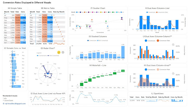
    Conversion rates record the percentage of users, customers and other entities who completed a desired action within a set of steps, typically as part of a process. Conversion rates are a way to evaluate the performance of digital marketing processes in respect to marketing campaigns, website traffic and other similar actions. 

    In data visualizations the conversion rates can be displayed occasionally alone over a time unit (e.g. months, weeks, quarters), though they make sense only in the context of some numbers that reveal the magnitude, either the conversions or the total number of users (as one value can be calculated then based on the other). Thus, it is needed to display two data series with different scales if one considers the conversion rates, respectively display the conversions and the total number of users on the same scale. 

    For the first approach, one can use (1) a table or heatmap, if the number of values is small (see A, B) or the data can be easily aggregated (see L); (2) a visual with dual axis where the values are displayed as columns, lines or even areas (see E, I, J, K); (3) two different visuals where the X axis represents the time unit (see H); (4) a visual that can handle by default data series with different axis - a scatter chart (see F). For the second approach, one has a wider set of display methods (see C, D, G), though there are other challenges involved.

    Conversion Rates in Power BI

    Tables/Heatmaps

    When the number of values is small, as in the current case, a table with the unaltered values can occasionally be the best approach in terms of clarity, understandability, explicitness, or economy of space. The table can display additional statistics including ranking or moving averages. Moreover, the values contained can be represented as colors or color saturation, with different smooth color gradients for each important column, which allows to easily identify high/low values, respectively values from the same row with different orders of magnitude (see the values for September).

    In Power BI, a simple table (see A) allows to display the values as they are, though it doesn't allow to display totals. Conversely, a matrix table (see B) allows to display the totals, though one needs to use measures to calculate the values, and to use sparklines, even if in this case the values displayed are meaningless except the totals. Probably, a better approach would be to display the totals with sparklines in an additional table (see L), which is based on a matrix table. Sparklines better use the space and can be represented inline in tables, though each sparkline follows its own scale of values (which can be advantageous or disadvantageous upon case).

    Column/Bar Charts 

    Column or bar charts are usually the easiest way to encode values as they represent magnitude by their length and are thus easy to decode. To use a single axis one is forced to use the conversions against the totals, and this may work in many cases. Unfortunately, in this case the number of conversions is small compared with the number of "actions", which makes it challenging to make inferences on conversion rates' approximate values. Independently of this, it's probably a good idea to show a visual with the conversion rates anyway (or use dual axes).

    In Power BI, besides the standard column/bar chart visuals (see G), one can use also the Tornado visual from Microsoft (see C), which needs to be added manually and is less customizable than the former. It allows to display two data series in mirror and is thus more appropriate for bipartite data (e.g. males vs females), though it allows to display the data labels clearly for both series, and thus more convenient in certain cases. 

    Dual Axes 

    A dual-axis chart is usually used to represent the relationship between two variables with different amplitude or scale, encoding more information in a smaller place than two separate visuals would do. The primary disadvantage of such representations is that they take more time and effort to decode, not all users being accustomed with them. However, once the audience is used to interpreting such charts, they can prove to be very useful.

    One can use columns/bars, lines and even areas to encode the values, though the standard visuals might not support all the combinations. Power BI provides dual axis support for the line chart, the area chart, the line and staked/clustered column charts (see I), respectively the Power KPI chart (see E). Alternatively, custom visuals from ZoomCharts and other similar vendors could offer more flexibility.  For example, ZoomCharts's Drill Down Combo PRO allows to mix  columns/bars, lines, and areas with or without smooth lines (see J, K).

    Currently, Power BI standard visuals don't allow column/bar charts on both axes concomitantly. In general, using the same encoding on both sides of the axes might not be a good idea because audience's tendency is to compare the values on the same axis as the encoding looks the same. For example, if the values on both sides are encoded as column lengths (see J), the audience may start comparing the length without considering that the scales are different. One needs to translate first the scale equivalence (e.g. 1:3) and might be a good idea to reflect this (e.g. in subtitle or annotation). Therefore, the combination column and line (see I) or column and area (see K) might work better. In the end, the choice depends on the audience or one's feeling what may work. 

    Radar Chart

    Radar charts are seldom an ideal solution for visualizing data, though they can be used occasionally for displaying categorical-like data, in this case monthly based data series. The main advantage of radar charts is that they allow to compare areas overlapping of two or more series when their overlap is not too cluttered. Encoding values as areas is in general not recommended, as areas are more difficult to decode, though in this case the area is a secondary outcome which allows upon case some comparisons.

    Scatter Chart

    Scatter charts (and bubble charts) allow by design to represent the relationship between two variables with different amplitude or scale, while allowing to infer further information - the type of relationship, respectively how strong the relationship between the variables is. However, each month needs to be considered here as a category, which makes color decoding more challenging, though labels can facilitate the process, even if they might overlap. 

    Using Distinct Visuals

    As soon as one uses distinct visuals to represent each data series, the power of comparison decreases based on the appropriateness of the visuals used. Conversely, one can use the most appropriate visual for each data series. For example, a waterfall chart can be used for conversions, and a line chart for conversion rates (see H). When the time axis scales similarly across both charts, one can remove it.

    The Data

    The data comes from a chart with dual axes similar to the visual considered in (J). Here's is the Power Query script used to create the table used for the above charts:

    let
        Source = #table({"Sorting", "Month" ,"Conversions", "Conversion Rate"}
    , {
    {1,"Jul",8,0.04},
    {2,"Aug",280,0.16},
    {3,"Sep",100,0.13},
    {4,"Oct",280,0.14},
    {5,"Nov",90,0.04},
    {6,"Dec",85,0.035},
    {7,"Jan",70,0.045},
    {8,"Feb",30,0.015},
    {9,"Mar",70,0.04},
    {10,"Apr",185,0.11},
    {11,"May",25,0.035},
    {12,"Jun",195,0.04}
    }
    ),
        #"Changed Types" = Table.TransformColumnTypes(Source,{{"Sorting", Int64.Type}, {"Conversions", Int64.Type}, {"Conversion Rate", Number.Type}})
    in
        #"Changed Types"
    

    Conclusion

    Upon case, depending also on the bigger picture, each of the above visuals can be used. I would go with (H) or an alternative of it (e.g. column chart instead of waterfall chart) because it shows the values for both data series. If the values aren't important and the audience is comfortable with dual axes, then probably I would go with (K) or (I), with a plus for (I) because the line encodes the conversion rates better than an area. 

    Happy (de)coding!

    Previous Post <<||>> Next Post

    07 May 2024

    🏭🗒️Microsoft Fabric: The Metrics Layer [Notes] 🆕

    Disclaimer: This is work in progress intended to consolidate information from various sources for learning purposes. For the latest information please consult the documentation (see the links below)! 

    Last updated: 07-May-2024

    The Metrics Layer in Microsoft Fabric (adapted diagram)
    The Metrics Layer in Microsoft Fabric (adapted diagram)

    [new feature] Metrics Layer (Metrics Store)

    • {definition}an abstraction layer available between the data store(s) and end users which allows organizations to create standardized business metrics, that are rooted in measures and are discoverable and intended for reuse
      • ⇐ {important} feature still in private preview 
    • {goal} extend existing infrastructure 
      • {benefit} leverages and extends existing features
    • {goal} provide consistent definitions and descriptions [1]
      • consistent definitions that include besides business logic additional dimensions and filters [1]
      • ⇒ {benefit} allows to standardize the metrics across the organization
      • ⇒ {benefit} enforce to enforce a SSoT
    • {goal} easy management 
      • via management views 
      • [feature] lineage 
      • [feature] source control
      • [feature] duplicate identification
      • [feature] push updates to downstream uses of the metrics 
    • {goal}searchable and discoverable metrics 
      • {feature} integration
        • based on Sempy fabric package
          • ⇐ a dataframe for storage and propagation of Power BI metadata which is part of the python-based semantic Link in Fabric
    • {goal}trust
      • [feature] trust indicators
      • {benefit} facilitates report's adoption
    • {feature} metric set 
      • {definition} a Fabric item that groups together a set of metrics into a mini-model
      • {benefit} allows to reduce the overall complexity of semantic models, while being easy to evolve and consume
      • associated with a single domain
        • ⇒ supports the data mesh architecture
      • shareable 
        • can be shared with other users
      • {action} create metric set
        • creates the actual artifact, to which metrics can be added 
    • {feature} metric
      •  {definition} a way to elevate the measures from the various semantic models existing in the organization
      • tied to the original semantic model
        • ⇒ {benefit} allows to see how a metric is used across the solutions 
      • reusable
        • can be reused in other fabric artifacts
          • new reports on the Power BI service
          • notebooks 
            • by copying the code
        • can be reused in Power BI
          • via OneLake data hub menu element
        • can be chained 
          • changes are propagated downstream 
      • materializable 
        • its output can be persisted to OneLake by saving it a delta table into a lakehouse
        • {misuse} data is persisted unnecessarily
      • {action} elevate metric
        • copies measure's definition and description
        • ⇒  implies restructuring, refactoring, moving, and testing a lot of code in the process
        • {misuse} data professionals build everything as metrics
      • {action} update metric
      • {action} add filters to metric 
      • {action} add dimensions to metric
      • {action} materialize metric 

    References:
    [1] Power BI Tips (2024) Explicit Measures Ep. 236: Metrics Hub, Hot New Feature with Carly Newsome (link)
    [2] Power BI Tips (2024) Introducing Fabric Metrics Layer / Power Metrics Hub [with Carly Newsome] (link)

    Resources:
    [R1] Microsoft Learn (2025) Fabric: What's new in Microsoft Fabric? [link]

    Acronyms:
    SSoT - single source of truth ()

    06 May 2024

    🧭🏭Business Intelligence: Microsoft Fabric (Part III: The Metrics Layer) 🆕

    Introduction

    One of the announcements of this year's Microsoft Fabric Community first conference was the introduction of a metrics layer in Fabric which "allows organizations to create standardized business metrics, that are rooted in measures and are discoverable and intended for reuse" [1]. As it seems, the information content provided at the conference was kept to a minimum given that the feature is still in private preview, though several webcasts start to catch up on the topic (see [2], [4]). Moreover, as part of their show, the Explicit Measures (@PowerBITips) hosts had Carly Newsome as invitee, the manager of the project, who unveiled more details about the project and the feature, details which became the main source for the information below. 

    The idea of a metric layer or metric store is not new, data professionals occasionally refer to their structure(s) of metrics as such. The terms gained weight in their modern conception relatively recently in 2021-2022 (see [5], [6], [7], [8], [10]). Within the modern data stack, a metrics layer or metric store is an abstraction layer available between the data store(s) and end users. It allows to centrally define, store, and manage business metrics. Thus, it allows us to standardize and enforce a single source of truth (SSoT), respectively solve several issues existing in the data stacks. As Benn Stancil earlier remarked, the metrics layer is one of the missing pieces from the modern data stack (see [10]).

    Microsoft's Solution

    Microsoft's business case for metrics layer's implementation is based on three main ideas (1) duplicate measures contribute to poor data quality, (2) complex data models hinder self-service, (3) reduce data silos in Power BI. In Microsoft's conception the metric layer provides several benefits: consistent definitions and descriptions, easy management via management views, searchable and discoverable metrics, respectively assure trust through indicators. 

    For this feature's implementation Microsoft introduces a new Fabric Item called a metric set that allows to group several (business) metrics together as part of a mini-model that can be tailored to the needs of a subset of end-users and accessed by them via the standard tools already available. The metric set becomes thus a mini-model. Such mini-models allow to break down and reduce the overall complexity of semantic models, while being easy to evolve and consume. The challenge will become then on how to break down existing and future semantic models into nonoverlapping mini-models, creating in extremis a partition (see the Lego metaphor for data products). The idea of mini-models is not new, [12] advocating the idea of using a Master Model, a technique for creating derivative tabular models based on a single tabular solution.

    A (business) metric is a way to elevate the measures from the various semantic models existing in the organization within the mini-model defined by the metric set. A metric can be reused in other fabric artifacts - currently in new reports on the Power BI service, respectively in notebooks by copying the code. Reusing metrics in other measures can mean that one can chain metrics and the changes made will be further propagated downstream. 

    The Metrics Layer in Microsoft Fabric (adapted diagram)
    The Metrics Layer in Microsoft Fabric (adapted diagram)

    Every metric is tied to the original semantic model which allows thus to track how a metric is used across the solutions and, looking forward to Purview, to identify data's lineage. A measure is related to a "table", the source from which the measure came from.

    Users' Perspective

    The Metrics Layer feature is available in Microsoft Fabric service for Power BI within the Metrics menu element next to Scorecards. One starts by creating a metric set in an existing workspace, an operation which creates the actual artifact, to which the individual metrics are added. To create a metric, a user with build permissions can navigate through the semantic models across different workspaces he/she has access to, pick a measure from one of them and elevate it to a metric, copying in the process its measure's definition and description. In this way the metric will always point back to the measure from the semantic model, while the metrics thus created are considered as a related collection and can be shared around accordingly. 

    Once a metric is added to the metric set, one can add in edit mode dimensions to it (e.g. Date, Category, Product Id, etc.). One can then further explore a metric's output and add filters (e.g. concentrate on only one product or category) point from which one can slice-and-dice the data as needed.

    There is a panel where one can see where the metric has been used (e.g. in reports, scorecards, and other integrations), when was last time refreshed, respectively how many times was used. Thus, one has the most important information in one place, which is great for developers as well as for the users. Probably, other metadata will be added, such as whether an increase in the metric would be favorable or unfavorable (like in Tableau Pulse, see [13]) or maybe levels of criticality, an unit of measure, or maybe its type - simple metric, performance indicator (PI), result indicator (RI), KPI, KRI etc.

    Metrics can be persisted to the OneLake by saving their output to a delta table into the lakehouse. As demonstrated in the presentation(s), with just a copy-paste and a small piece of code one can materialize the data into a lakehouse delta table, from where the data can be reused as needed. Hopefully, the process will be further automated. 

    One can consume metrics and metrics sets also in Power BI Desktop, where a new menu element called Metric sets was added under the OneLake data hub, which can be used to connect to a metric set from a Semantic model and select the metrics needed for the project. 

    Tapping into the available Power BI solutions is done via an integration feature based on Sempy fabric package, a dataframe for storage and propagation of Power BI metadata which is part of the python-based semantic Link in Fabric [11].

    Further Thoughts

    When dealing with a new feature, a natural idea comes to mind: what challenges does the feature involve, respectively how can it be misused? Given that the metrics layer can be built within a workspace and that it can tap into the existing measures, this means that one can built on the existing infrastructure. However, this can imply restructuring, refactoring, moving, and testing a lot of code in the process, hopefully with minimal implications for the solutions already available. Whether the process is as simple as imagined is another story. As misusage, in extremis, data professionals might start building everything as metrics, though the danger might come when the data is persisted unnecessarily. 

    From a data mesh's perspective, a metric set is associated with a domain, though there will be metrics and data common to multiple domains. Moreover, a mini-model has the potential of becoming a data product. Distributing the logic across multiple workspaces and domains can add further challenges, especially in what concerns the synchronization and implemented of requirements in a way that doesn't lead to bottlenecks. But this is a general challenge for the development team(s). 

    The feature will probably suffer further changes until is released in public review (probably by September or the end of the year). I subscribe to other data professionals' opinion that the feature was for long needed and that can have an important impact on the solutions built. 

    Previous Post <<||>> Next Post

    Resources:
    [1] Microsoft Fabric Blog (2024) Announcements from the Microsoft Fabric Community Conference (link)
    [2] Power BI Tips (2024) Explicit Measures Ep. 236: Metrics Hub, Hot New Feature with Carly Newsome (link)
    [3] Power BI Tips (2024) Introducing Fabric Metrics Layer / Power Metrics Hub [with Carly Newsome] (link)
    [4] KratosBI (2024) Fabric Fridays: Metrics Layer Conspiracy Theories #40 (link)
    [5] Chris Webb's BI Blog (2022) Is Power BI A Semantic Layer? (link)
    [6] The Data Stack Show (2022) TDSS 95: How the Metrics Layer Bridges the Gap Between Data & Business with Nick Handel of Transform (link)
    [7] Sundeep Teki (2022) The Metric Layer & how it fits into the Modern Data Stack (link)
    [8] Nick Handel (2021) A brief history of the metrics store (link)
    [9] Aurimas (2022) The Jungle of Metrics Layers and its Invisible Elephant (link)
    [10] Benn Stancil (2021) The missing piece of the modern data stack (link)
    [11] Microsoft Learn (2024) Sempy fabric Package (link)
    [12] Michael Kovalsky (2019) Master Model: Creating Derivative Tabular Models (link)
    [13] Christina Obry (2023) The Power of a Metrics Layer - and How Your Organization Can Benefit From It (link
    [14] KratosBI (2024) Introducing the Metrics Layer in #MicrosoftFabric with Carly Newsome [link]

    Resources:
    [R1] Microsoft Learn (2025) Fabric: What's new in Microsoft Fabric? [link]
    Related Posts Plugin for WordPress, Blogger...

    About Me

    My photo
    Koeln, NRW, Germany
    IT Professional with more than 25 years experience in IT in the area of full life-cycle of Web/Desktop/Database Applications Development, Software Engineering, Consultancy, Data Management, Data Quality, Data Migrations, Reporting, ERP implementations & support, Team/Project/IT Management, etc.