Showing posts with label visuals. Show all posts

30 July 2025

📊Graphical Representation: Sense-making in Data Visualizations (Part 3: Heuristics)

Graphical Representation Series
 

Consider the following general heuristics in data visualizations (work in progress):

  • plan design
    • plan page composition
      • text
        • title, subtitles
        • dates 
          • refresh, filters applied
        • parameters applied
        • guidelines/tooltips
        • annotation 
      • navigation
        • main page(s)
        • additional views
        • drill-through
        • zoom in/out
        • next/previous page
        • landing page
      • slicers/selections
        • date-related
          • date range
          • date granularity
        • functional
          • metric
          • comparisons
        • categorical
          • structural relations
      • icons/images
        • company logo
        • button icons
        • background
    • pick a theme
      • choose a layout and color schema
        • use a color palette generator
        • use a focused color schema or restricted palette
        • use consistent and limited color scheme
        • use suggestive icons
          • use one source (with similar design)
        • use formatting standards
    • create a visual hierarchy 
      • use placement, size and color for emphasis
      • organize content around eye movement pattern
      • minimize formatting changes
      • 1 font, 2 weights, 4 sizes
    • plan the design
      • build/use predictable and consistent templates
        • e.g. using Figma
      • use layered design
      • aim for design unity
      • define & use formatting standards
      • check changes
    • GRACEFUL
      • group visuals with white space 
      • right chart type
      • avoid clutter
      • consistent & limited color schema
      • enhanced readability 
      • formatting standard
      • unity of design
      • layered design
  • keep it simple 
    • be predictable and consistent 
    • focus on the message
      • identify the core insights and design around them
      • pick suggestive titles/subtitles
        • use dynamics subtitles
      • align content with the message
    • avoid unnecessary complexity
      • minimize visual clutter
      • remove the unnecessary elements
      • round numbers
    • limit colors and fonts
      • use a restrained color palette (<5 colors)
      • stick to 1-2 fonts 
      • ensure text is legible without zooming
    • aggregate values
      • group similar data points to reduce noise
      • use statistical methods
        • averages, medians, min/max
      • categories when detailed granularity isn’t necessary
    • highlight what matters 
      • e.g. actionable items
      • guide attention to key areas
        • via annotations, arrows, contrasting colors 
        • use conditional formatting
      • do not show only the metrics
        • give context 
      • show trends
        • via sparklines and similar visuals
    • use familiar visuals
      • avoid questionable visuals 
        • e.g. pie charts, gauges
    • avoid distortions
      • preserve proportions
        • scale accurately to reflect data values
        • avoid exaggerated visuals
          • don’t zoom in on axes to dramatize small differences
      • use consistent axes
        • compare data using the same scale and units across charts
        • don't use dual axes or shifting baselines that can mislead viewers
      • avoid manipulative scaling
        • use zero-baseline on bar charts 
        • use logarithmic scales sparingly
    • design for usability
      • intuitive interaction
      • at-a-glance perception
      • use contrast for clarity
      • use familiar patterns
        • use consistent formats the audience already knows
    • design with the audience in mind
      • analytical vs managerial perspectives (e.g. dashboards)
    • use different level of data aggregations
      •  in-depth data exploration 
    • encourage scrutiny
      • give users enough context to assess accuracy
        • provide raw values or links to the source
      • explain anomalies, outliers or notable trends
        • via annotations
    • group related items together
      • helps identify and focus on patterns and other relationships
    • diversify 
      • don't use only one chart type
      • pick the chart that reflects the best the data in the conrext considered
    • show variance 
      • absolute vs relative variance
      • compare data series
      • show contribution to variance
    • use familiar encodings
      • leverage (known) design patterns
    • use intuitive navigation
      • synchronize slicers
    • use tooltips
      • be concise
      • use hover effects
    • use information buttons
      • enhances user interaction and understanding 
        • by providing additional context, asking questions
    • use the full available surface
      • 1080x1920 works usually better 
    • keep standards in mind 
      • e.g. IBCS
  • state the assumptions
    • be explicit
      • clearly state each assumption 
        • instead of leaving it implied
    • contextualize assumptions
      • explain the assumption
        • use evidence, standard practices, or constraints
    • state scope and limitations
      • mention what the assumption includes and excludes
    • tie assumptions to goals & objectives
      • helps to clarify what underlying beliefs are shaping the analysis
      • helps identify whether the visualization achieves its intended purpose 
  • show the data
    • be honest (aka preserve integrity)
      • avoid distortion, bias, or trickery
    • support interpretation
      • provide labels, axes, legends
    • emphasize what's meaningful
      • patterns, trends, outliers, correlations, local/global maxima/minima
  • show what's important 
    • e.g. facts, relationships, flow, similarities, differences, outliers, unknown
    • prioritize and structure the content
      • e.g. show first an overview, what's important
    • make the invisible visible
      • think about what we do not see
    • know your (extended) users/audience
      • who'll use the content, at what level, for that
  • test for readability
    • get (early) feedback
      • have the content reviewed first
        • via peer review, dry run presentation
  • tell the story
    • know the audience and its needs
    • build momentum, expectation
    • don't leave the audience to figure it out
    • show the facts
    • build a narrative
      • show data that support it
      • arrange the visuals in a logical sequence
    • engage the reader
      • ask questions that bridge the gaps
        • e.g. in knowledge, in presentation's flow
      • show the unexpected
      • confirm logical deductions
Previous Post <<||>> Next Post

21 July 2025

📊Graphical Representation: Sense-making in Data Visualizations (Part 1: An Introduction)

Graphical Representation Series

Introduction

Creating simple charts or more complex data visualizations may appear trivial for many, though their authors shouldn't forget that readers have different backgrounds, degrees of literacy, many of them not being maybe able to make sense of graphical displays, at least not without some help.

Beginners start with a limited experience and build upon it, then, on the road to mastery, they get acquainted with the many possibilities, a deeper sense is achieved and the choices become a few. Independently of one's experience, there are seldom 'yes' and 'no' answers for the various choices, but everything is a matter of degree that varies with one's experience, available time, audience's expectations, and many more aspects might be considered in time.  

The following questions are intended to expand, respectively narrow down our choices when dealing with data visualizations from a data professional's perspective. The questions are based mainly on [1] though they were extended to include a broader perspective. 

General Questions

Where does the data come from? Is the source reliable, representative (for the whole population in scope)? Is the data source certified? Are yhe data actual? 

Are there better (usable) sources? What's the effort to consider them? Does the data overlap? To what degree? Are there any benefits in merging the data? How much this changes the overall picture? Are the changes (in trends) explainable? 

Was the data collected? How, from where, and using what method? [1] What methodology/approach was used?

What's the dataset about? Can one recognize the data, the (data) entities, respectively the structures behind? How big is the fact table (in terms of rows and columns)? How many dimensions are in scope?

What transformations, calculations or modifications have been applied? What was left out and what's the overall impact?

Any significant assumptions were made? [1] Were the assumptions clearly stated? Are they entitled? Is it more to them? 

Were any transformation applied? Do the transformations change any data characteristics? Were they adequately documented/explained? Do they make sense? Was it something important left out? What's the overall impact?

What criteria were used to include/exclude data from the display? [1] Are the criteria adequately explained/documented? Do they make sense?

Are similar data publicly available? Is it (freely) accessible/usable? To what degree? How much do the datasets overlap? Is there any benefit to analyze/use the respective data? Are the characteristics comparable? To what degree?

Dataviz Questions

What's the title/subtitle of the chart? Is it meaningful for the readers? Does the title reflect the data, respectively the findings adequately? Can it be better formulated? Is it an eye-catcher? Does it meet the expectations? 

What data is shown? Of what type? At what level is the data aggregated? 

What chart (type) is being used? [1] Are the readers familiar with the chart type? Does it needs further introduction/clarifications? Are there better means to represent the data? Does the chart offer the appropriate perspective? Does it make sense to offer different (complementary) perspective(s)? To what degree other perspectives help?

What items of data do the marks represent? What value associations do the attributes represent? [1] Are the marks visible? Are the marks adequately presented (e.g. due to missing data)? 

What range of values are displayed? [1] What approximation the values support? To what degree can the values be rounded without losing meaning?

Is the data categorical, ordinal or continuous? 

Are the axes property chosen/displayed/labeled? Is the scale properly chosen (linear, semilogarithmic, logarithmic), respectively displayed? Do they emphasize, diminish, distort, simplify, or clutter the information? 

What features (shapes, patterns, differences or connections) are observable, interesting or vital for understanding the chart? [1] 

Where are the largest, mid-sized and smallest values? (aka ‘stepped magnitude’ judgements). [1] 

Where lie the most/least values? Where is the average or normal? (aka ‘global comparison’ judgements)” [1] How are the values distributed? Are there any outliers present? Are they explainable? 

What features are expected or unexpected? [1] To what degree are they unexpected?  

What features are important given the subject? [1] 

What shapes and patterns strike readers as being semantically aligned with the subject? [1] 

What is the overall feeling when looking at the final result? Is the chart overcrowded? Can anything be left out/included? 

What colors were used? [1] Are the colors adequately chosen, respectively meaningful? Do they follow the general recommendations?  

What colors, patterns, forms do readers see first? What impressions come next, respectively last longer?  

Are the various elements adequately/intuitively positioned/distinguishable? What's the degree of overlapping/proximity? Do the elements respect an intuitive hierarchy? Do they match readers' expectations, respectively the best practices in scope? Are the deviations entitled? 

Is the space properly used? To what degree? Are there major gaps? 

Know Your Audience

What audience targets the visualization? Which are its characteristics (level of experience with data visualizations; authors, experts or casual attendees)? Are there any accidental attendees? How likely is the audience to pay attention? 

What is audience’s relationship with the subject matter? What knowledge do they have or, conversely, lack about the subject? What assistance might they need to interpret the meaning of the subject? Do they have the capacity to comprehend what it means to them? [1]

Why do the audience wants/needs to understand the topic? Are they familiar, respectively actively interested or more passive? Is it able to grasp the intended meaning? [1] To what degree? What kind of challenges might be involved, of what nature?

What is their motivation? Do they have a direct, expressed need or are they more passive and indifferent? Is it needed a way to persuade them or even seduce them to engage? [1] Can this be done without distorting the data and its meaning(s)?

What are their visualization literacy skill set? Do they require assistance perceiving the chart(s)? Are they sufficiently comfortable with operating features of interactivity? Do they have any visual accessibility issues (e.g. red–green color blindness)? Do they need to be (re)factored into the design? [1]

Reflections

What has been learnt? Has it reinforced or challenged existing knowledge? [1] Was new knowledge gained? How valuable is this knowledge? Can it be reused? In which contexts? 

Do the findings meet one's expectations? To what degree? Were the expectations entitled? On what basis? What's missing? What's gaps' relevance? 

What feelings have been stirred? Has the experience had an impact emotionally? [1] To what degree? Is the impact positive/negative? Is the reaction entitled/explainable? Are there any factors that distorted the reactions? Are they explainable? Do they make sense? 

What does one do with this understanding? Is it just knowledge acquired or something to inspire action (e.g. making a decision or motivating a change in behavior)? [1] How relevant/valuable is the information for us? Can it be used/misused? To what degree? 

Are the data and its representation trustworthy? [1] To what degree?

Previous Post <<||>> Next Post

References:
[1] Andy Kirk, "Data Visualisation: A Handbook for Data Driven Design" 2nd Ed., 2019

06 July 2025

🧭Business Intelligence: Perspectives (Part 32: Data Storytelling in Visualizations)

Business Intelligence Series

From data-related professionals to book authors on data visualization topics, there are many voices that require from any visualization to tell a story, respectively to conform to storytelling principles and best practices, and this independently of the environment or context in which the respective artifacts are considered. The need for data visualizations to tell a story may be entitled, though in business setups the data, its focus and context change continuously with the communication means, objectives, and, at least from this perspective, one can question storytelling’s hard requirement.

Data storytelling can be defined as "a structured approach for communicating data insights using narrative elements and explanatory visuals" [1]. Usually, this supposes the establishment of a context, respectively a fundament on which further facts, suppositions, findings, arguments, (conceptual) models, visualizations and other elements can be based upon. Stories help to focus the audience on the intended messages, they connect and eventually resonate with the audience, facilitate the retaining of information and understanding the chain of implications the decisions in scope have, respectively persuade and influence, when needed.

Conversely, besides the fact that it takes time and effort to prepare stories and the afferent content (presentations, manually created visualizations, documentation), expecting each meeting to be a storytelling session can rapidly become a nuisance for the auditorium as well for the presenters. Like in any value-generating process, one should ask where the value in storytelling is based on data visualizations and the effort involved, or whether the effort can be better invested in other areas.

In many scenarios, requesting from a dashboard to tell a story is an entitled requirement given that many dashboards look like a random combination of visuals and data whose relationship and meaning can be difficult to grasp and put into a plausible narrative, even if they are based on the same set of data. Data visualizations of any type should have an intentional well-structured design that facilitates visual elements’ navigation, understanding facts’ retention, respectively resonate with the auditorium.

It’s questionable whether such practices can be implemented in a consistent and meaningful manner, especially when rich navigation features across multiple visuals are available for users to look at data from different perspectives. In such scenarios the identification of cases that require attention and the associations existing between well-established factors help in the discovery process.

Often, it feels like visuals were arranged aleatorily in the page or that there’s no apparent connection between them, which makes the navigation and understanding more challenging. For depicting a story, there must be a logical sequencing of the various visualizations displayed in the dashboards or reports, especially when visuals’ arrangement doesn’t reflect the typical navigation of the visuals or when the facts need a certain sequencing that facilitates understanding. Moreover, the sequencing doesn’t need to be linear but have a clear start and end that encompasses everything in between.

Storytelling works well in setups in which something is presented as the basis for one-time or limited in scope sessions like decision-making, fact-checking, awareness raising and other types of similar communication. However, when building solutions for business monitoring and data exploration, there can be multiple stories or no story worth telling, at least not for the predefined scope. Even if one can zoom in or out, respectively rearrange the visuals and add others to highlight the stories encompassed, the value added by taking the information out of the dashboards and performing such actions can be often neglected to the degree that it doesn’t pay off. A certain consistency, discipline and acumen is needed then for focusing on the important aspects and ignoring thus the nonessential. 

Previous Post <<||>> Next Post

References:
[1] Brent Dykes, "Effective Data Storytelling: How to Drive Change with Data, Narrative and Visuals", 2019 [quotes]

04 February 2025

🧭Business Intelligence: Perspectives (Part 26: Monitoring - A Cockpit View)

Business Intelligence Series

The monitoring of business imperatives is sometimes compared metaphorically with piloting an airplane, where pilots look at the cockpit instruments to verify whether everything is under control and the flight ensues according to the expectations. The use of a cockpit is supported by the fact that an airplane is an almost "closed" system in which the components were developed under strict requirements and tested thoroughly under specific technical conditions. Many instruments were engineered and evolved over decades to operate as such. The processes are standardized, inputs and outputs are under strict control, otherwise the whole edifice would crumble under its own complexity. 

In organizational setups, a similar approach is attempted for monitoring the most important aspects of a business. A few dashboards and reports are thus built to monitor and control what’s happening in the areas which were identified as critical for the organization. The various gauges and other visuals were designed to provide similar perspectives as the ones provided by an airplane’s cockpit. At first sight the cockpit metaphor makes sense, though at careful analysis, there are major differences. 

Probably, the main difference is that businesses don’t necessarily have standardized processes that were brought under control (and thus have variation). Secondly, the data used doesn’t necessarily have the needed quality and occasionally isn’t fit for use in the business processes, including supporting processes like reporting or decision making. Thirdly, are high the chances that the monitoring within the BI infrastructures doesn’t address the critical aspects of the business, at least not at the needed level of focus, detail or frequency. The interplay between these three main aspects can lead to complex issues and a muddy ground for a business to build a stable edifice upon. 

The comparison with airplanes’ cockpit was chosen because the number of instruments available for monitoring is somewhat comparable with the number of visuals existing in an organization. In contrast, autos have a smaller number of controls simple enough to help the one(s) sitting in the cockpit. A car’s monitoring capabilities can probably reflect the needs of single departments or teams, though each unit needs its own gauges with specific business focus. The parallel is however limited because the areas of focus in organizations can change and shift in other directions, some topics may have a periodic character while others can regain momentum after a long time. 

There are further important aspects. At high level, the expectation is for software products and processes, including the ones related to BI topics, to have the same stability and quality as the mass production of automobiles, airplanes or other artifacts that have similar complexity and manufacturing characteristics. Even if the design process of software and manufacturing may share many characteristics, the similar aspects diverge as soon as the production processes start, respectively progress, and these are the areas where the most differences lie. Starting from the requirements and ending with the overall goals, everything resembles the characteristics of quick shifting sands on which is challenging to build any stabile edifice.

At micro level in manufacturing each piece was carefully designed and produced according to a set of characteristics that were proved to work. Everything must fit perfectly in the grand design and there are many tests and steps to make sure that happens. To some degree the same is attempted when building software products, though the processes break along the way with the many changes attempted, with the many cost, time and quality constraints. At some point the overall complexity kicks back; it might be still manageable though the overall effort is higher than what organizations bargained for. 

19 April 2024

⚡️🗒️Power BI: Working with Visual Calculations (Part I: Test Drive) 🆕

Introduction

I recently watched a webcast with Jeroen (Jay) ter Heerdt (see [2]) in which he introduces visual calculations, a type of DAX calculation that's defined and executed directly on a visual [1]. Visual calculations provide an approach of treating a set of data much like an Excel table, allowing to refer to any field available on a visual and write formulas, which simplifies considerably the solutions used currently for ranking records, running averages and other windowing functions. 

The records behind a visual can be mentally represented as a matrix, while the visual calculations can refer to any column from the matrix, allowing to add new columns and include the respective columns in further calculations. Moreover, if a column is used in a formula, it's not recalculated as is the case of measures, which should improve the performance of DAX formulas considerably. 

Currently, one can copy a formula between visuals and if the formula contains fields not available in the targeted visual, they are added as well. Conversely, it's possible to build such a visual, copy it and then replace the dimension on which the analysis is made (e.g. Customer with Product), without being needed to make further changes. Unfortunately, there are also downsides: (1) the calculations are visible only within the visual in which were defined; (2) currently, the visual's data can't be exported if a visual calculation is added; (3) no formatting is supported, etc.

Ranking and Differences

I started to build a solution based on publicly available sales data, which offers a good basis for testing the use of visual calculations. Based on a Power BI visual table made of [Customer Name], [Sales Amount], [Revenue] and [Total Discount], I've added several calculations:

-- percentages
Sales % = 100*DIVIDE([Sales Amount], COLLAPSE([Sales Amount], ROWS))
Revenue % = 100*DIVIDE([Revenue],[Sales Amount])
Discount % = 100*DIVIDE([Total  Discount], [Total  Discount]+[Sales Amount])

-- rankings 
Rank Sales = Rank(DENSE, ORDERBY([Sales Amount], DESC))
Rank Revenue = Rank(DENSE, ORDERBY([Revenue], DESC))

-- differences between consecutive values
Diff. to Prev. Sales = IF([Rank Sales]>1, INDEX([Rank Sales]-1, , ORDERBY([Sales Amount], DESC)) - [Sales Amount] , BLANK())
Diff. to Prev. Rev. = IF([Rank Revenue]>1, INDEX([Rank Revenue]-1, , ORDERBY([Revenue], DESC)) - [Revenue] , BLANK())

Here's the output considered only for the first 10 records sorted by [Sales Amount]:

Customer Name Sales Amount Sales % Revenue Revenue % Total Discount Discount % Rank Sales Diff. to Prev. Sales. Rank Rev. Diff. to Prev. Rev.
Medline 1058923.78 3.76 307761.99 3.75 126601.02 10.68 1 1
Ei 707663.21 2.51 229866.98 2.8 95124.09 11.85 2 351260.57 2 77895.01
Elorac, Corp 702911.91 2.49 209078.76 2.55 83192.39 10.58 3 4751.3 6 20788.22
Sundial 694918.98 2.47 213362.1 2.6 78401.72 10.14 4 7992.93 4 -4283.34
OUR Ltd 691687.4 2.45 196396.26 2.4 78732.2 10.22 5 3231.58 10 16965.84
Eminence Corp 681612.78 2.42 213002.78 2.6 86904.03 11.31 6 10074.62 5 -16606.52
Apotheca, Ltd 667283.99 2.37 157435.56 1.92 101453.91 13.2 7 14328.79 31 55567.22
Rochester Ltd 662943.9 2.35 224918.2 2.74 81158.11 10.91 8 4340.09 3 -67482.64
ETUDE Ltd 658370.48 2.34 205432.79 2.51 89322.72 11.95 9 4573.42 9 19485.41
Llorens Ltd 646779.31 2.29 206567.4 2.52 82897.59 11.36 10 11591.17 8 -1134.61

Comments:
1) One could use [Total Amount] = [Total  Discount]+[Sales Amount] as a separate column.
2) The [Rank Sales] is different from the [Rank Rev.] because of the discount applied.
3) In the last two formulas a blank was considered for the first item from the ranking.
4) It's not possible to control when the totals should be displayed, however one can change the color for the not needed total to match the background.

Visualizing Differences 

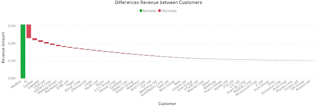
Once the formulas are added, one can hide the basis columns and visualize the data as needed. To obtain the below chart I copied the visual and changed the column as follows:

Diff. to Prev. Rev. = IF([Rank Revenue]>1, [Revenue]- INDEX([Rank Revenue]-1, , ORDERBY([Revenue], DESC)) , [Revenue]) -- modified column

Differences Revenue between Customers

Comments:
1) Instead of showing the full revenue, the chart shows only the differences from the highest revenue, where the column in green is the highest revenue, while the columns in red are the differences of the current customer's revenue to the previous customer, as the data are sorted by the highest revenue. At least in this case it results in a lower data-ink ratio (see Tufte).
2) The values are sorted by the [Revenue] descending. 
3) Unfortunately, it's not possible to change the names from the legend.

Simple Moving Averages (SMAs)

Based on the [Sales Amount], [Revenue] and [Month] one can add the following DAX formulas to the table for calculating the SMA:

Sales Amount (SMA) = MOVINGAVERAGE([Sales Amount],6)
Revenue (SMA) = MOVINGAVERAGE([Revenue],6)

The chart becomes:


Comments:
1) Unfortunately, the formula can't project the values into the feature, at least not without the proper dates.
2) "Show items with not data" feature seems to be disabled when visual calculations are used.
3) The SMA was created via a template formula. Similarly, calculating a running sum is reduced to applying a formula:
Running Sales Amount = RUNNINGSUM([Sales Amount])

Wrap Up

It's easier to start with a table for the visual, construct the needed formulas and then use the proper visual while eliminating the not needed fields. 

The feature is still in public preview and changes can still occur. Unfortunately, there's still no information available on the general availability date. From the first tests, it provides considerable power with a minimum of effort, which is great! I don't want to think how long I would have needed to obtain the same results without it!

Happy coding!

Previous Post <<||>> Next Post

References
[1] Microsoft Learn (2024) Power BI: Using visual calculations [preview] (link)
[2] SSBI Central (2024) Visual Calculations - Making DAX easier, with Jeroen ter Heerdt (link)

01 November 2011

📉Graphical Representation: Visuals (Just the Quotes)

"Data storytelling can be defined as a structured approach for communicating data insights using narrative elements and explanatory visuals." (Brent Dykes, "Effective Data Storytelling: How to Drive Change with Data, Narrative and Visuals", 2019)

"Data storytelling involves the skillful combination of three key elements: data, narrative, and visuals. Data is the primary building block of every data story. It may sound simple, but a data story should always find its origin in data, and data should serve as the foundation for the narrative and visual elements of your story." (Brent Dykes, "Effective Data Storytelling: How to Drive Change with Data, Narrative and Visuals", 2019)

"Even with a solid narrative and insightful visuals, a data story cannot overcome a weak data foundation. As the master architect, builder, and designer of your data story, you play an instrumental role in ensuring its truthfulness, quality, and effectiveness. Because you are responsible for pouring the data foundation and framing the narrative structure of your data story, you need to be careful during the analysis process. Because all of the data is being processed and interpreted by you before it is shared with others, it can be exposed to cognitive biases and logical fallacies that distort or weaken the data foundation of your story." (Brent Dykes, "Effective Data Storytelling: How to Drive Change with Data, Narrative and Visuals", 2019)

"In addition to managing how the data is visualized to reduce noise, you can also decrease the visual interference by minimizing the extraneous cognitive load. In these cases, the nonrelevant information and design elements surrounding the data can cause extraneous noise. Poor design or display decisions by the data storyteller can inadvertently interfere with the communication of the intended signal. This form of noise can occur at both a macro and micro level." (Brent Dykes, "Effective Data Storytelling: How to Drive Change with Data, Narrative and Visuals", 2019)

"The success of your narratives will depend on your ability to effectively perform the following tasks and responsibilities as the data storyteller: Identify a key insight. [...] Minimize or remove bias. [...] Gain adequate context. [...] Understand the audience. [...] Curate the information. [...] Assemble the story. [...] Choose the visuals. [...] Add credibility." (Brent Dykes, "Effective Data Storytelling: How to Drive Change with Data, Narrative and Visuals", 2019)

"While visuals are an essential part of data storytelling, data visualizations can serve a variety of purposes from analysis to communication to even art. Most data charts are designed to disseminate information in a visual manner. Only a subset of data compositions is focused on presenting specific insights as opposed to just general information. When most data compositions combine both visualizations and text, it can be difficult to discern whether a particular scenario falls into the realm of data storytelling or not." (Brent Dykes, "Effective Data Storytelling: How to Drive Change with Data, Narrative and Visuals", 2019)

"Data visualization is a mix of science and art. Sometimes we want to be closer to the science side of the spectrum - in other words, use visualizations that allow readers to more accurately perceive the absolute values of data and make comparisons. Other times we may want to be closer to the art side of the spectrum and create visuals that engage and excite the reader, even if they do not permit the most accurate comparisons." (Jonathan Schwabish, "Better Data Visualizations: A guide for scholars, researchers, and wonks", 2021)

"Raw data without appropriate visualization is like dumped construction raw materials at a building construction site. The finished house is the actual visuals created from those data like raw materials." (Bill Inmon et al, "Building the Data Lakehouse", 2021)

"Good data stories have three key components: data, narrative, and visuals. [...] The data part is fairly obvious - data has to be accurate for the correct insights to be achieved. The narrative has to give a voice to the data in simple language, turning each data point into a character in the story with its own tale to tell. The visuals are what we are most concerned about. They have to allow us to be able to find trends and patterns in our datasets and do so easily and specifically. The last thing we want is for the most important points to be buried in rows and columns." (Kate Strachnyi, "ColorWise: A Data Storyteller’s Guide to the Intentional Use of Color", 2023)

"Good design isn’t just choosing colors and fonts or coming up with an aesthetic for charts. That’s styling - part of design, but by no means the most important part. Rather, people with design talent develop and execute systems for effective visual communication. They understand how to create and edit visuals to focus an audience and distill ideas." (Scott Berinato, "Good Charts : the HBR guide to making smarter, more persuasive data visualizations", 2023)

Related Posts Plugin for WordPress, Blogger...

About Me

My photo
Koeln, NRW, Germany
IT Professional with more than 25 years experience in IT in the area of full life-cycle of Web/Desktop/Database Applications Development, Software Engineering, Consultancy, Data Management, Data Quality, Data Migrations, Reporting, ERP implementations & support, Team/Project/IT Management, etc.